The Brand Monograph
Tech:NYC brand identity by Red Antler
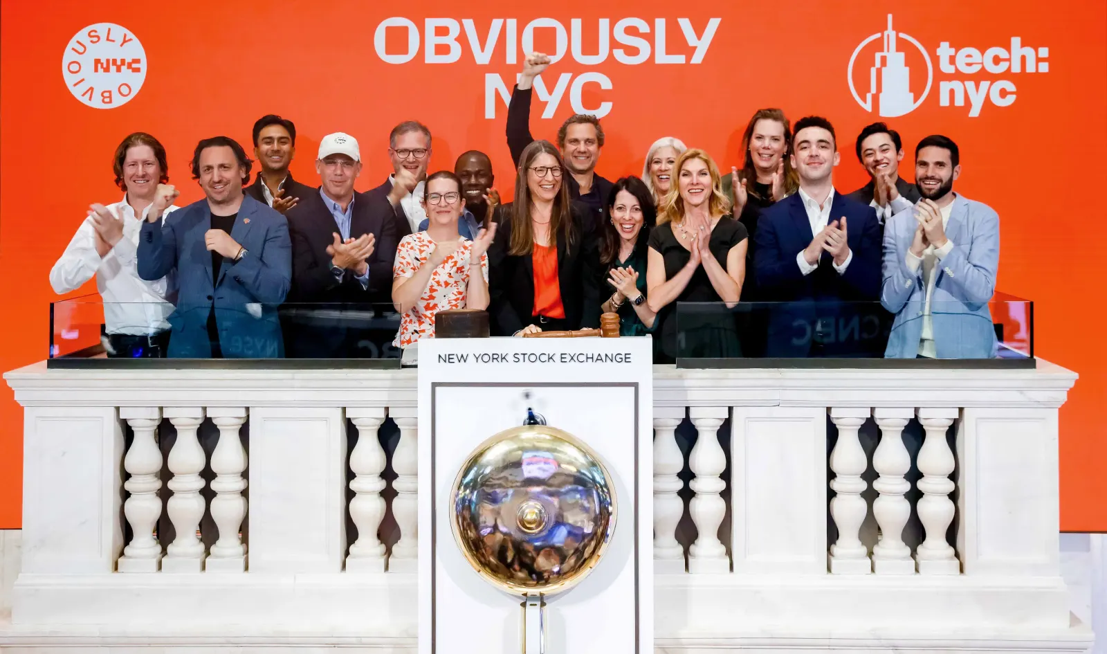
↗Red Antler gave New York's tech community an argument it can put on a wall. Tech:NYC, a coalition of tech leaders, wanted to make the case for building companies in the city, where the sector accounts for roughly 10% of GDP and employs more than 369,000 people. The studio's answer is Obviously NYC, a name that treats the decision as already settled.
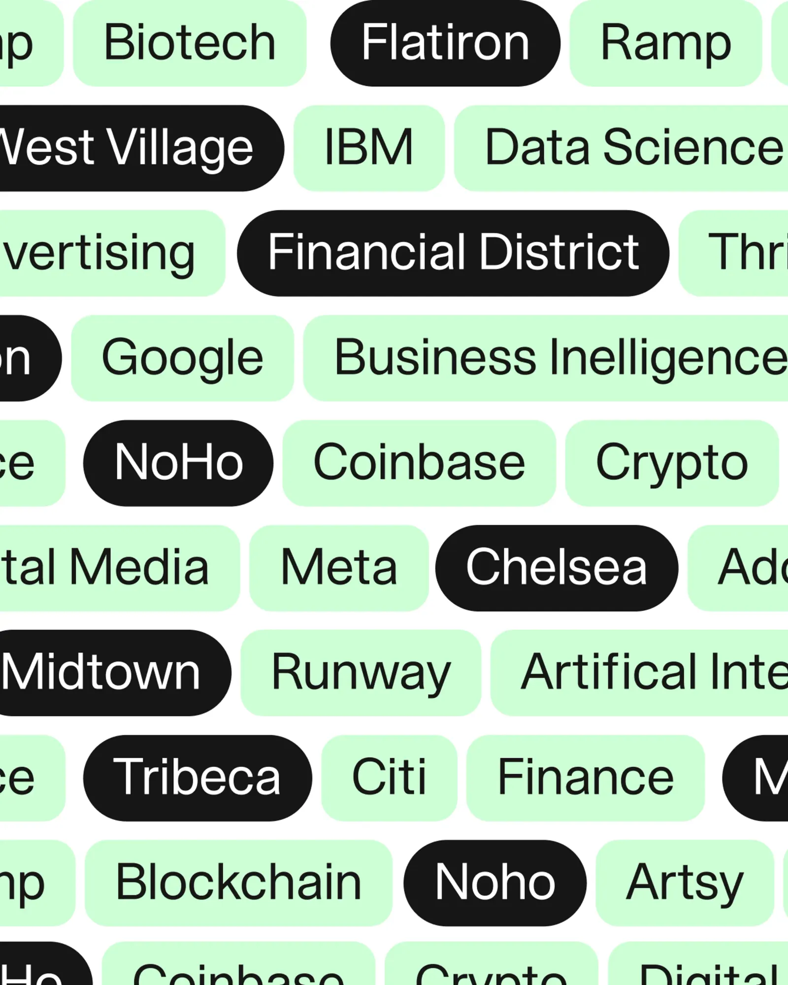
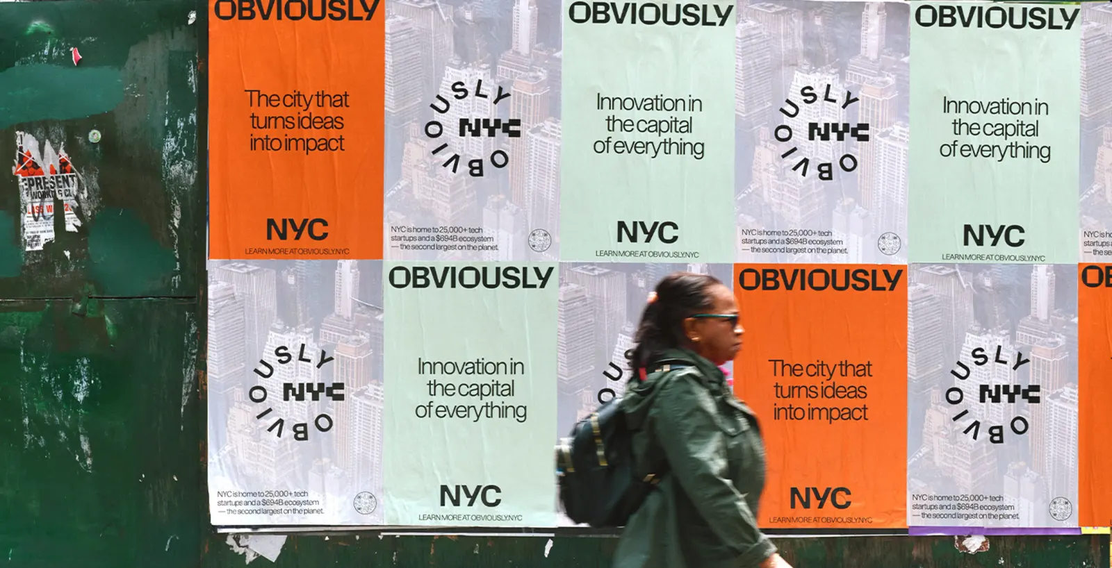
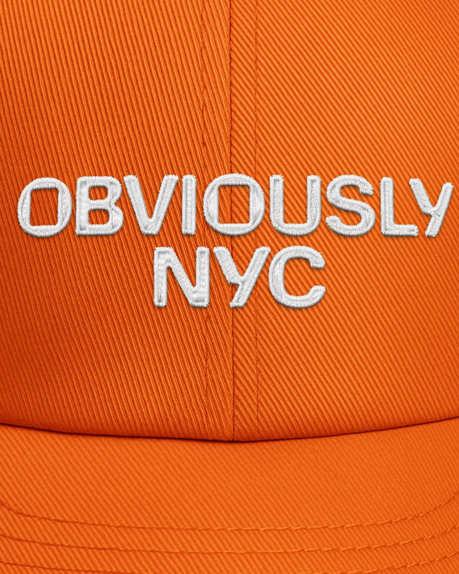
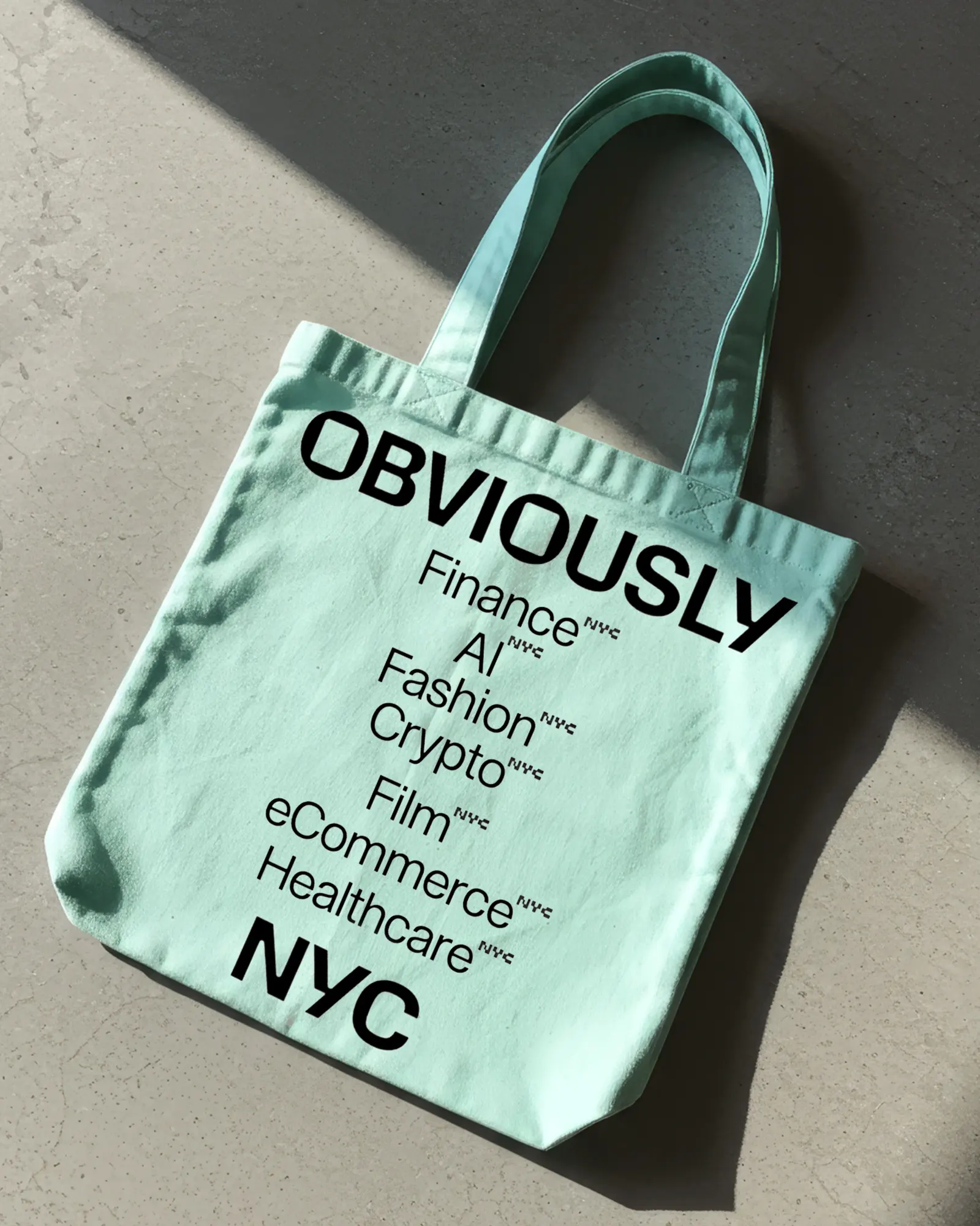
The identity borrows from landmarks and materials New Yorkers see every day: Lady Liberty green, Staten Island Ferry orange, and Warm Concrete gray. Short, assertive copy carries the tone. The detail worth studying is the out-of-home work, which pairs real companies with the neighborhoods they operate in. The campaign launched across digital and in-person touchpoints during New York Tech Week.
Why it works
The palette is the smartest decision here. Tech branding tends to default to glossy blues and abstract gradients, while these colors are specific, local, and a little unglamorous in the best way. They make the brand feel like part of the city rather than a pitch aimed at it. The name does similar work, since it sounds like a verdict, not a slogan. The neighborhood-based placements then supply the evidence, so the claim is backed by names and places instead of adjectives.
Applications
Logo
Typography
Images and video from redantler.com, by Red Antler.