The Brand Monograph
ICAT brand identity by Red Antler
↗Logistics identities rarely make anyone lean in, which is what makes Red Antler's work for ICAT so striking. The company handles bespoke logistics for sectors where the cargo is precious and the schedule unforgiving, including defense, aerospace, luxury retail, and live events. The brief was to pull those very different specialties under one roof without flattening any of them.
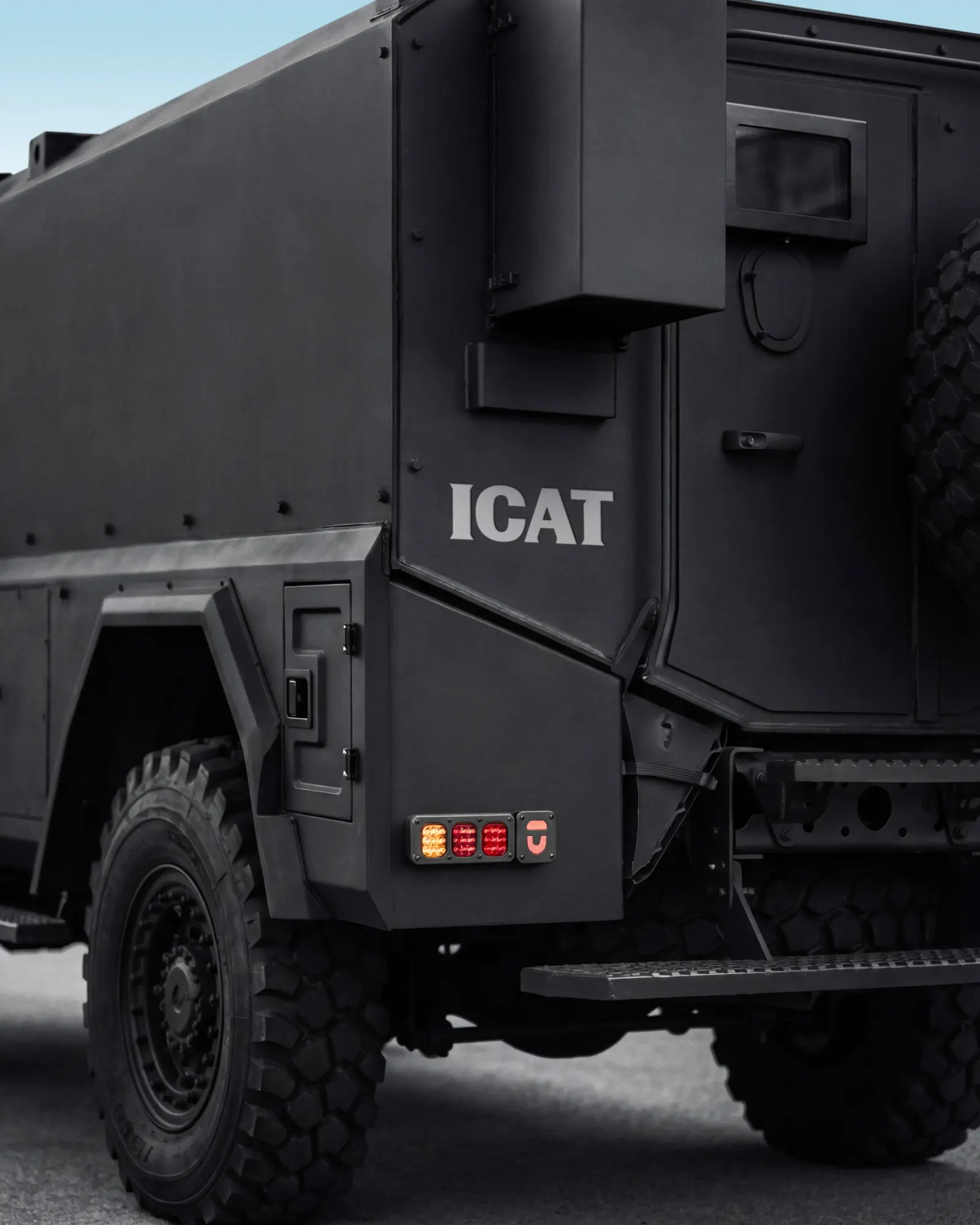
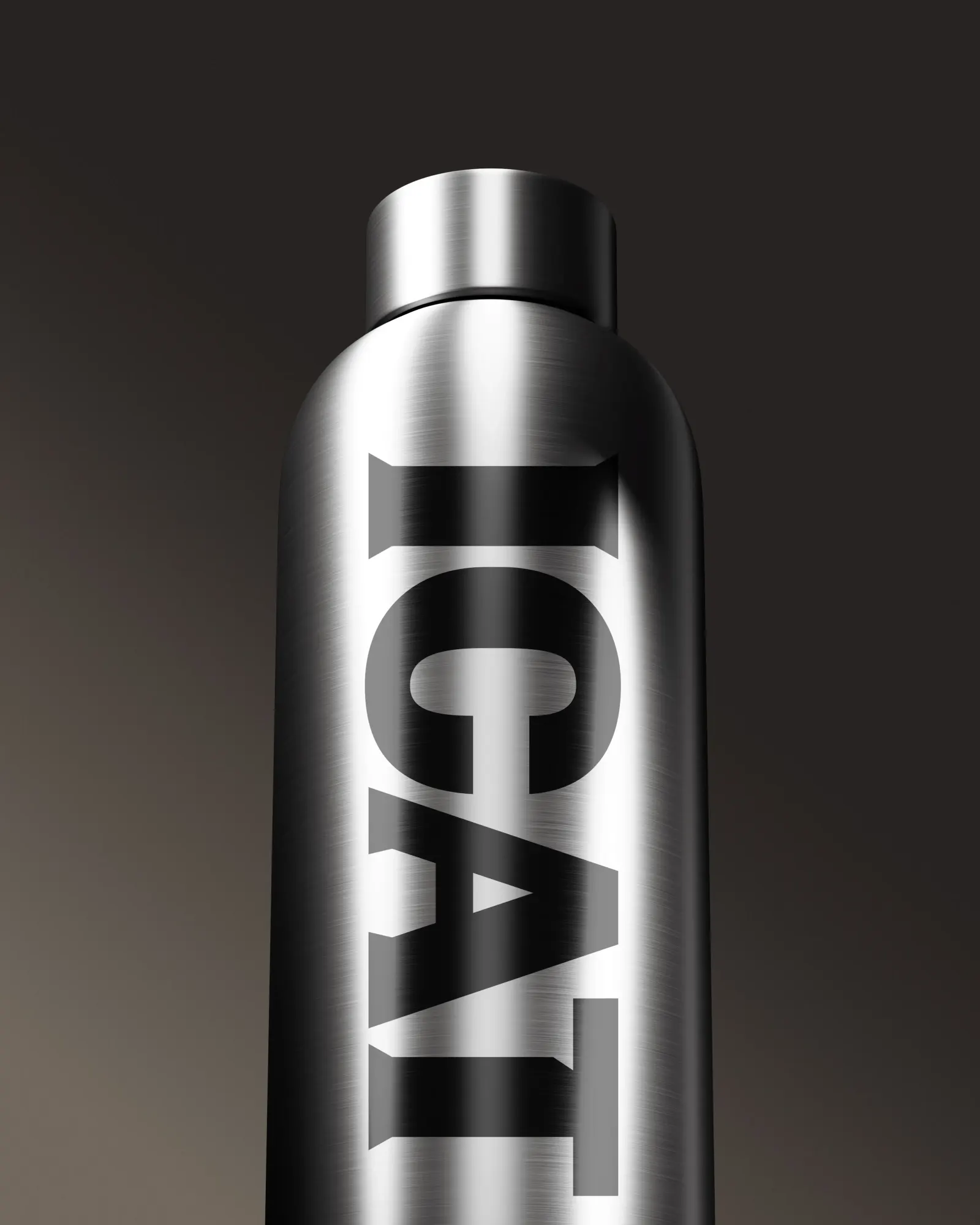
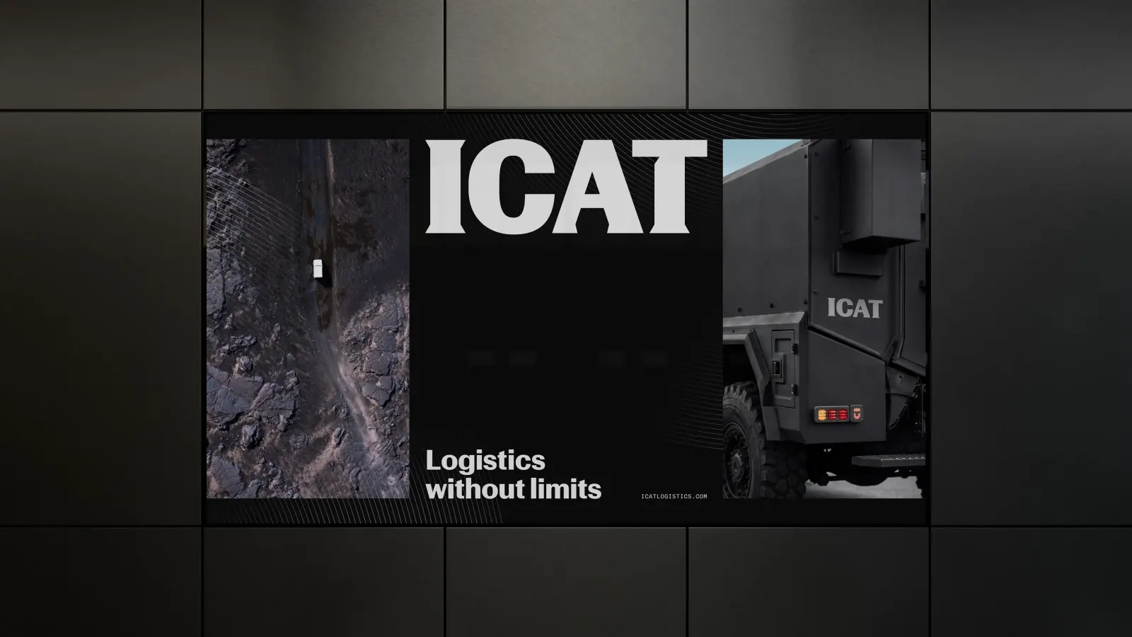
Red Antler anchored the brand in responsibility: the weight of being trusted with something irreplaceable and getting it there on time. The design system carries that idea through sharply cut type and restrained, elegant detailing, with references drawn from operational planning documents and high-end magazine layouts. The result feels tense, polished, and calm. Each vertical gets space to show its own expertise, and the whole still reads as one operation.
Why it works
The smartest move is the tonal pairing. Hard-edged type tells a defense or aerospace buyer that ICAT is serious, while the finer details speak to luxury clients, who judge a company by its polish. Neither audience gets a diluted version of the other. Because the system relies on discipline rather than category shorthand, it can stretch across very different sectors without fragmenting. In a field that mostly sells speed and reach, ICAT sells composure, which is what someone handing over something irreplaceable wants to see.
Logo
Typography
Applications


Images and video from redantler.com, by Red Antler.