The Brand Monograph
Elm Biosciences brand identity by Red Antler
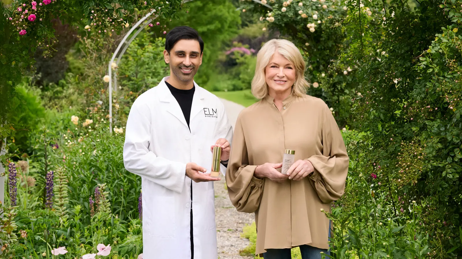
↗Elm Biosciences shows how a science-heavy skincare brand can feel warm and premium without losing credibility. Red Antler worked with Martha Stewart and dermatologist Dr. Dhaval Bhanusali on the project, taking the brand from early strategy through identity and packaging.
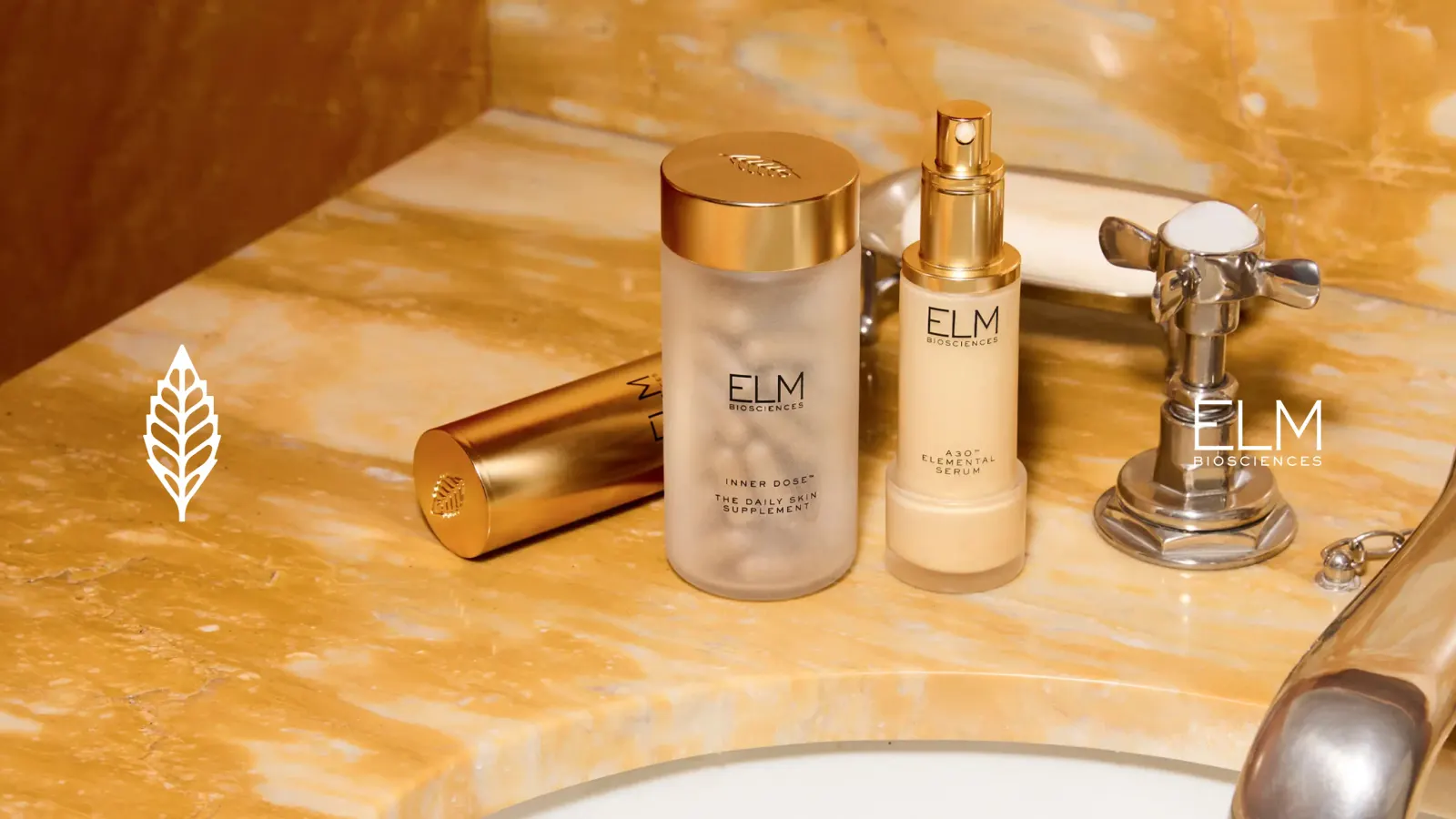
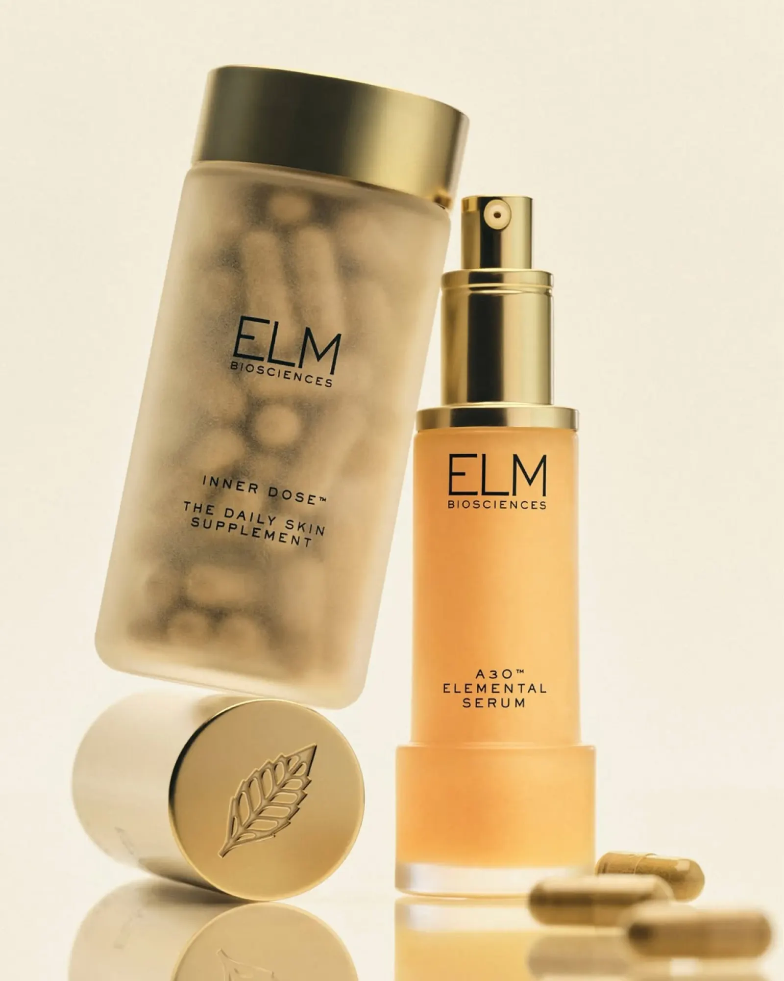
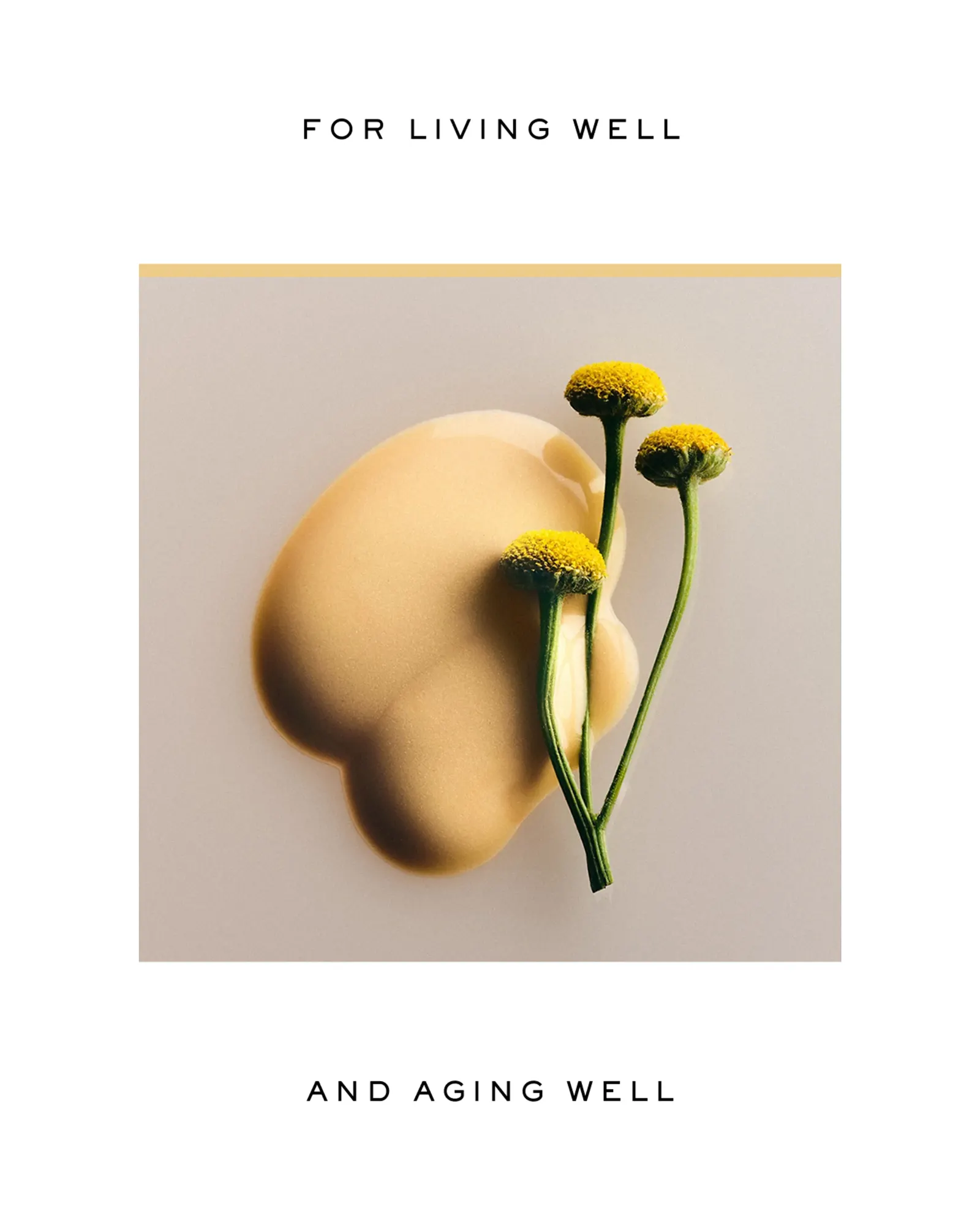
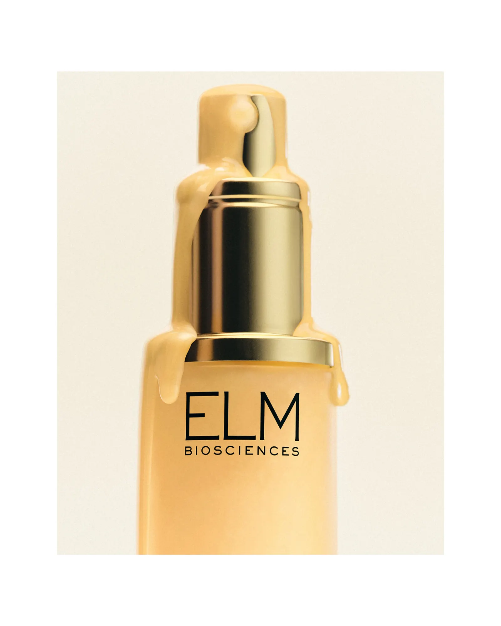
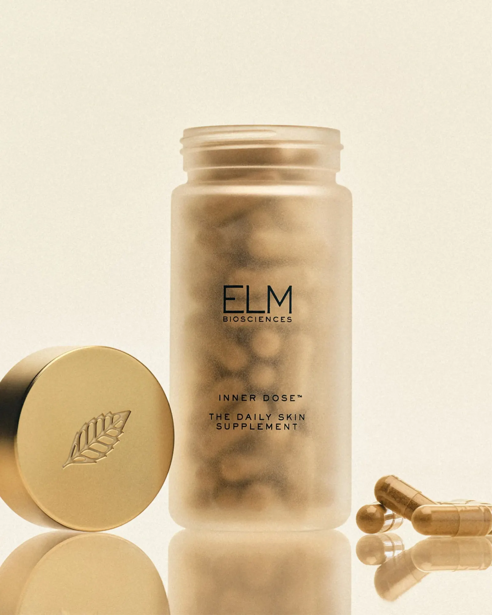
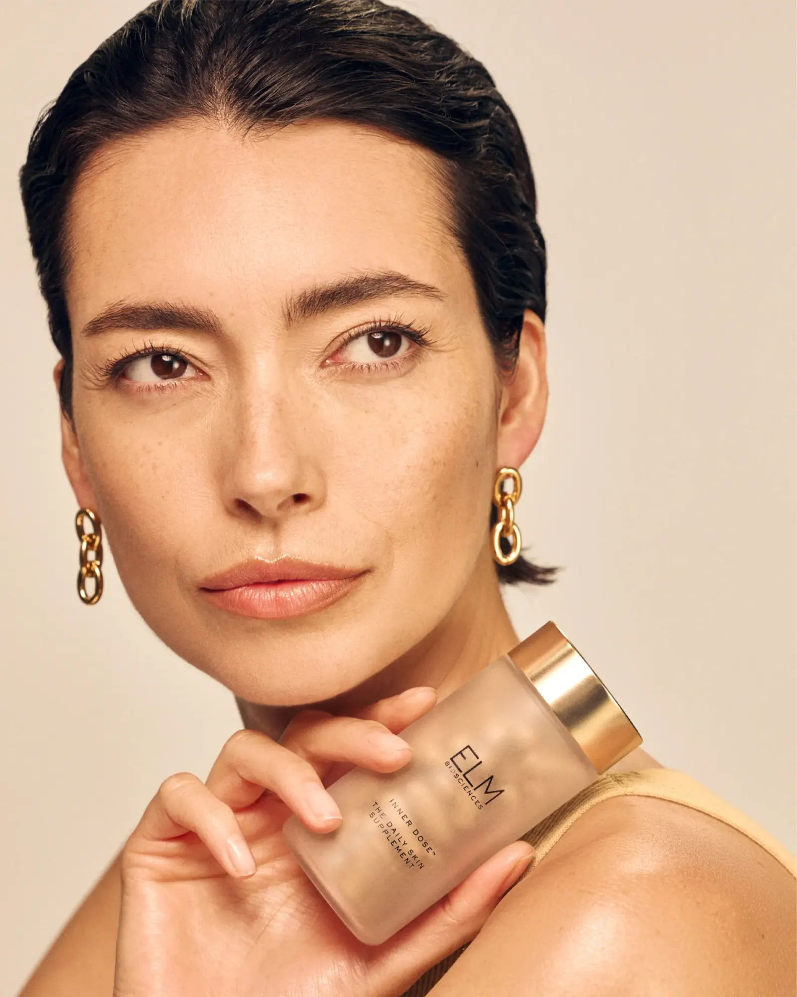
The brief centered on a two-part system, a serum paired with a proprietary capsule, shaped by input from more than 350 dermatologists and scientists. It goes after oxidative stress, inflammation, and hormonal imbalance as well as visible signs of aging. Red Antler's answer is a mark based on the leaf of the Chinese Elm tree, balanced and precise. The packaging is just as restrained: frosted glass bottles let the gold serum show through, and modern, uncluttered typography carries the information.
Why it works
Leaves are a familiar move in skincare, but tying this one to a specific tree and keeping it symmetrical gives it a precise, almost diagrammatic quality that suits a product built on research. The frosted glass makes the gold serum the focal point, so the formula does the work that decoration usually does. Plain type keeps the claims easy to read, which matters for an informed, skeptical buyer. Together, these choices place Elm between spa softness and pharmacy severity.
Applications
Typography
Images and video from redantler.com, by Red Antler.