The Brand Monograph
The Other House brand identity by Further
↗The Other House is the first Residents Club, and Further's identity makes that new category feel instantly understandable. Where most hospitality brands sell escape, this one sells settling in. After immersing itself in the client's world, and in a hospitality industry reshaped by the pandemic, the studio shaped the brand around staying longer and being at ease. Its workshops produced the name and a four-part approach to living like a resident, which guides decisions inside the company as well as outside it.
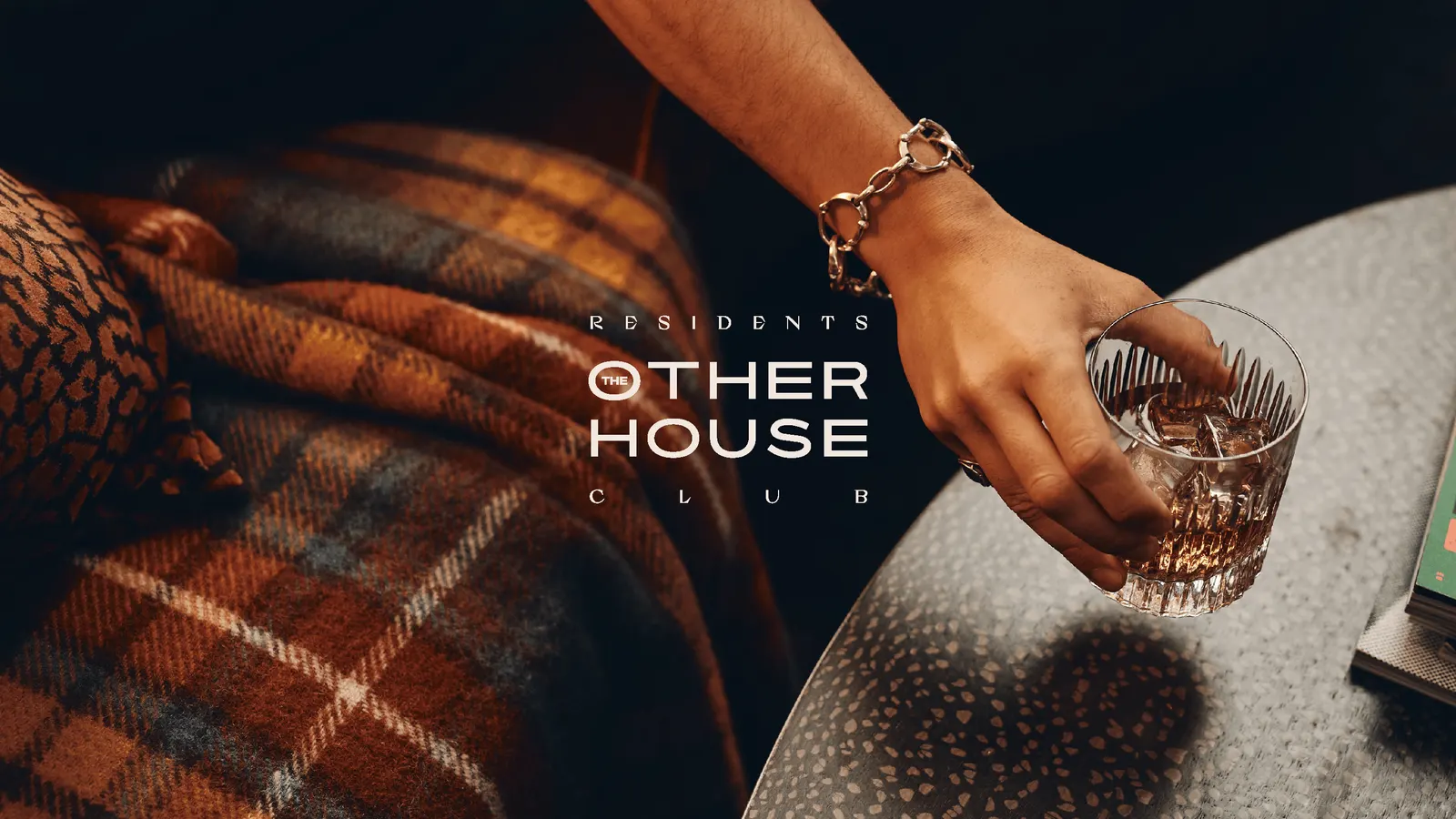
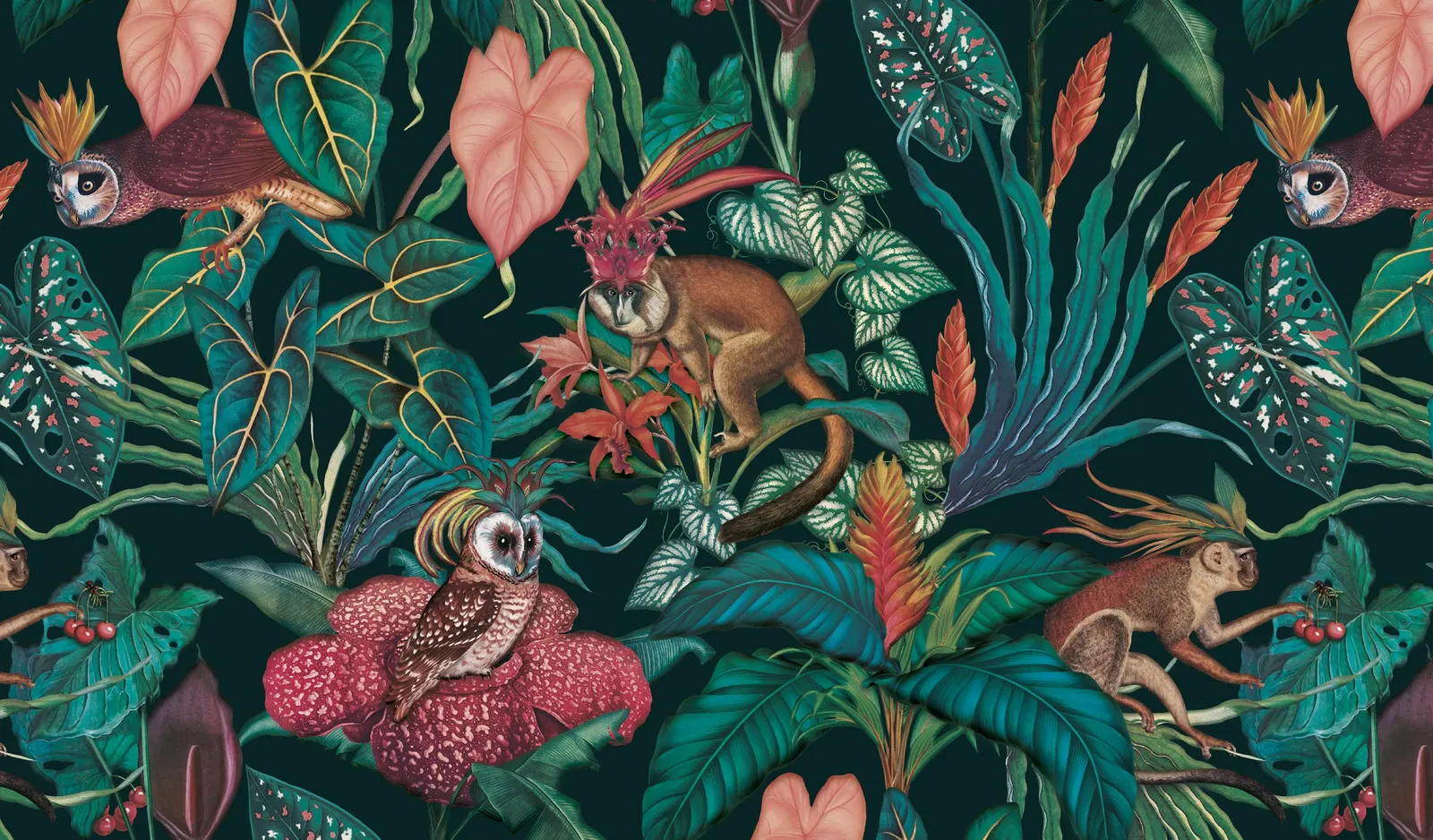
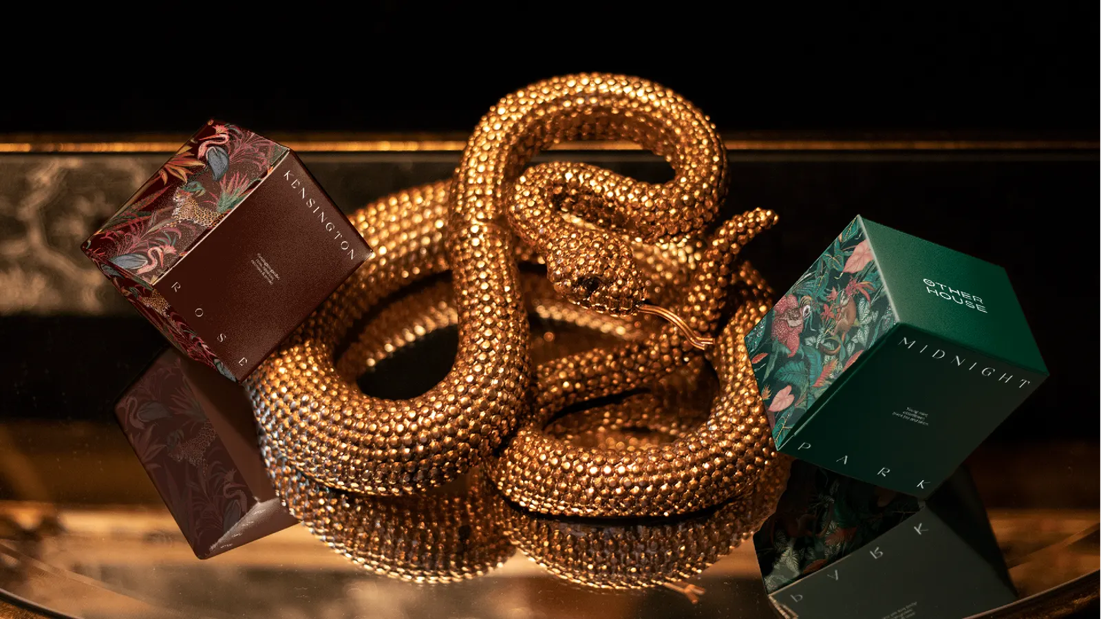
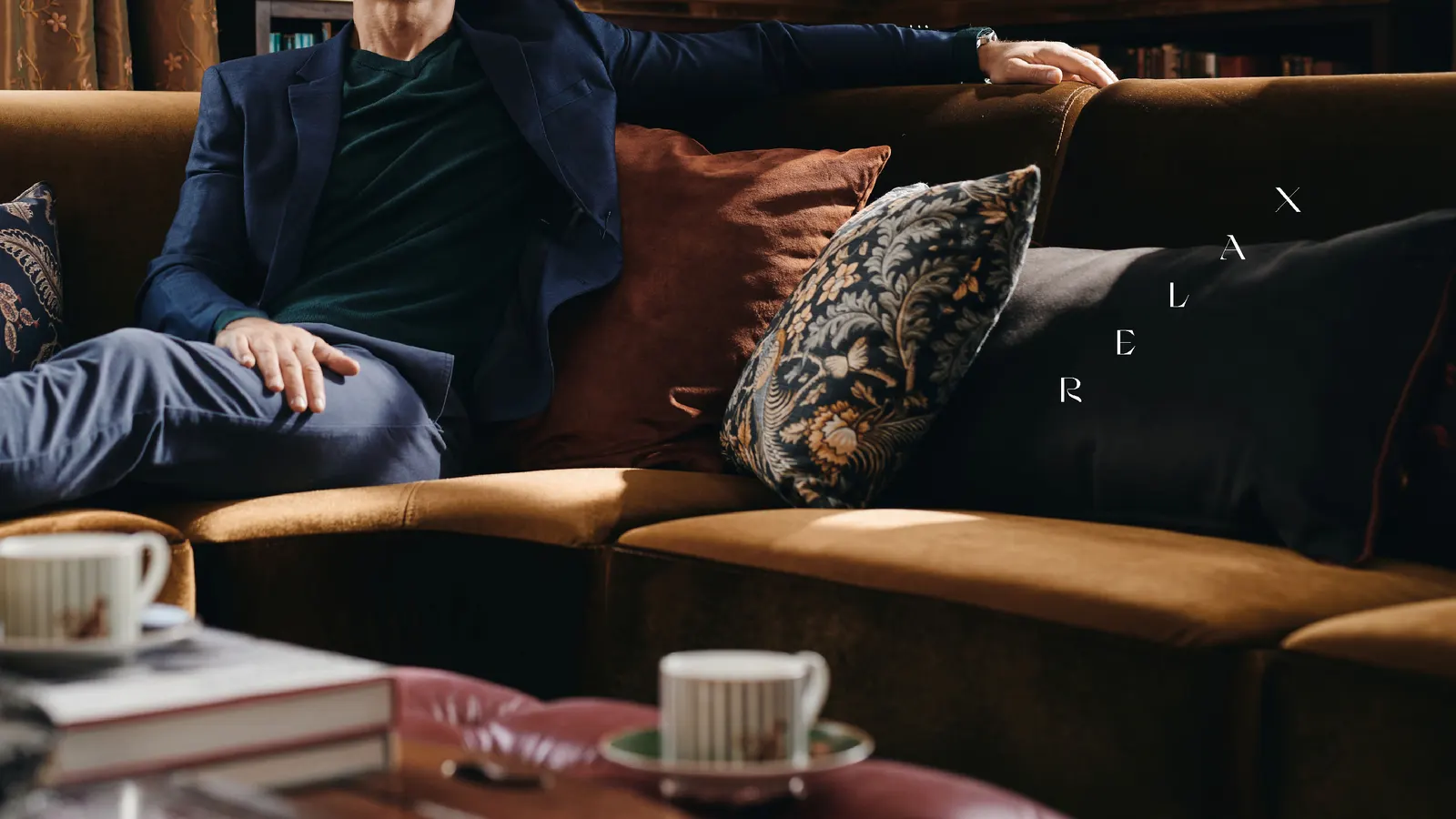
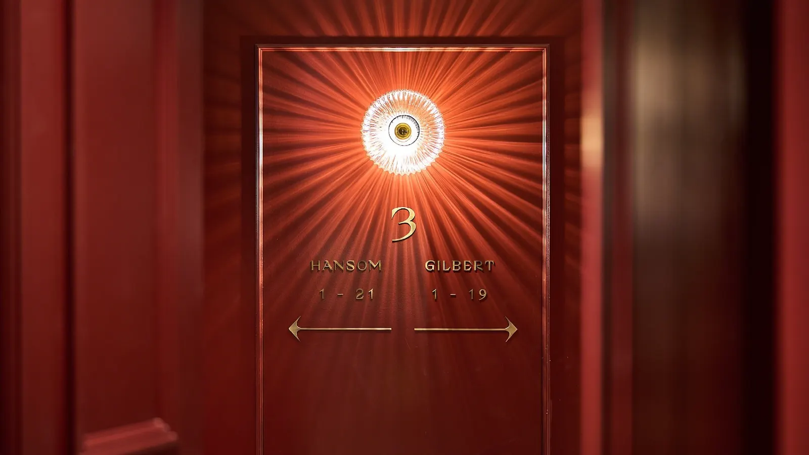
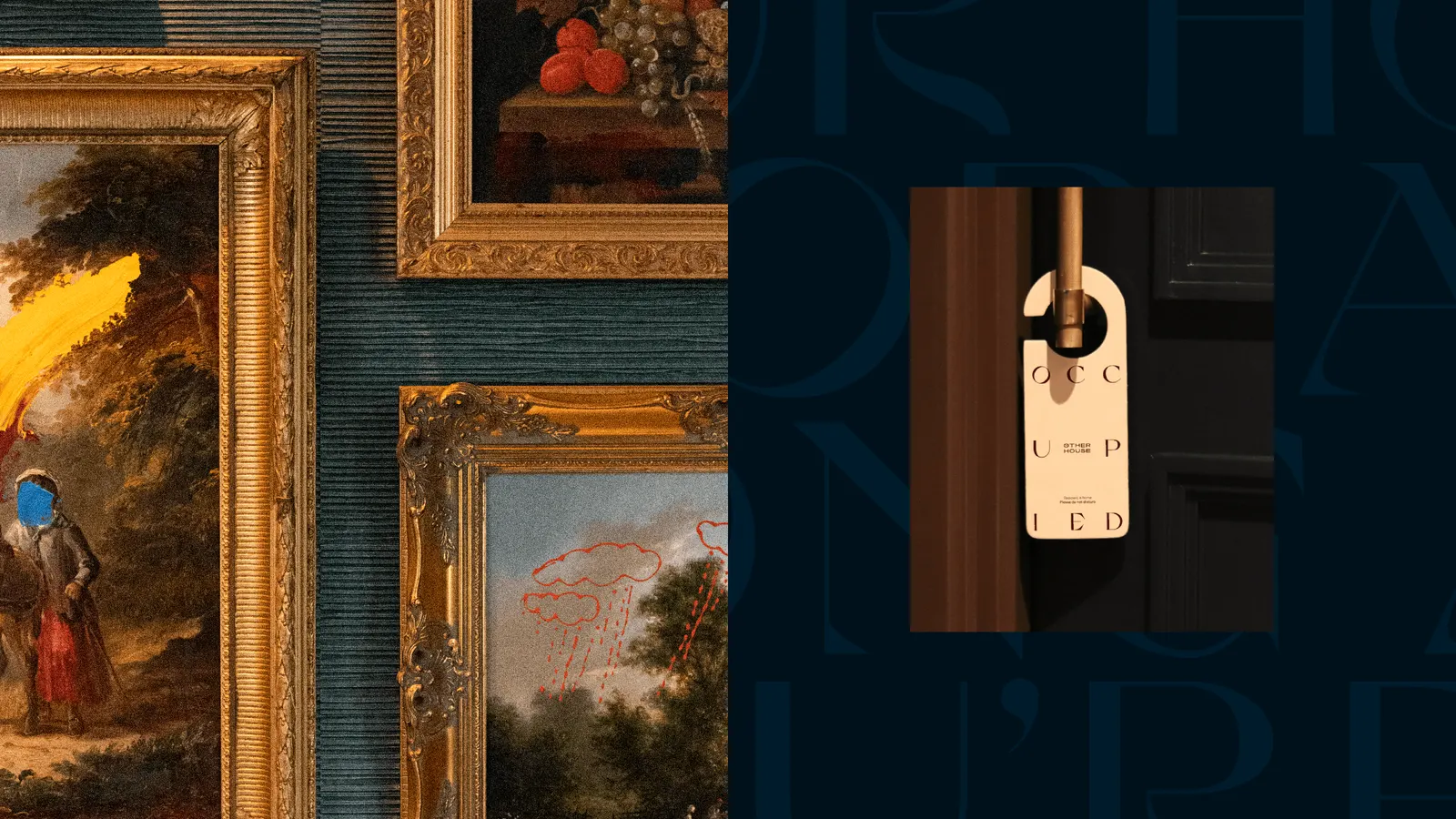
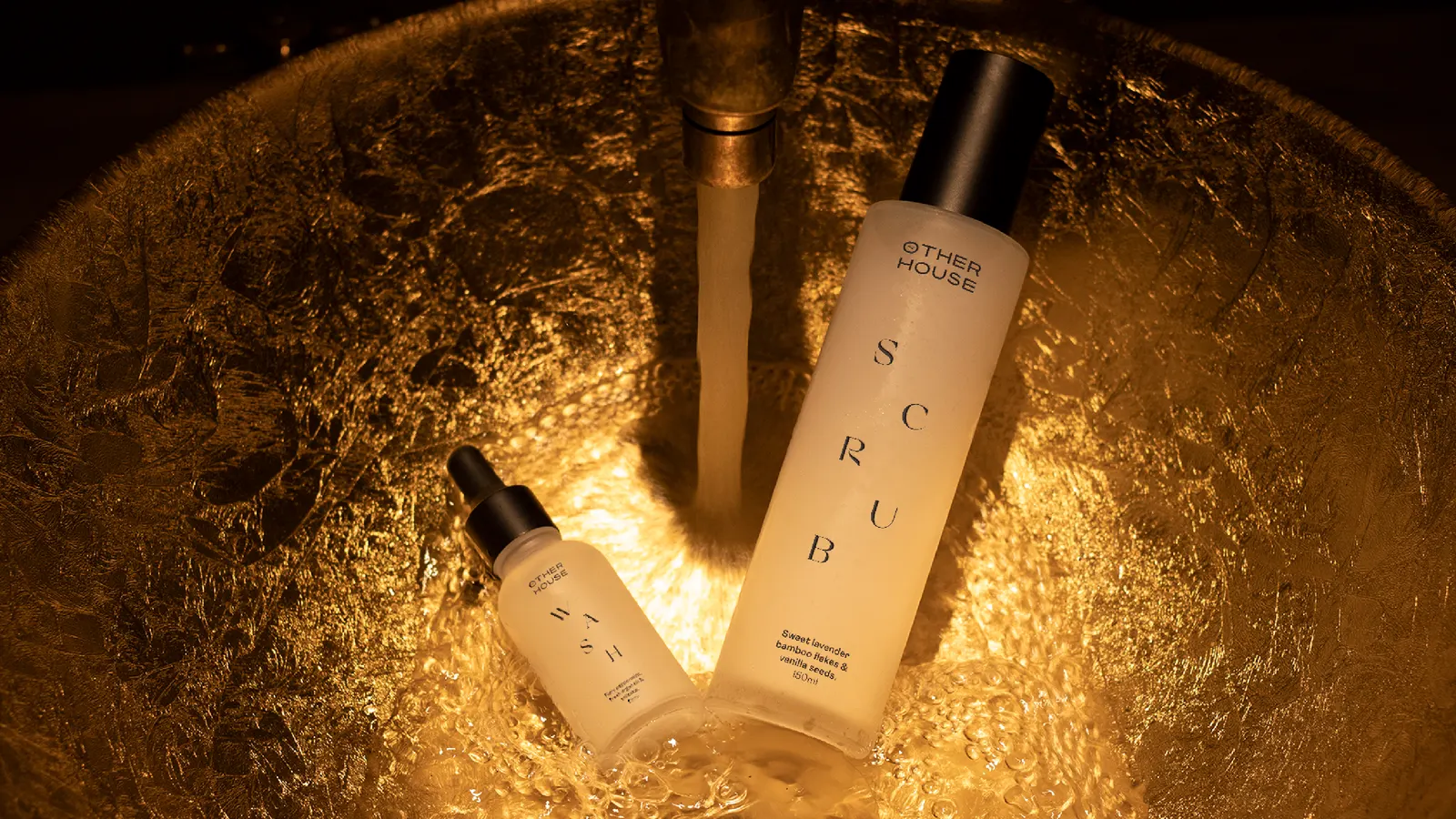
The craft is in the pairing of old and new. Bold typography sits alongside intimate, domestic photography, and the icons carry a classic flourish. Mariana Rodrigues illustrated a commissioned set inspired by historic wallpaper, which Further animated with subtle motion. A messaging matrix keeps the tone consistent from press pieces to menus, and a Webby-winning app handles doors, tables, food, and room settings.
Why it works
The identity avoids the usual split in this category between cool minimalism and stiff heritage. Confident type keeps the homey touches from turning twee, while the wallpaper-inspired illustrations bring warmth and a sense of history that a new brand would otherwise lack. The motion stops them from feeling nostalgic. The app matters as much as the visuals: it proves the comfort-first idea works in practice, so the brand's promise of ease is something residents can use every day.
Applications
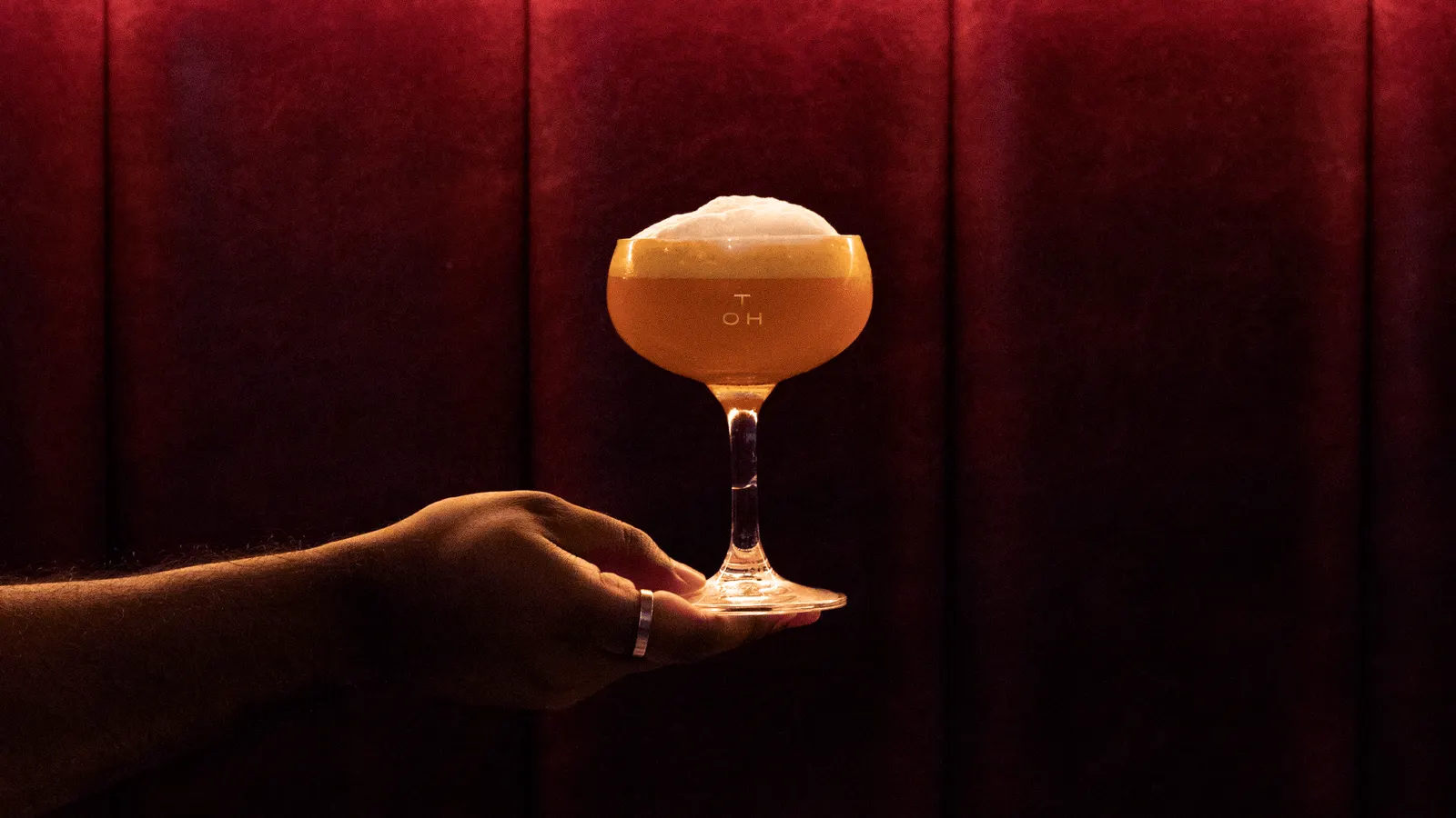
Images and video from further.group, by Further.