The Brand Monograph
Mamma Tiramisù brand identity by Brindo Studio
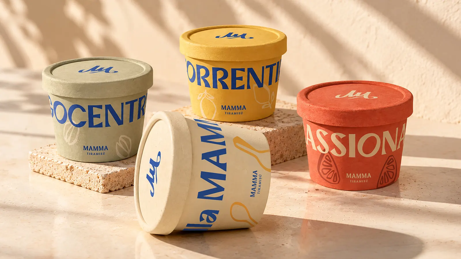
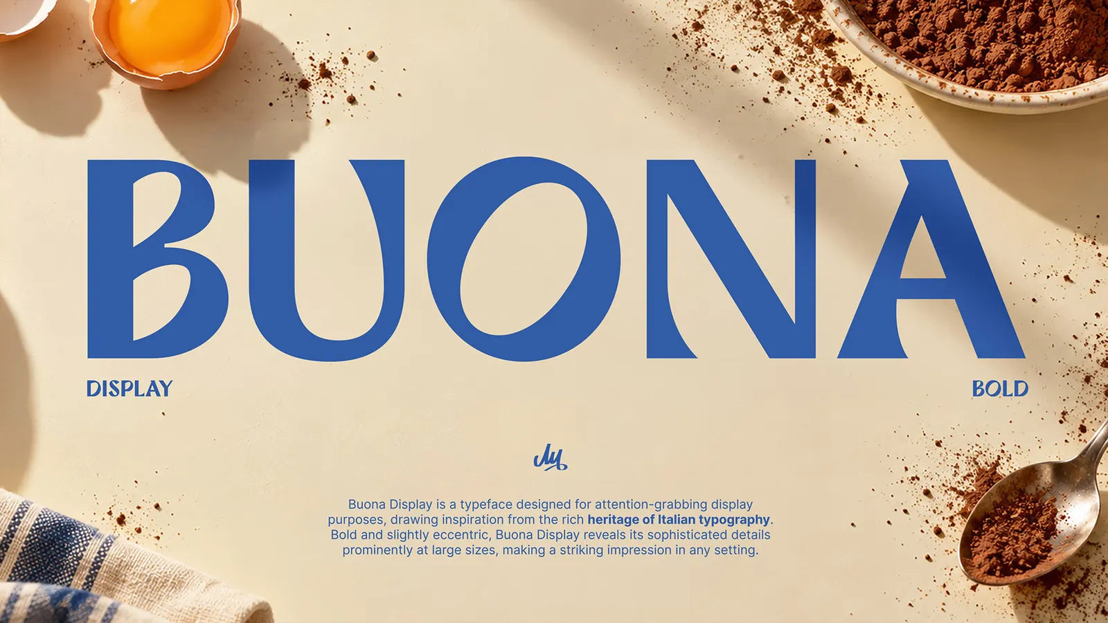
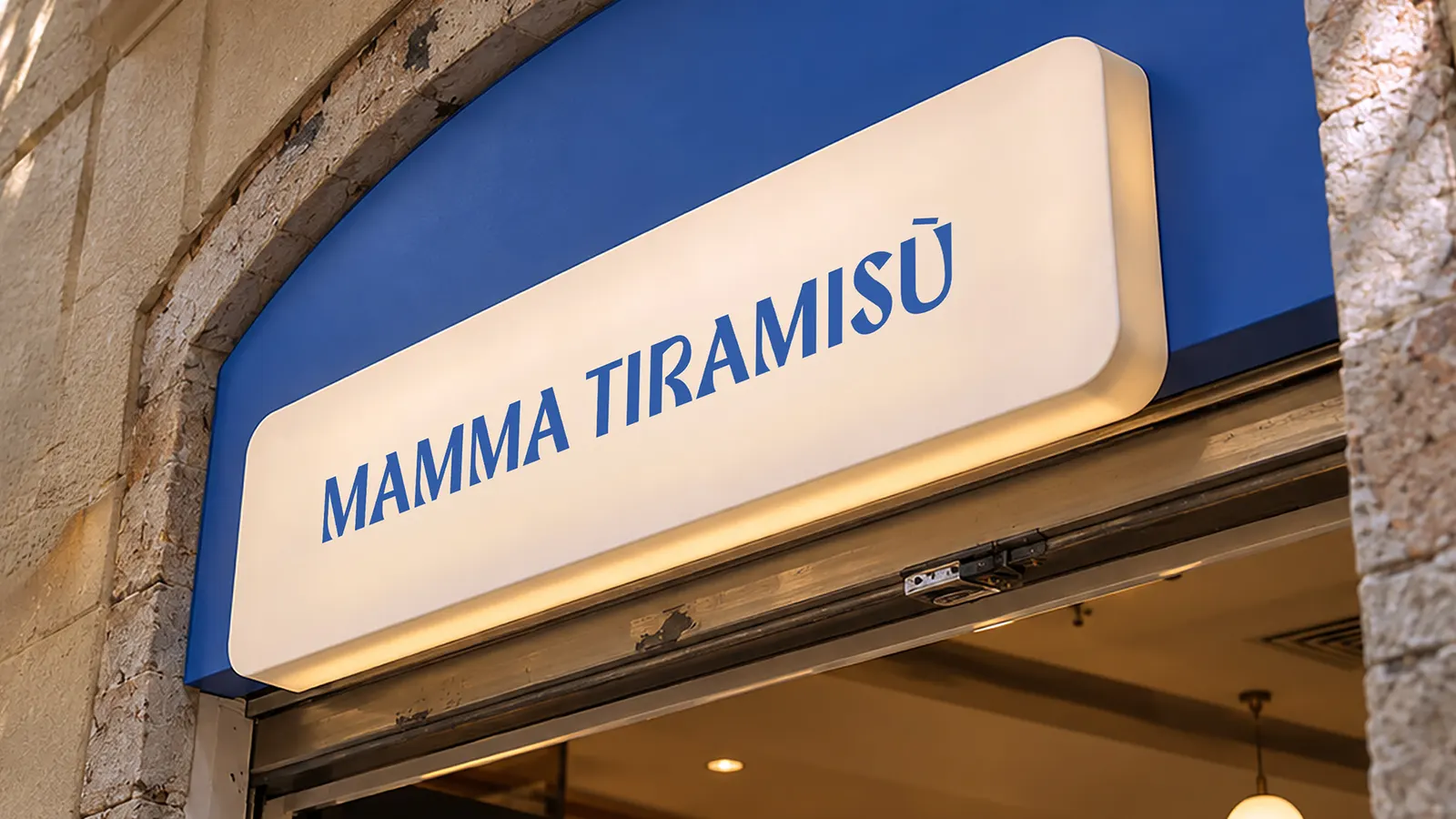
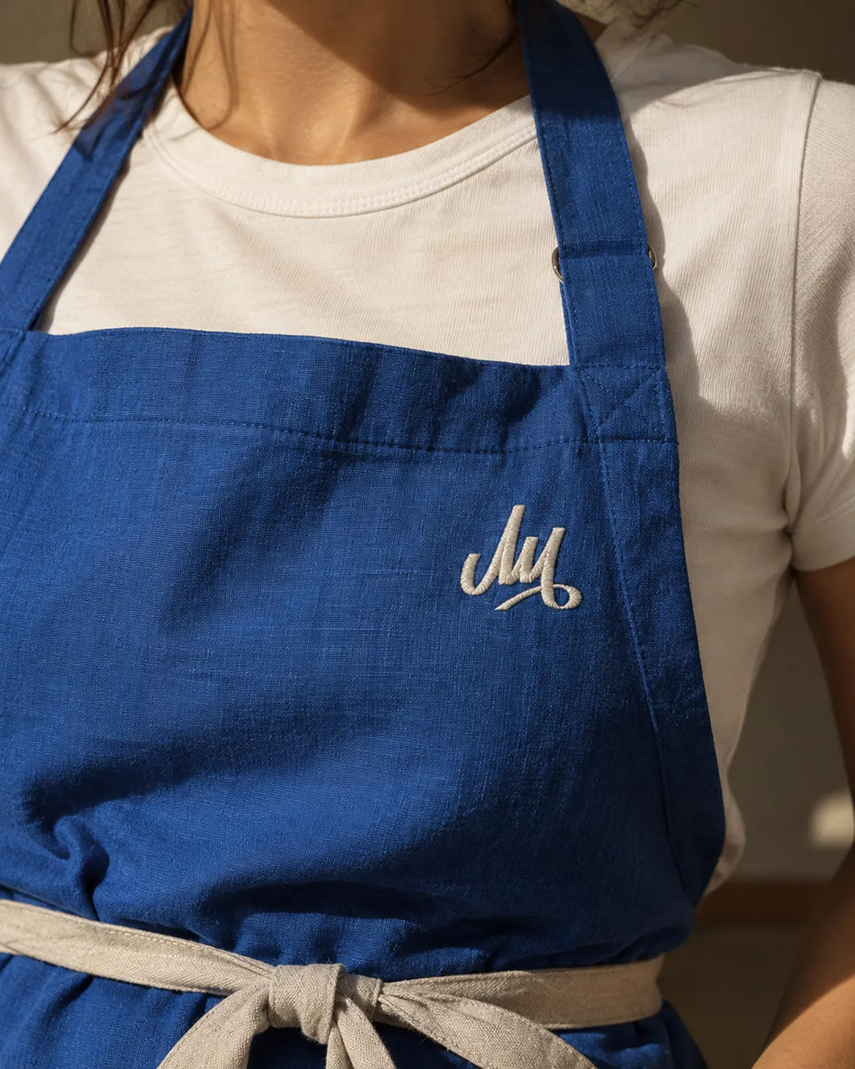
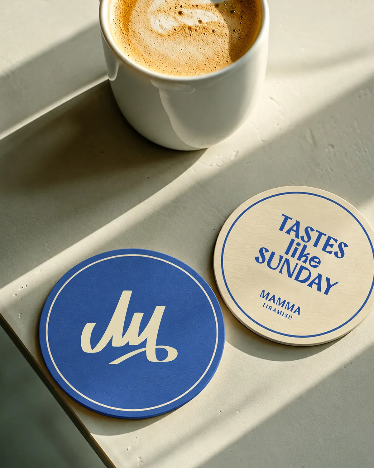
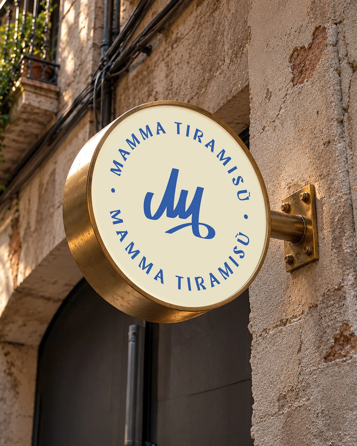
↗Brindo Studio's identity for Mamma Tiramisù stands out for what it leaves out. Plenty of food brands chase a clean, contemporary look, but this one feels closer to a drawer of family recipes than a startup's launch deck. It is playful, a little nostalgic, and clearly made by people who care about the product.
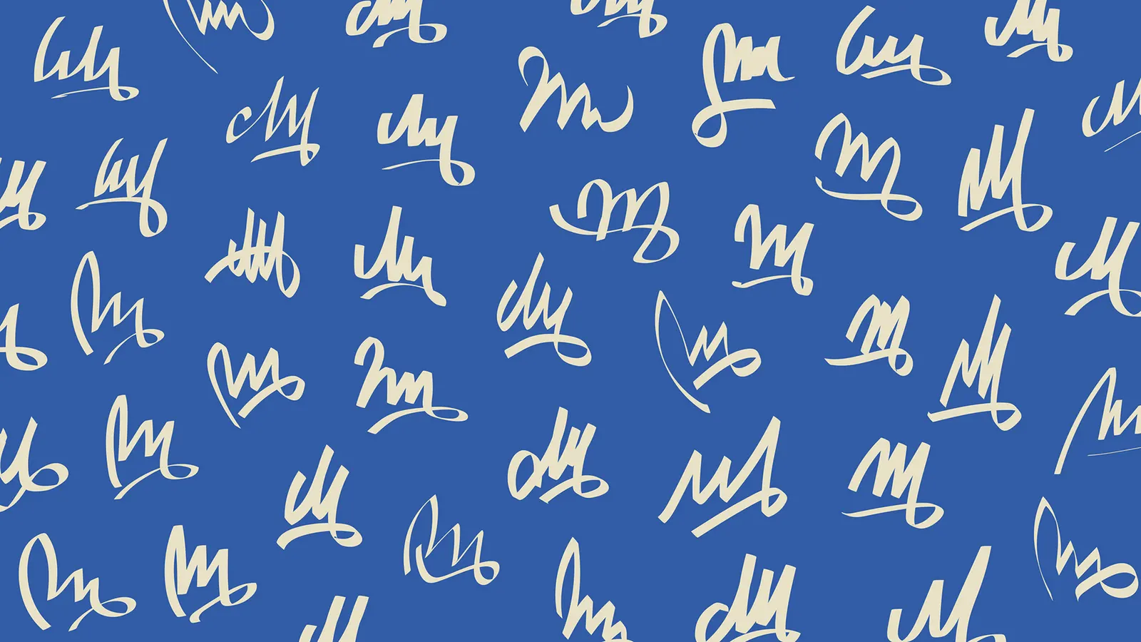
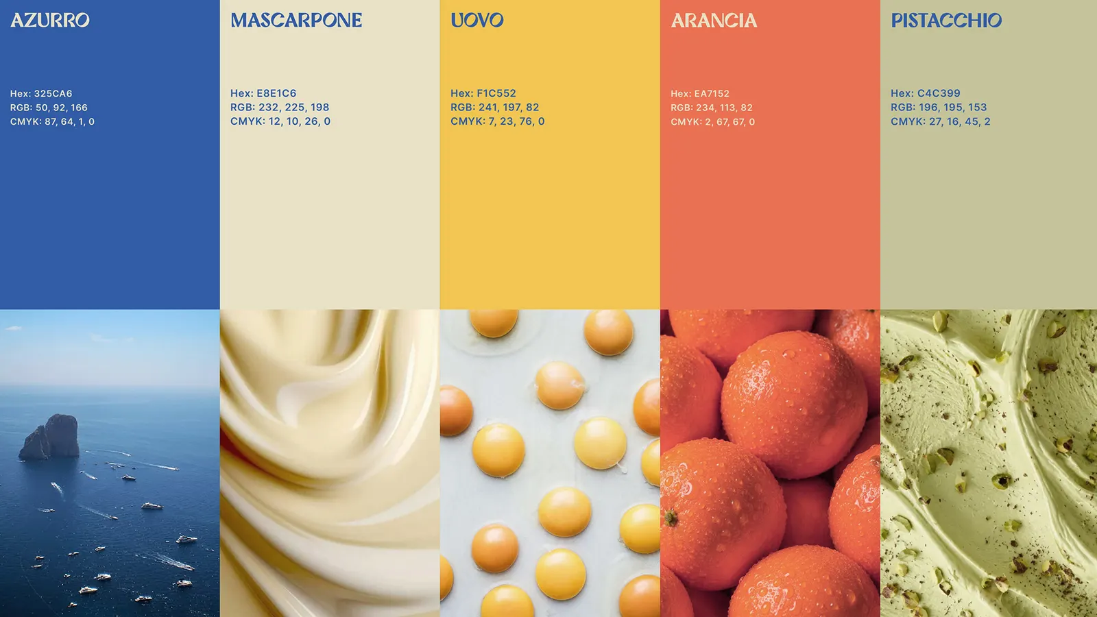
The brief came from founders Cate and David, who already had a well-loved tiramisù and a story tied to their mothers' and grandmothers' kitchens. Brindo Studio began by working inside that history with them, gathering childhood colors, handwritten recipes, and images and textures from old family kitchens. The studio also explored a range of signatures for the "Mamma" behind the brand, searching for the right personal voice. The references that shaped the identity give it a Mediterranean sense of place: tiled mosaics, windows onto the sea, lemons from the garden, and hands working dough.
Why it works
The strength is the source material. Because the identity is built from real recipes, colors, and kitchens, it has a human author, which is hard for a competitor selling on ingredients alone to imitate. The exploration of signatures points the brand toward a personal, handwritten kind of voice, which suits a dessert people associate with someone's mother or grandmother. Tiles, lemons, and sea views are also instantly legible shorthand for Italy, so the brand reads quickly while still feeling specific to its founders.
Applications
Logo
Images and video from brindostudio.com, by Brindo Studio.