The Brand Monograph
Nubank brand identity by Koto
↗Few fintech brands carry as much range as Nubank does now, and Koto's work for it shows how an identity can expand without fraying. The bank that began in Brazil now serves 140 million customers across more markets, products, and audiences, and its earlier brand and digital tools were sized for something much smaller.
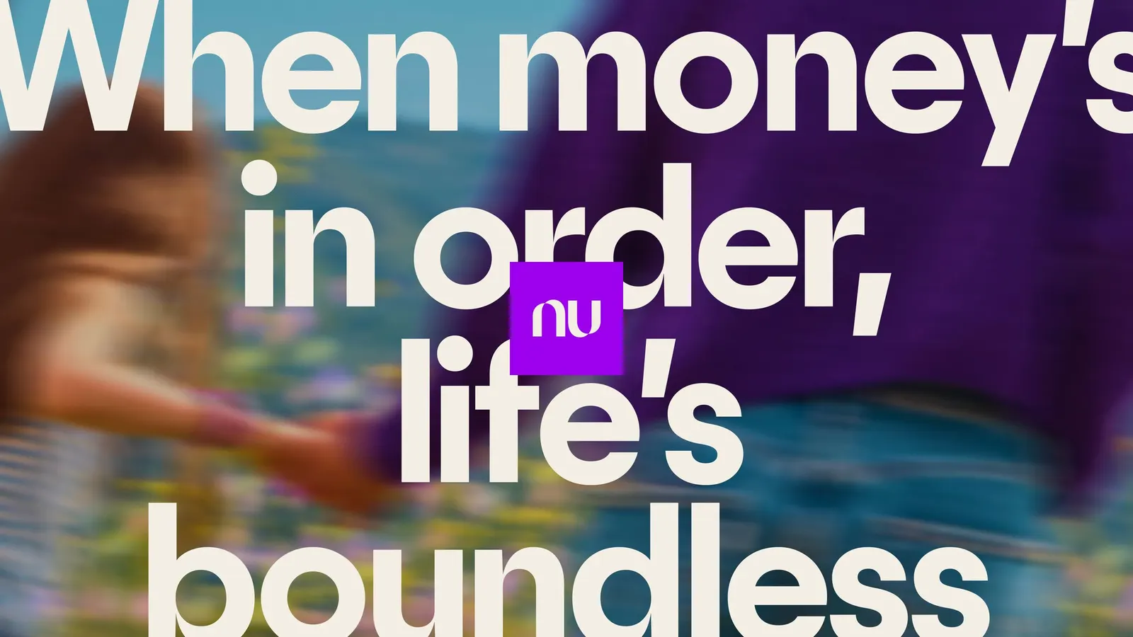
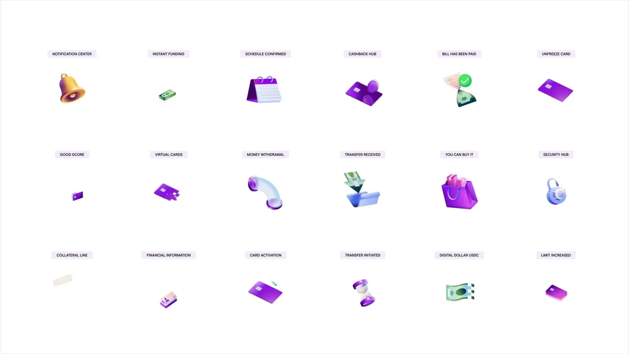
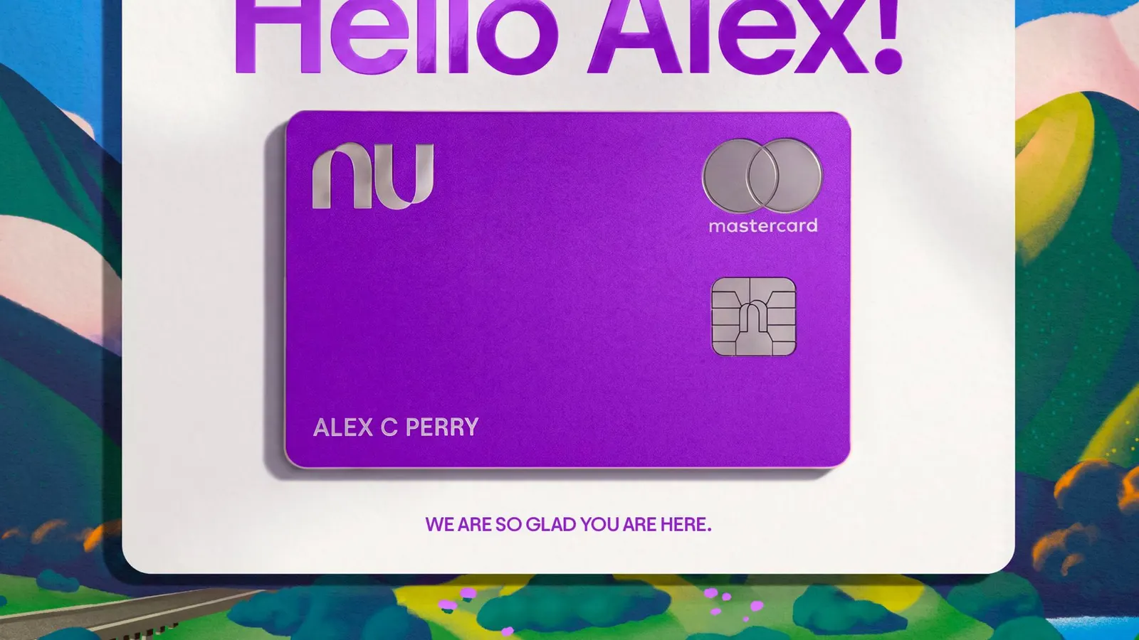
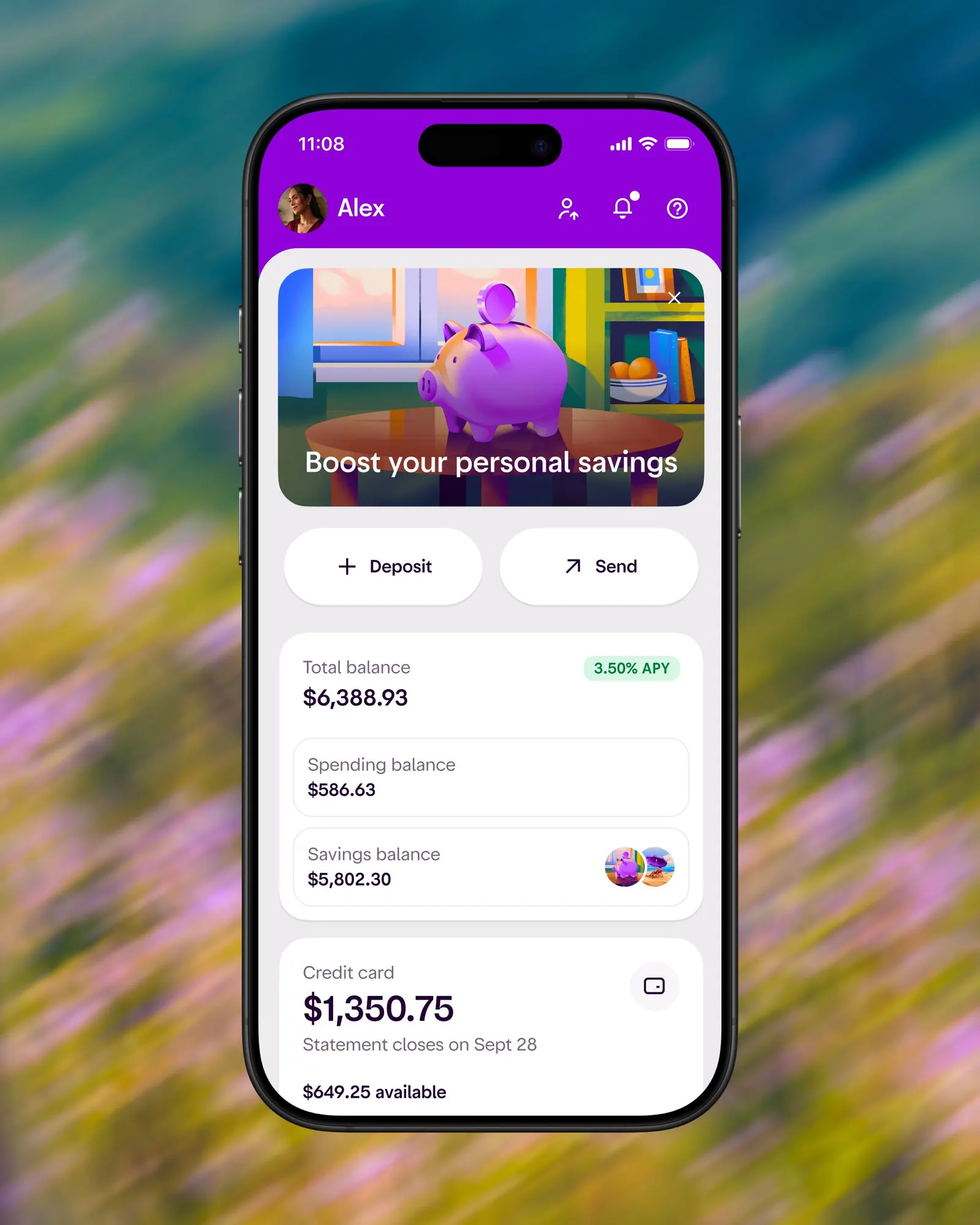
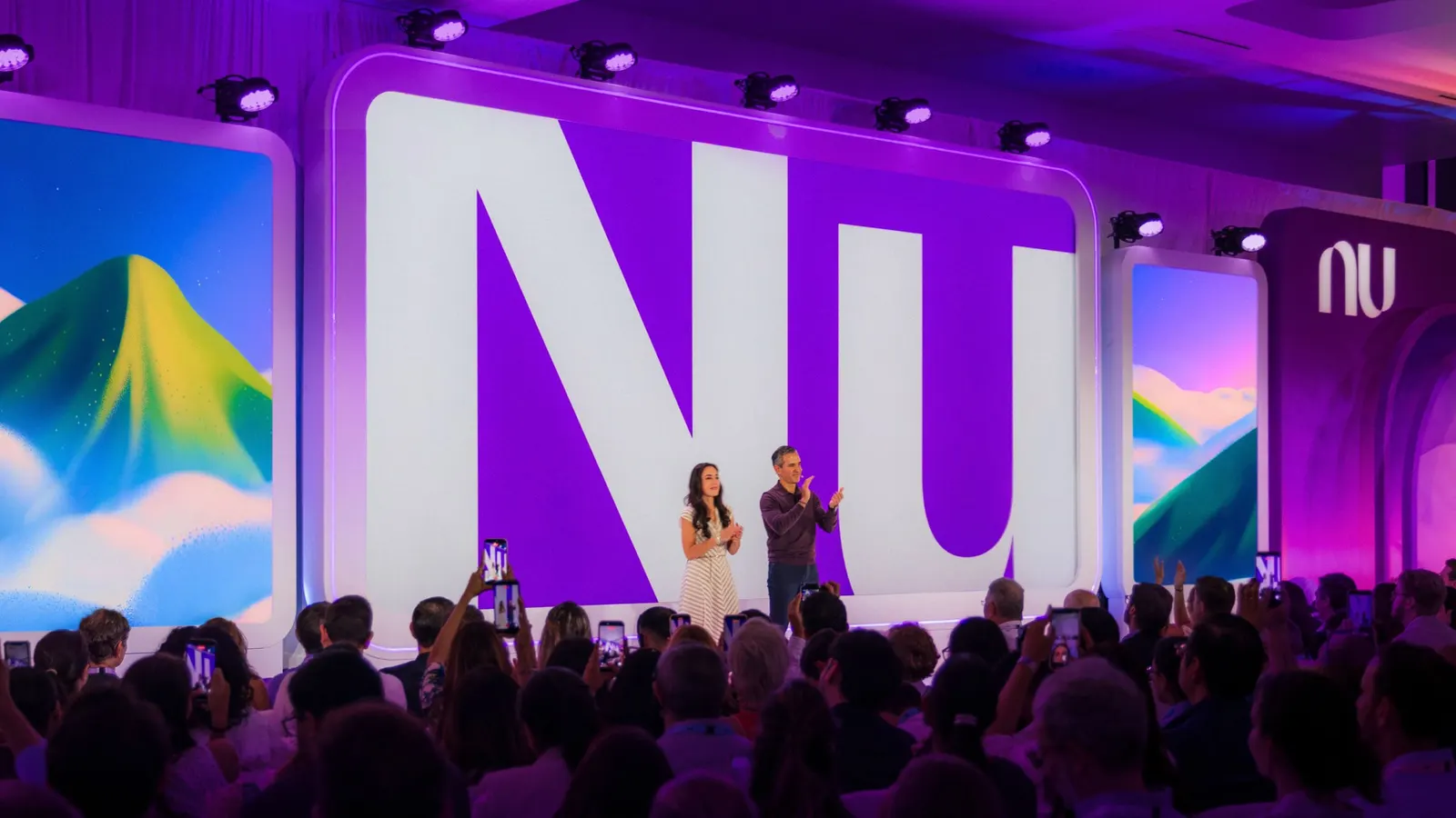
Koto's answer is a kit of color, modules, and layers that stack and rearrange, with motion following the same rules from launch moments to small in-app interactions. Photography catches people mid-life rather than mid-transaction, and illustration covers ideas a camera can't. Working with Blackletra Type Foundry on typography, the studio carried the system across nu.com, the more expressive Croma, and the premium Ultravioleta. The rollout was unveiled in Miami with launch films and a founder keynote.
Why it works
Most banks default to either stiff reassurance or generic fintech polish. Koto built the identity from a few reusable ingredients instead, which is why Croma and Ultravioleta read as siblings rather than separate brands. The photography sells the outcome, a life with less money anxiety, instead of the product. Ultravioleta also skips the usual signals of exclusivity, so the premium tier doesn't alienate the mass audience that made Nubank. Each choice keeps the brand approachable while it scales.



Images and video from koto.com, by Koto.