The Brand Monograph
South brand identity by Studio South
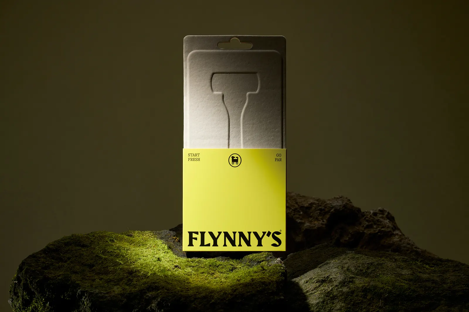
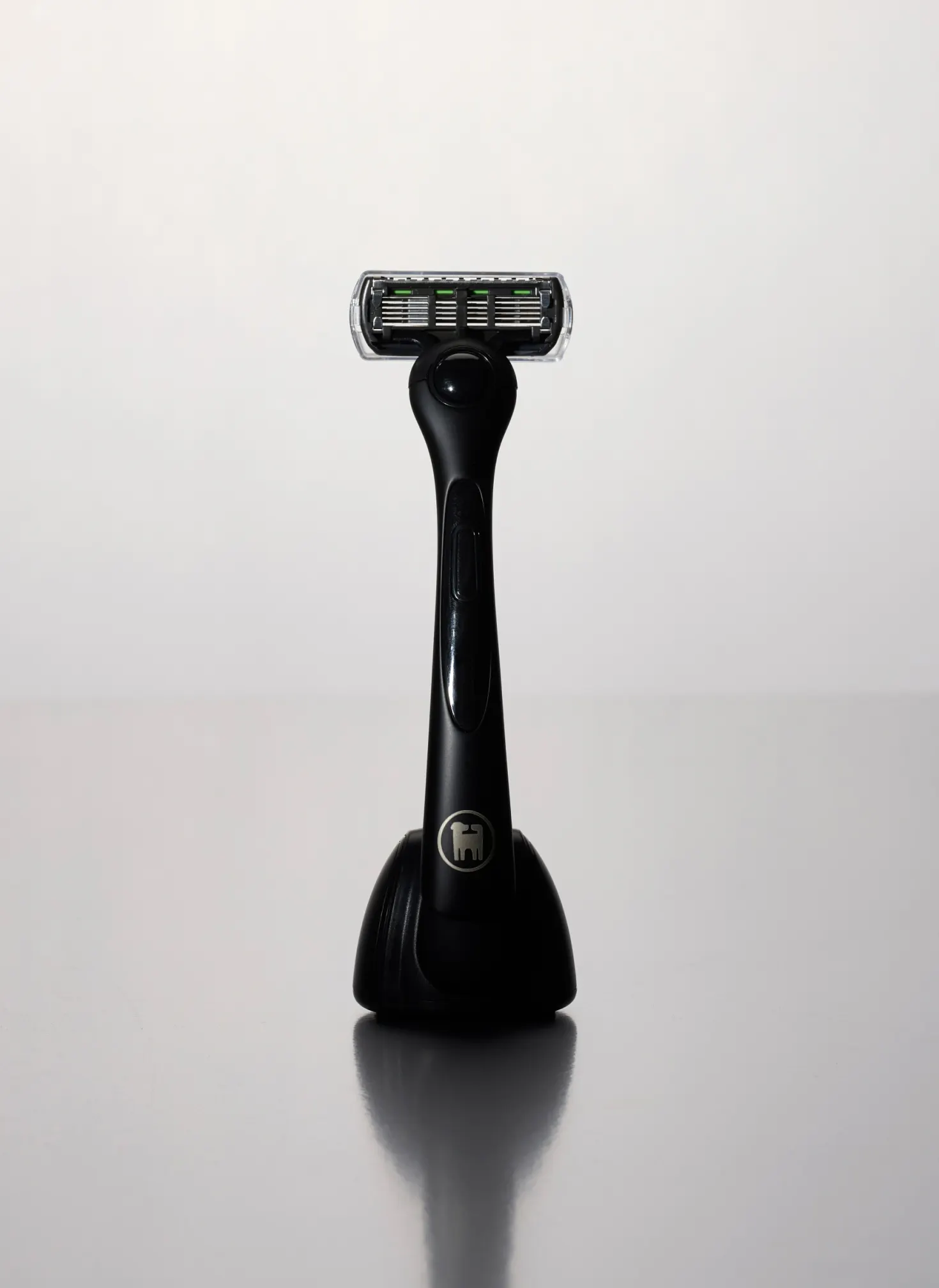
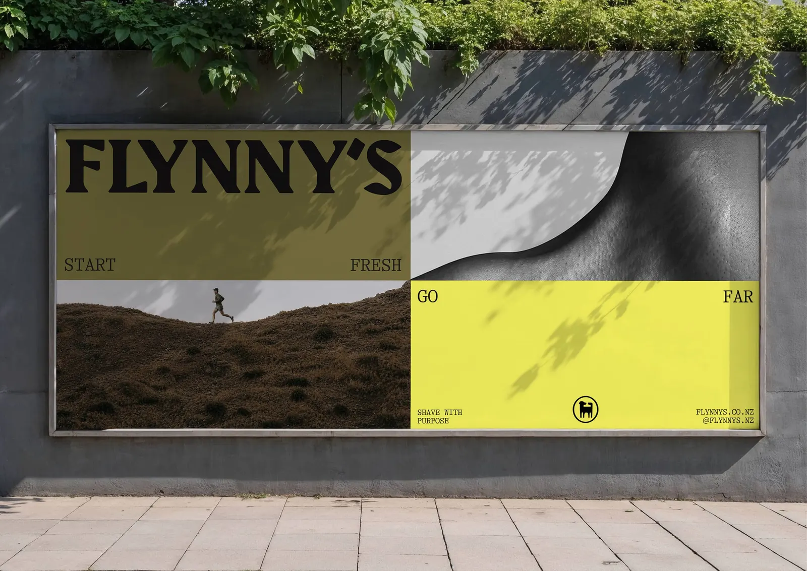
↗Studio South's identity for Flynny's gets a lot of mileage out of a very ordinary product. The brief was to launch New Zealand's first Kiwi-owned subscription razor brand, one that gives 10% of its profits to outdoor and sporting initiatives around the country. Instead of selling smoothness, the studio sold the weekend. Shaving becomes the small step before heading outside, and a heavy beard is treated as terrain worth tackling.
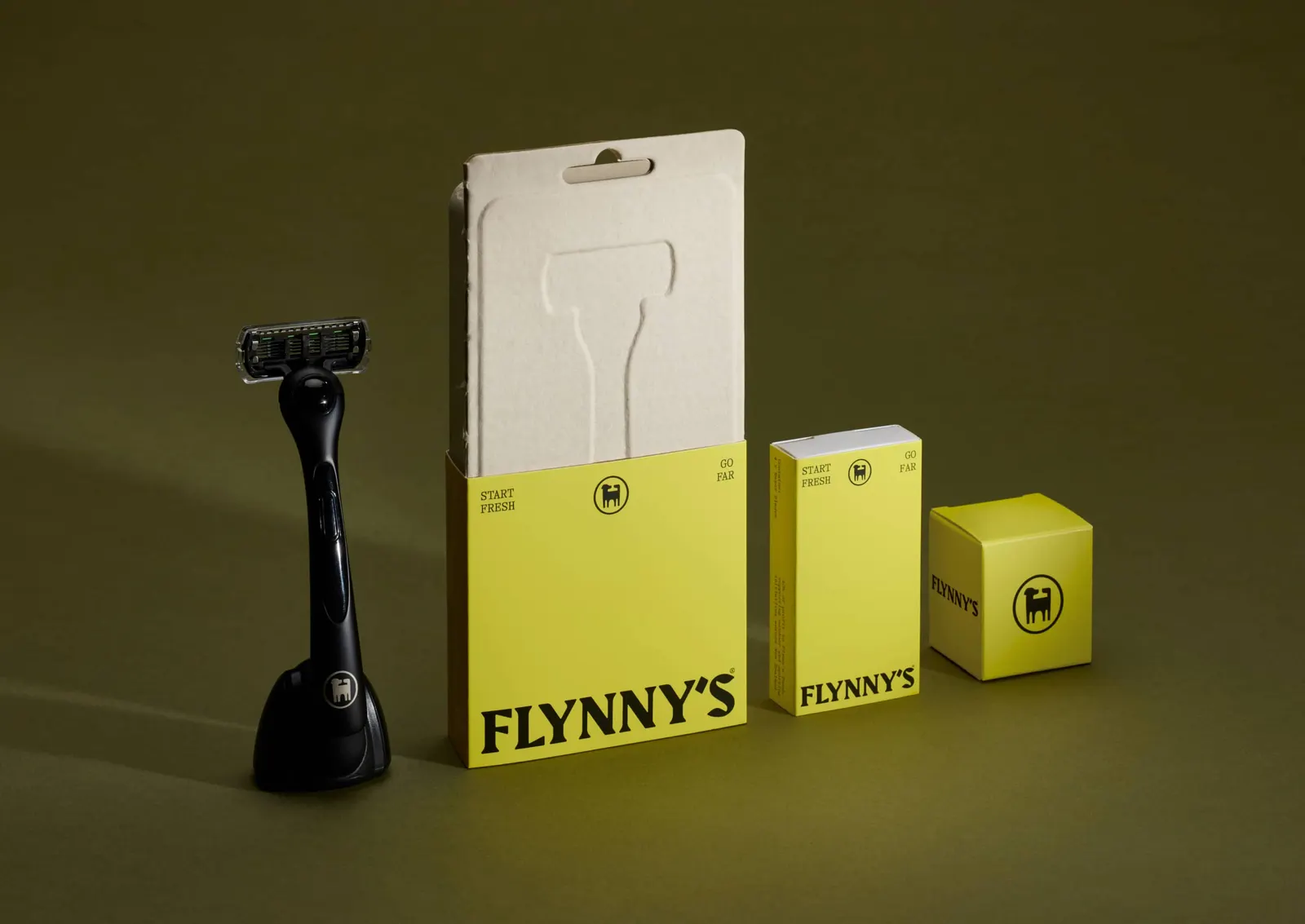
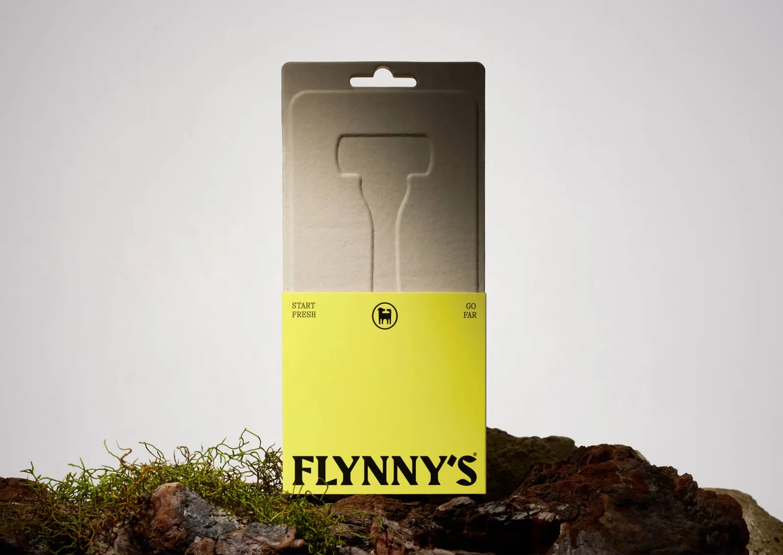
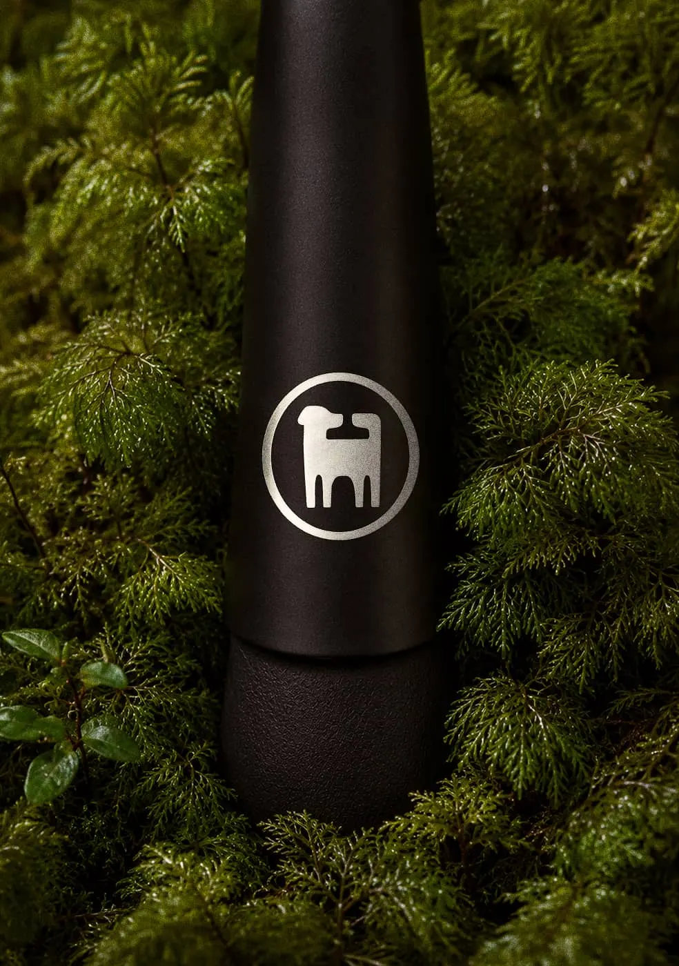
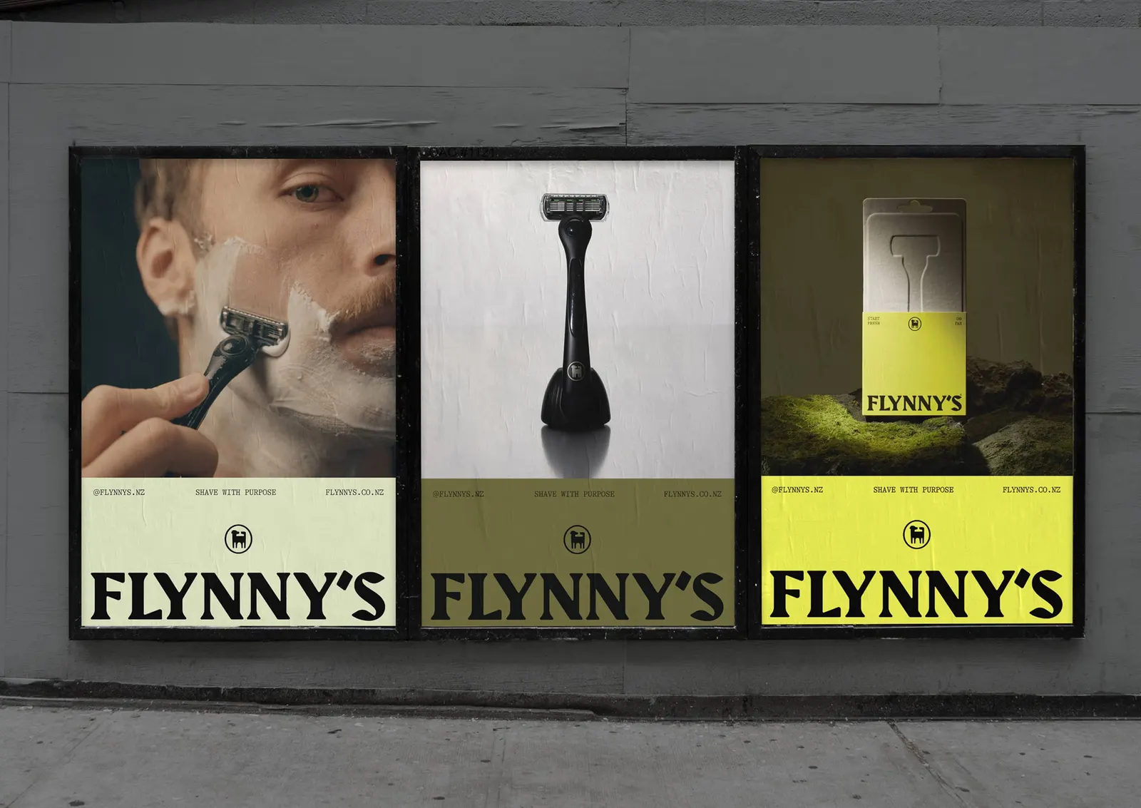
The mark is a dog with a razor tucked into its outline, a neat way to join companionship, adventure, and the product itself. Type is set in GT Alpina Mono, alongside outdoor photography by Lachlan Paton and Yuki Sato and plain-spoken copy. The packaging carries the same attitude through recyclable stocks, tactile debossing, a tear-away sleeve, and blade packs styled after matchboxes.
Why it works
Razor brands usually lean on chrome, close-ups, and grooming clichés. Flynny's steps out of that with a dog, which brings warmth and a story, and the hidden blade rewards a second look without forcing the product into the mark. The monospaced type feels like field notes rather than a bathroom shelf, and the photography keeps the tone dry and unfussy. The matchbox-style blade packs are the smartest touch, because they make a consumable feel like something you'd toss in a daypack.
Applications
Logo
Images and video from studiosouth.co.nz, by Studio South.