The Brand Monograph
Keith's Cacao brand identity by Caveat
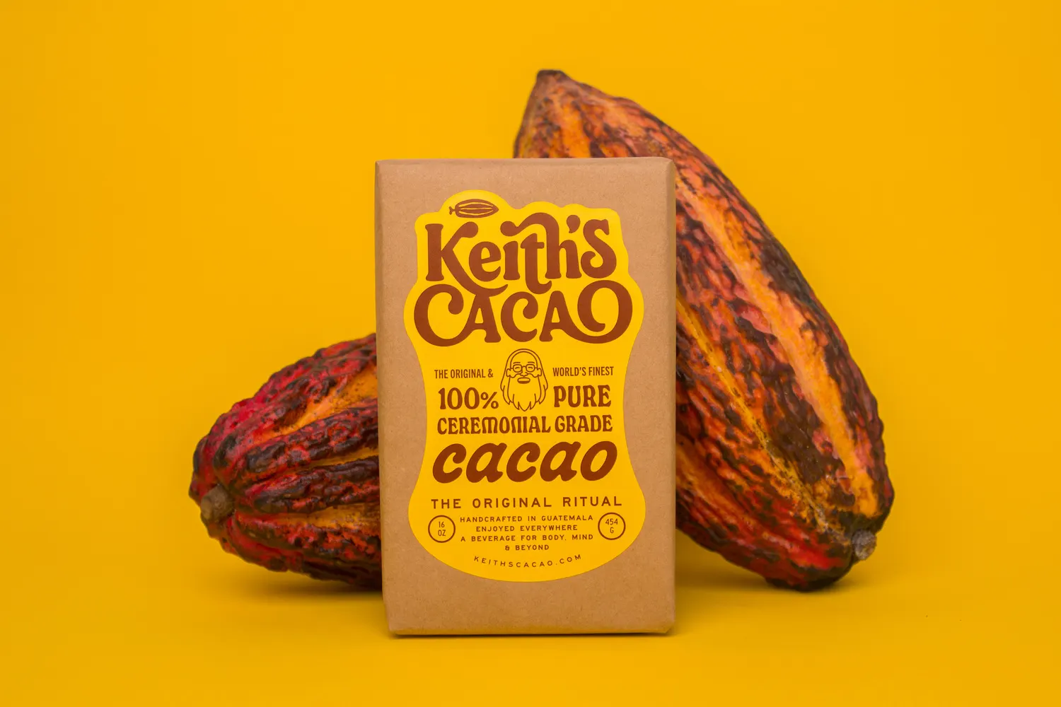
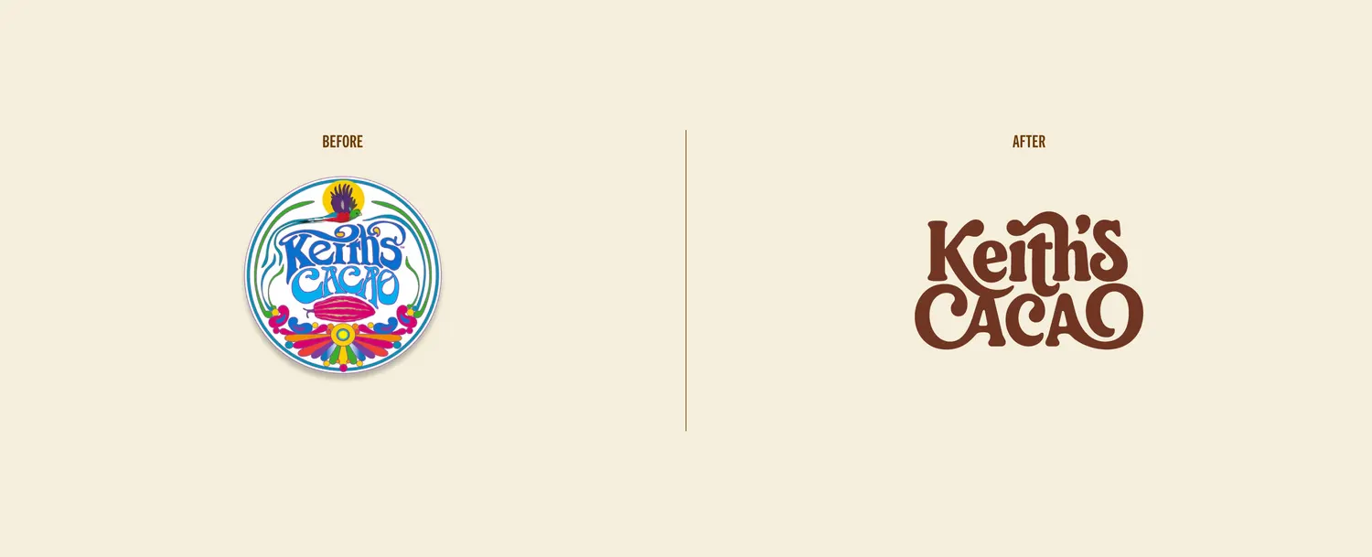
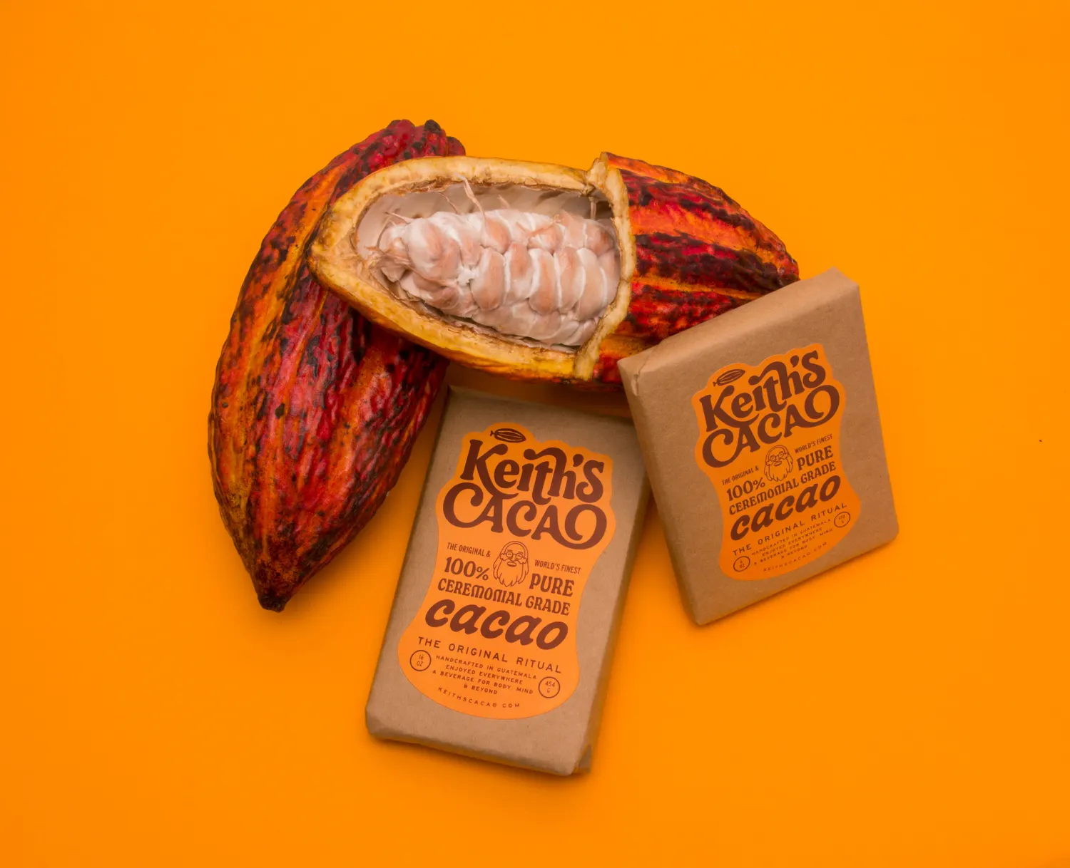
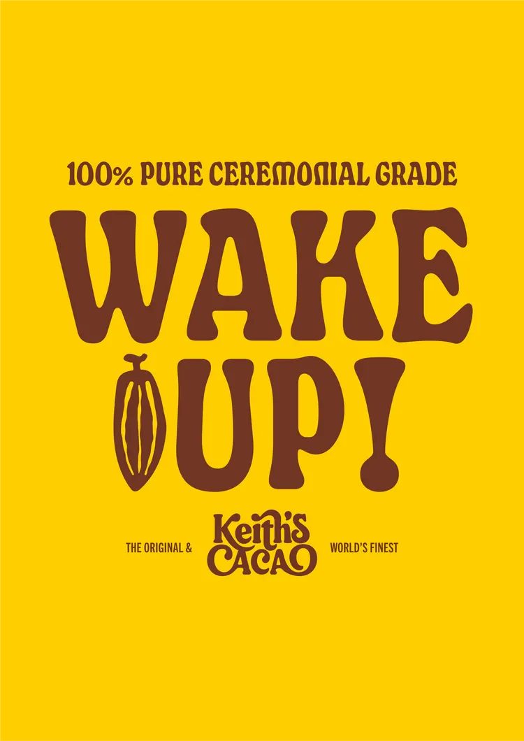
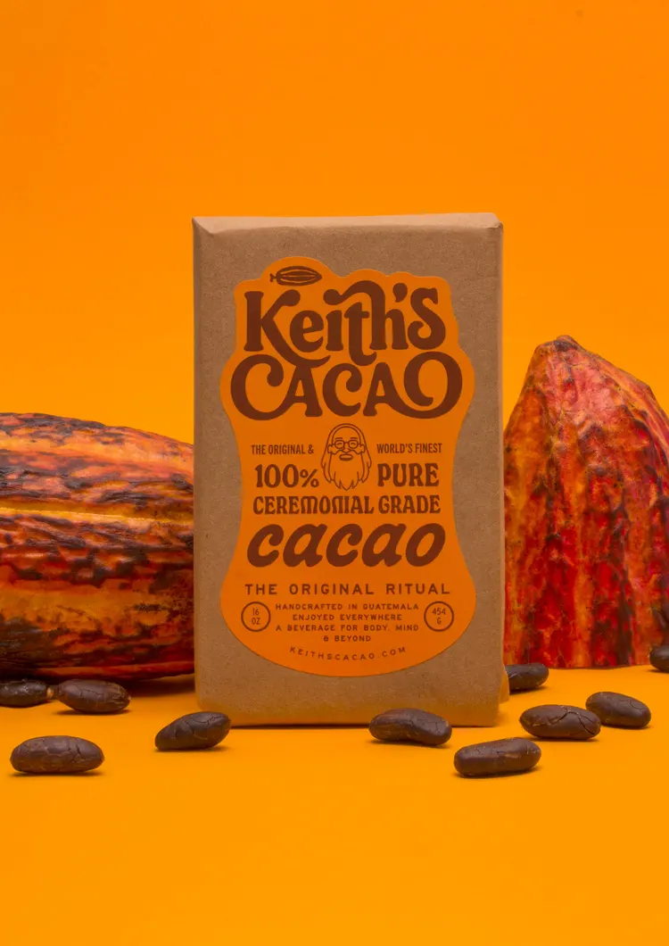
↗Rebranding a product with a decade of loyal followers is mostly an exercise in restraint, and Kinoto Studio shows plenty of it here. For Keith's Cacao, a maker of 100% pure ceremonial cacao, the studio reworked the identity, packaging, and website while keeping the brand recognizable to the people who already buy it.
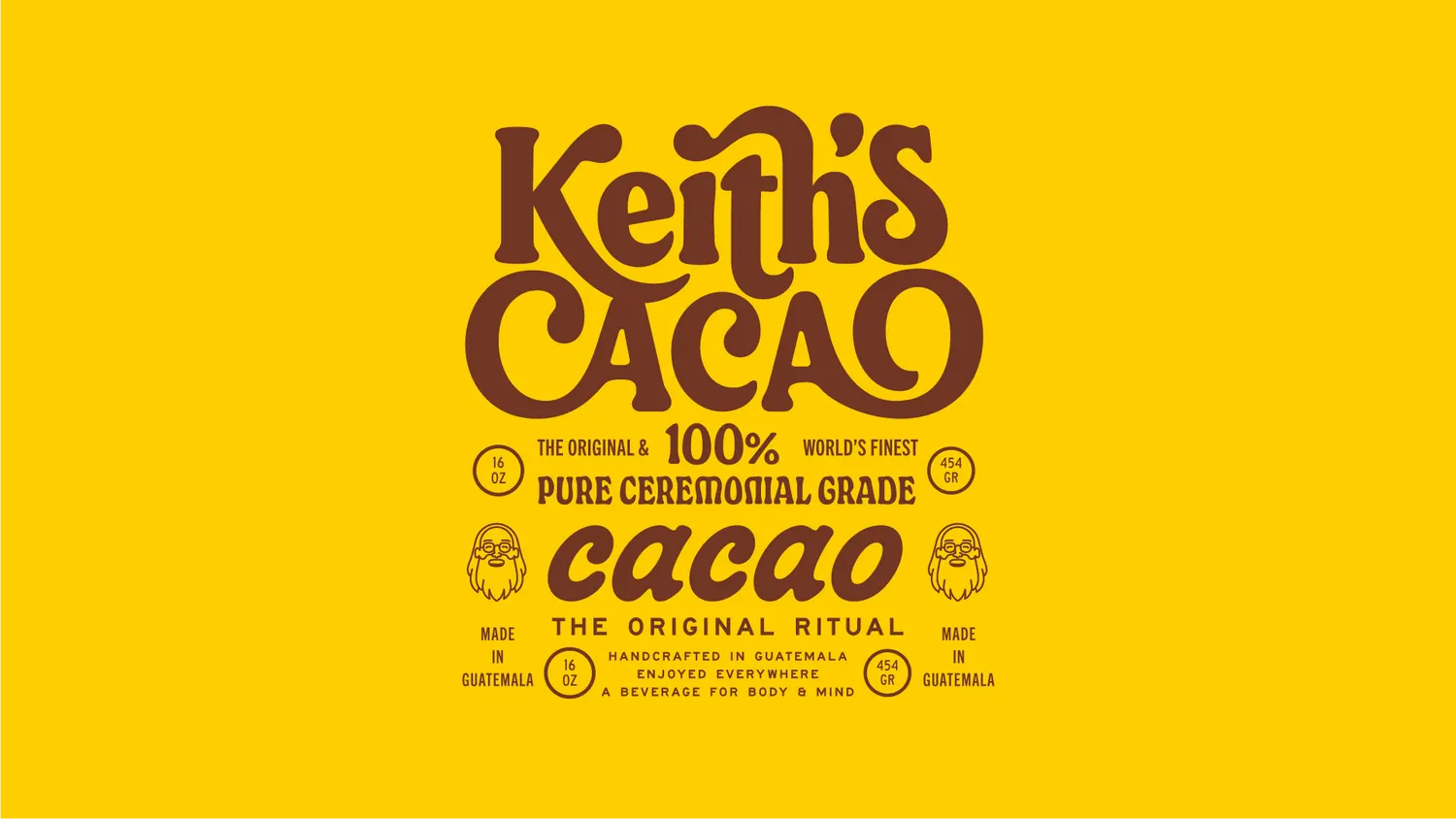
Caveat led the strategy behind a visual language rooted in where cacao comes from, the natural world around it, and the handmade quality of the product. Fer Cozzi shaped the typography and worked on design with Joaquin Contini, and photography by Carolina Silvero and Juan Elizalde sits alongside it. GRANDst. built the site, so one system carries from the pack on the shelf to the screen.
Why it works
Ceremonial cacao can drift toward either wellness-aisle minimalism or generic chocolate luxury. Drawing on origin, nature, and craft instead gives Keith's Cacao a language that feels specific to the product and warmer than much of its category. Giving typography its own specialist also pays off, because letterforms are often what makes a refresh feel owned rather than styled. And with one system running through packaging and web, a longtime customer meets the same brand in both places, which is how a community keeps trusting a change.
Applications
Logo

Images and video from kinotostudio.com, by Caveat.