The Brand Monograph
OVO Egg Tart brand identity by The Lab
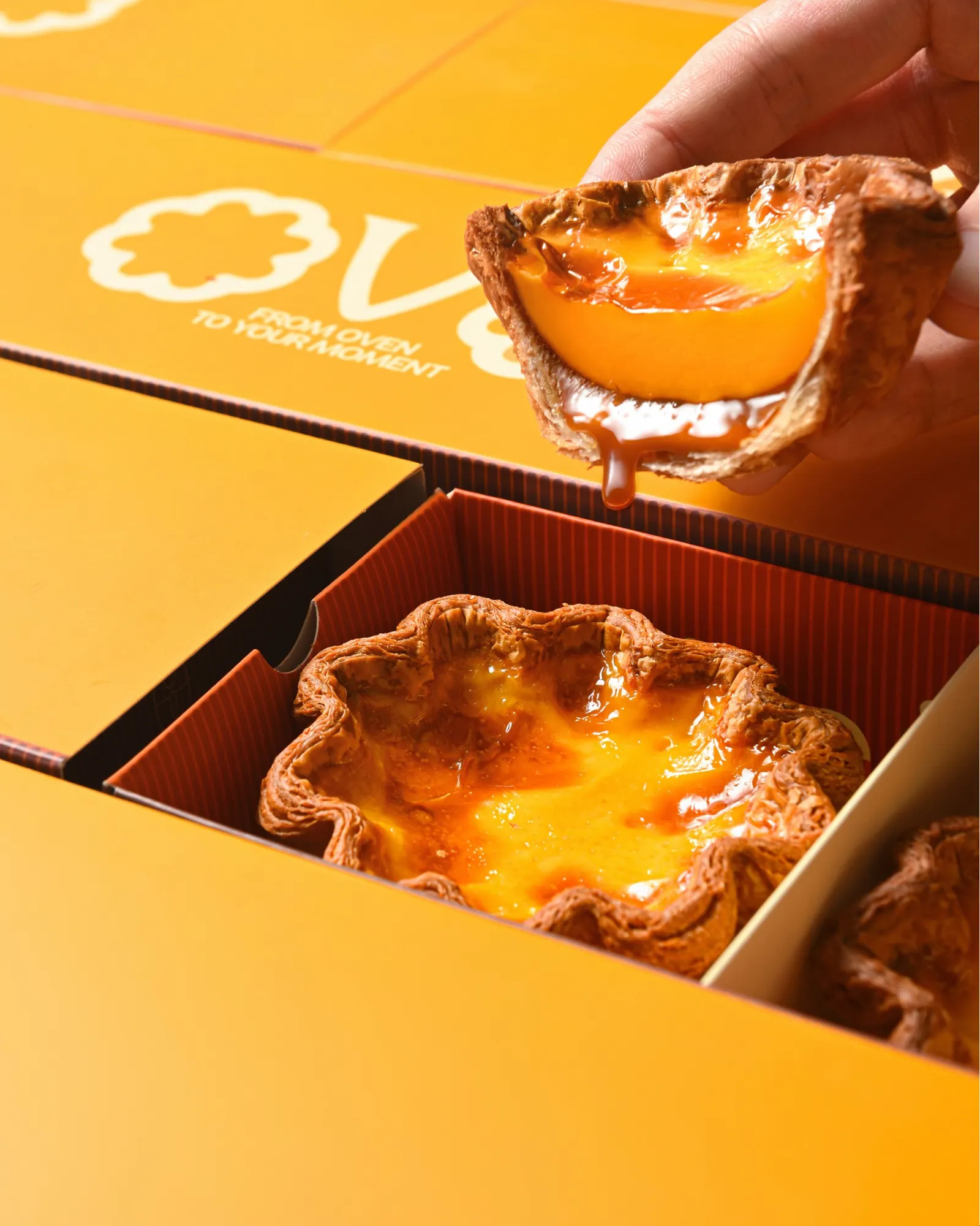
↗OVO's best idea lives inside the box. The Lab, with designers Pim Truong and Xuan Phan, built takeaway packaging that opens in stages, each layer revealing more saturated color until a joke appears inside. It turns picking up a tart into a small piece of theater and gives a grab-and-go product something people will remember.
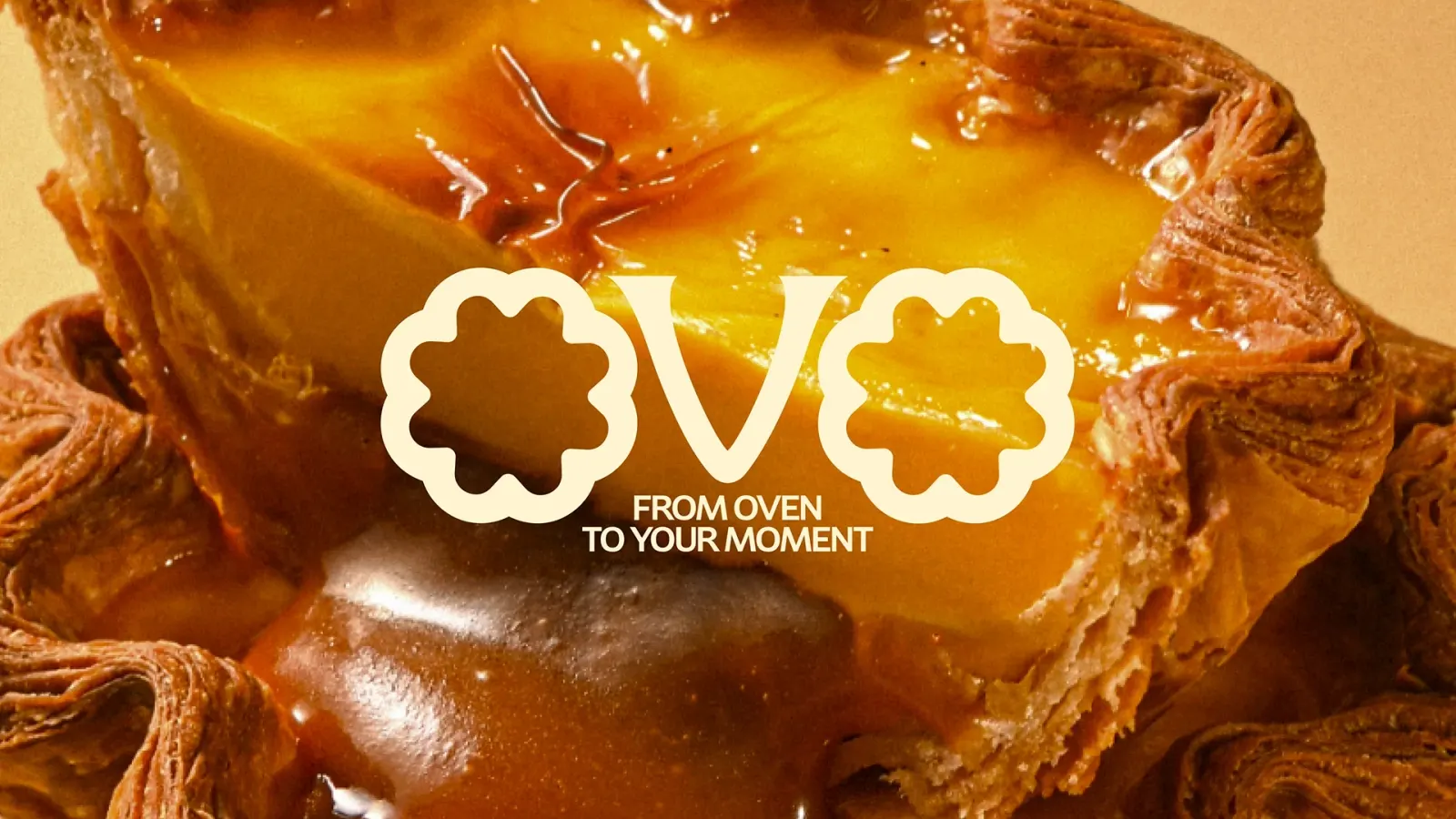
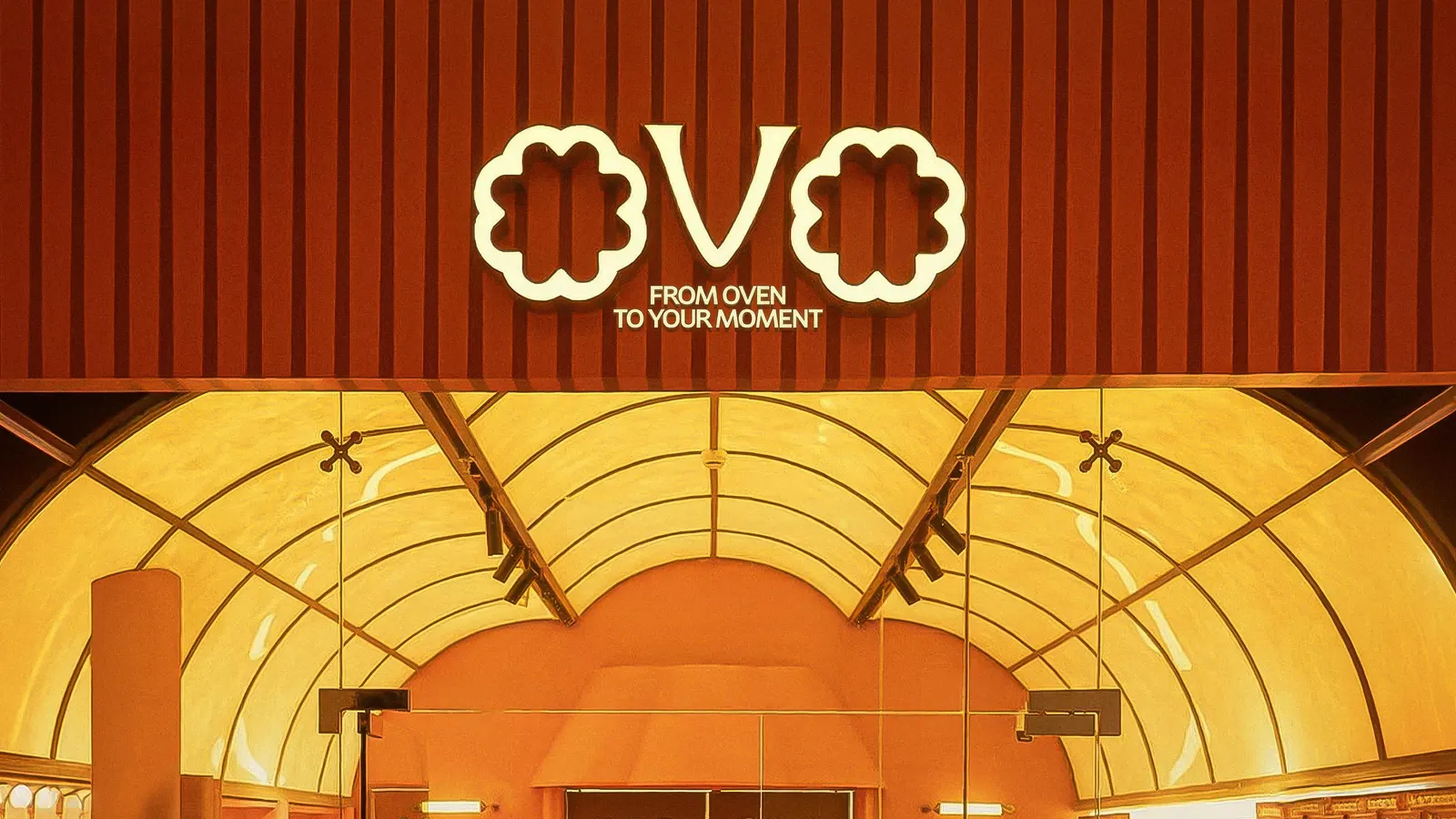
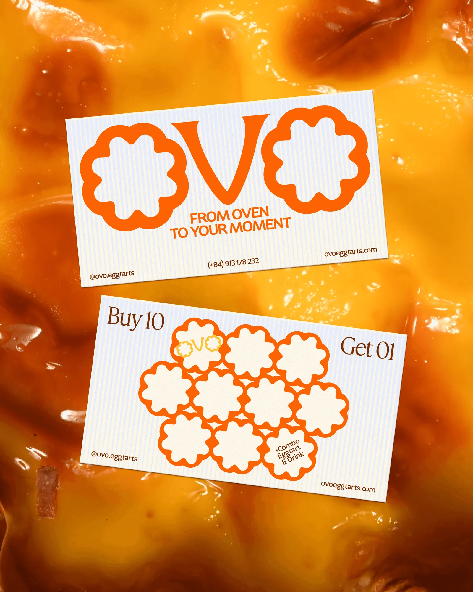
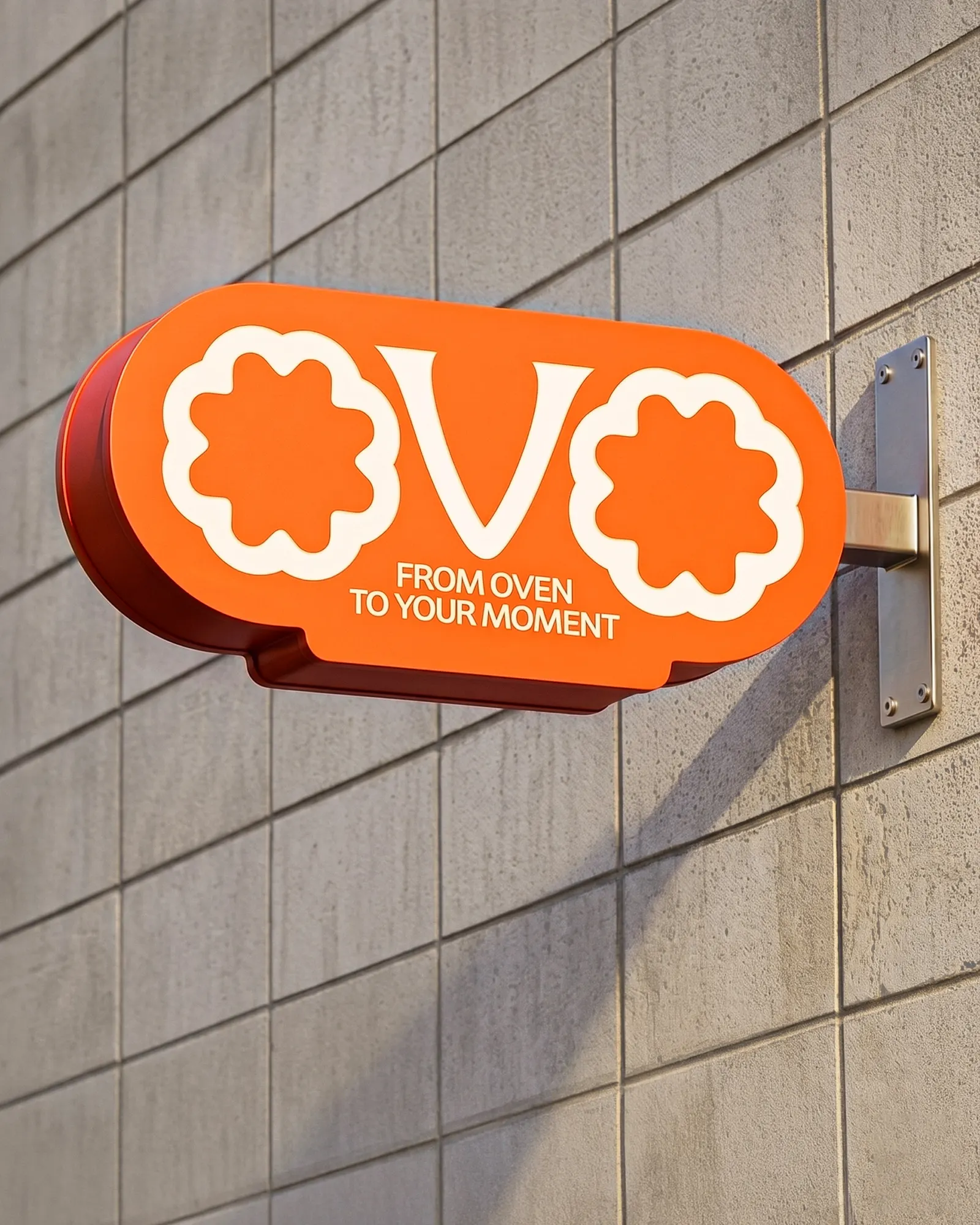
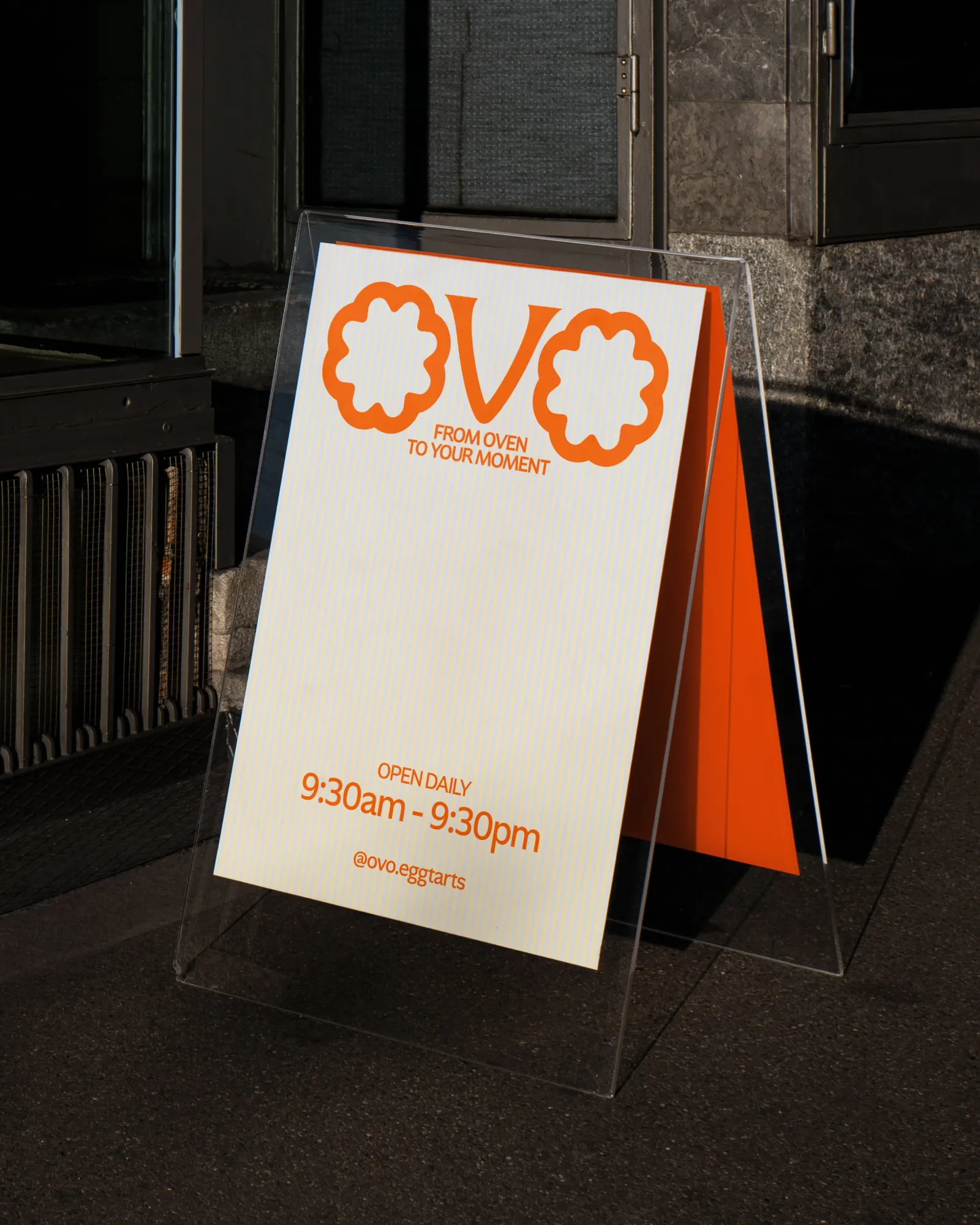
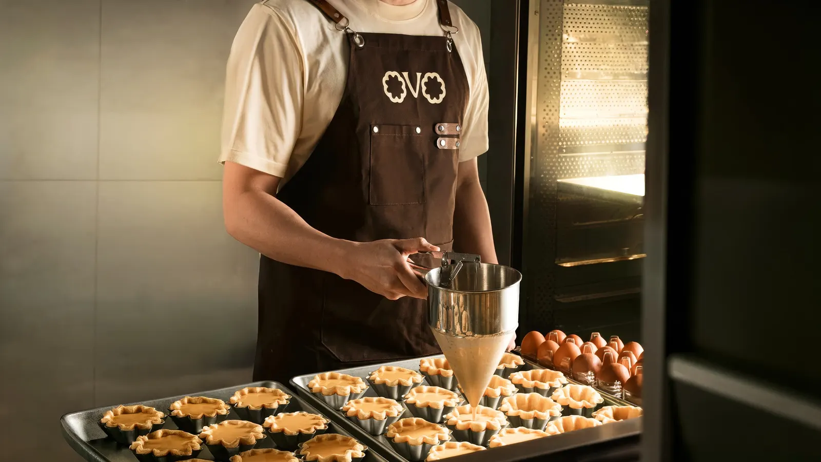
The name is Portuguese for egg, and the identity stays close to the pastry. The logo borrows its silhouette from the tart, the pattern abstracts the flaky crust, and the palette moves through the tones of a tart baking. The typography keeps polish and energy in balance. Anh Nguyen contributed strategy, Kim Cuong handled production, and Pey and Quang Do added motion.
Why it works
The mark is the product, so it is recognizable even at a glance, on a bag or a counter. The bright palette and playful tone also feel like a deliberate step away from the heritage-bakery look that egg tarts often default to. What we like most is the consistency: the layered pattern, the layered color of the unboxing, and the humor all carry one idea. The functional details, like the handles and the lock, mean the fun never gets in the way of carrying the tarts home.
Applications
Images and video from thelabsaigon.com, by The Lab.