The Brand Monograph
De Bijloke brand identity by Pentagram
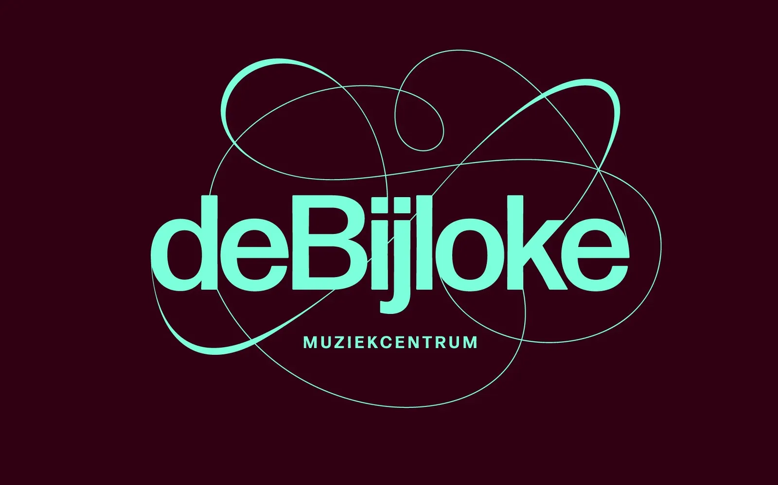
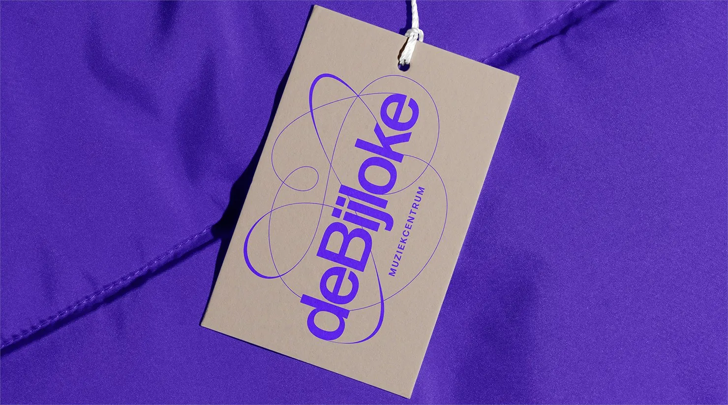
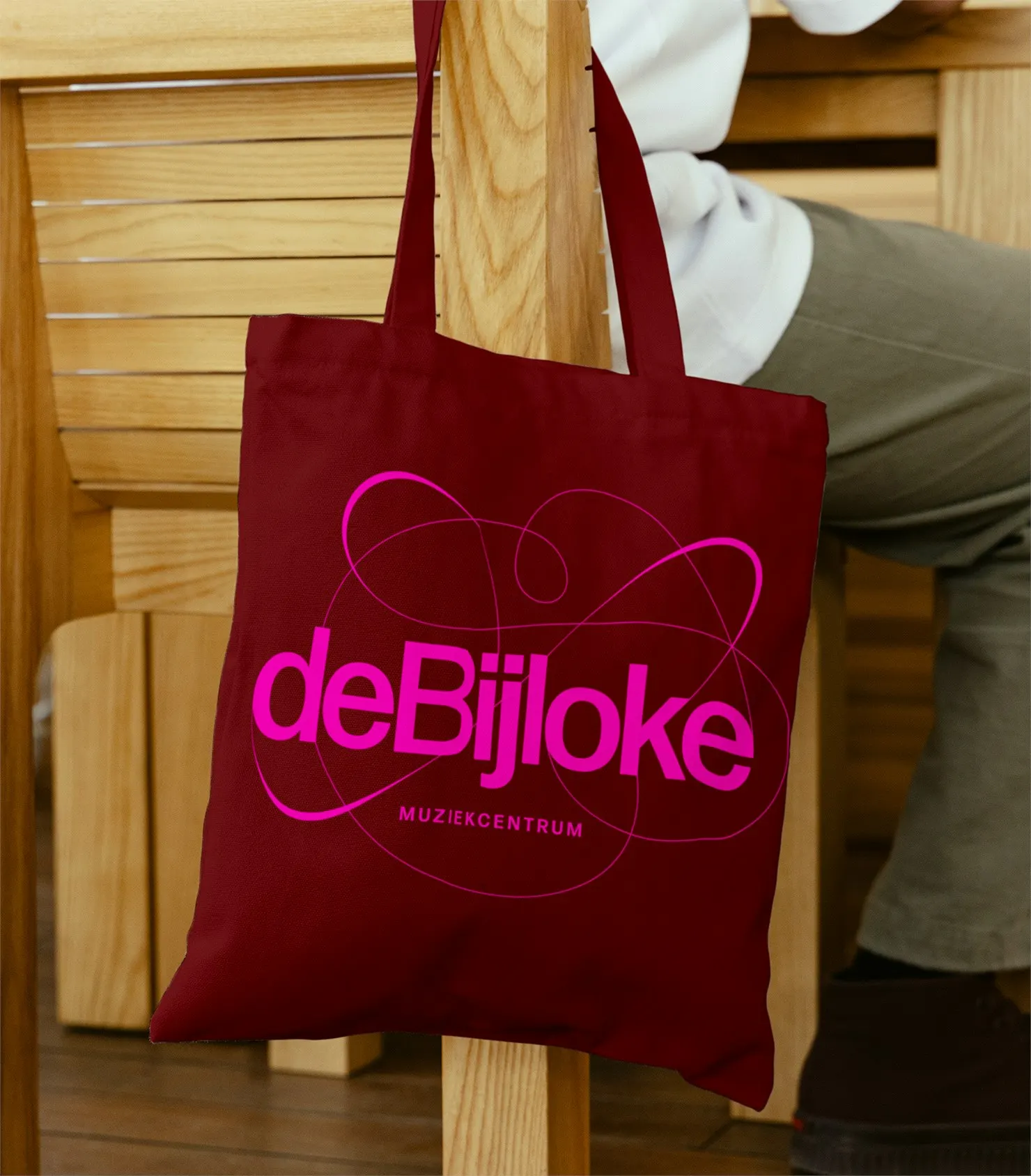
↗A concert hall in a 1251 hospital now has a logo that behaves like a signal on a screen. Pentagram's identity for De Bijloke, the music centre in Ghent, turns one looping gesture into the anchor for everything from string quartets to children's afternoons.
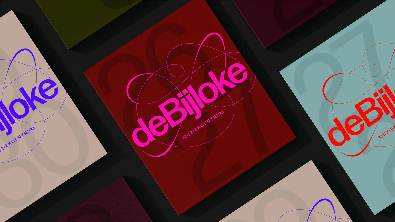
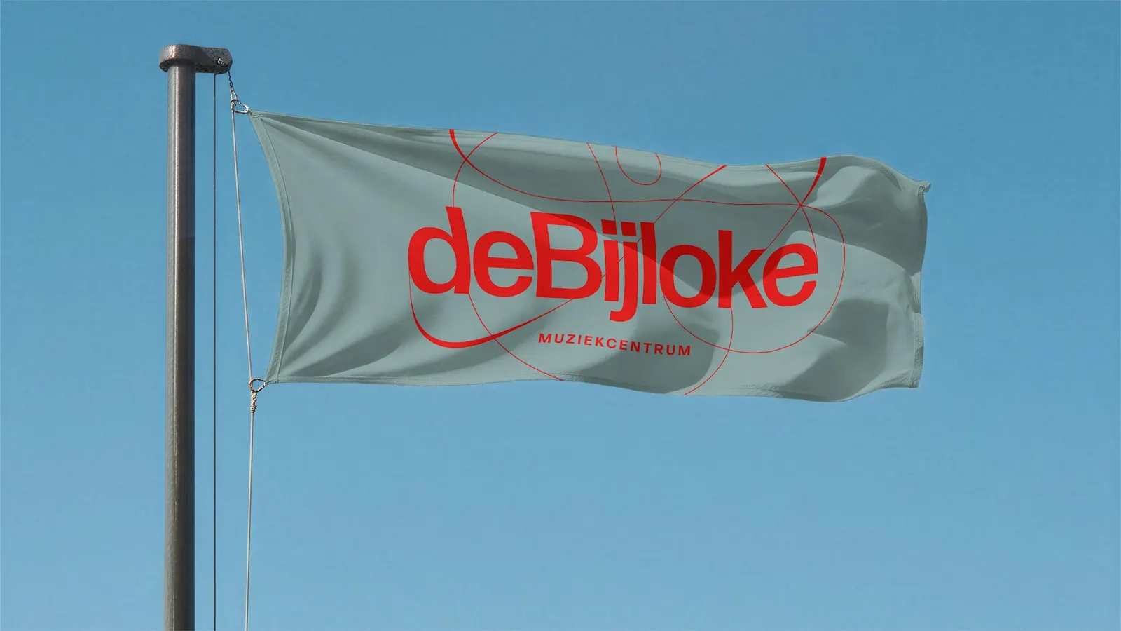
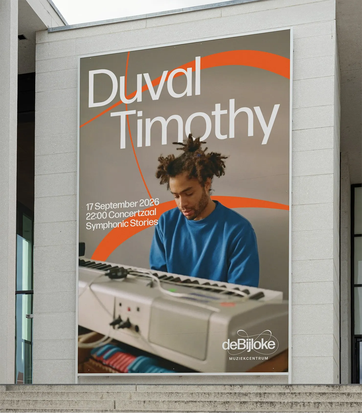
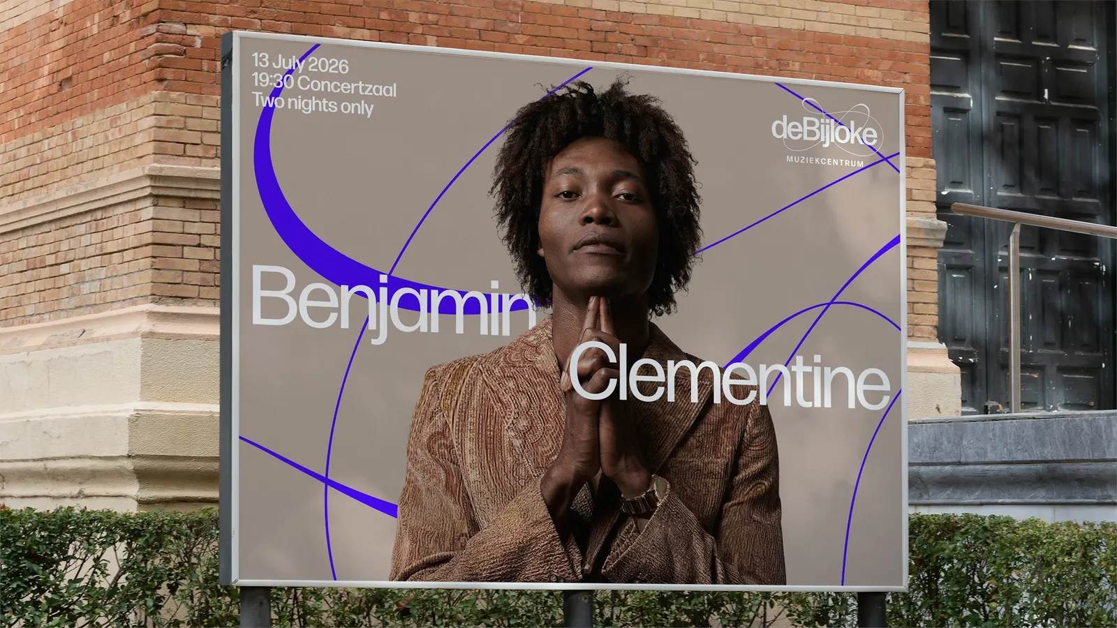
Ahead of the 26/27 season, the centre wanted a digital-first look that could win new listeners without losing regulars. The mark draws on John Cage's unconventional scores and on oscilloscope traces, and Forma DJR keeps the typography clear and confident. Colors come from features of the building itself, with brighter tones signaling the range of the programme. Jazz and New Music push the oscilloscope idea further, while the Family programme gets three patterns and a generative tool that remixes them for motion and any format. Copywriters Ashley Johnson, Ishaan Pamnani, and Ruth Jamieson gave the verbal side an evocative voice that stays plain when it needs to, alongside a design team that included Marina Willer.
Why it works
Arts venues usually default to stately restraint or loud novelty, and this does neither. A gestural line reads as sound itself, so it doesn't tie De Bijloke to the classical canon or to its medieval architecture. Because the mark is a line, it can stretch, animate, and be reinterpreted for each audience, which suits a digital-first brief. The palette roots it in the place, and the calm, sturdy type stops the energy from tipping into chaos.
Applications
Logo
Images and video from pentagram.com, by Pentagram.