The Brand Monograph
Kinisla brand identity by RichardsDee
↗Kinisla is a rename that feels earned rather than imposed. When Kerry Dairy Ireland returned to farmer ownership after fifty years inside the wider Kerry Co-op story, RichardsDee had to find a name and identity that kept hard-won trust intact while stepping away from the look of a traditional dairy company.
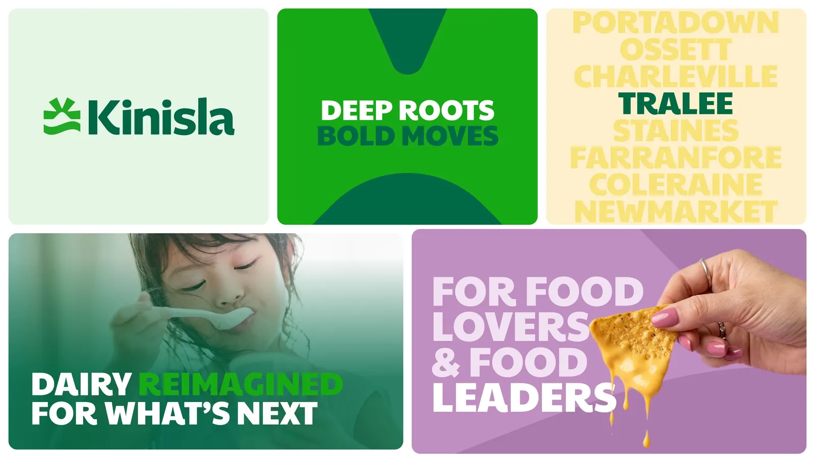
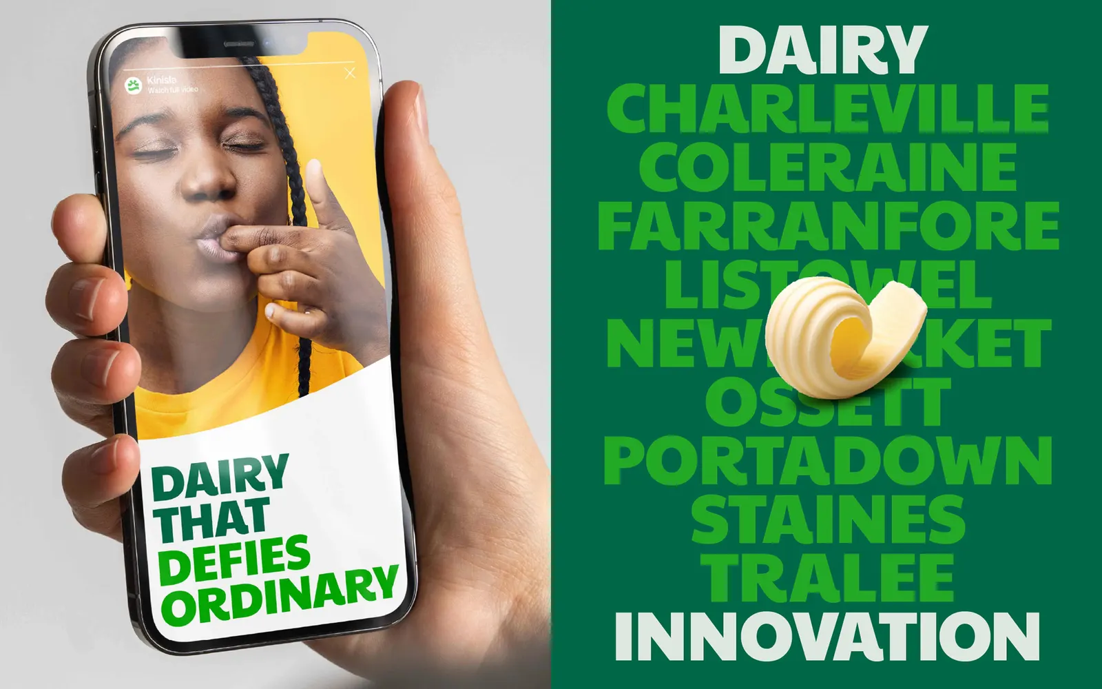
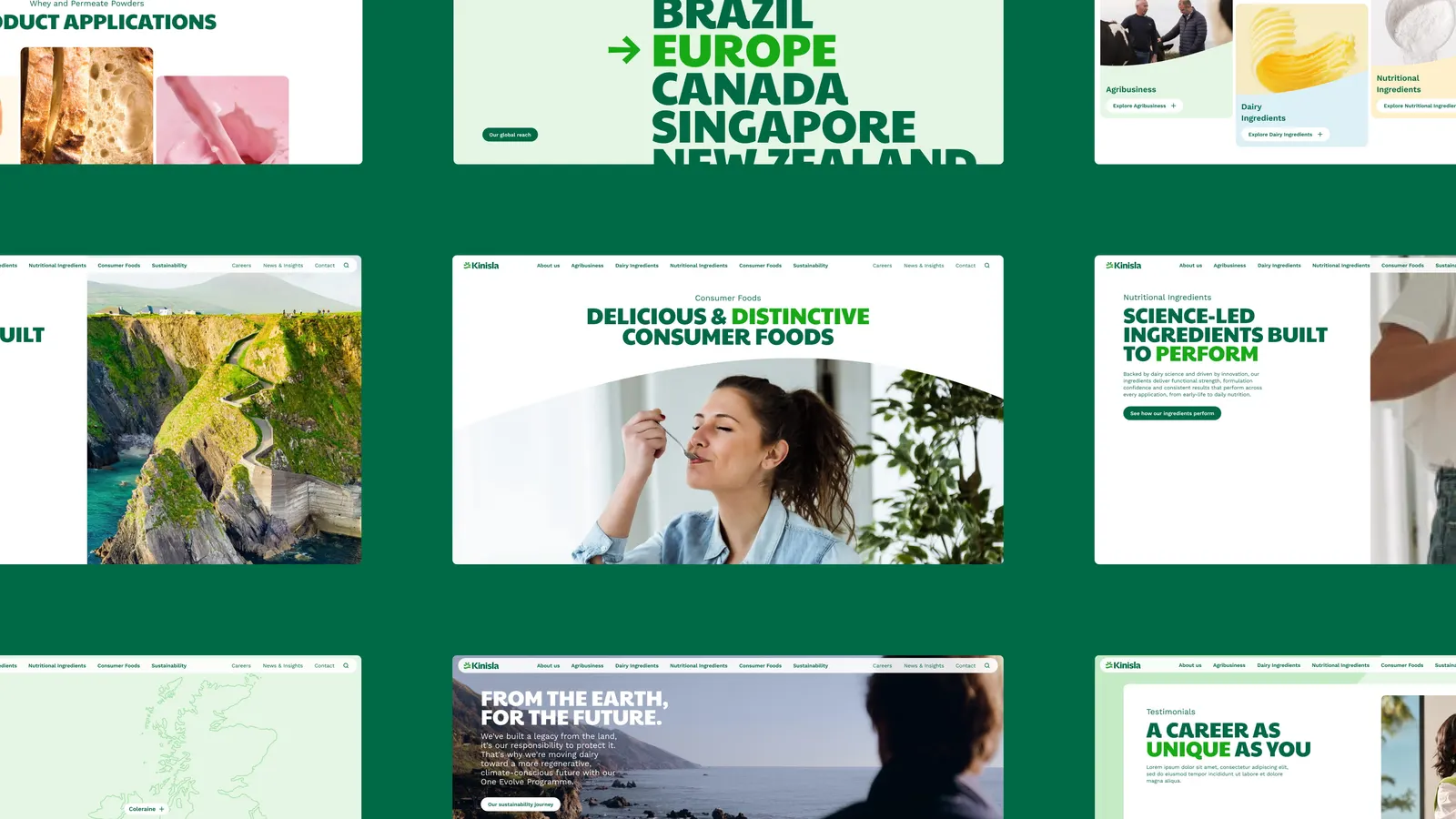
After interviews, site visits, archive research, and hundreds of name candidates, the studio settled on Kinisla, which joins the idea of the collective with a sense of island resilience. The logo gathers a wave, landforms cut through negative space, rising rays, and a discreet K referencing Kerry. Greens, earthy neutrals, and creamy whites anchor the palette, with brighter secondary colors drawn from science and innovation. Typography was developed with Dinamo Typefaces and Newglyph, and Jenna Simmons contributed photography.
Why it works
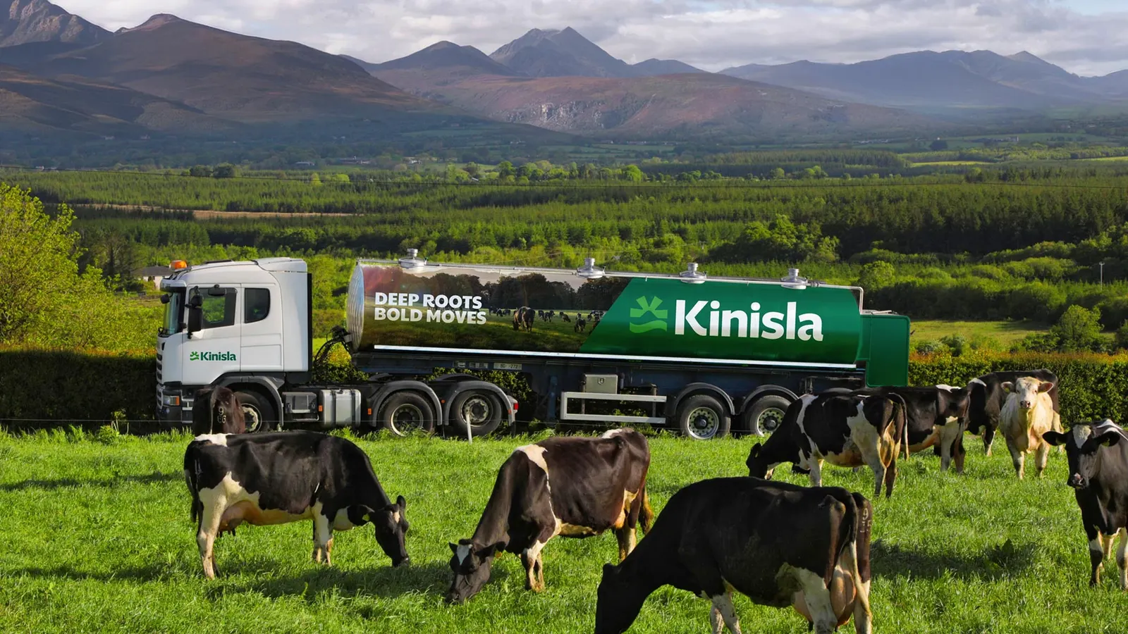
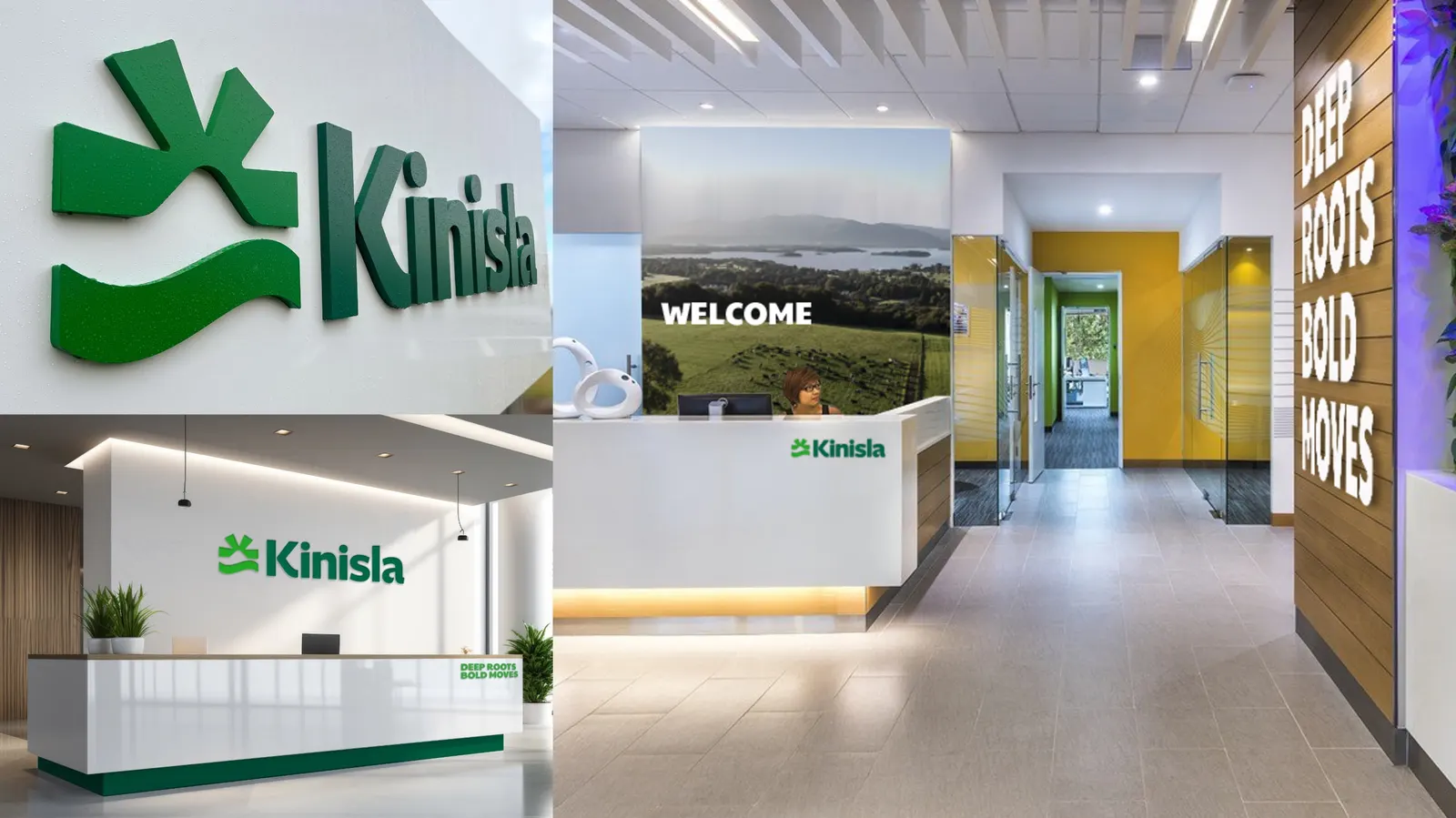
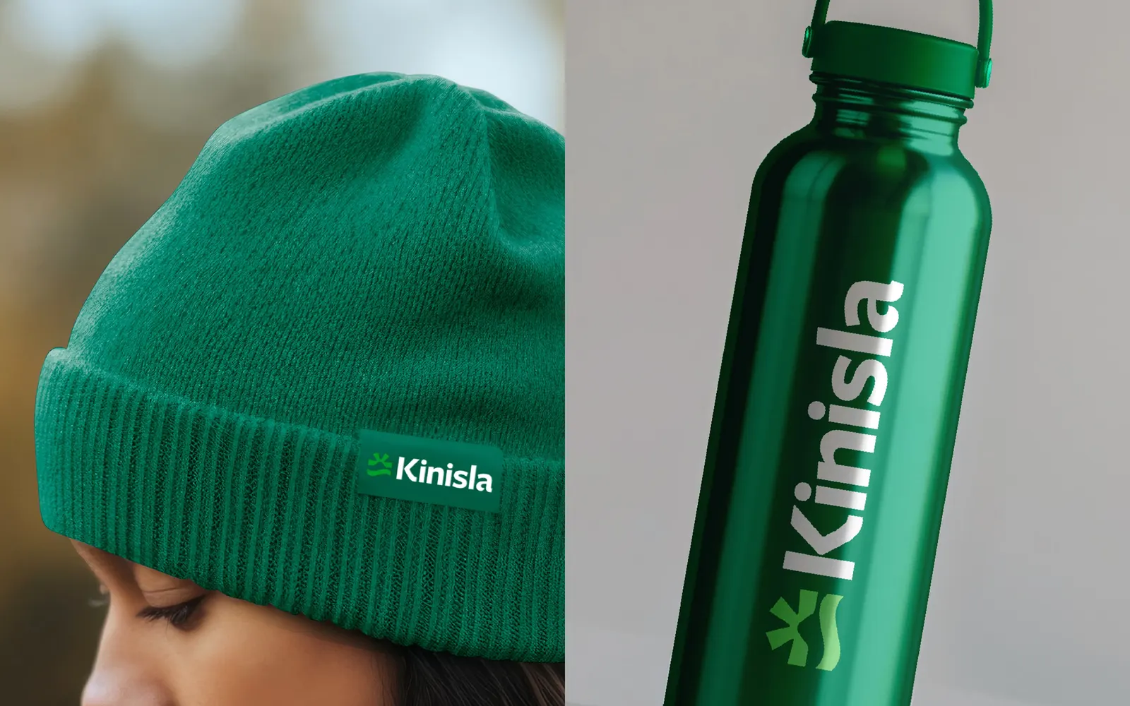
The mark does what dairy branding rarely does: it avoids milk drops, cows, and farmhouse nostalgia, yet still feels tied to a place. Because the symbol is built from simple shapes, it can scale from packaging to a trade-show wall without losing character. The split palette is the smartest move. Its natural core reassures farmers and long-standing customers, while the brighter accents speak to ingredient buyers and partners who expect a business grounded in science and innovation.
Applications
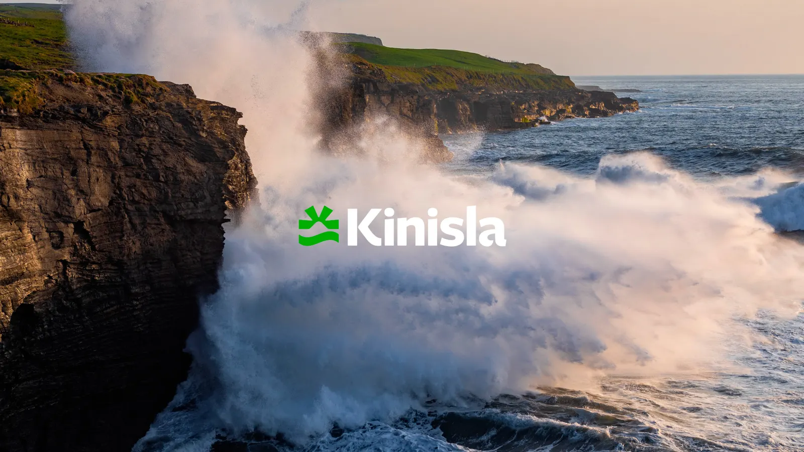
Logo
Images and video from richardsdee.com, by RichardsDee.