The Brand Monograph
SCANA Energy brand identity
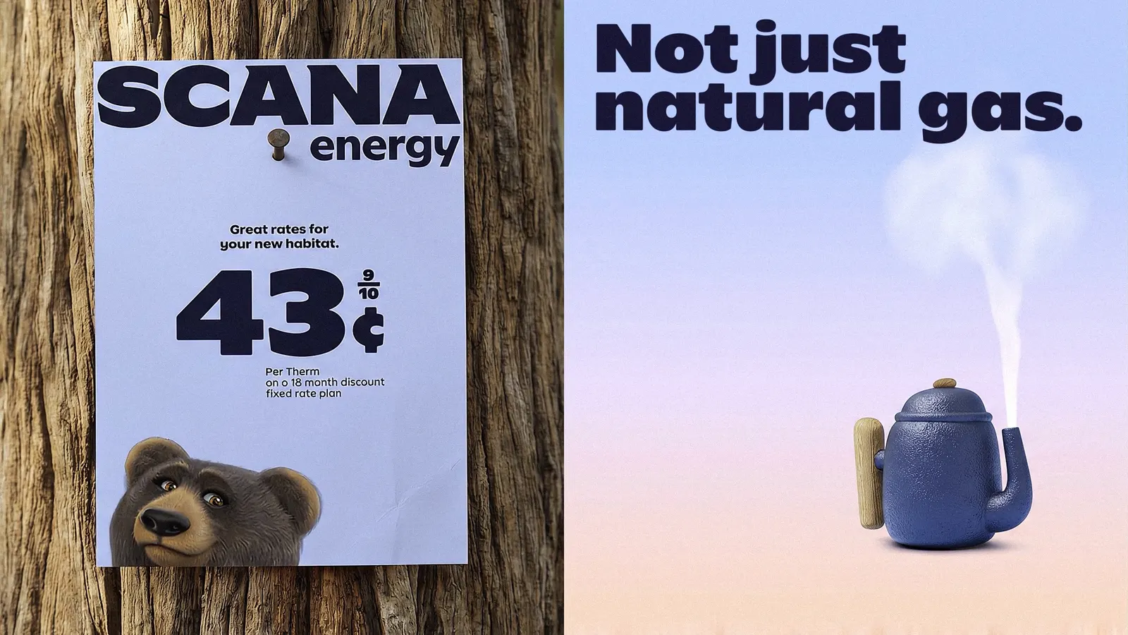
↗Landor tackled a category where the product can't be told apart. Since Georgia opened its gas market to competition, suppliers sell the same gas, and customers shop on price alone. What stands out is where the studio looked for an edge. Research showed people found the category murky and hard to trust, while SCANA Energy already scored better on service, so Landor built the brand around that human strength, with the bears leading the way as Big Bear Energy.
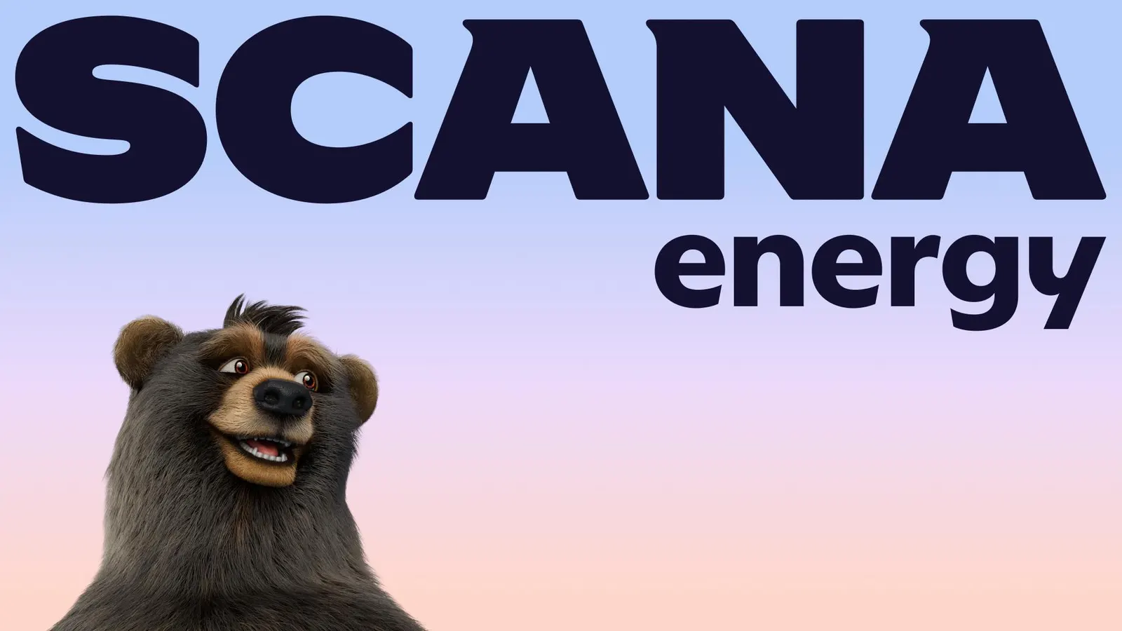
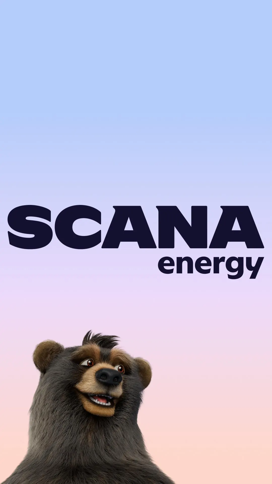
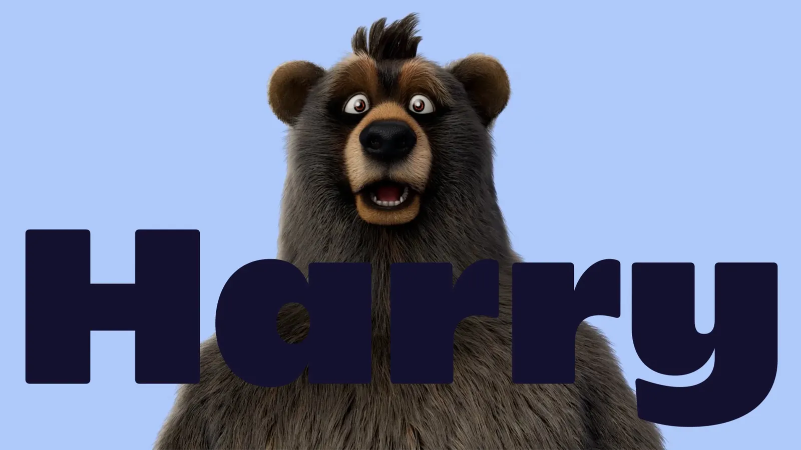
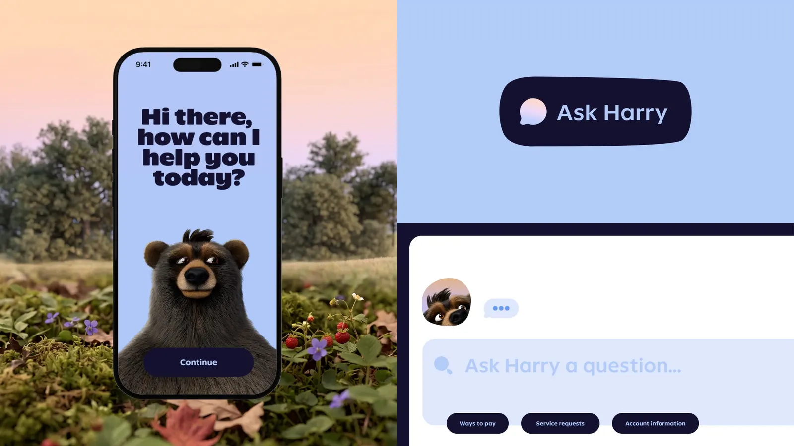
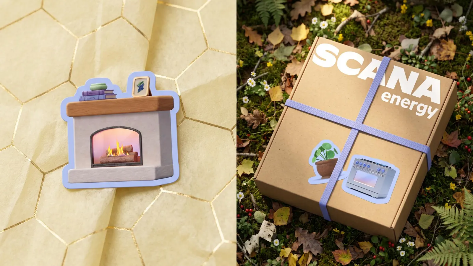
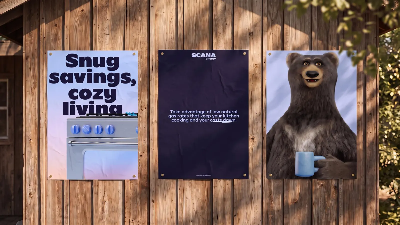
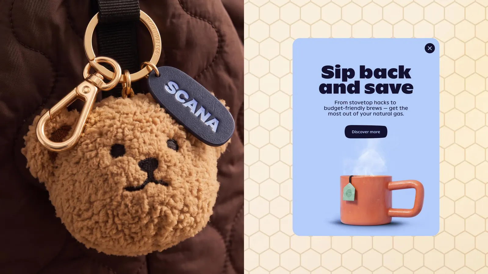
Linda, Harry, and the cubs survived distinctive asset testing and returned warmer and more expressive. Pawprints run through the identity, joined by a custom wordmark and a bespoke type family from Landor's in-house font foundry. Familiar blues now sit beside flame-inspired tones, and the verbal voice is clear, kind, and quietly playful. Buck handled motion and VML made the film, with the system reaching billing, digital, customer communications, and internal activation.
Why it works
Keeping the bears was the smartest decision here. In a field of interchangeable names, they are the one asset only this company owns, and the service data makes their warmth believable rather than decorative. The flame tones connect to what the product actually does, while the retained blues spare existing customers a jarring break. Custom type and a bespoke wordmark give a utility-style category a voice of its own, and the pawprint is a simple, repeatable device that works as well on a bill as on a screen.
Applications
Logo
Typography
Images and video from landor.com.