The Brand Monograph
Marshmallow brand identity by Ragged Edge
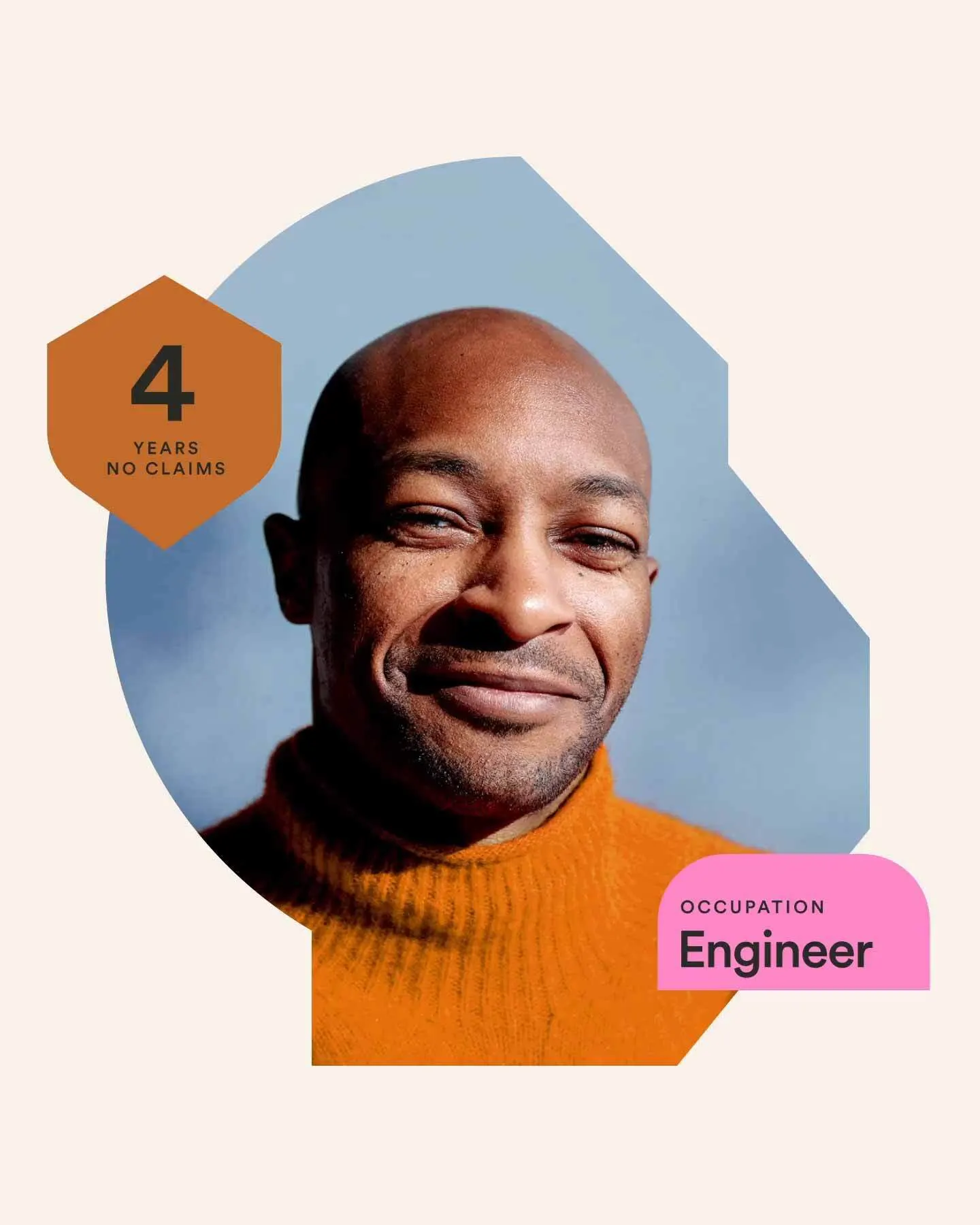
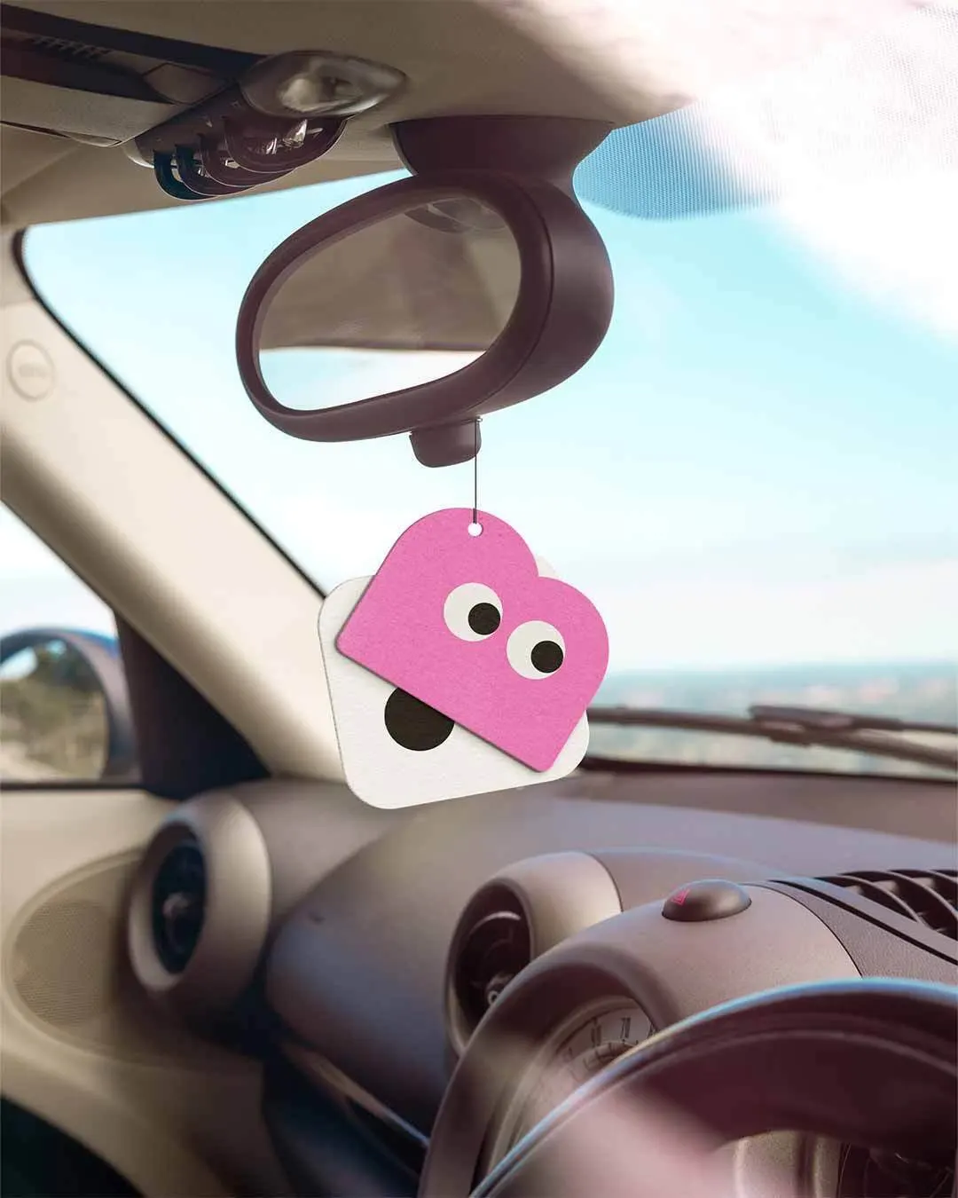
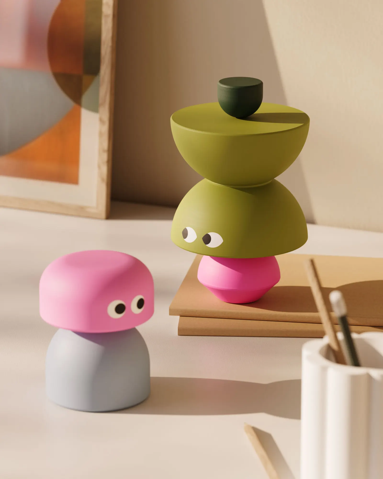
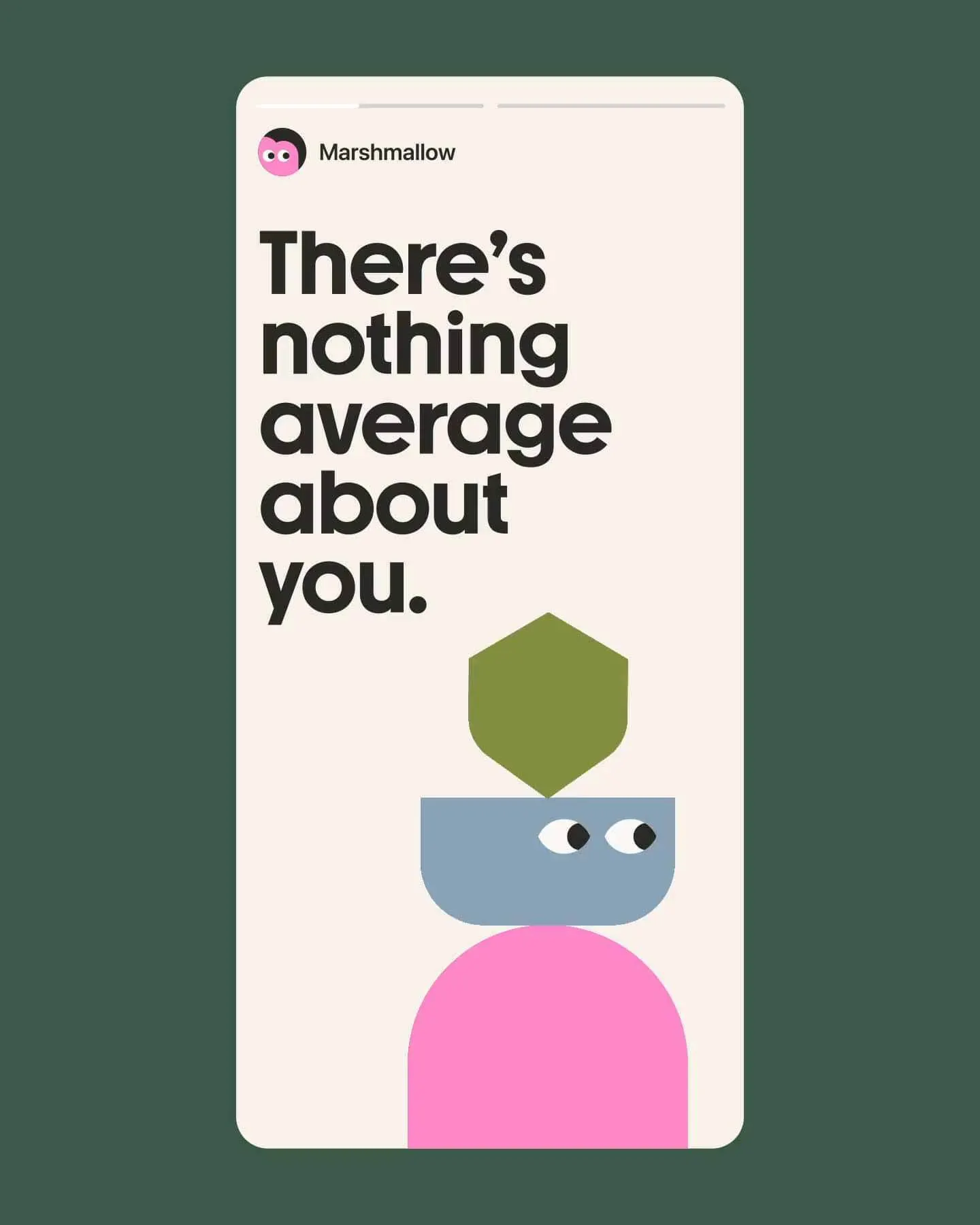
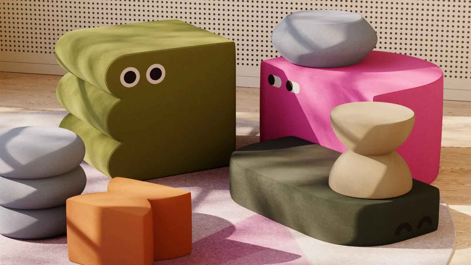
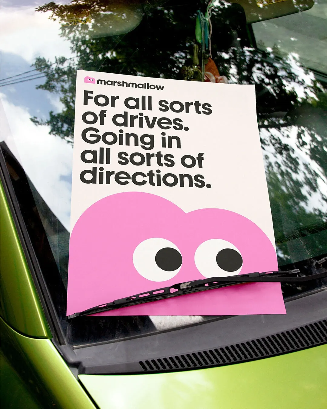
↗Insurance branding usually leans on reassurance clichés, so Marshmallow's rebrand by Ragged Edge feels like a different species. The studio built the identity around a mascot and the marshforms, a growing family of character variations that can be assembled in endless combinations. It's playful, but it has a clear point of view behind it.
The brief was to keep faith with Marshmallow's core customers, people new to the UK whom established insurers often overlook, while the company scaled past unicorn status. Ragged Edge began with a brand strategy for the internal team, then added a confident, inclusive tone of voice and a custom headline typeface developed with AllCaps. The studio stayed on to test the system with Marshmallow's product and design teams across the website, product, and communications. In the year after launch, the company turned its first profit, on £184 million in turnover.
Why it works
A single logo or mascot can only suggest one kind of person. A system of characters lets many customers find themselves in the brand without a tokenistic campaign, which suits an audience defined by variety. The custom headline type gives the voice a recognizable shape, so the brand can be identified even at thumbnail size, in a category where competitors tend to blur together. The modular approach also gives an in-house team room to keep extending the identity without diluting it.
Applications
Logo
Images and video from raggededge.com, by Ragged Edge.