The Brand Monograph
LEOPRD brand identity by All Things Considered
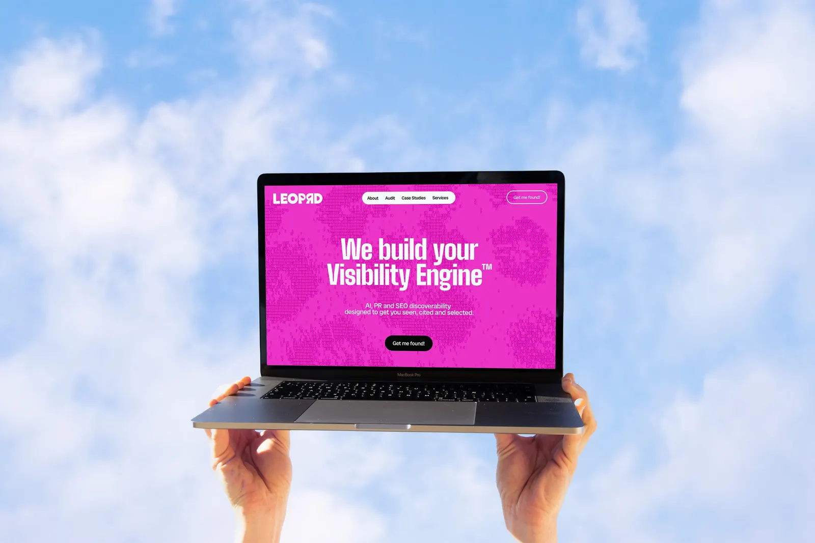
↗LEOPRD sells a fairly abstract service: making brands legible to AI so that tools like ChatGPT mention them. All Things Considered gave the company an identity that is loud, playful, and built almost entirely from its own name.
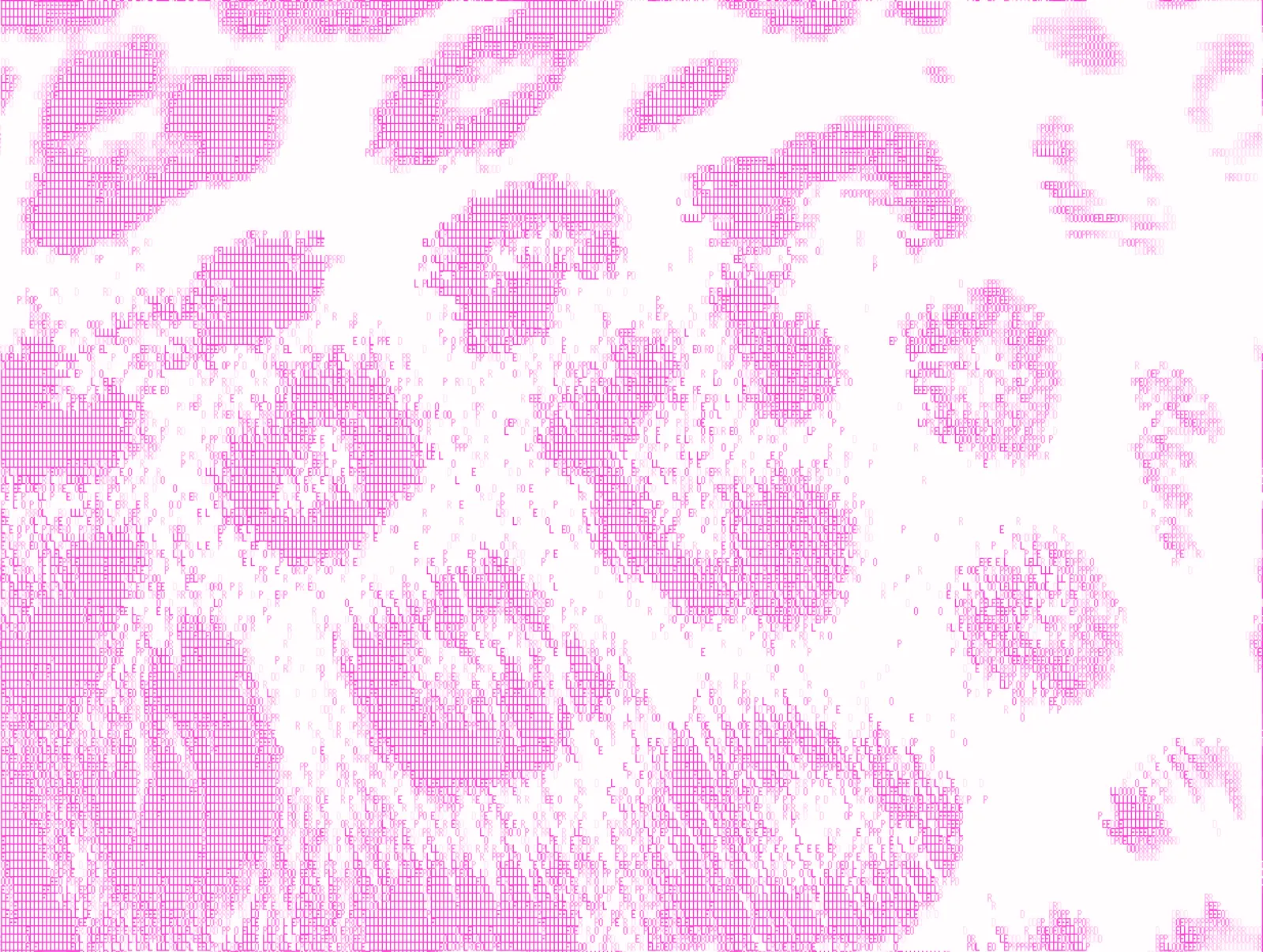
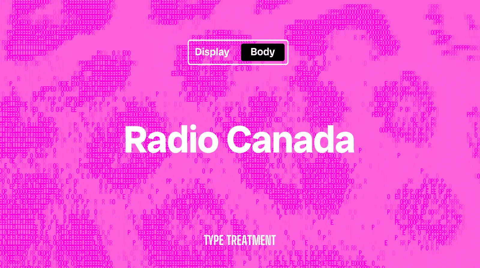
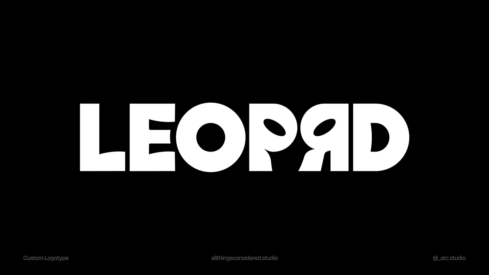
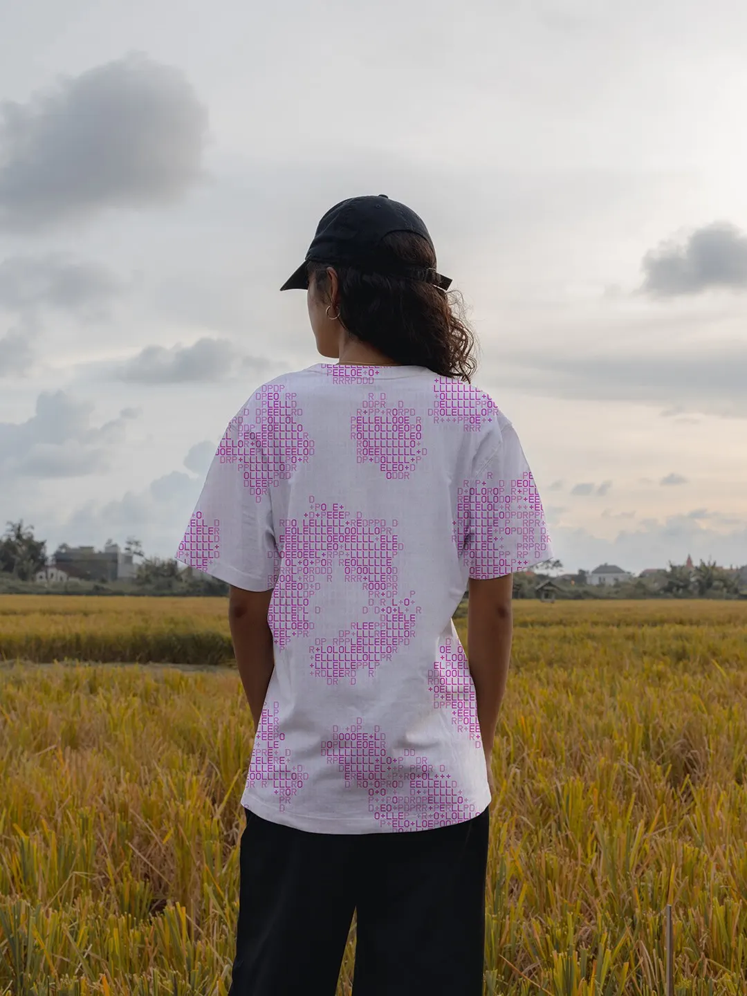
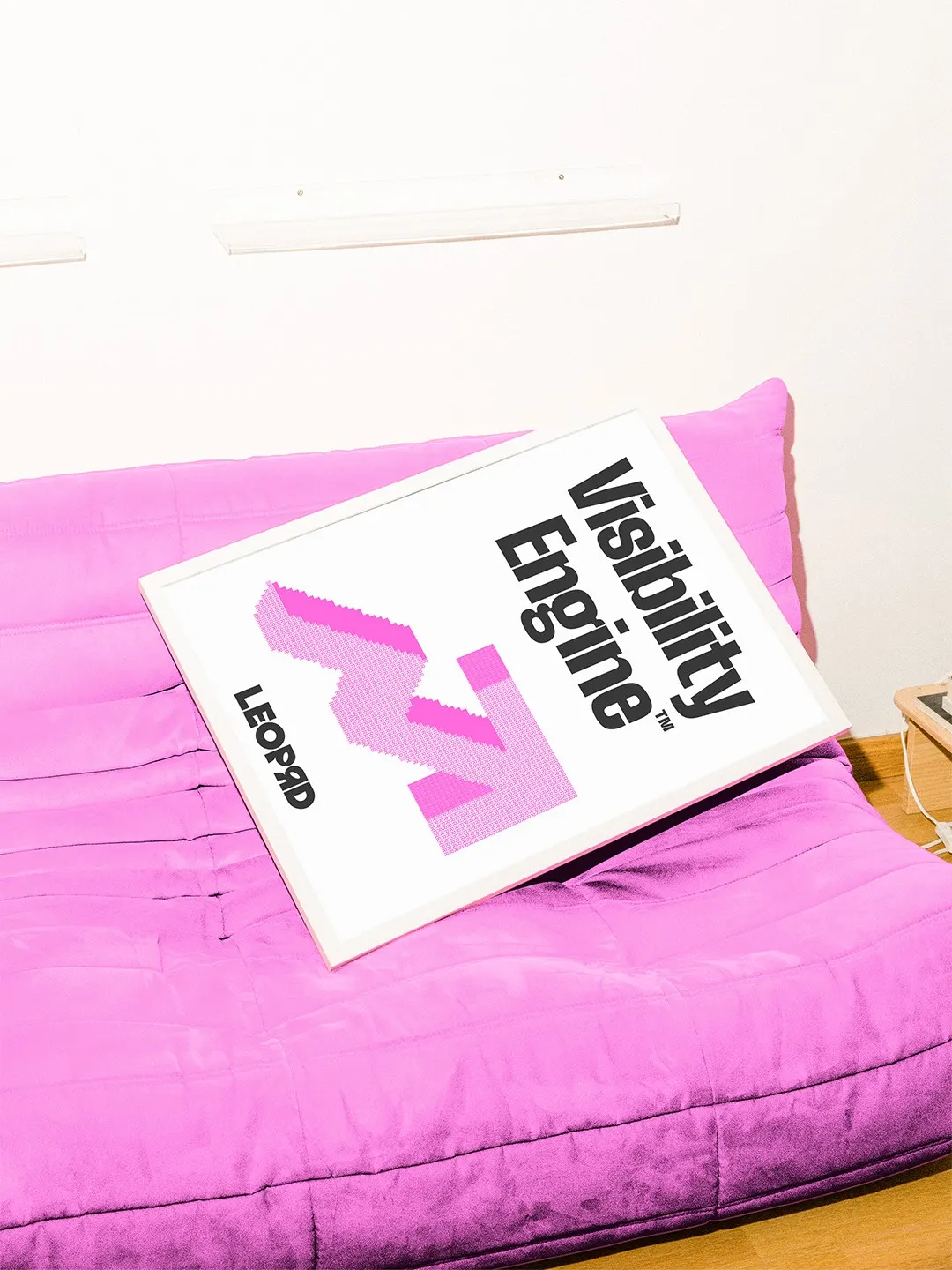
The name is a pun on LEO, short for language engine optimization, which the company pairs with PR and SEO. The studio turned that wordplay into a leopard mascot and a custom logotype that borrows the animal's fierce, watchful eyes. Colors are bold and used one at a time, and the letters L, E, O, P, R, and D are tucked into the mascot, the symbols, and the patterns. Those patterns start from leopard rosettes, scaled up and redrawn as lettering. The typefaces carry the brand's volume while working natively in Google Workspace, so the personality survives in everyday documents and decks.
Why it works
In a category that usually defaults to cool, abstract tech styling, a mascot is a confident move, and it gives a hard-to-explain service something memorable to hold onto. The rosette pattern makes the strategy visible: markings that hide an animal become oversized lettering that announces it. Because the name is built into the patterns, the brand repeats itself even without a logo. And choosing type that holds up in Google Workspace is a practical decision, since most client-facing work will live there.
Applications
Typography
Logo

Images and video from allthingsconsidered.studio, by All Things Considered.