The Brand Monograph
Melissa brand identity by Porto Rocha
↗Melissa has spent decades making plastic shoes feel like fashion, and PORTO ROCHA's work for the Brazilian brand shows how to grow that idea up without losing the humor. Two projects that began separately, a monogram and a global campaign, ended up working as one system.
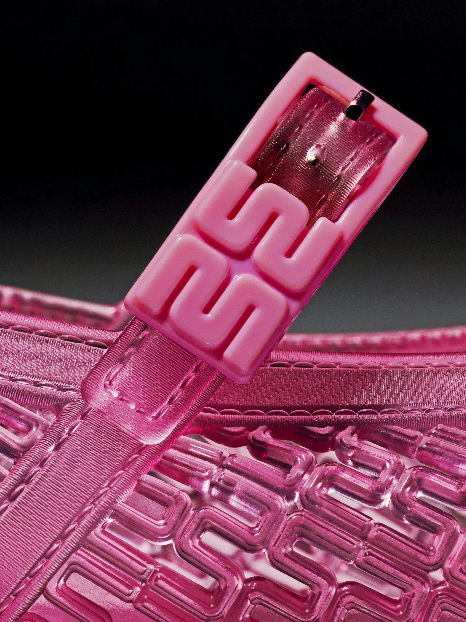
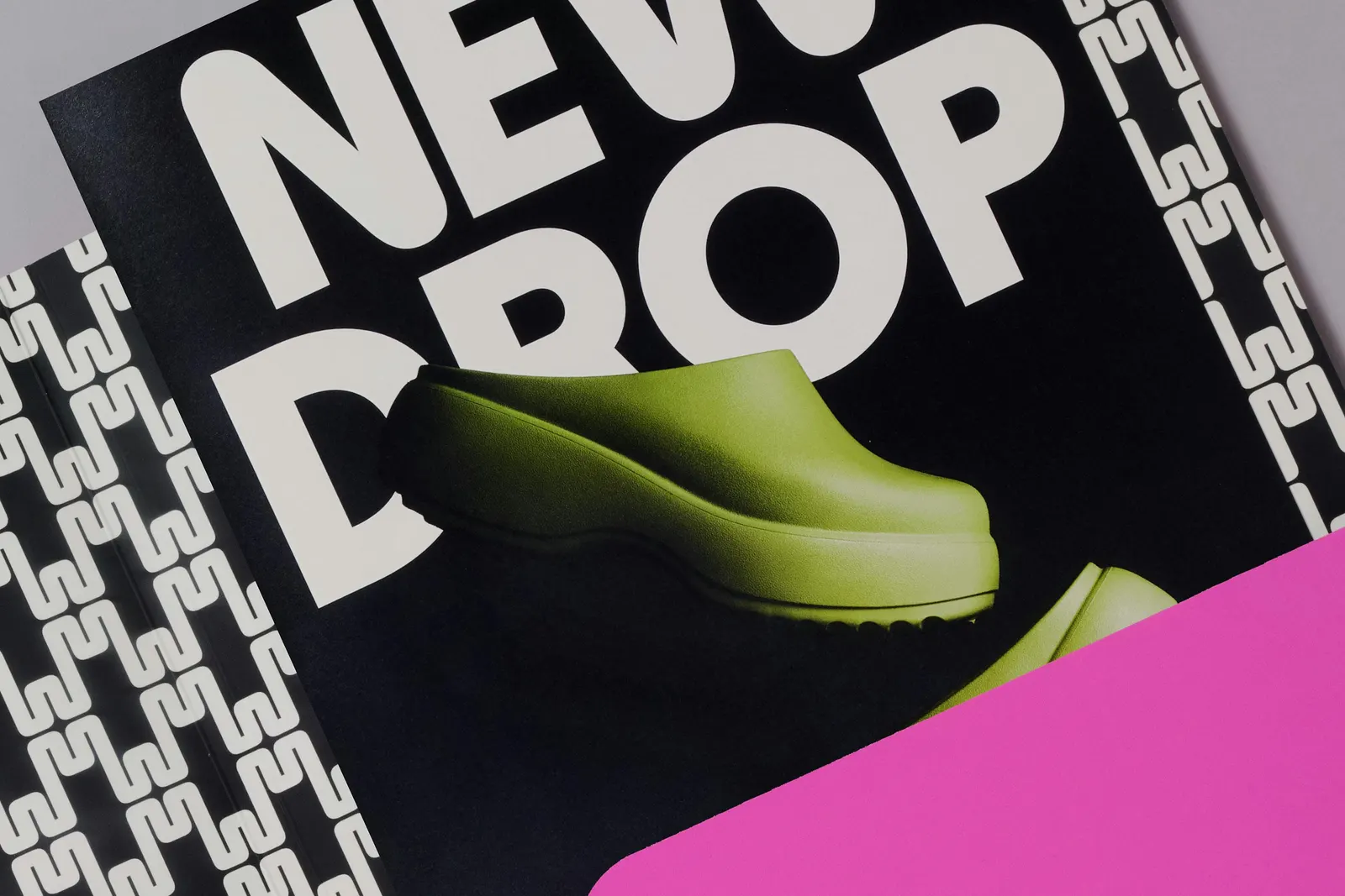
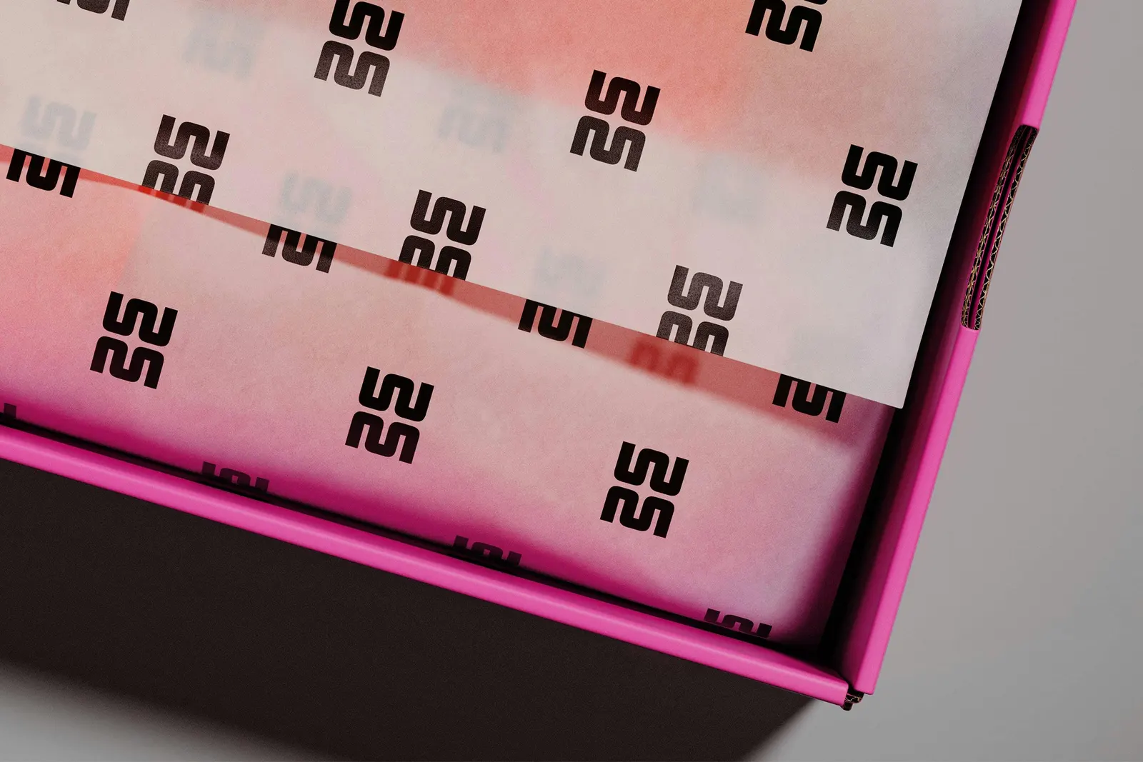
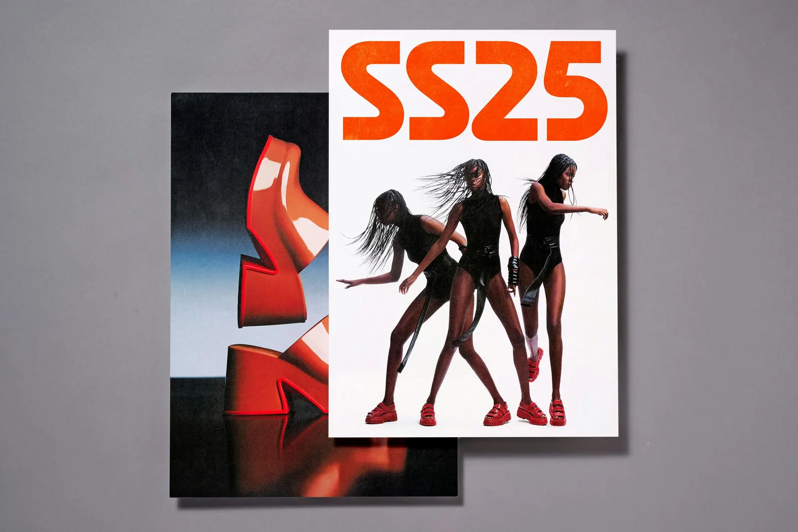
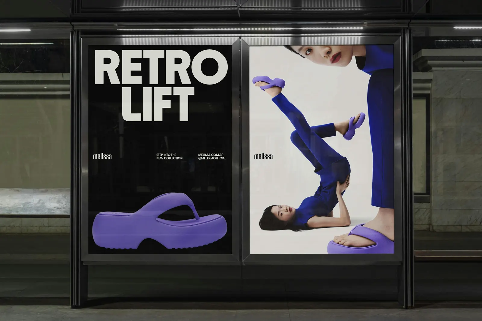
The monogram marks a new, more refined product tier. It is built from two mirrored Ms drawn in a single line weight, with softened inside corners and crisp outer edges, so it reads equally well as a logo, a repeat pattern, or a piece of hardware. The 2024 campaign, Melissa Station, borrows from subway wayfinding. PORTO ROCHA drew a custom wordmark and typeface with All Caps, added a secondary logo that echoes tiled New York station lettering, and used lines, circles, and arrows to put motion into still photography. Motion designers, 3D artist Pedro Veneziano, and copywriter Garrett Herzik extended it further.
Why it works
The two pieces divide the labor well. The monogram handles polish and the campaign handles energy, so neither has to compromise. Rounding only the inside corners of the M is a smart move: the mark keeps a tactile, jelly-like softness while still looking sharp enough for a luxury product. The transit language gives a global campaign a clear structure for photography and typography, and it travels easily across markets because directional graphics need little translation. That it has outgrown its original brief suggests the system is built on solid logic.
Applications
Logo

Typography
Images and video from portorocha.com, by Porto Rocha.