The Brand Monograph
Paribu Art brand identity by Fol
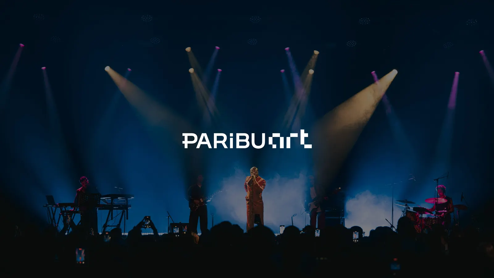
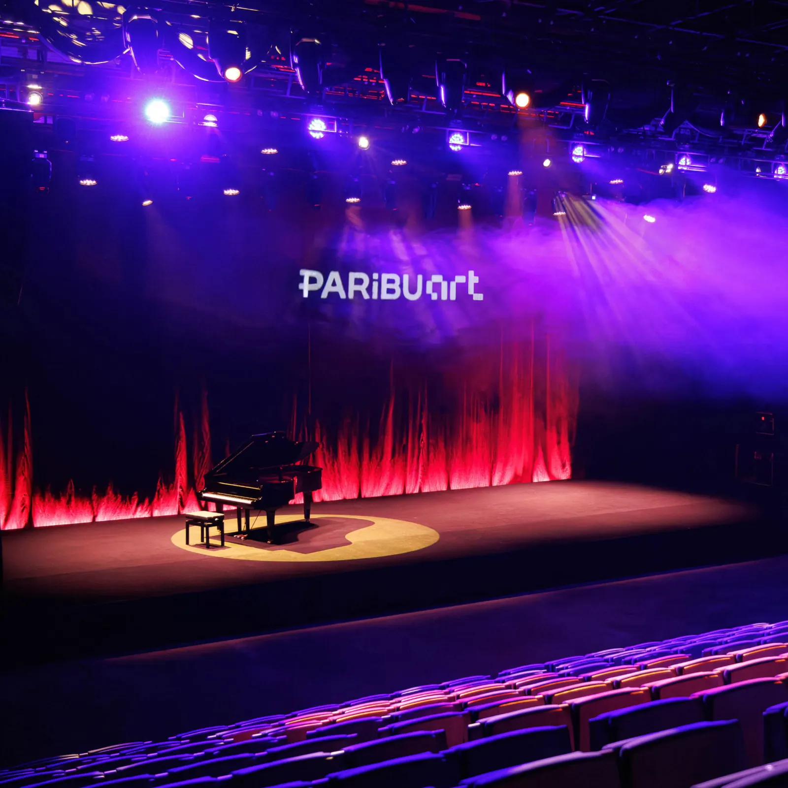
↗Most art brands wear a fixed logo, even though the work they show rarely stays put. Fol's identity for Paribu Art goes the other way. The studio built the mark from pixels, the smallest unit of a screen, and connected it to the physical space so the digital and the real read as one brand rather than two.
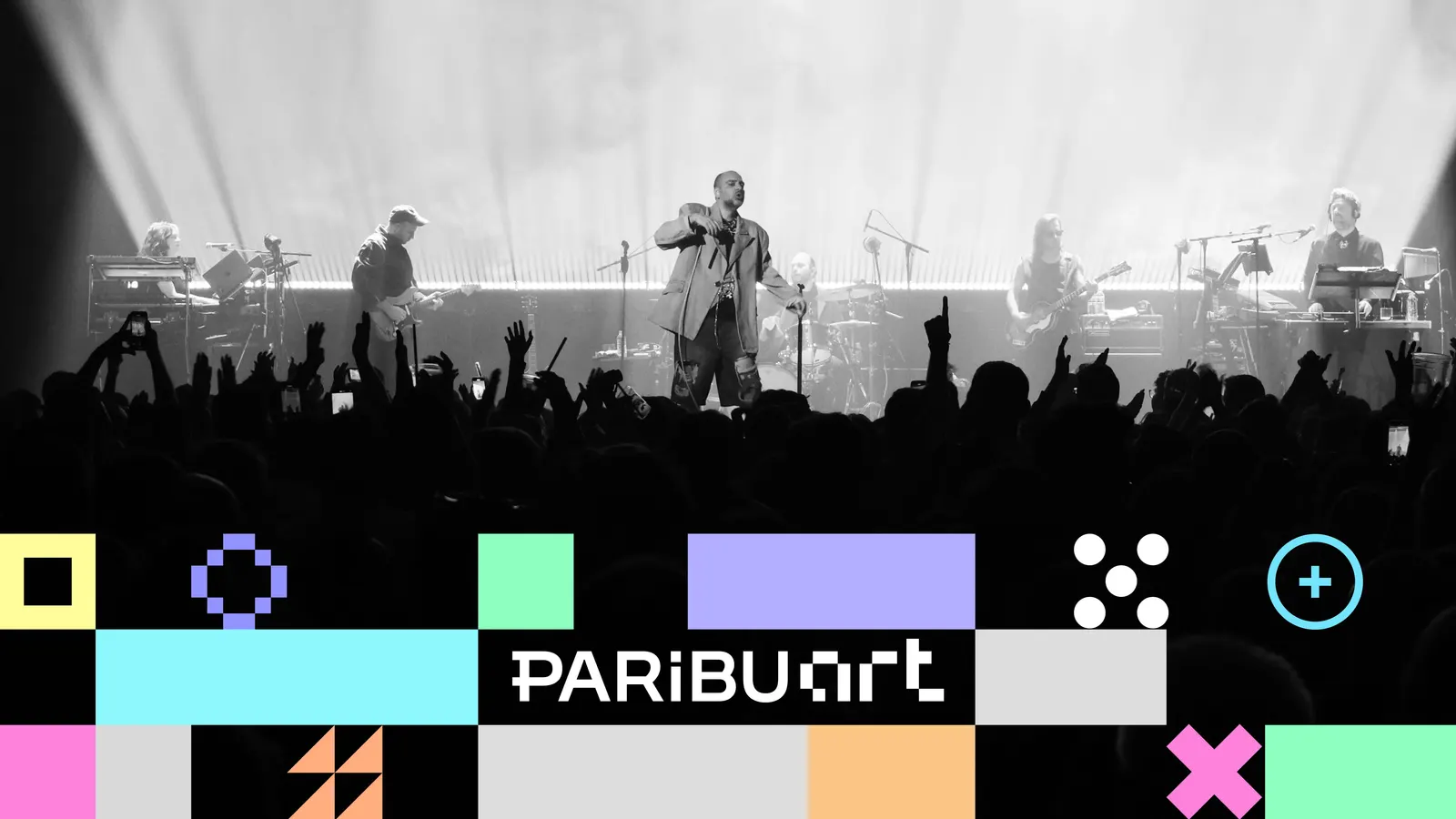
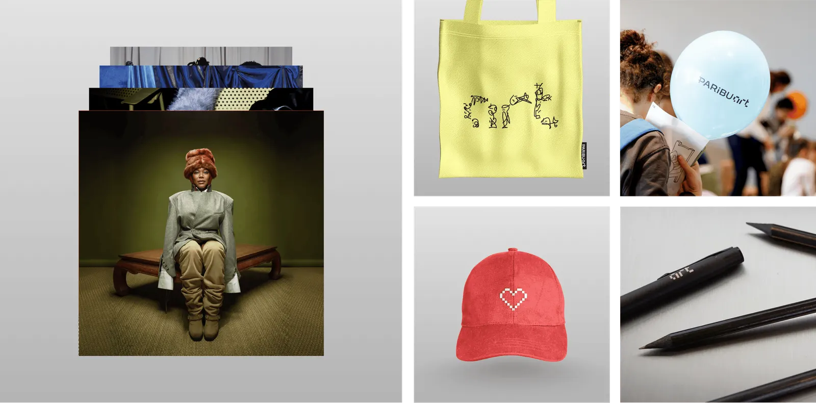
The brief was to make art feel explorable and interactive instead of something viewed from a distance. Behind the logo, Fol built a modular pixel system meant to be reworked with artists and audiences, not applied rigidly. Paribu Studio and TAF Studio contributed to the design, and TAF Studio handled typography. The result can shift from one context to the next and still be recognizable.
Why it works
The pixel is a smart choice because it is modular by nature. The logo and the system follow the same logic, so the mark isn't a one-off the rest has to chase. That makes the identity easy to extend without losing coherence. It also gives artists something to work with instead of a frame to sit inside. In a category that often defaults to neutral restraint, the pixel gives Paribu Art a clear point of view while leaving room for the work itself.
Applications
Typography
Logo
Images and video from fol.com.tr, by Fol.