The Brand Monograph
GRAU brand identity by Porto Rocha
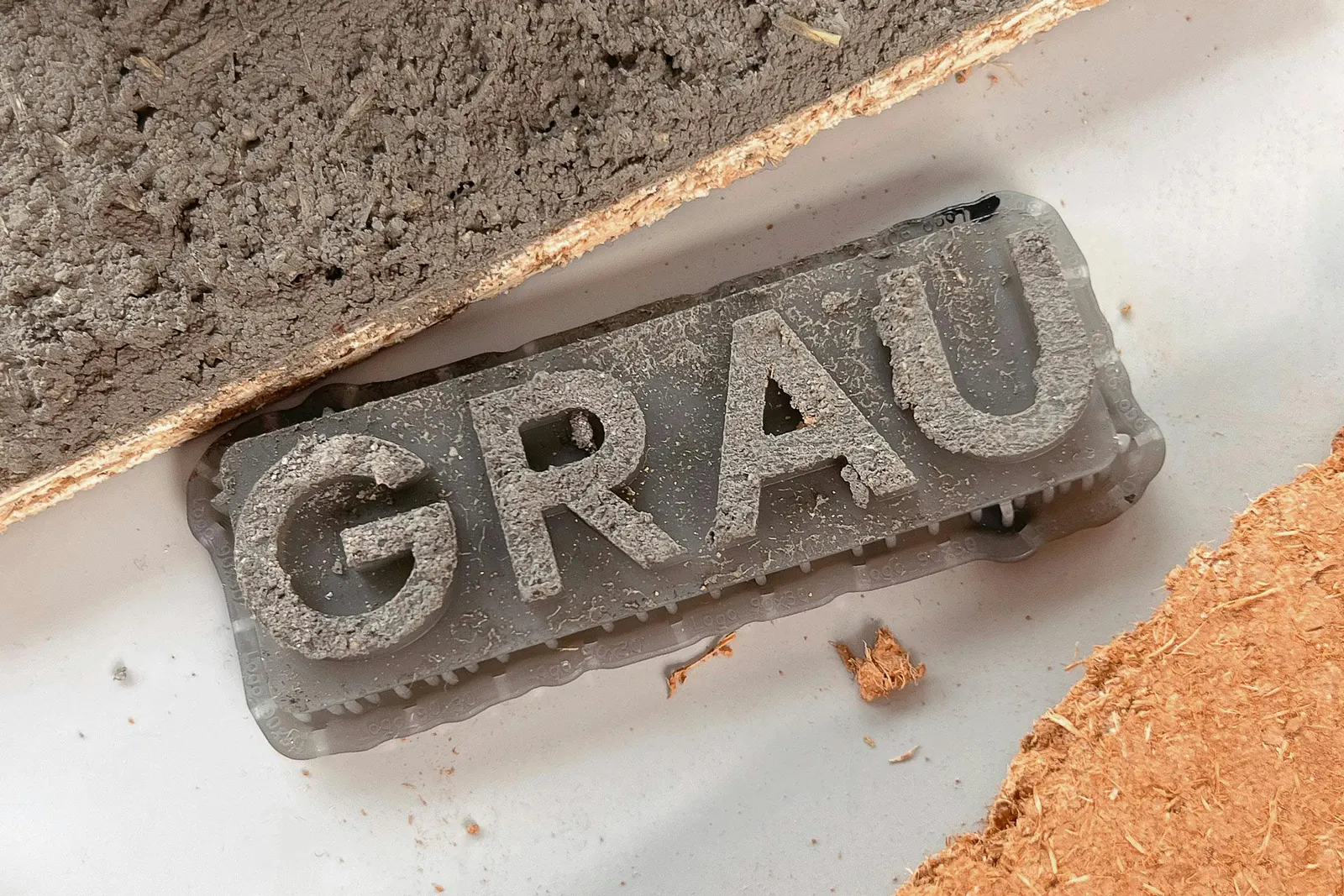
↗Most lighting brands sell the glow. Porto Rocha's identity for GRAU is more interested in what that glow does to the person standing in it. The brief came from a handover: brothers Timon and Melchior Grau were taking over their father Tobias's company and wanted a brand that could hold the family's industrial design heritage alongside their own work in art. Working with strategists Claren Walker and Natalee Ranii Dropcho, the studio chose wellbeing as its territory, a clear point of difference among European luxury names.
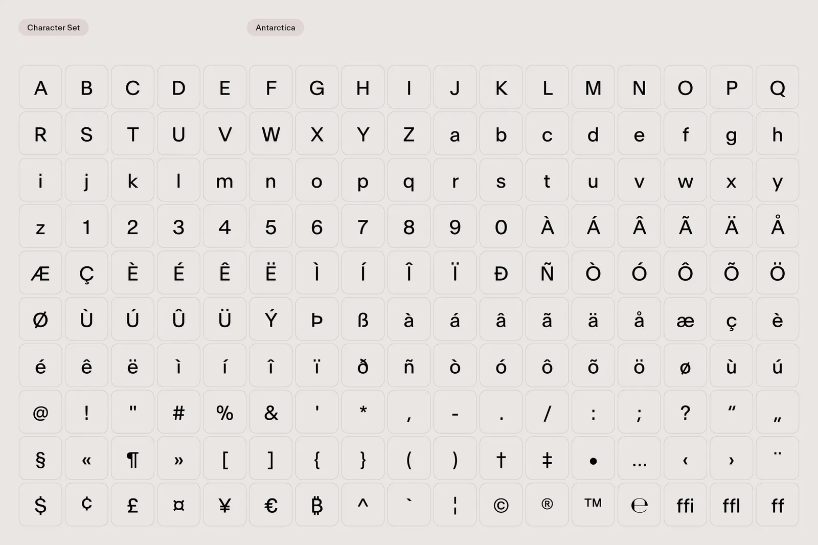
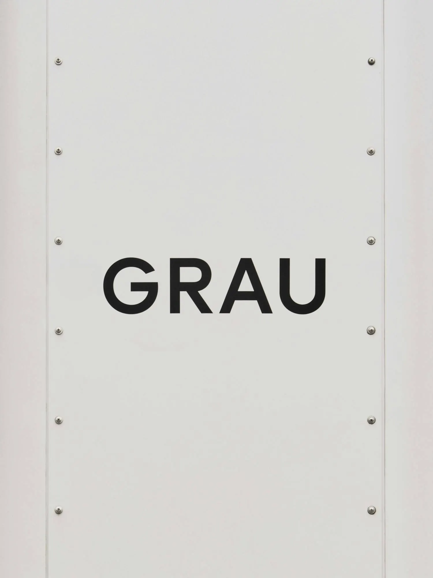
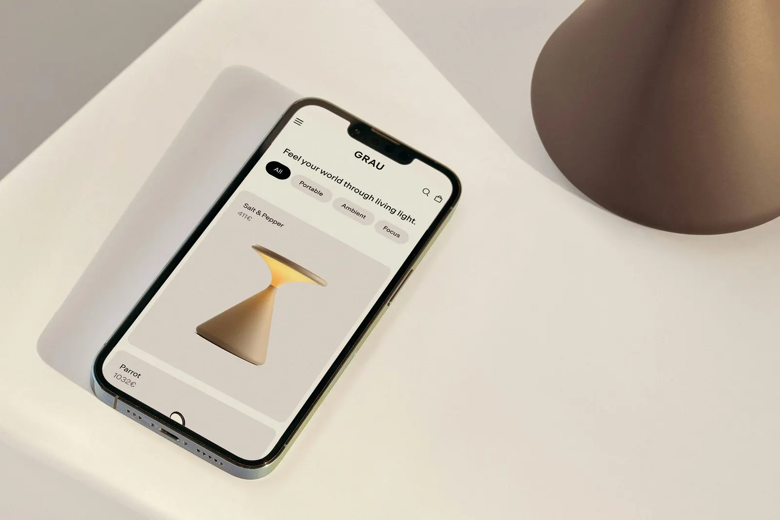
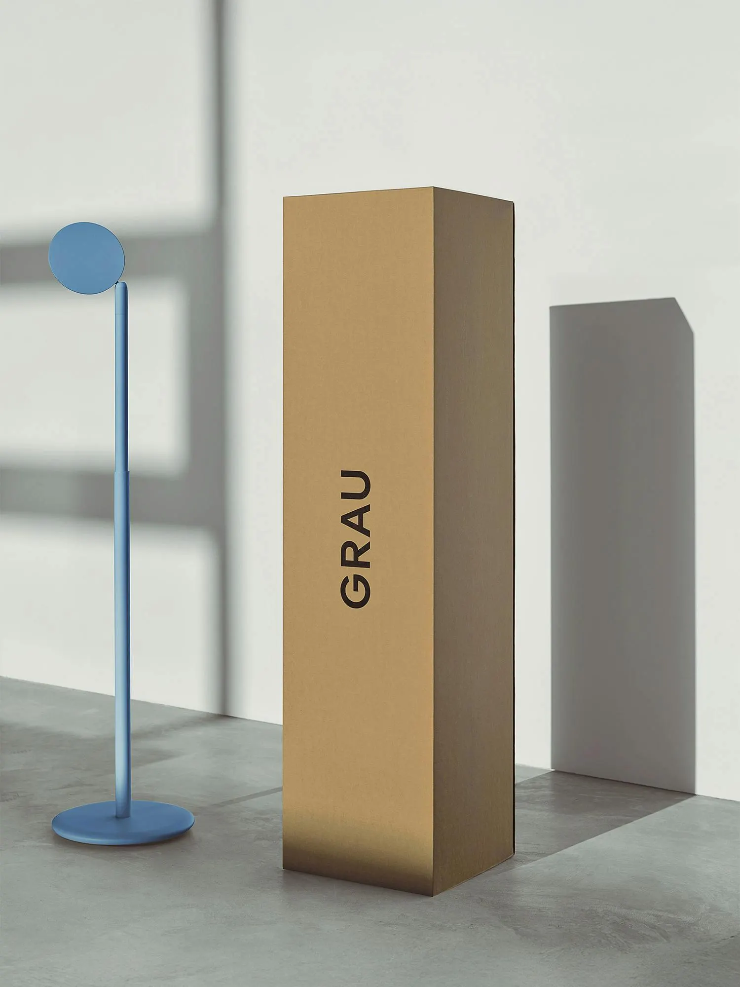
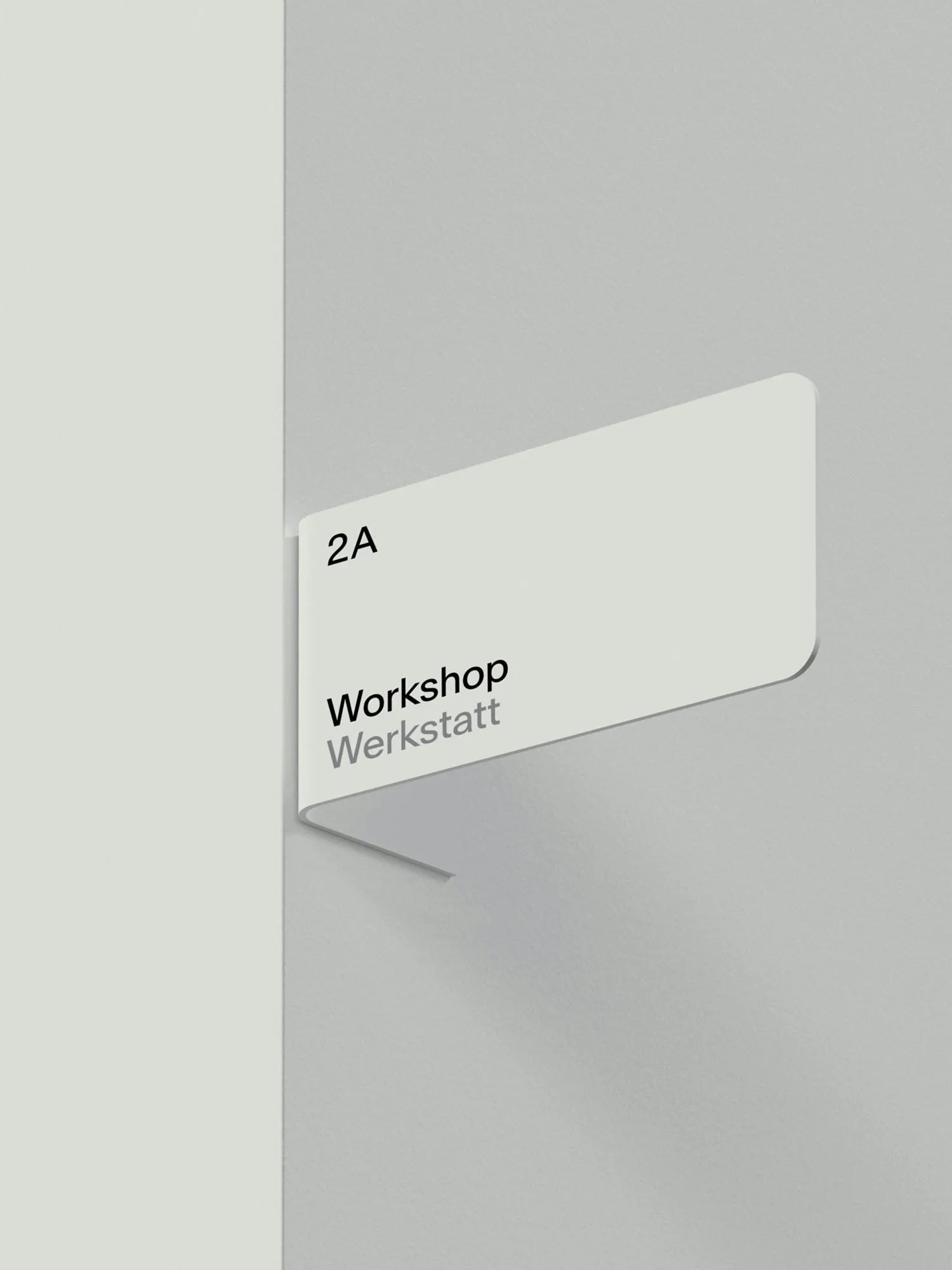
The system stays deliberately spare. Open geometric logo forms sit alongside Newglyph's Antarctica, in black and off-white with red and blue accents standing in for warm and cool light. Photography, including work by Simon Menges and Mathilde Agius, swings between sharp and hazy, and artist collaborations extend it. We Make Websites built the site to stay minimal and respond to interaction, while the copy alternates between open questions and plain technical detail.
Why it works
The restraint is the strategy. An open, geometric mark reads as unfinished in the best way, so it takes on meaning from whatever sits next to it, which suits a brand whose products change character the moment they're switched on. Limiting color to black, off-white, and two temperature accents keeps the palette functional rather than decorative, and it sidesteps the gilded, serif-heavy cues common in heritage luxury. The result feels closer to a gallery than a showroom, which fits buyers who care about ideas as much as finish.
Applications

Typography
Logo
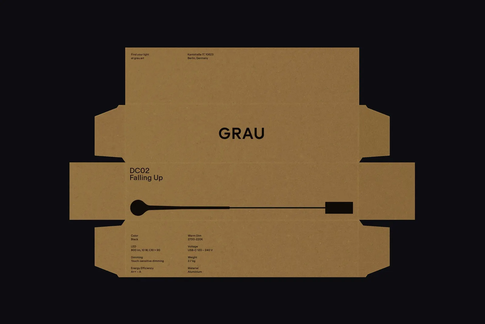
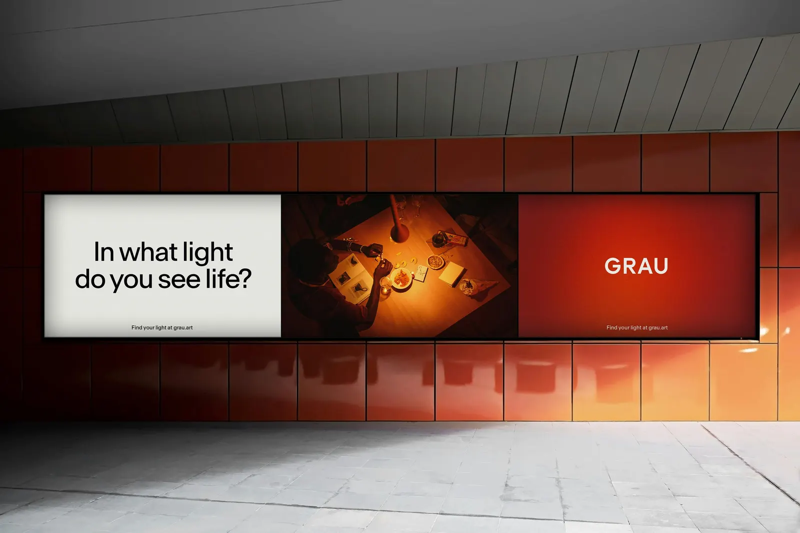
Images and video from portorocha.com, by Porto Rocha.