The Brand Monograph
First Choice brand identity by Ragged Edge
↗Ragged Edge took the part of holiday booking most people dread, the endless choosing, and made it the reason to pick First Choice. The brand has been a fixture for three decades, from British high streets to the TUI group's online business, but its all-inclusive reputation sat awkwardly with younger travelers who want more say in how they spend their time off.
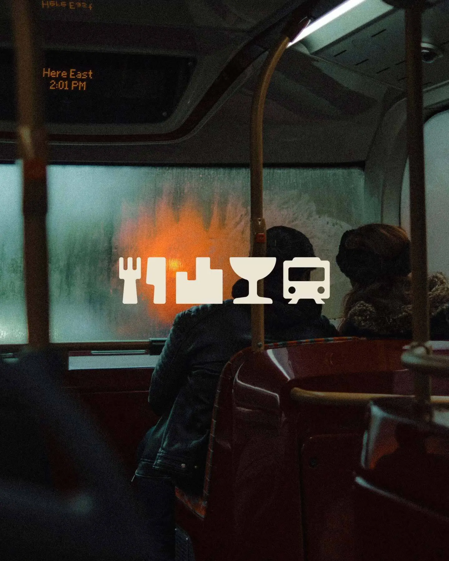
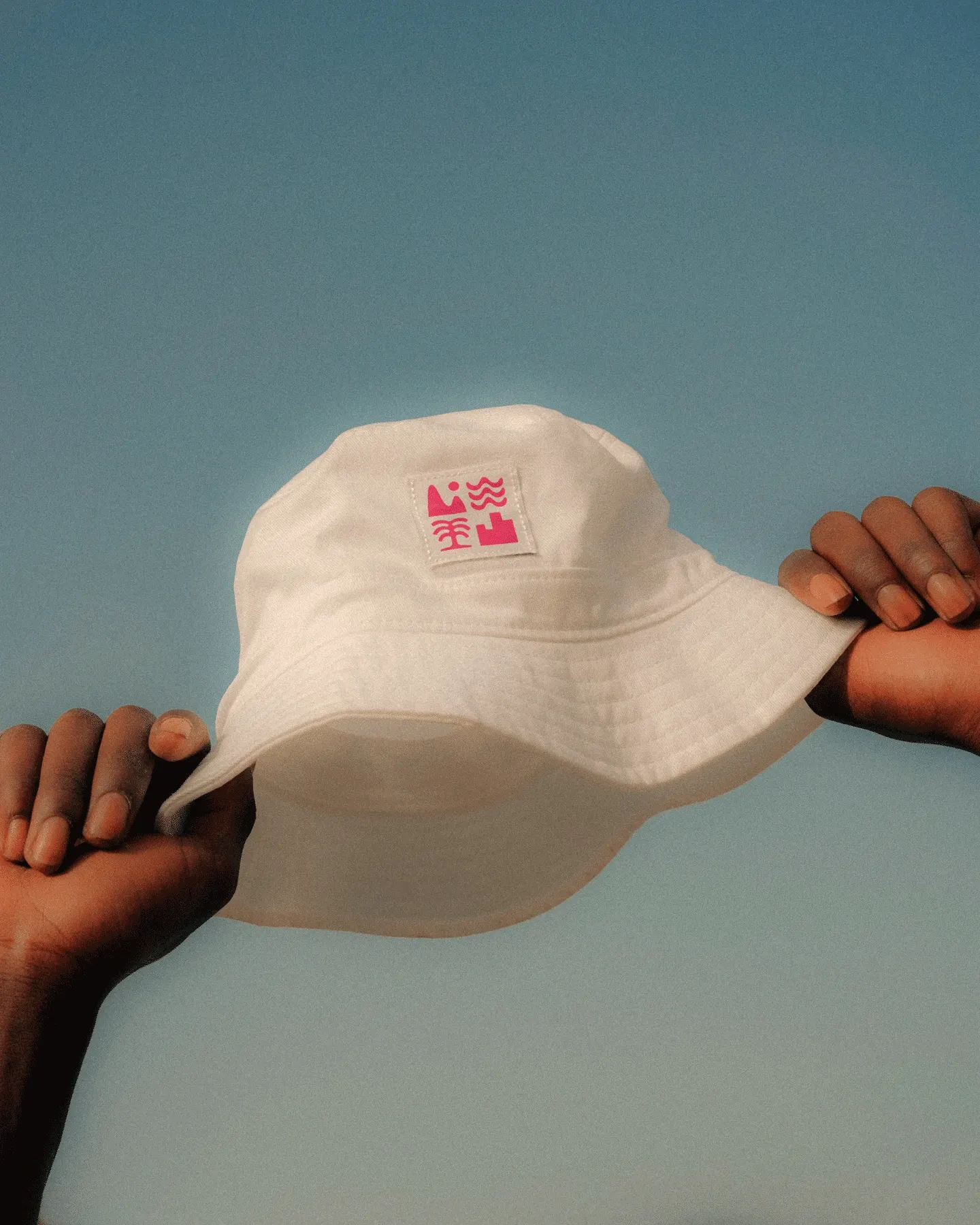
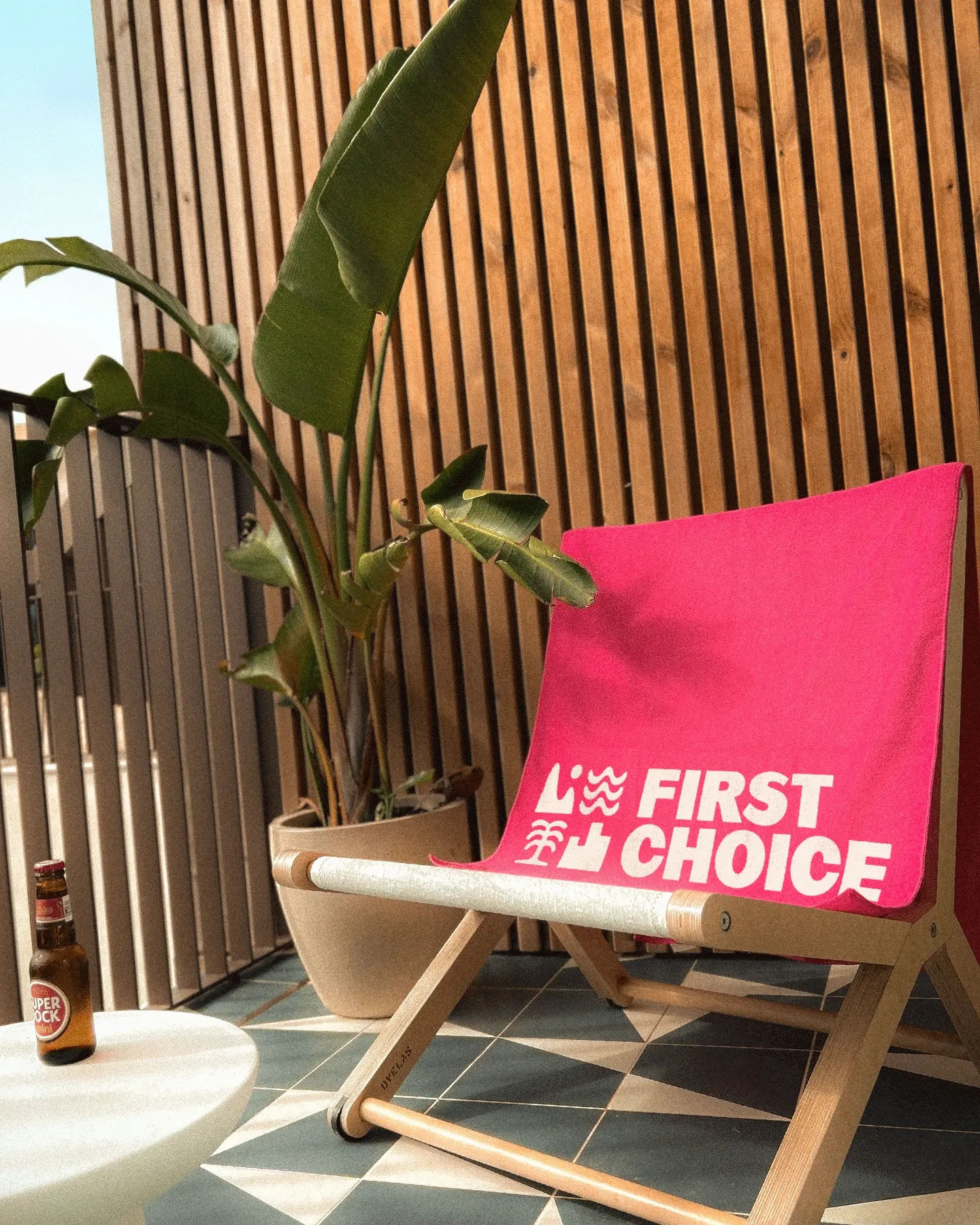
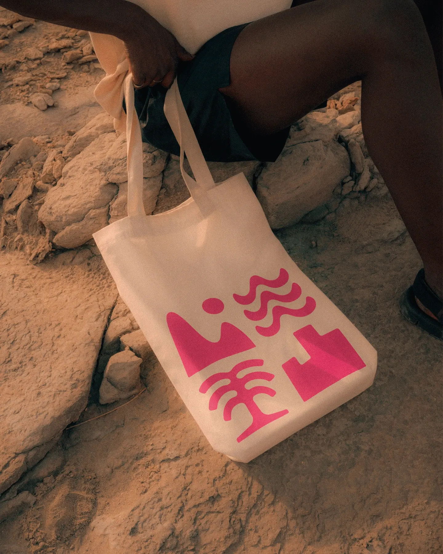
The studio's answer is a personalized product and an identity that celebrates having preferences. Customers start from an interest or a destination and build outward. A set of icons for pool, mountain, city, and sea works as visual shorthand for mixing experiences, and a customized headline typeface, developed with Benjamin Tuttle and Order Type Foundry, gives the voice an assertive edge. Photography stays close to the people on holiday. Ragged Edge carried the thinking through the website, digital product, and campaign.
Why it works
The icons do real work. They turn a daunting menu of options into something quick to read and fun to combine, which suits a category usually defined by dense filters. The custom type gives the brand a recognizable voice where generic sans serifs tend to blend together, and the close-up photography puts people ahead of inventory. Most of all, the idea is built into the product, with Flight-Free and Flex as proof, so it reads as a promise the brand keeps rather than a slogan.
Applications
Logo
Typography
Images and video from raggededge.com, by Ragged Edge.