The Brand Monograph
Go.Compare brand identity by Ragged Edge
↗Most brands try to outgrow a mascot people have strong feelings about. Ragged Edge went the other way and made Gio the center of the Go.Compare rebrand. The studio started from a tricky position: near-universal recognition in the UK, but no guarantee anyone would pick Go.Compare once they started comparing.
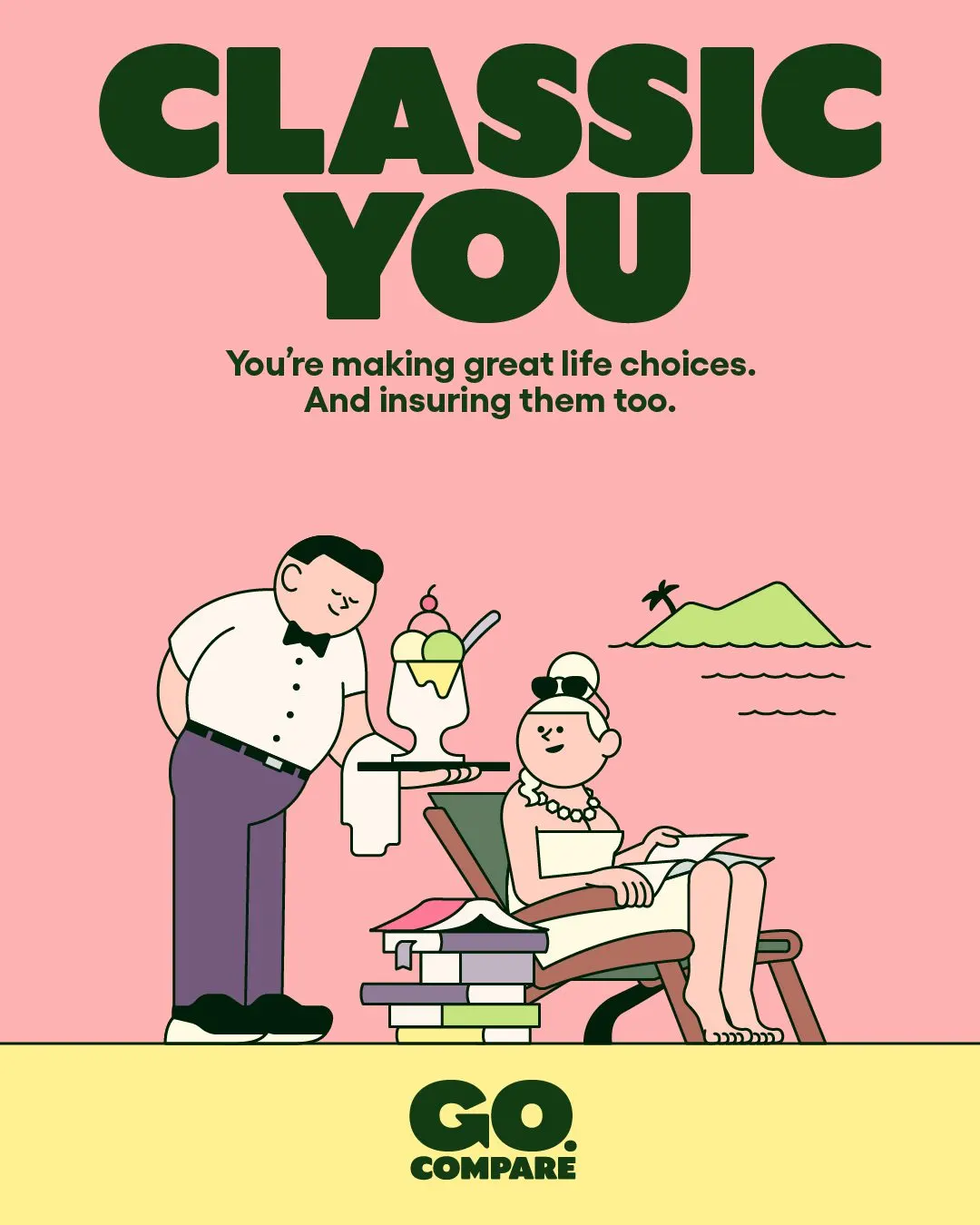
The studio anchored the strategy in something rivals couldn't copy, Go.Compare's status as the only BIBA accredited price comparison site, then gave that idea a face. Gio was redrawn as an exaggerated, animation-ready cartoon who can appear on TV, in stadiums, on social, and inside the product. Illustrator Rami Niemi collaborated on an illustration system that extends Gio's style to everyday situations, and a bespoke typeface carries the same warmth into the copy. Record revenues of £158 million followed in the year after the rebrand.
Why it works
The best decision here is restraint about what to change. Instead of replacing a divisive character, Ragged Edge sharpened him until he could carry a whole system. Custom illustration gives the brand a visual language of its own in a category where interchangeable stock photos are the norm, and a typeface drawn to match keeps the voice consistent with the pictures. The dot in the name is small but smart: it turns a title into an address, which suits a brand whose job is to be chosen at the moment of search.
Applications
Logo



Images and video from raggededge.com, by Ragged Edge.