The Brand Monograph
Solflare brand identity by Ragged Edge
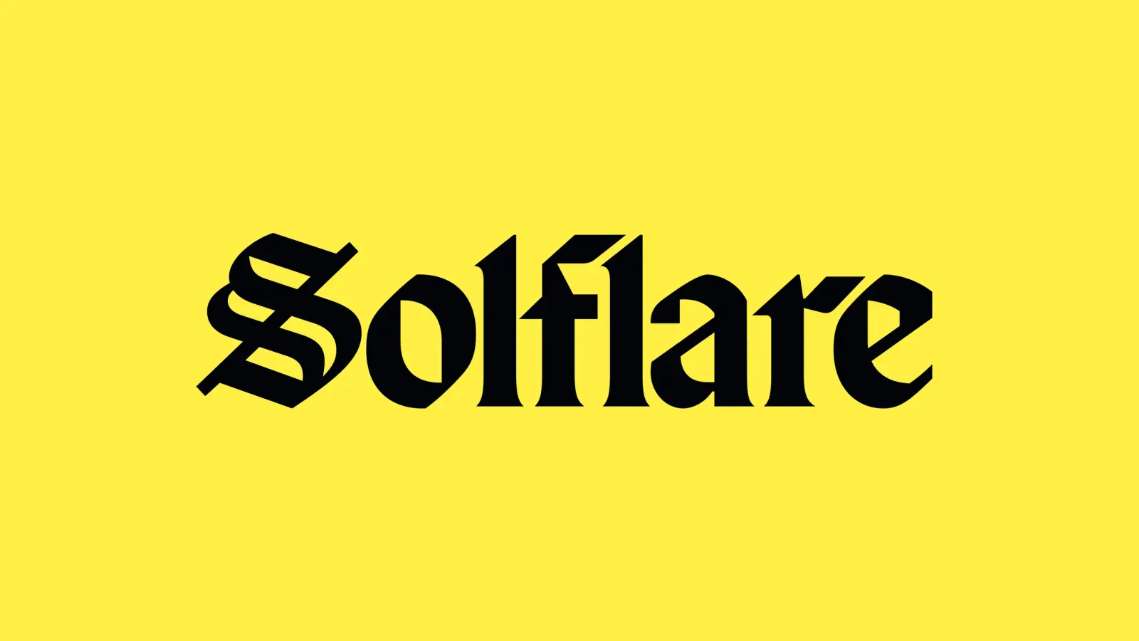
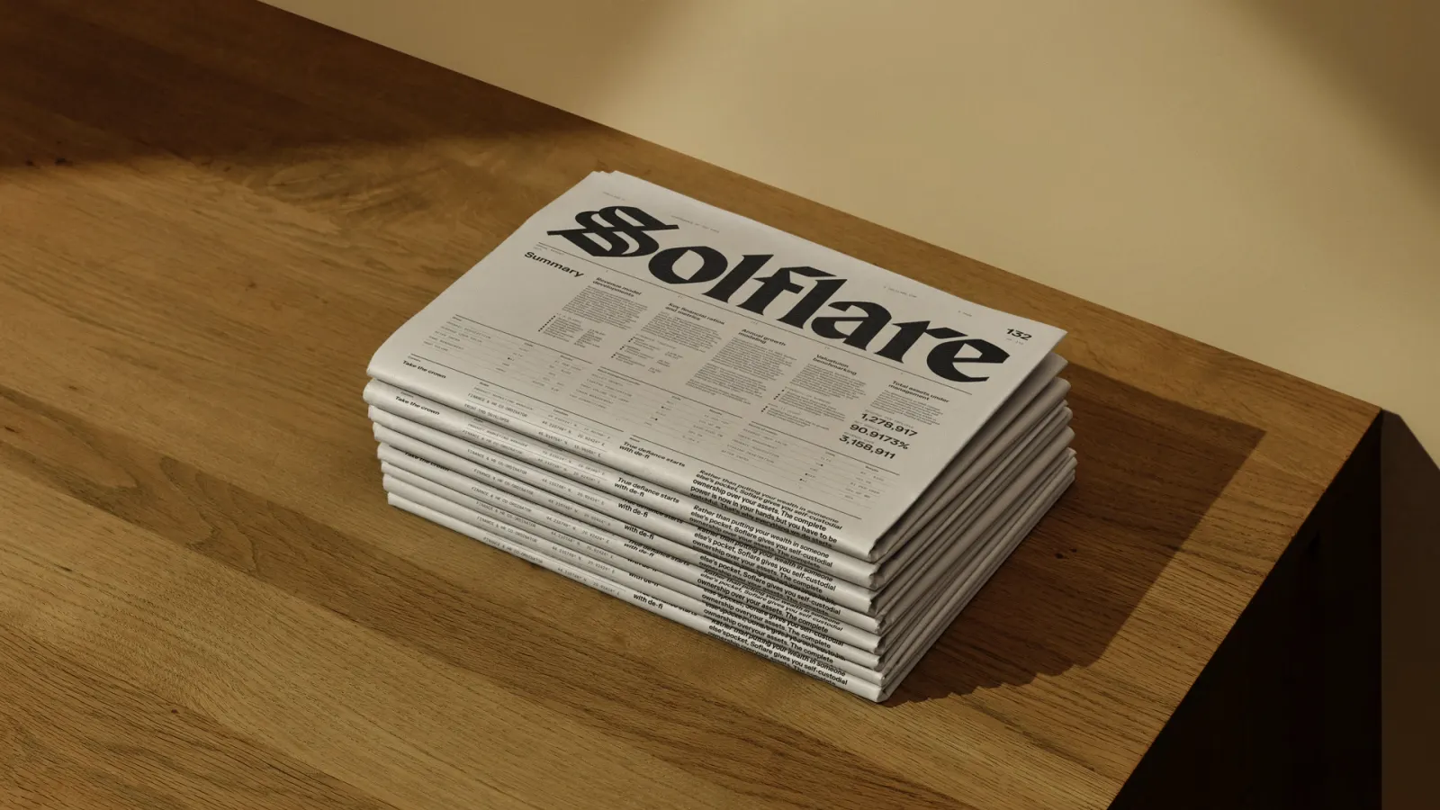
↗Few crypto brands look like they were issued by a bank, which is why Ragged Edge's work for Solflare stands out. In a category full of neon gradients and jargon, the studio looked backward to the visual language of old money to make a Solana wallet feel dependable.
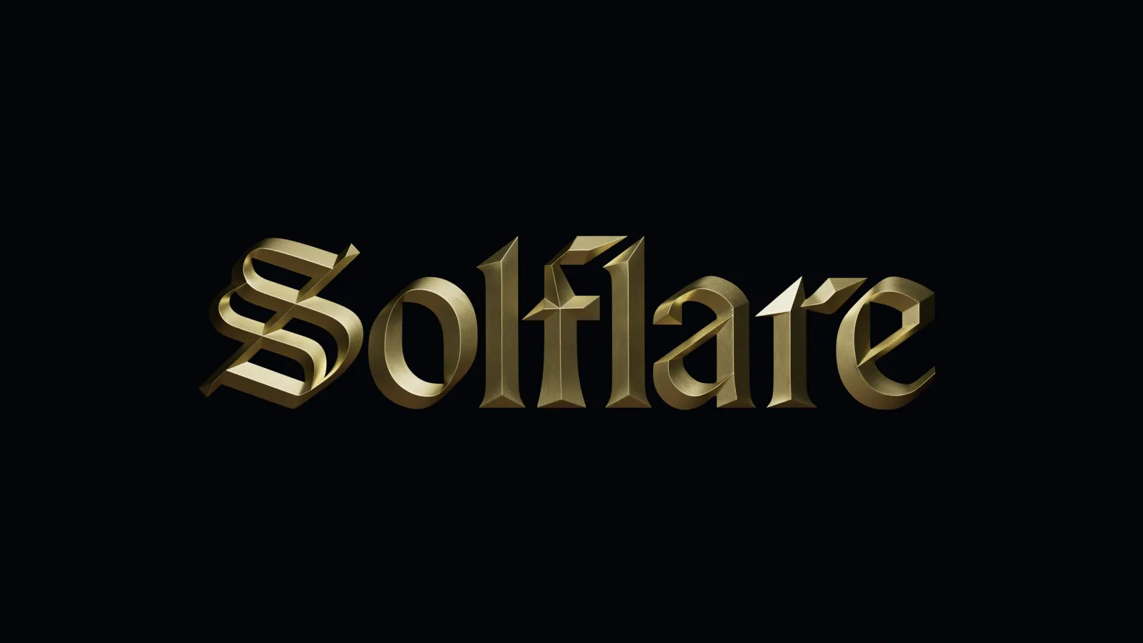
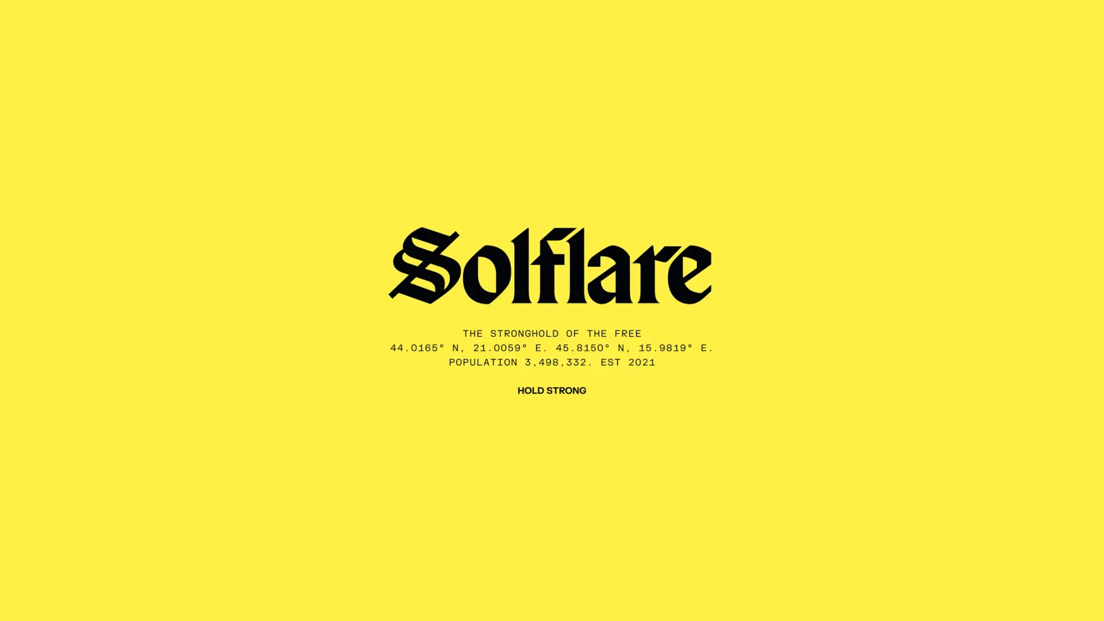
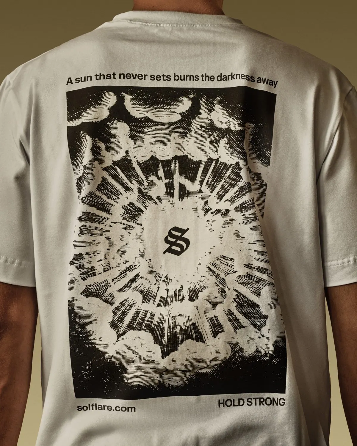
The brief was to set Solflare apart from better-known but less secure rivals and to reach people wary of a scam-ridden ecosystem. Ragged Edge positioned the wallet as a refuge for people who want control of their finances. The logo draws on the script of the earliest bank charters, and engraving-style illustrations come with a tool that lets Solflare's team make more. Restrained lighting, tight navigation, and clear type carry the idea through the website, built with Bornfight Studio, and into the product, with photography by Charlie McKay. Within six months of launch, 1.5 million users had joined.
Why it works
The charter-style script makes the logo feel like a signature, a mark of authority in a category dominated by generic sans-serif futurism. Engraving is a smart borrowing too, since it recalls banknotes and certificates, and the illustration tool keeps it from turning into a museum piece. Sparing light and clear type give the interface a calm that competitors rarely offer. For newcomers who are nervous about losing money, that calm reads as safety before they've read a word about security.
Applications
Logo
Images and video from raggededge.com, by Ragged Edge.