The Brand Monograph
Omlet brand identity by Ragged Edge
↗Ragged Edge's rebrand for Omlet stands out because it treats the company's curiosity as the brand itself, not as a tagline. The maker of the Eglu Cube had already sold 150,000 coops and built a devoted community of keepers. With a widening range and fresh investment, it needed a story that could travel beyond its home market, in a category that mostly plays it safe.
The studio worked with the founders and the in-house team to boil that habit of questioning down to one idea, a World Of Wonder, then built the identity from the principles behind Omlet's product design. The wordmark is redrawn with a visible sense of fun. Illustration, led by Holly Szczypka, runs from small icons to animated stories, with Adam Garbutt handling motion. In the first year, social engagement rose 87%, ad click-throughs 30%, and add-to-cart rates 44%.
Why it works
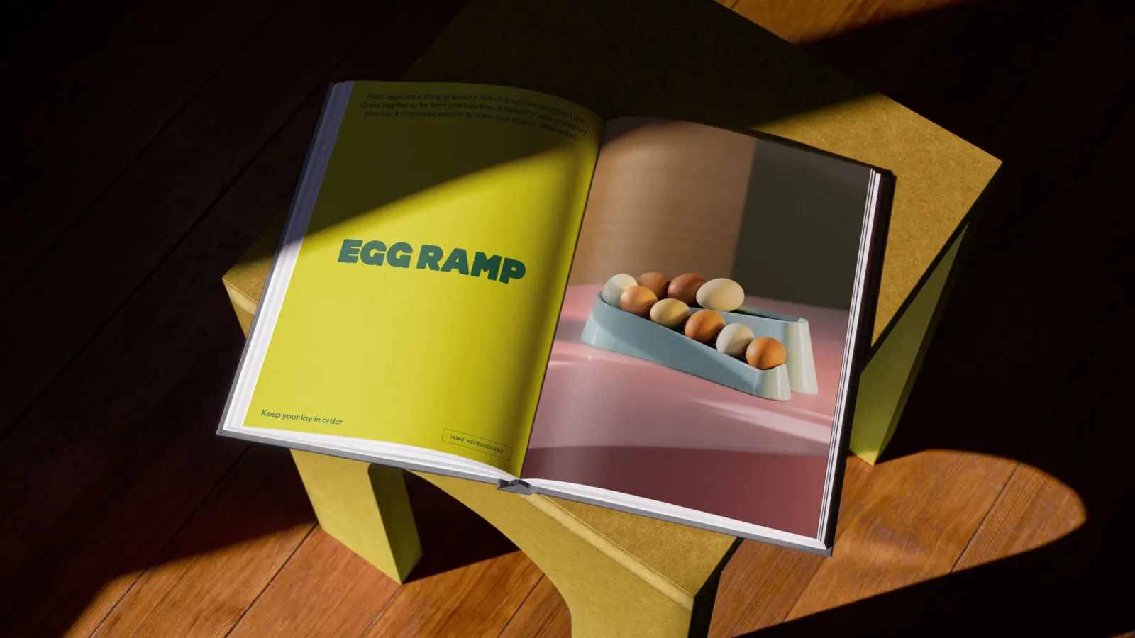
Pet care branding tends to split between clinical reassurance and generic cuteness. Ragged Edge avoids both by making the illustration look handmade and physical, which matches how the coops themselves feel to own and signals that these are designed objects, not commodity hutches. The friendly wordmark keeps the tone warm without turning twee. Illustration is also a flexible tool: it stretches from packaging to motion without losing character, which is why an in-house team can keep extending it with confidence.
Applications
Logo
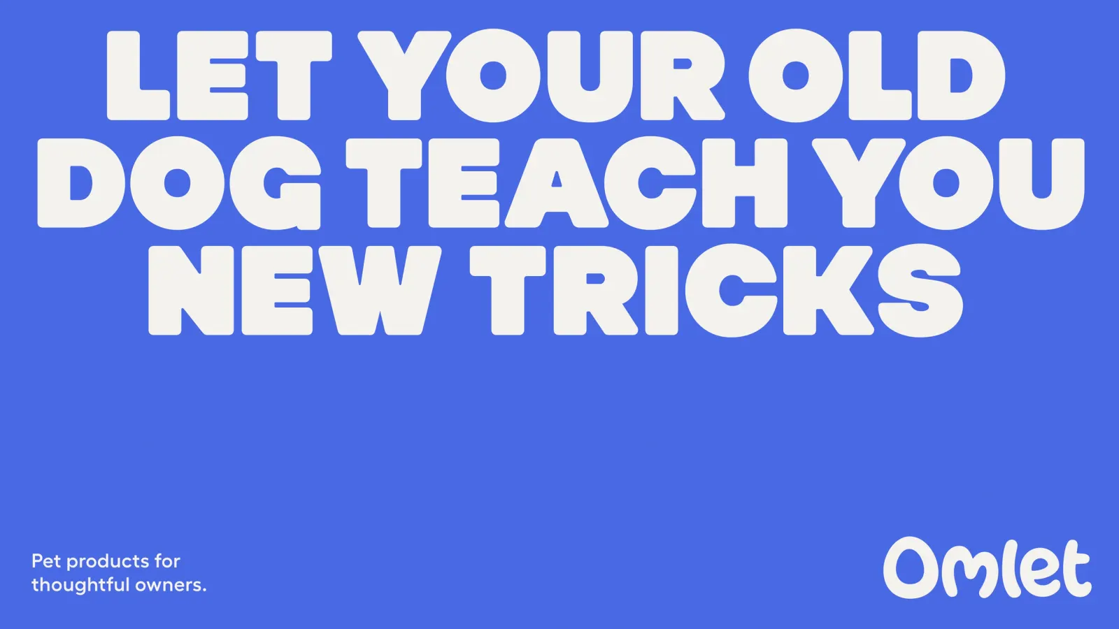
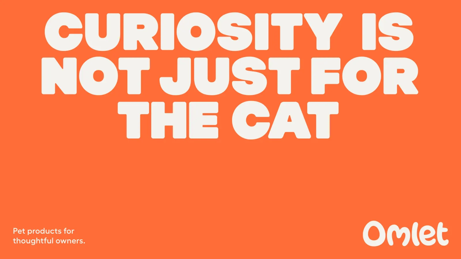
Images and video from raggededge.com, by Ragged Edge.