The Brand Monograph
Fhirst brand identity by Mother Design
↗Fhirst arrives in a cooler where healthy drinks have started to look alike, with pale palettes, thin sans serifs, and calm reassurance. Mother Design took the opposite route for this probiotic soda, whose founders spent years on the science linking gut bacteria to mood. The studio gave the brand a louder job: be the soda for people who want more than the default.
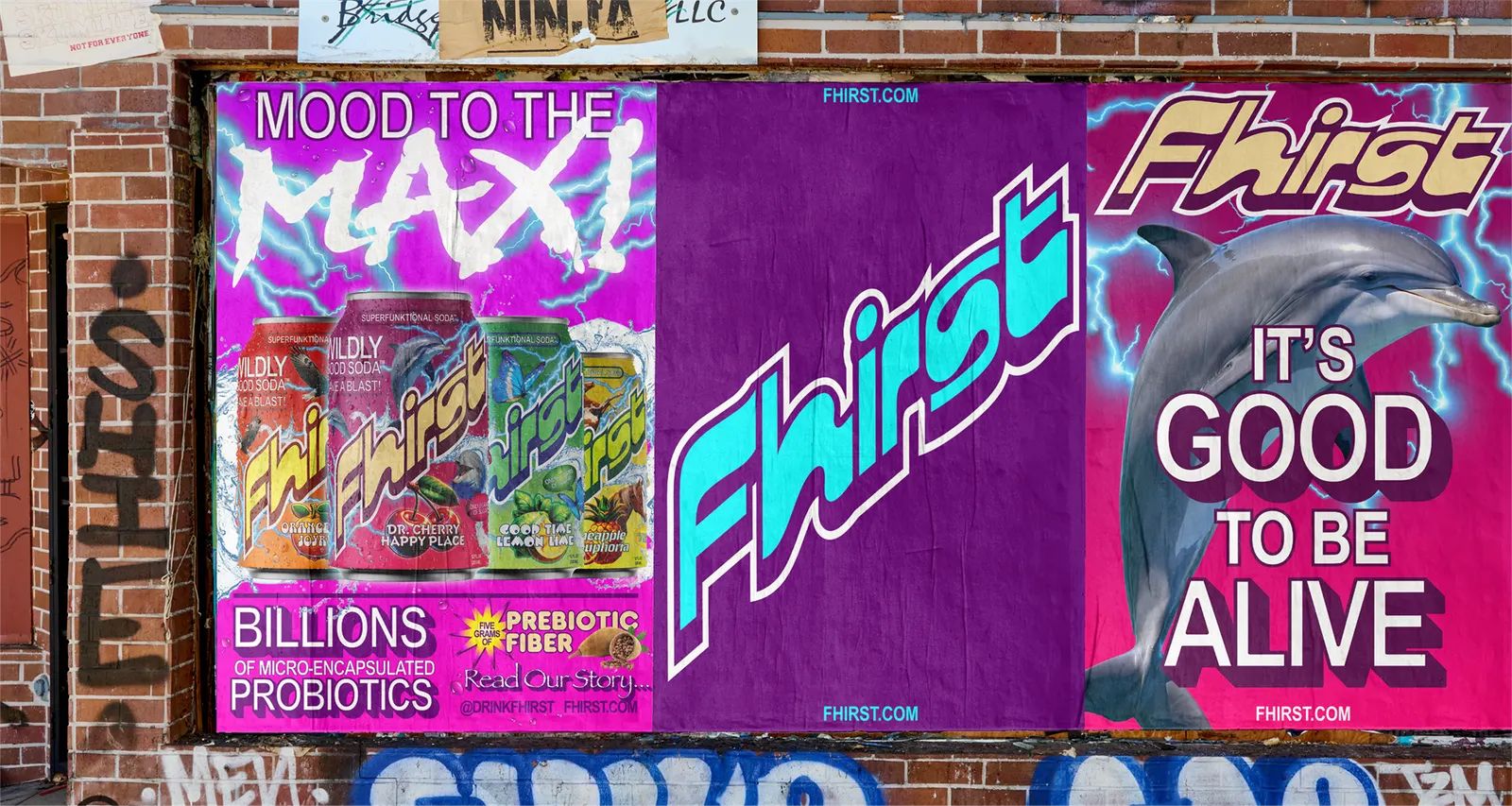
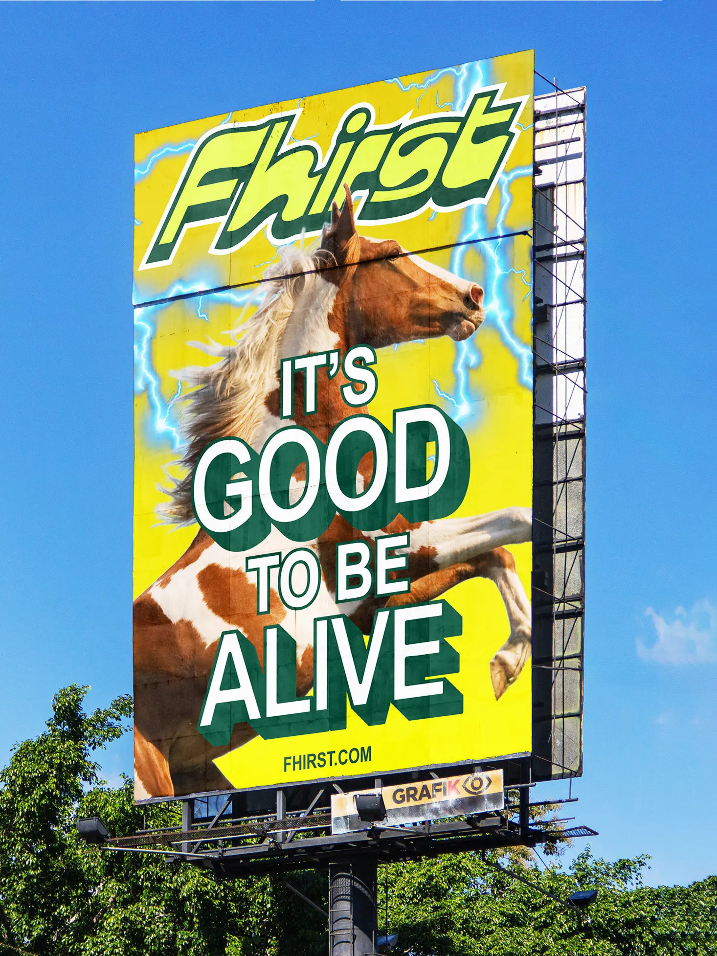
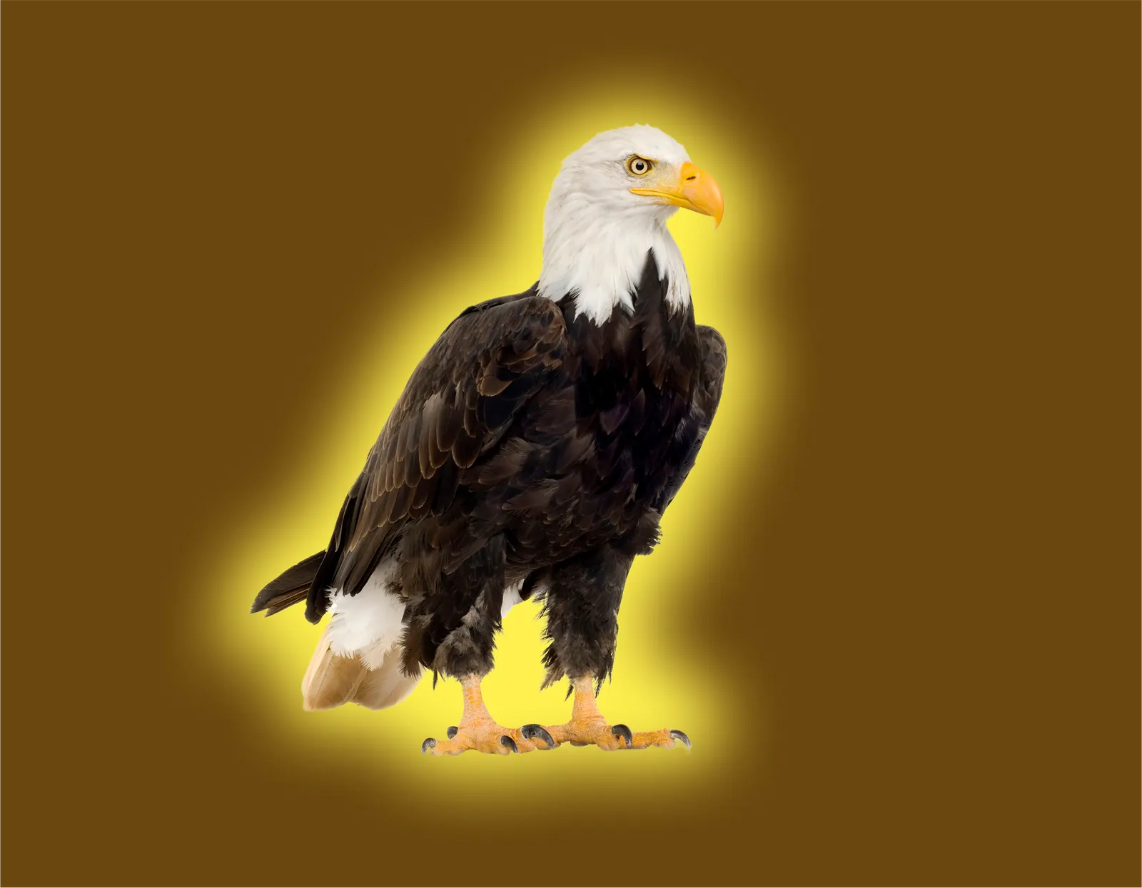
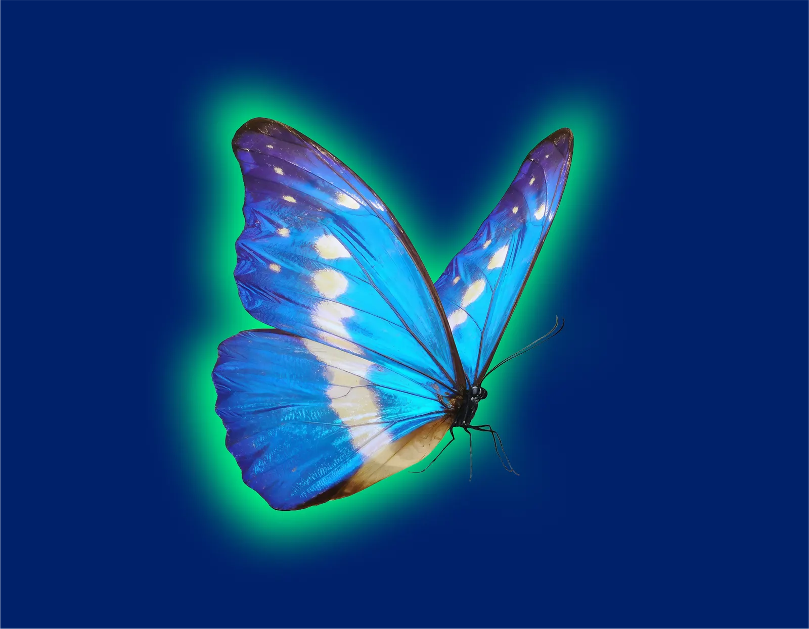
The result is a maximalist identity that crosses soda-aisle swagger with the look of a neighborhood vitamin shop. The wordmark nods to Othmar Motter's Motter Regatta, while Papyrus, Frankfurter, Blackmoor, and Beesknees bring dated signage energy to each flavor. An eagle, butterfly, dolphin, and horse serve as mascots, and every flavor gets its own gradient and color pairing, anchored by cyan and purple. The system stretches from cans to vending machines, stickers, and merch, and it can be turned up or down as needed.
Why it works
Fhirst's identity treats the category's blandness as the problem and answers with confidence rather than volume alone. Choosing typefaces that designers usually avoid, Papyrus above all, reads as a deliberate joke, and that self-awareness makes the brand feel honest instead of preachy. The gradients bring back the appetite appeal that wellness packaging often gives up. The mascots also give the range a recognizable cast without forcing every flavor into one look. Credibility stays in the product, so the shelf presence can be about pleasure.
Applications

Logo
Typography

Images and video from motherdesign.com, by Mother Design.