The Brand Monograph
Scribd brand identity by Mother Design
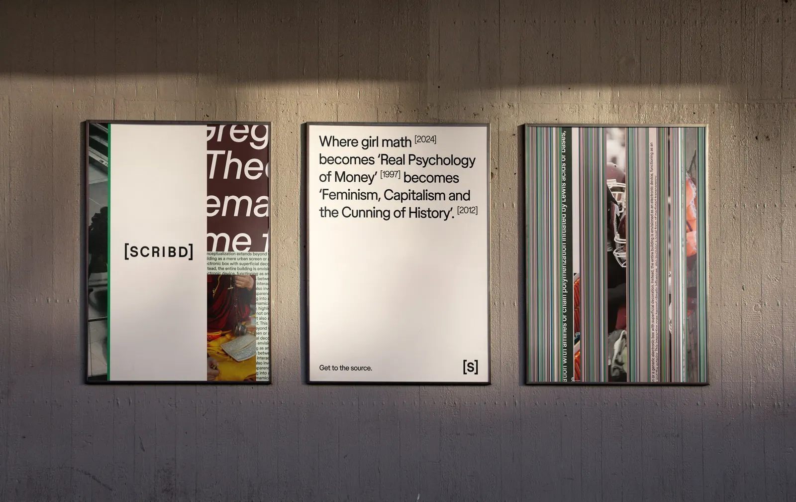
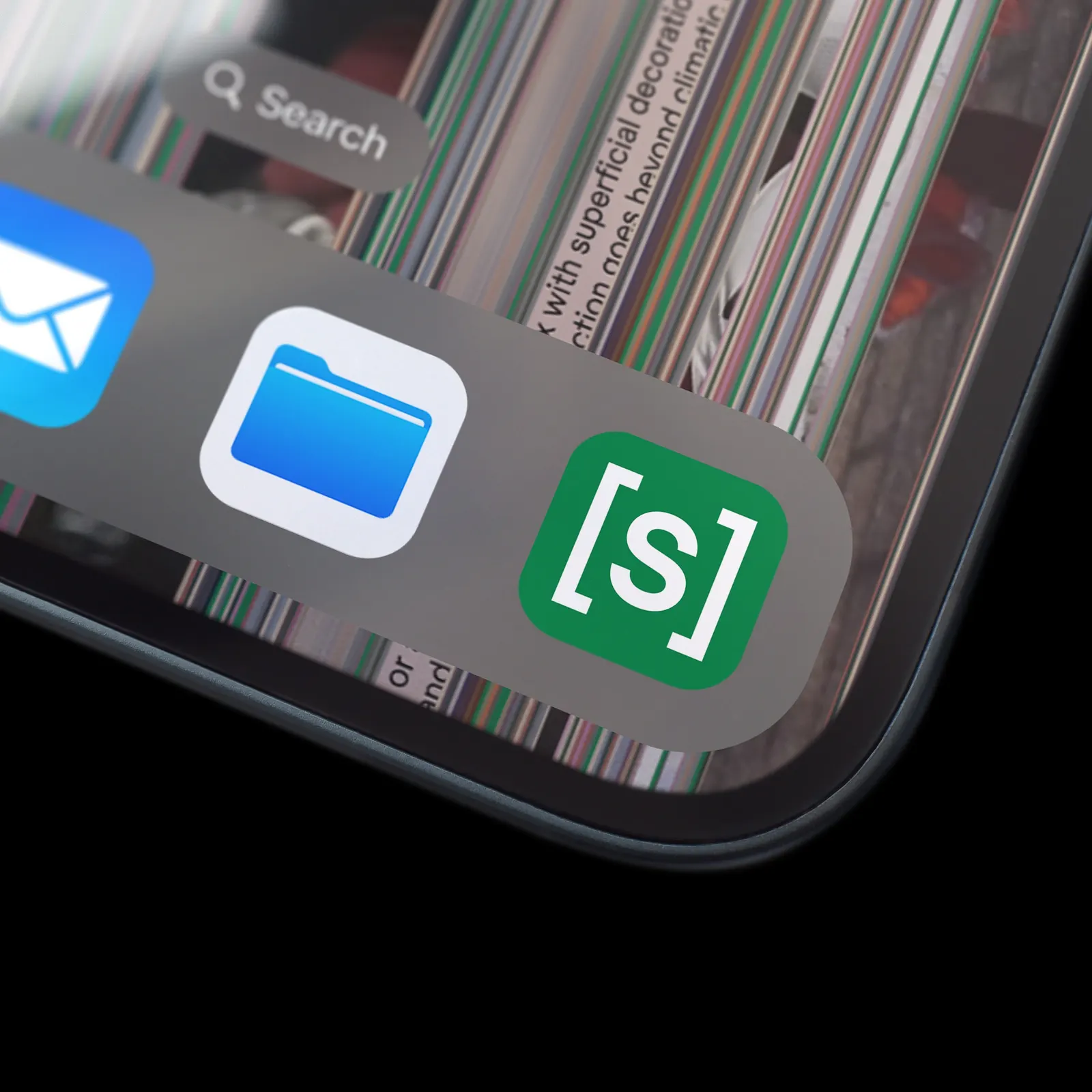
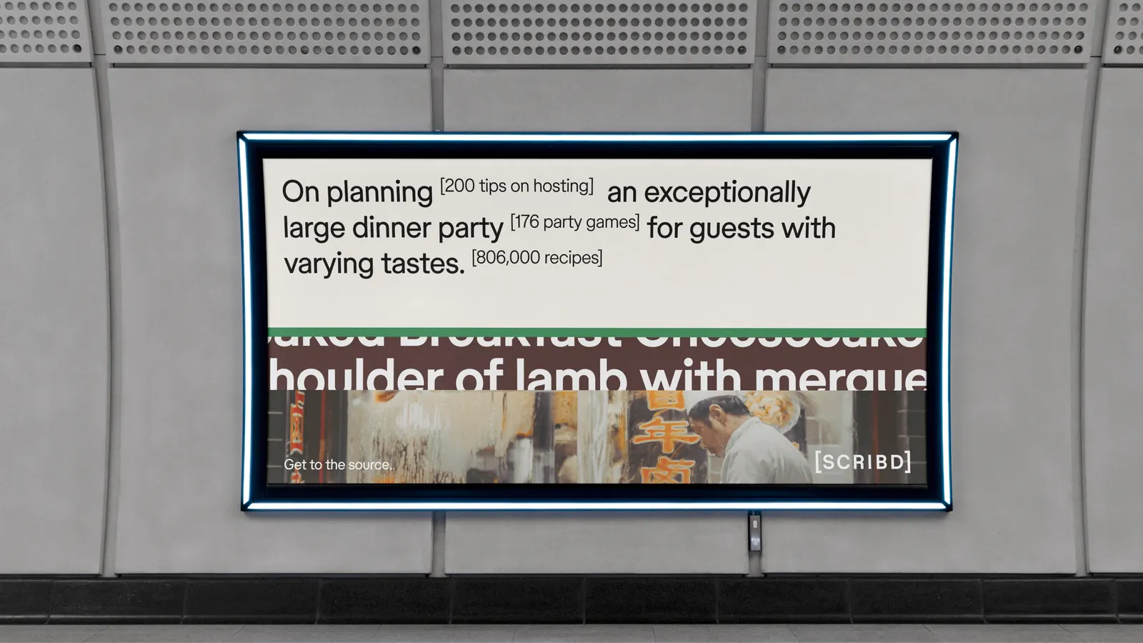
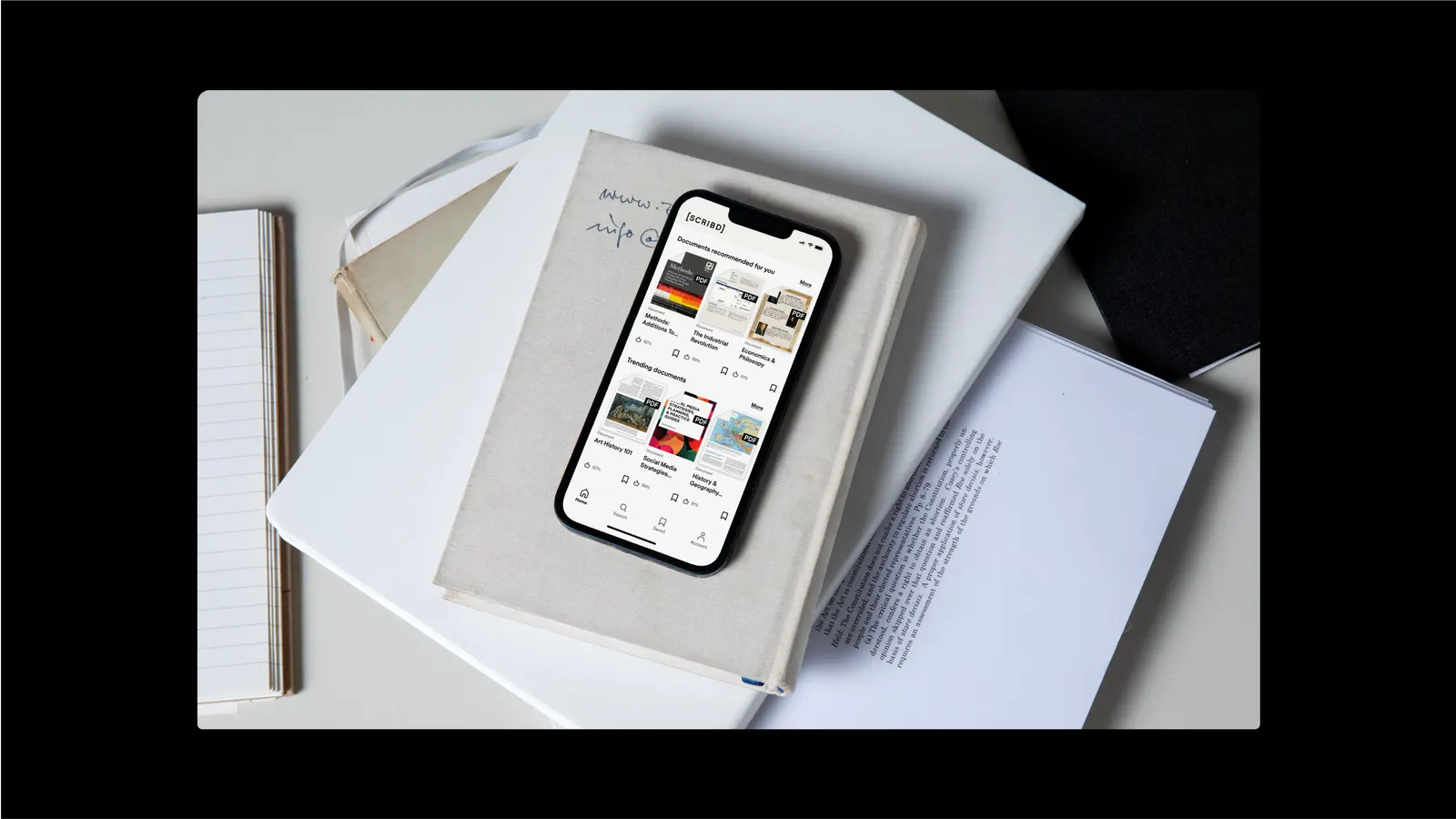
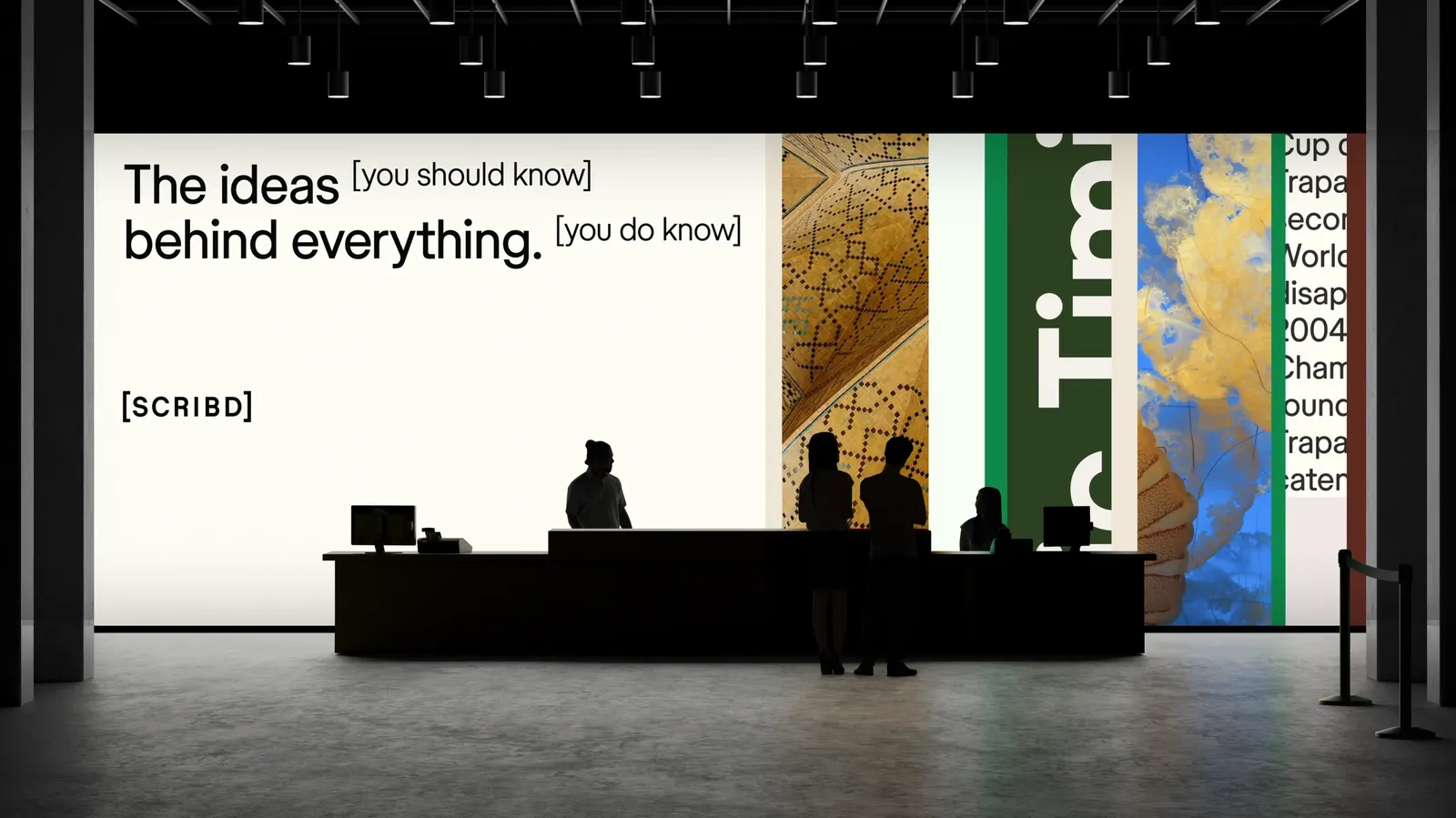
↗Scribd holds more than 200 million documents from nearly two million contributors, but its brand used to sound like a utility. Mother Design gave it a stance instead: Scribd as the place that shows its sources. Referencing runs through the whole identity, from the bracketed logo to the symbols and annotations that sit alongside headlines and add detail.
Store Norske Skriftkompani worked with the studio on a type system drawn from citation details and wayfinding signage. The palette is black, off-white, and one bright green, backed by custom icons and a humanist sans that keeps reading easy. Graphics grow denser to suggest the move from one document to a whole library, while textural, deliberately ambiguous imagery invites a closer look.
Why it works
The bracket is a mark that feels borrowed from the page rather than invented for a logo slide, so it carries the idea without explaining it. Green used sparingly acts like a highlighter, which keeps a huge, messy catalog navigable. The formal voice may be the smartest move. Most tech brands compete on friendliness, and Scribd earns trust by being precise and a little serious. That suits readers who come looking for answers.
Applications
Typography
Logo
Images and video from motherdesign.com, by Mother Design.