The Brand Monograph
Mindful Chef brand identity by Mother Design
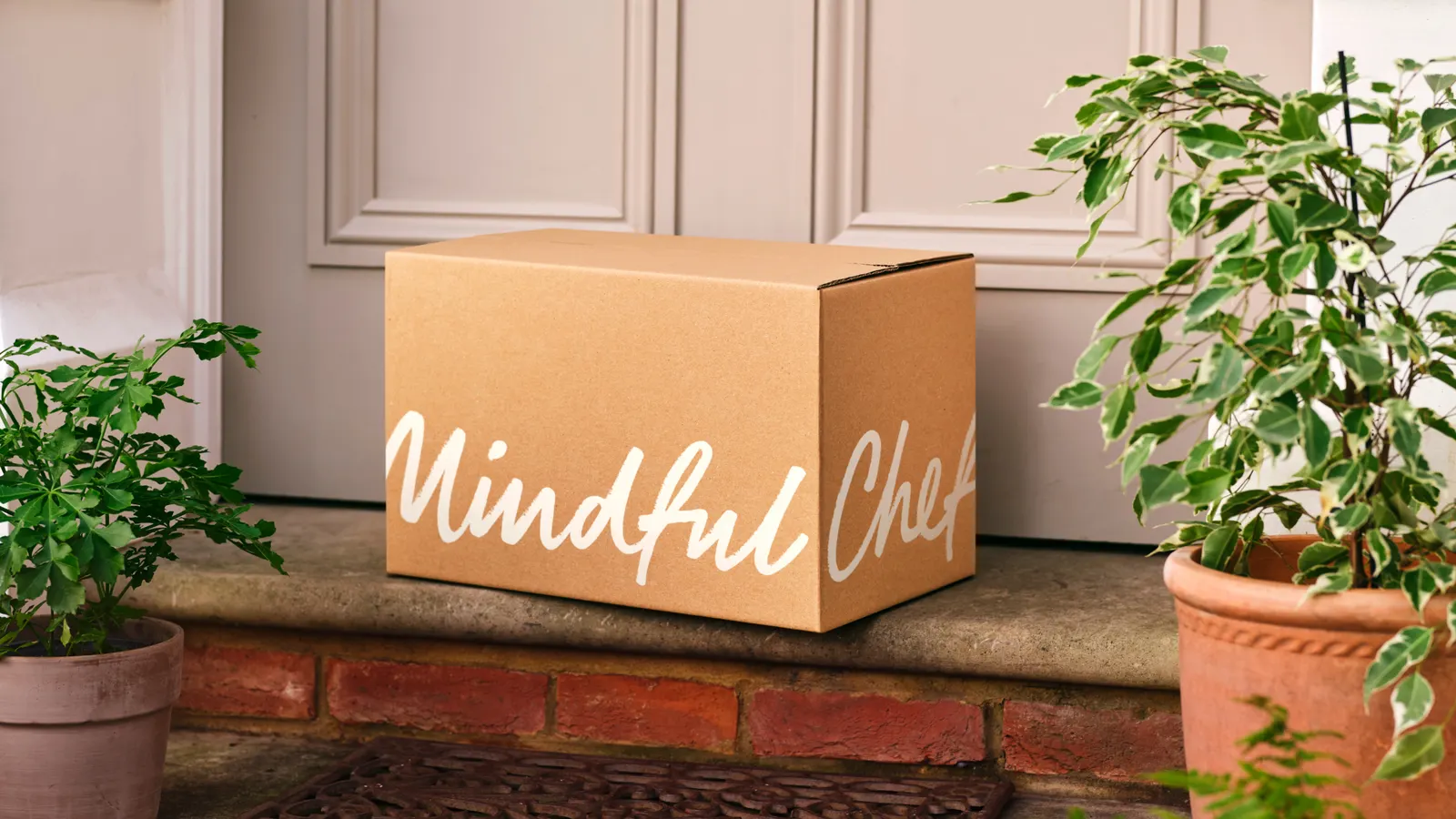
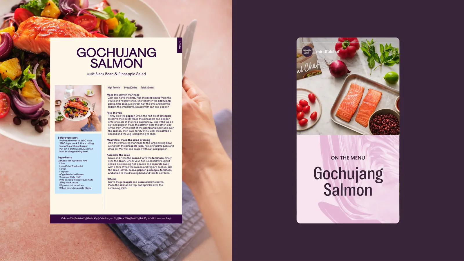
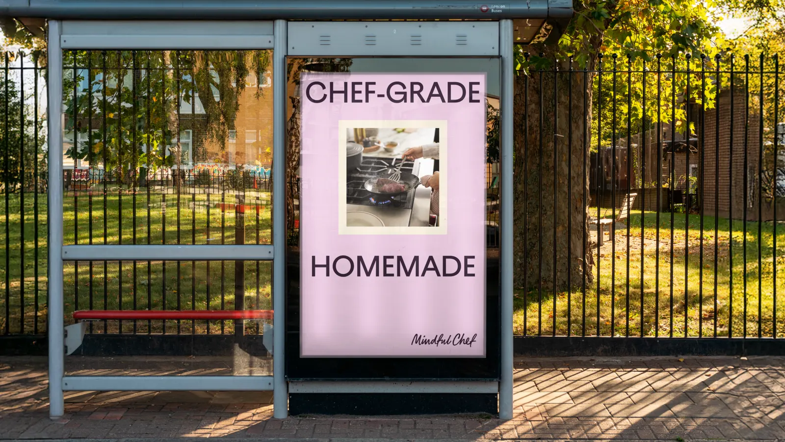
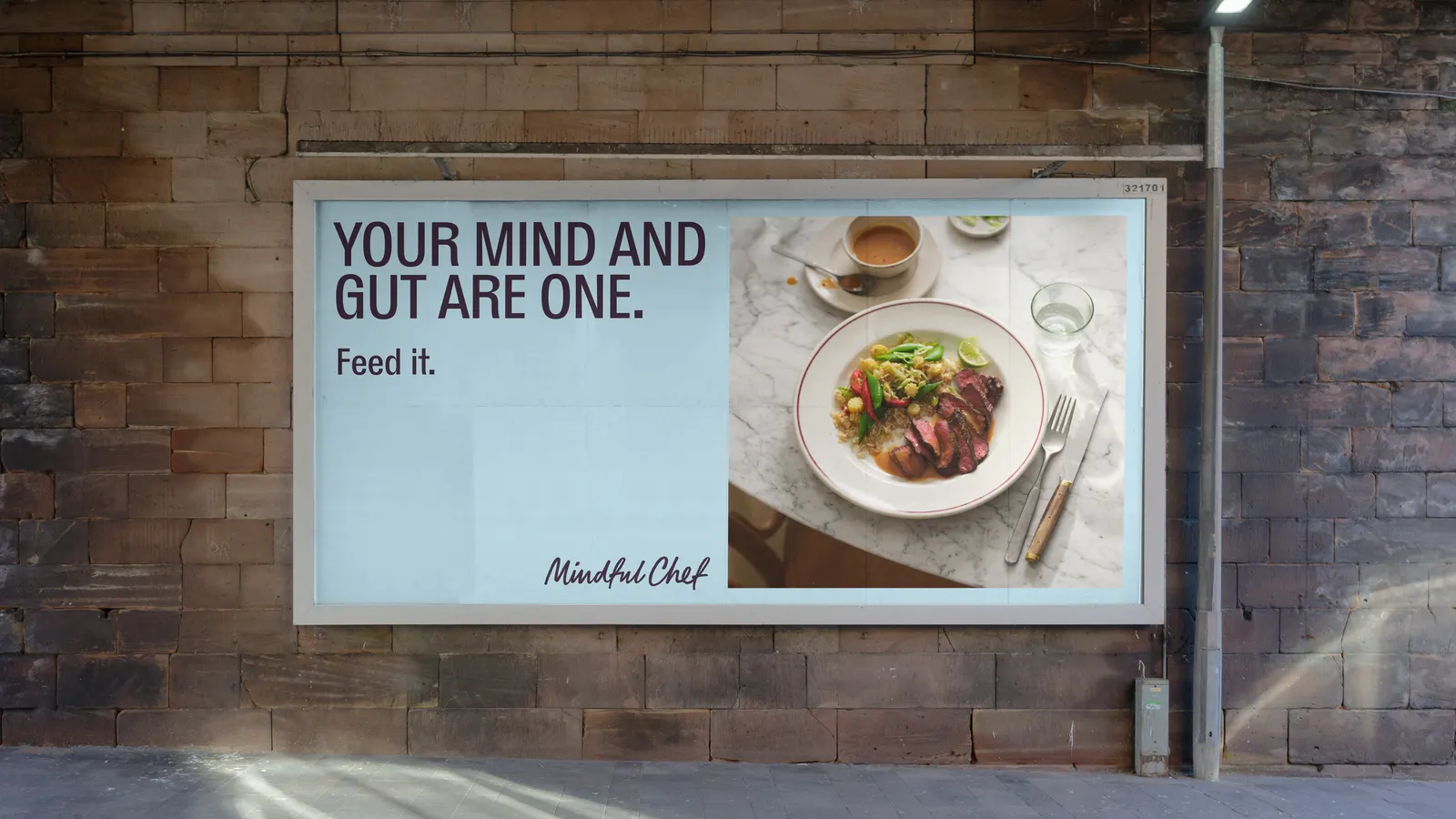
↗Mother Design's refresh of Mindful Chef makes a meal kit look like it belongs on a cookbook shelf, not in a logistics app. The category usually sells speed and convenience, while Mindful Chef offers health-focused recipes developed by chefs. The studio set out to give it a brand that matched the food.
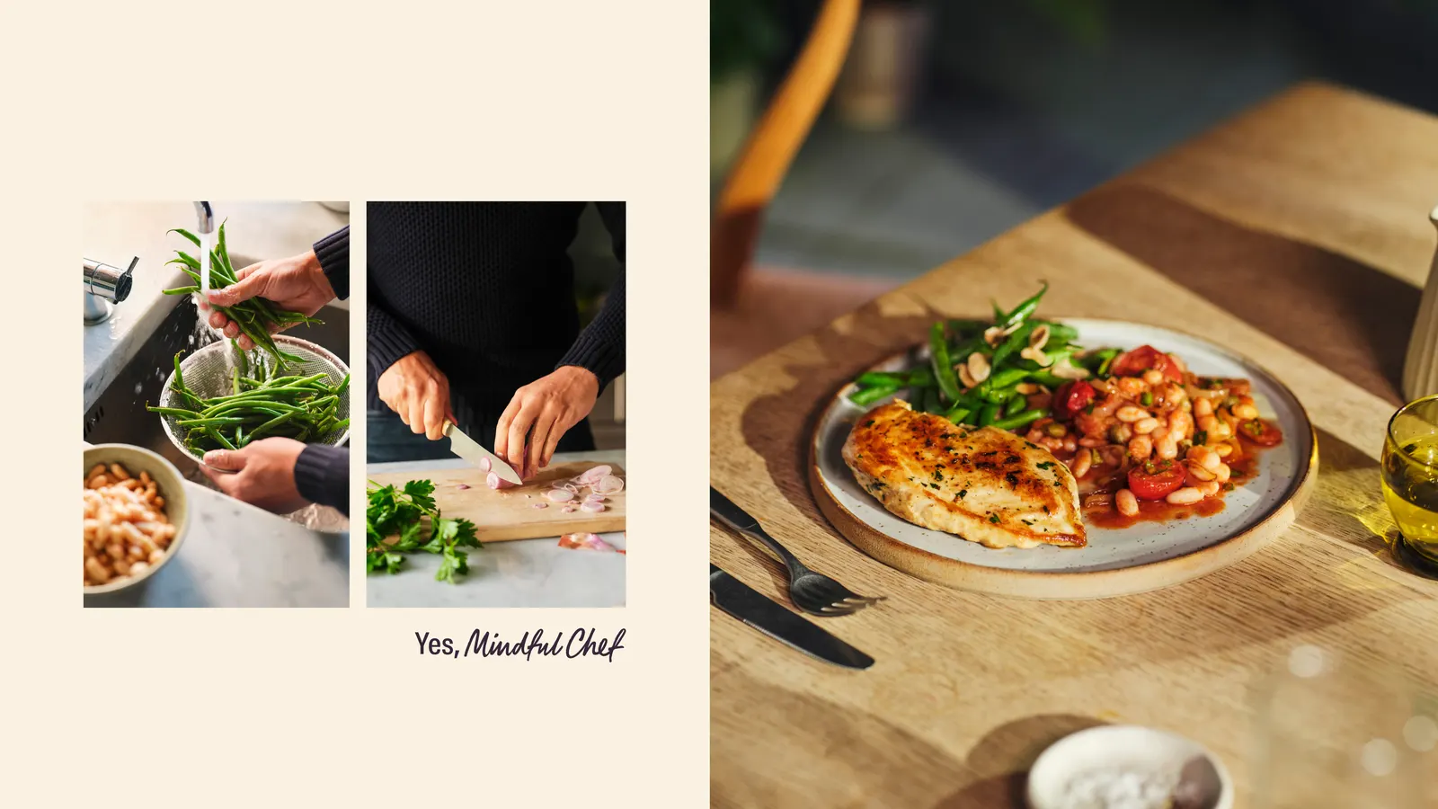
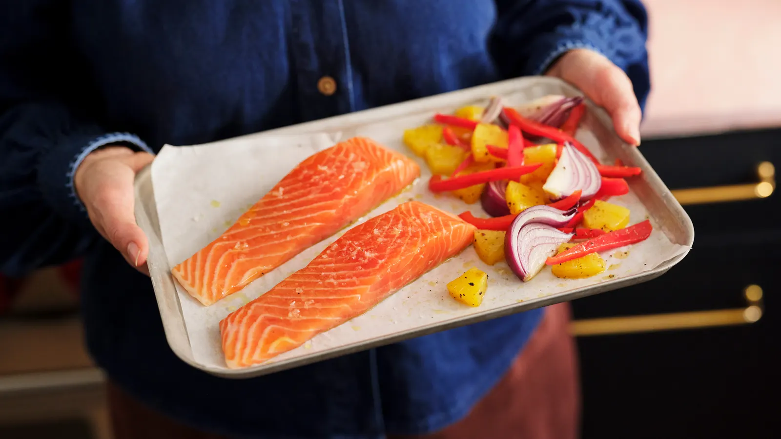
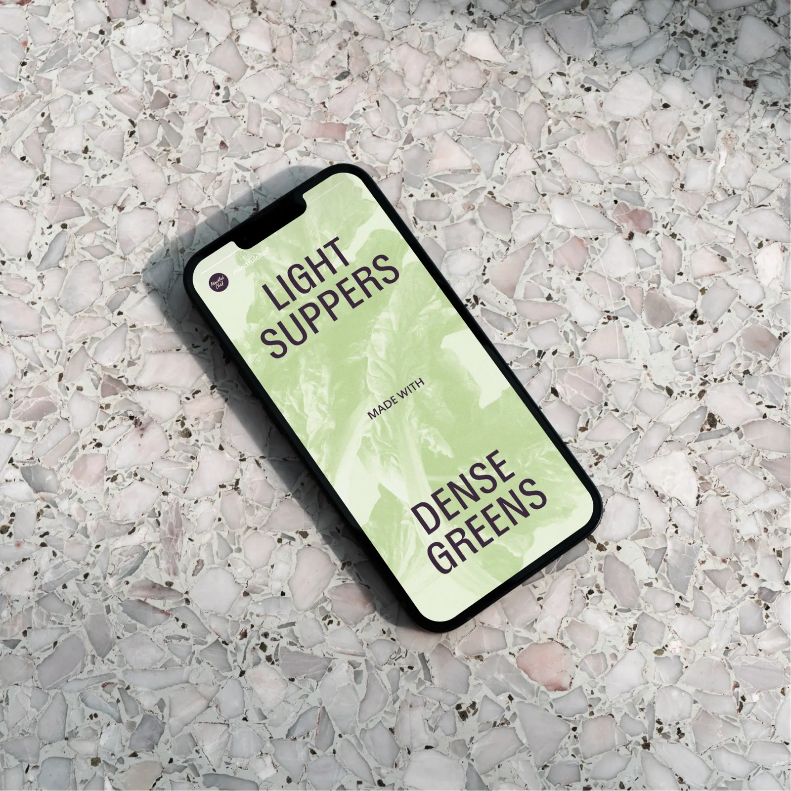
The idea puts the customer in charge of the kitchen, without the airs of restaurant culture. Photography, shot with Yuki Sugiura alongside food stylist Emily Kidd and props stylist Rachel Vere, relies on natural light, ordinary kitchens, and relaxed styling. Copy gives each ingredient generous adjectives, the palette borrows from the food itself, and motion nods to the box and its delivery. Bourrasque and Ostia Antica pair through contrasting proportions, and sparing sculptural textures treat produce as form.
Why it works
The cookbook is the smartest reference here. It's where home cooks already go to feel capable, so borrowing its layouts and photography signals care and aspiration without intimidation. Close, naturally lit produce does the hardest job for a delivered product, which is proving quality before anyone has tasted it. The food-derived palette and the playful type pairing add warmth, while restraint with the textures keeps the whole system premium. Together they set Mindful Chef apart from the convenience-first look of its competitors.
Applications
Color
Images and video from motherdesign.com, by Mother Design.