The Brand Monograph
Index Press brand identity by Koto
↗Index Press feels less like a firm's content section and more like a publication with a point of view. Koto made it for Index Ventures, which wanted founders to find real value in what it shares, in a space where every investor is already publishing.
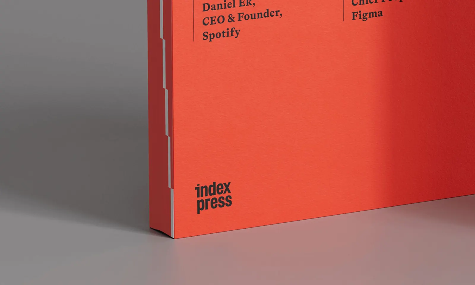
The studio built the brand around clarity over volume, with advice drawn from the founders and companies closest to Index. The identity extends Index's existing visual language and adds an editorial edge. It works as a flexible system that stretches from phone screens to printed books, podcasts, and digital tools, with motion from Marta Azaña and illustration from Sam Kerr. The website carries most of the weight. Nearly everything sits on the surface, and tagging, indexing, and categorization help people find their way through it.
Why it works
The strongest decision is treating the library itself as the brand. Putting almost everything up front shows confidence in the content, and the indexing structure echoes the name. Editorial cues borrow the credibility of publishing, while the link to Index's visual foundations keeps the platform clearly part of the firm. Because the identity is a system rather than a set of fixed layouts, a book, a podcast, and a web page can feel related without looking identical. For busy founders, that consistency builds trust.
Logo
Applications
Typography

Images and video from koto.com, by Koto.