The Brand Monograph
Riot LCP brand identity by Koto
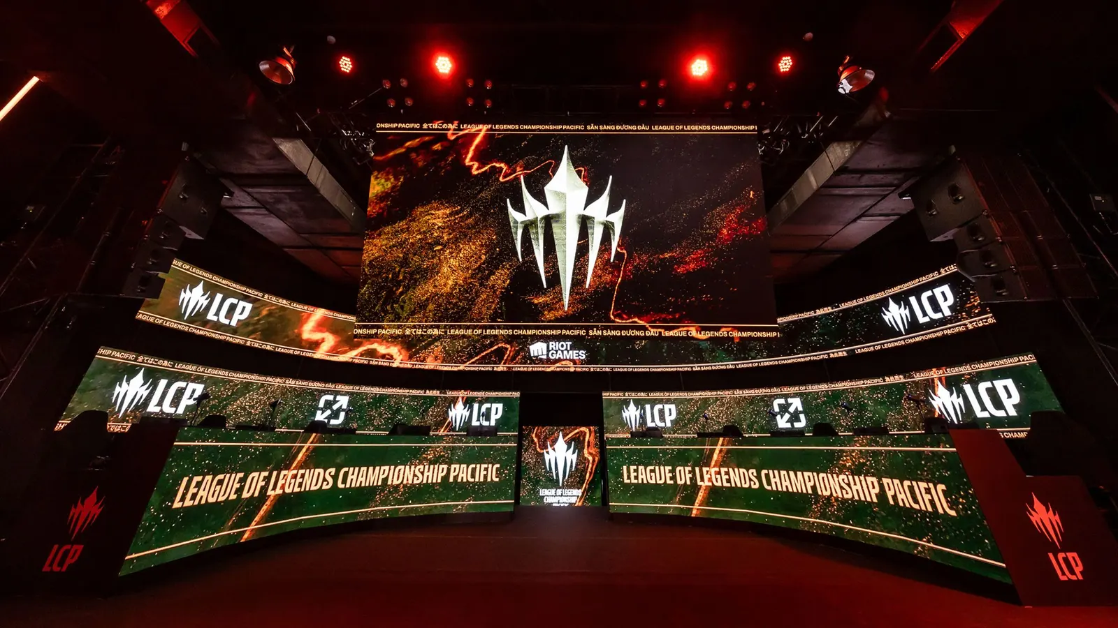
↗Koto's identity for Riot LCP, the League of Legends league for the APAC region, looks like it was forged rather than drawn. Riot had devoted fans and rising players across the region but no single stage to bring them together, so the studio had to build one that could raise the level of competition and give APAC a stronger presence internationally.
The answer centers on The Pinnacle, a mark of five players fused into one form that reads as both a team and a climb. Around it sit a fire-toned palette, molten textures, and raw typography from Swim Type, with illustration by Overdrive, 3D by SYLAS, motion by Histeria!, and film by Core A. Built for broadcast, the system covers stats, matchups, highlights, and arena staging. Guidelines, templates, and toolkits carry it from screens to stadiums, merch, and environmental graphics, with Yen Partnerships handling production.
Why it works
Esports branding often defaults to chrome, neon, and angular shields. Here, a mark made of five figures turns teamwork into the symbol, and a wordless symbol travels well across a region with many languages and local rivalries. The heat-driven palette and tactile textures give the league a physical presence that stands apart from the cool, digital look common in the category. The coarse type keeps that intensity from feeling polished or corporate, which suits fans who value grit over gloss.
Applications
Logo
Typography
Images and video from koto.com, by Koto.