The Brand Monograph
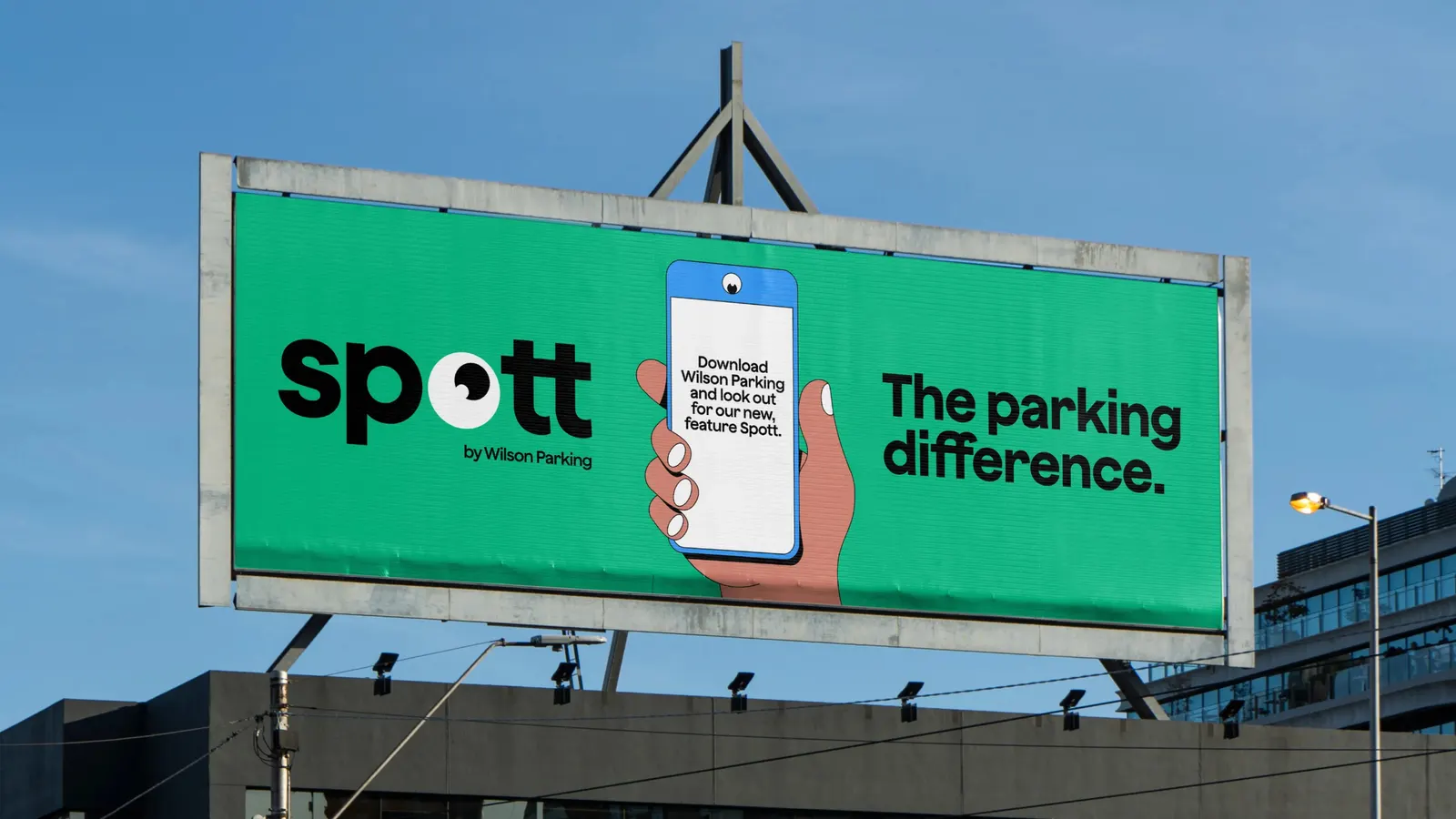
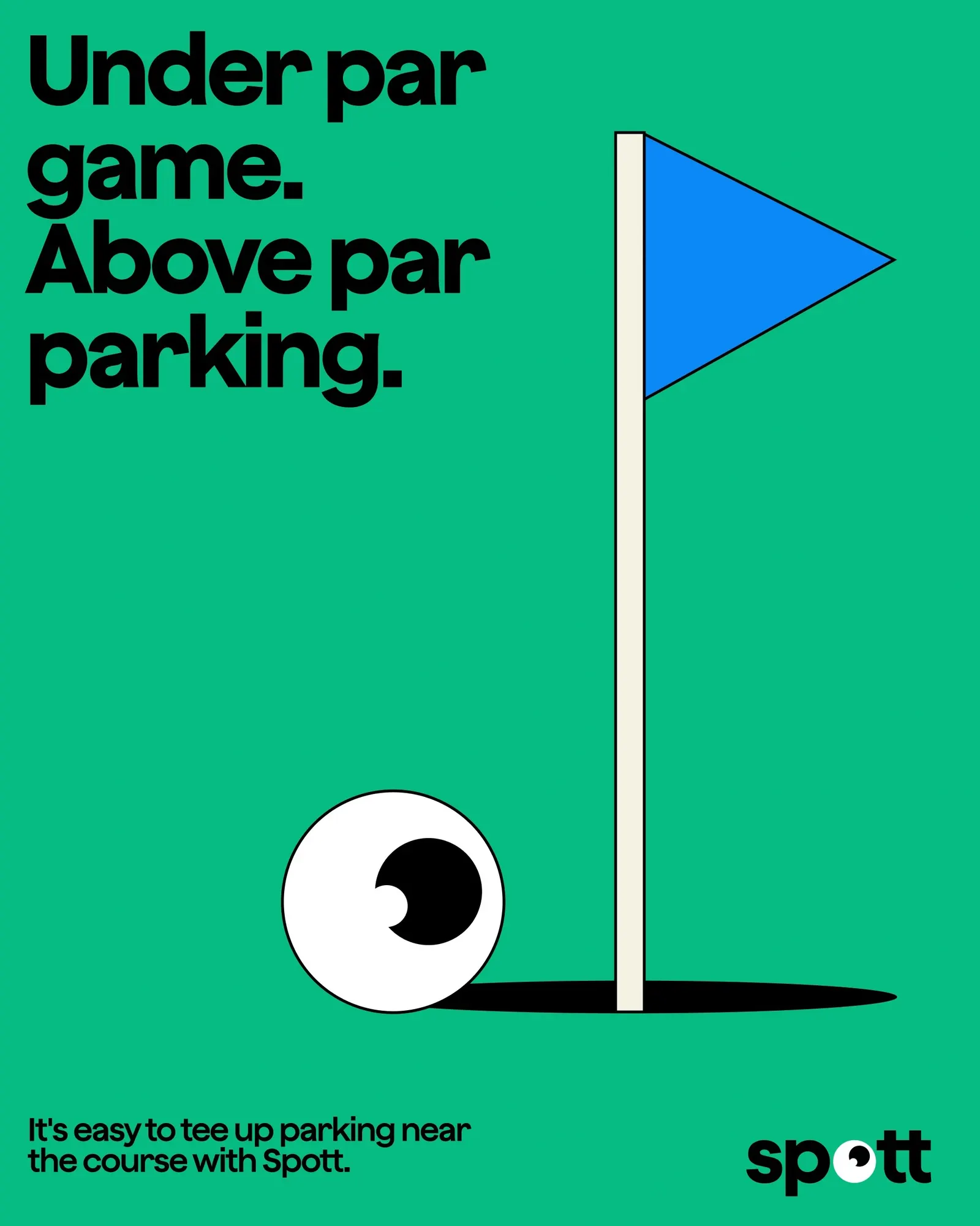
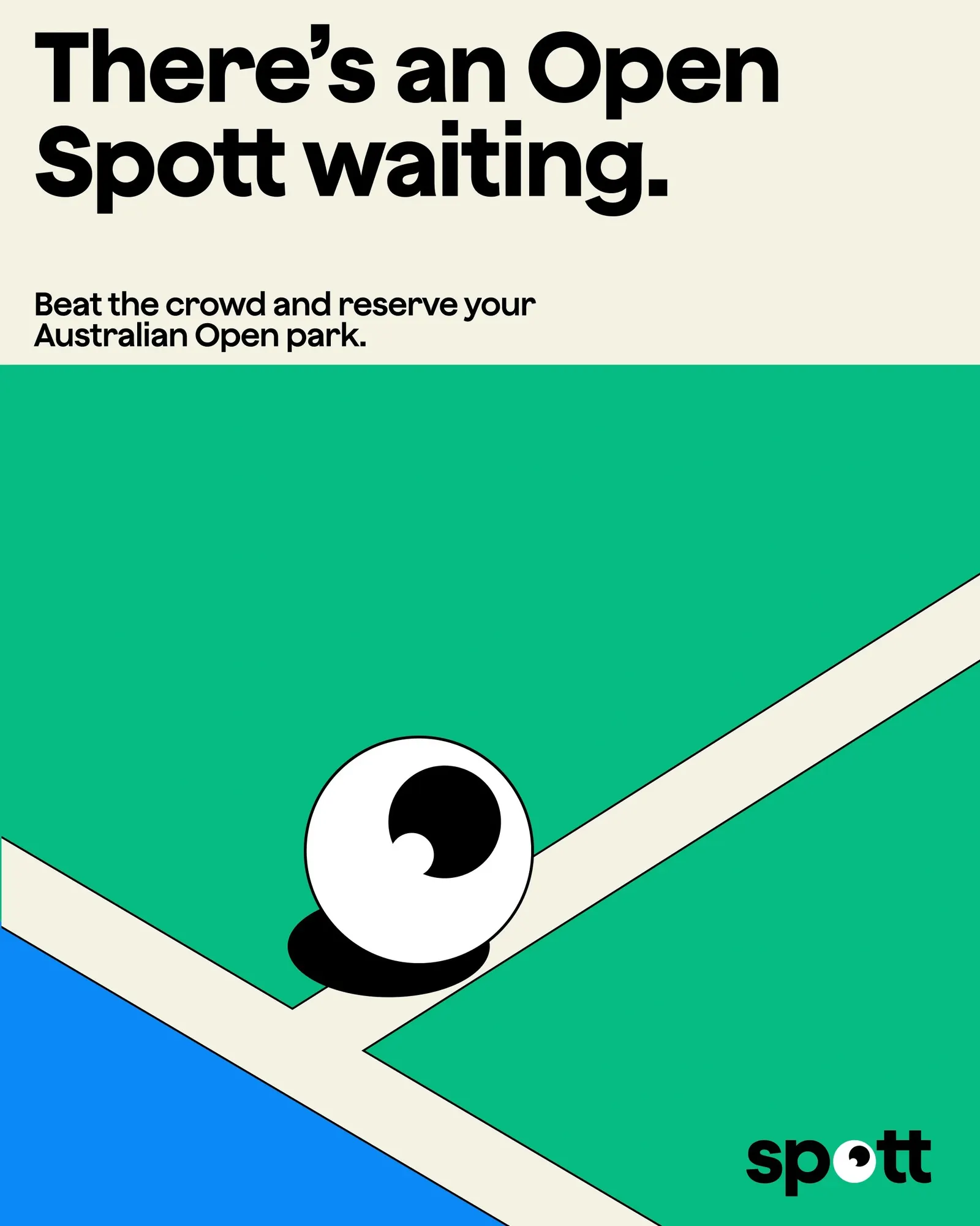
Spott by Wilson Parking brand identity by re.design
↗Few categories are as joyless as parking, which makes re.design's work for Wilson Parking feel quietly radical. Rather than giving Australia's largest operator a tidier logo, the studio treated the brand as something that has to perform at the barrier, in the app, and on the walk back to the car.
The result is Spott, an identity built from small acts of personality: vehicles that wave hello, a tone of voice with a sense of humor, and a world that stretches past the concrete and the ticket machine. Spott Watch is its signature moment. The brief was practical, to make booking, paying, entering, and leaving less painful, and the numbers suggest it landed: 48 Spott-enabled assets across five cities, 81% of online earnings coming through the app, dynamic pricing of up to 20% off for users, and the top rating among parking apps on the App Store.
Why it works
The name does a lot of the heavy lifting. Spott is a small twist on the exact thing drivers are hunting for, so it is easy to remember and easy to say. Giving the car itself a gesture is just as smart, because the vehicle is the one object every customer cares about, and a wave makes the brand feel like it is on their side. In a category that tends to default to signage and utility, warmth and humor at moments of friction become the differentiator, and they live in the product, not just the poster.
Logo

Applications
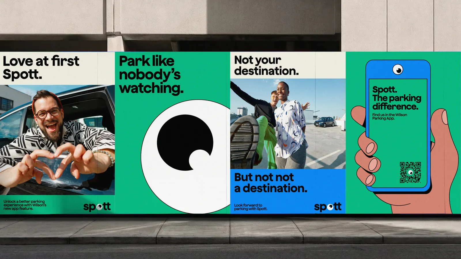
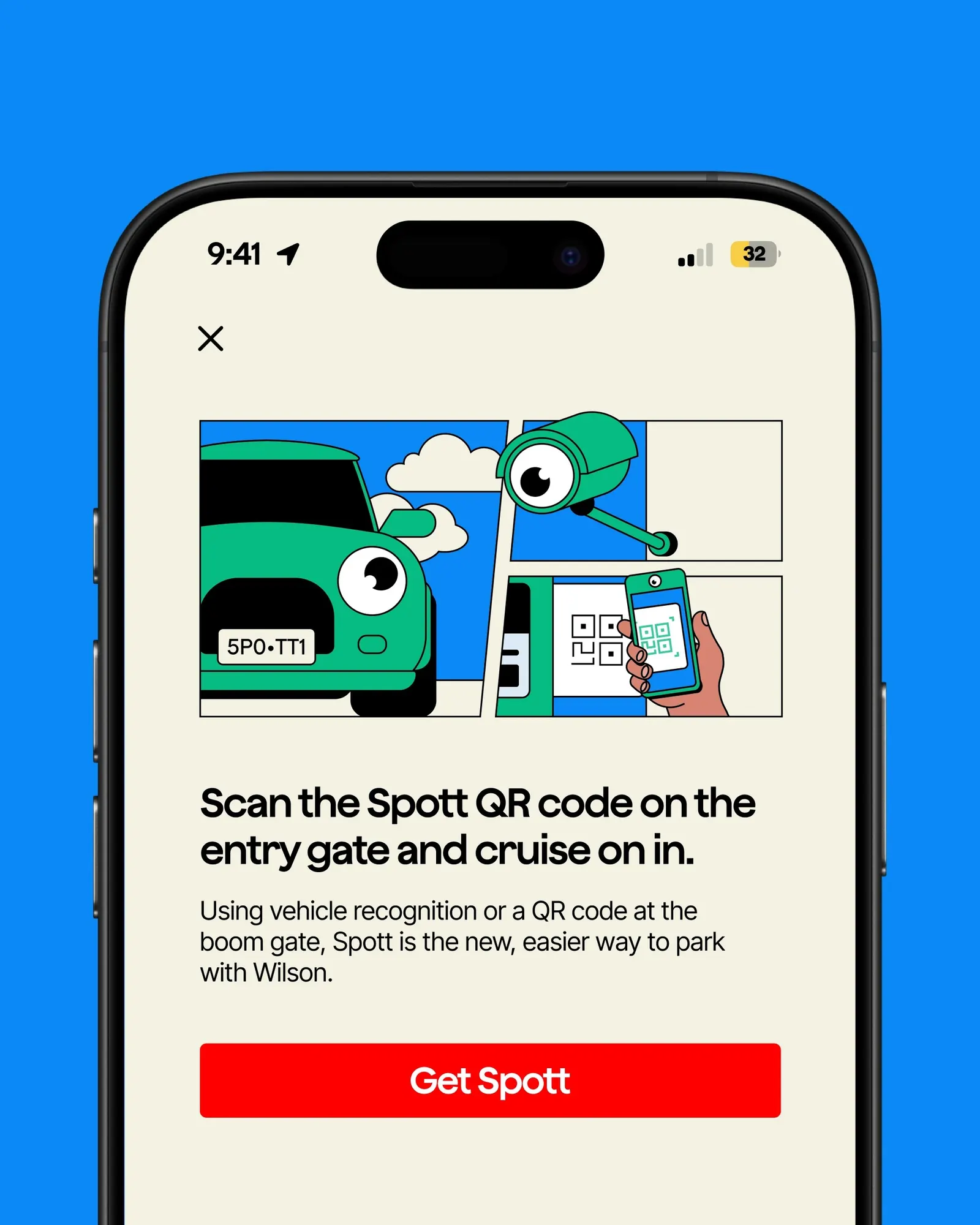
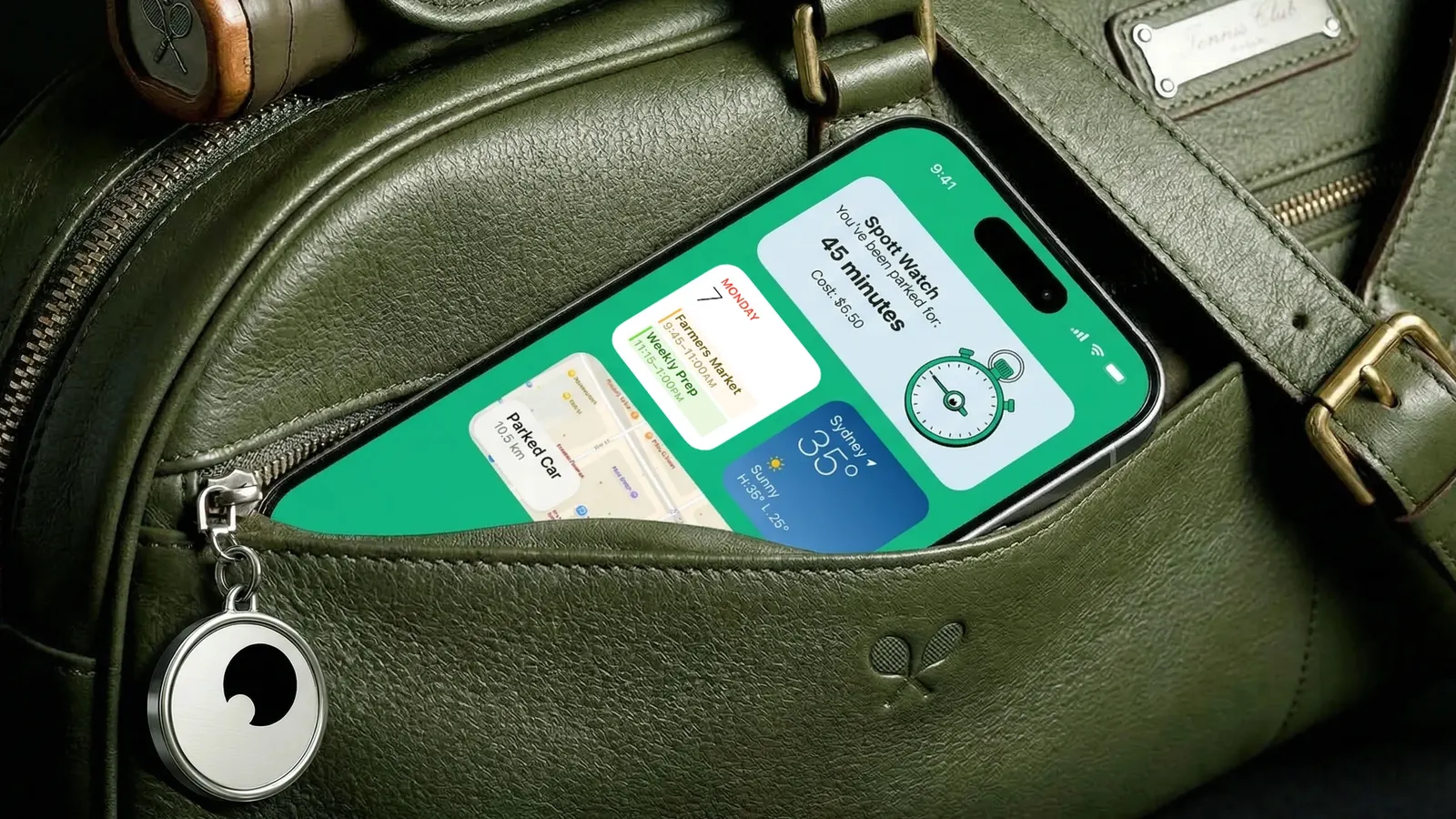
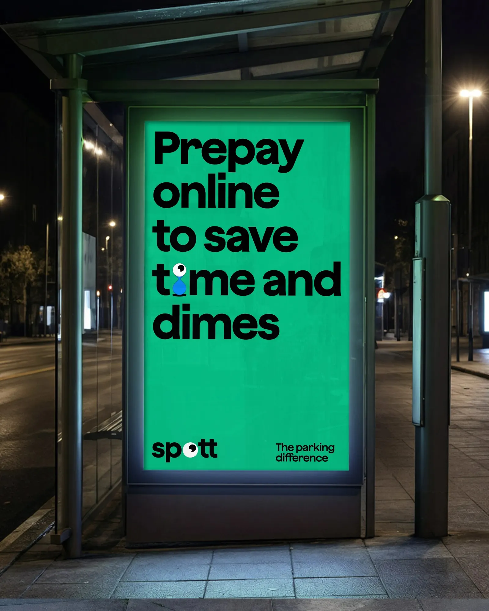
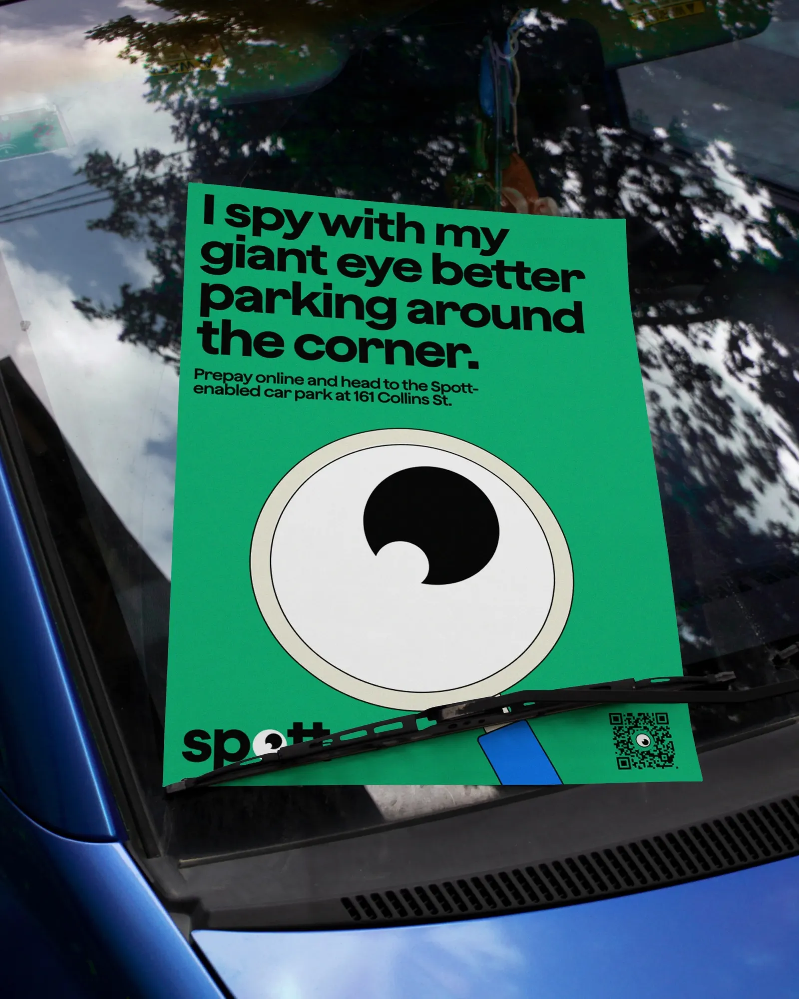
Images and video from re.design, by re.design.