The Brand Monograph
Microsoft 50th brand identity by Koto
↗Most anniversary campaigns are a victory lap. Koto's work for Microsoft's 50th takes a less expected route and hands the spotlight to the people who built and used the products. Instead of polishing the corporate story, the studio put makers at the center, using landmark products and breakthroughs as evidence of what individual ingenuity can do.
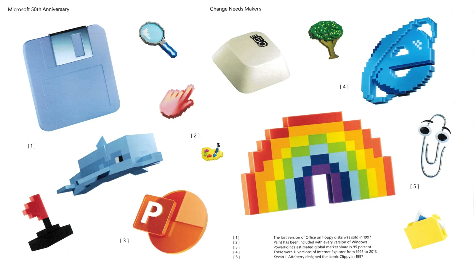
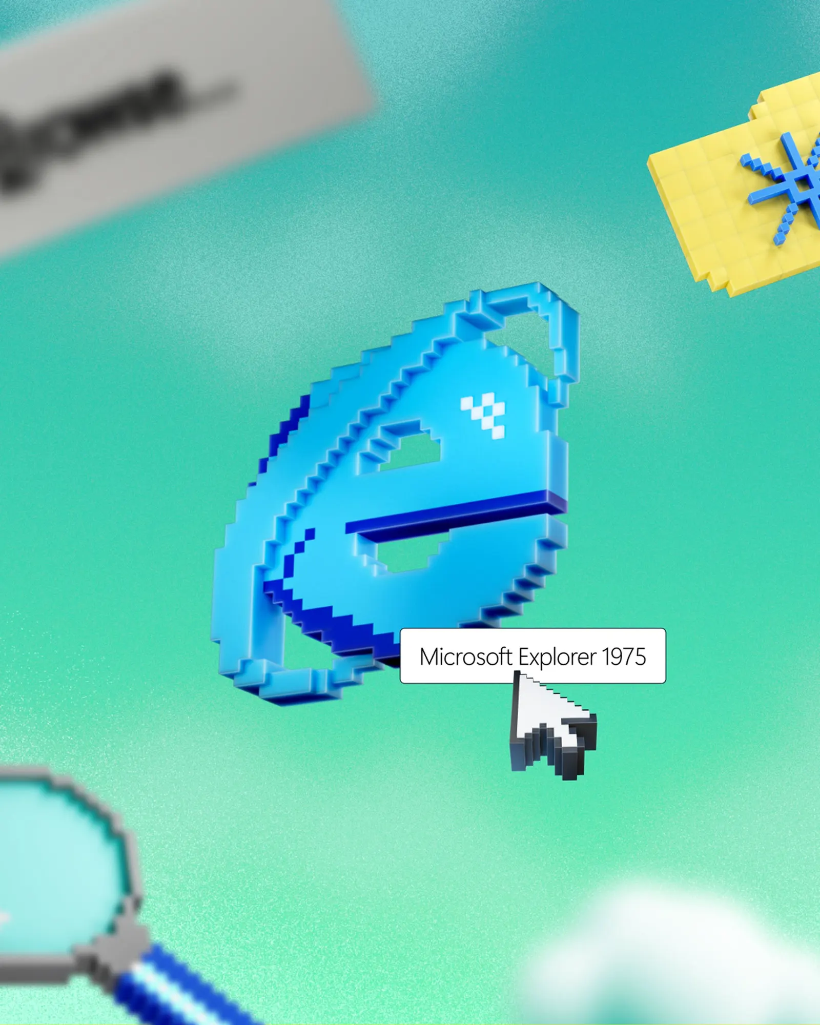
The identity does the connecting. Koto rendered iconic artifacts in 3D, Clippy among them, and combined them into layered, imaginative scenes set against backgrounds drawn from Microsoft's heritage. The logo takes a cue from the original Windows mark, and the art direction features real employees and customers. The system then traveled widely: a Microsoft.com takeover, placements inside Teams and Edge, a Times Square activation, limited-edition merch, and an event at the Redmond campus.
Why it works
Microsoft's products span decades and categories, and objects are the one thing that can hold them together. The 3D artifacts turn nostalgia into something tangible and a little playful, which suits a brand that is rarely described as warm. Echoing the original Windows mark gives the logo continuity without making the company look dated. Featuring real people also sets the work apart from the scale-and-stats tone common among big tech anniversaries, and it gives longtime users and newcomers a reason to see themselves in the story.
Applications
Logo
Typography
Images and video from koto.com, by Koto.