The Brand Monograph
Lyme Academy of Fine Arts brand identity by Order
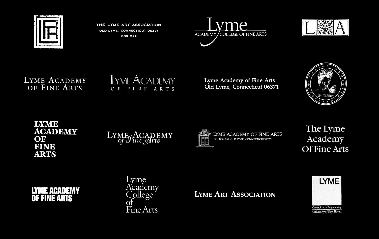
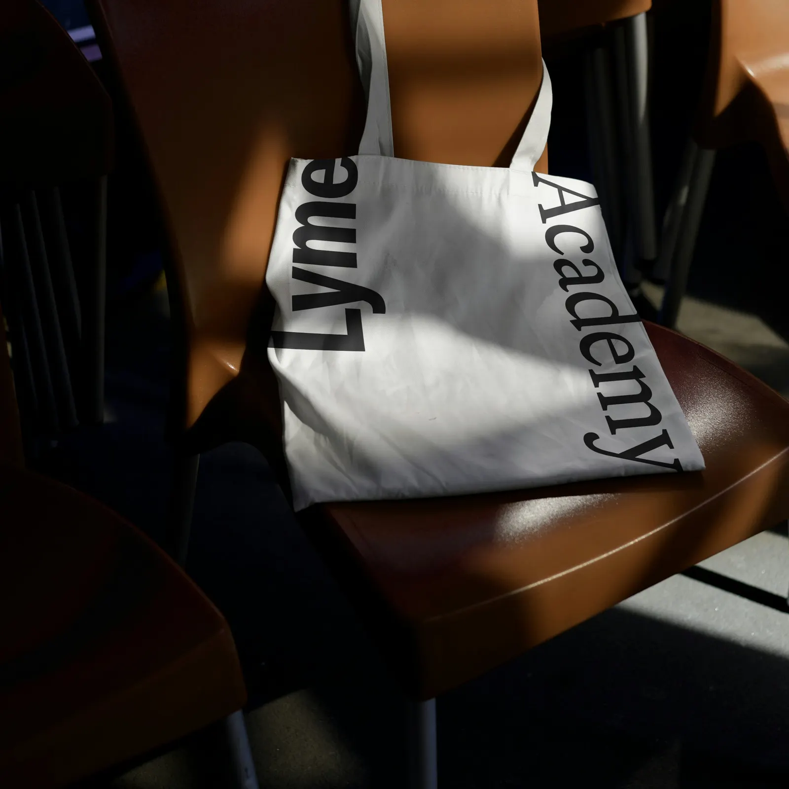
↗Order's identity for Lyme Academy of Fine Arts is a wordmark with no symbol, no brush, and no nod to the riverside setting. That is a bold choice for an art school, and a fitting one. The Connecticut school, founded in 1976 and devoted to figurative drawing, painting, and sculpture, was returning to its founder's methods while still showing what its students make today.
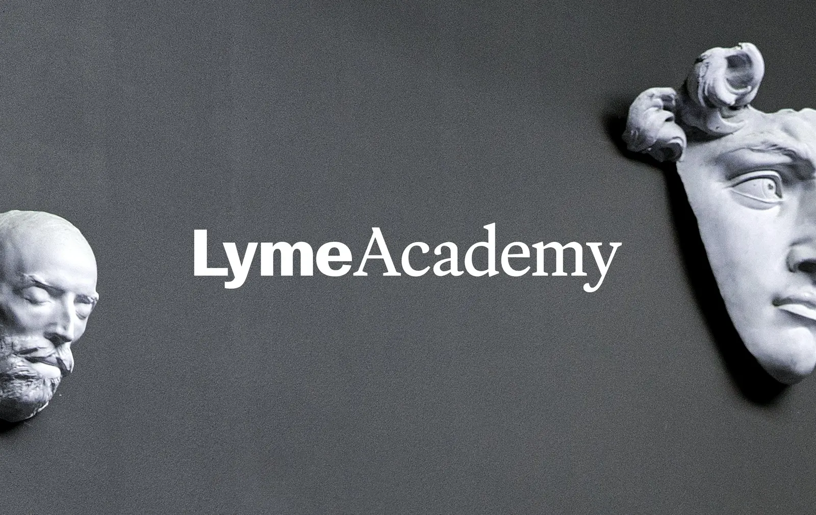
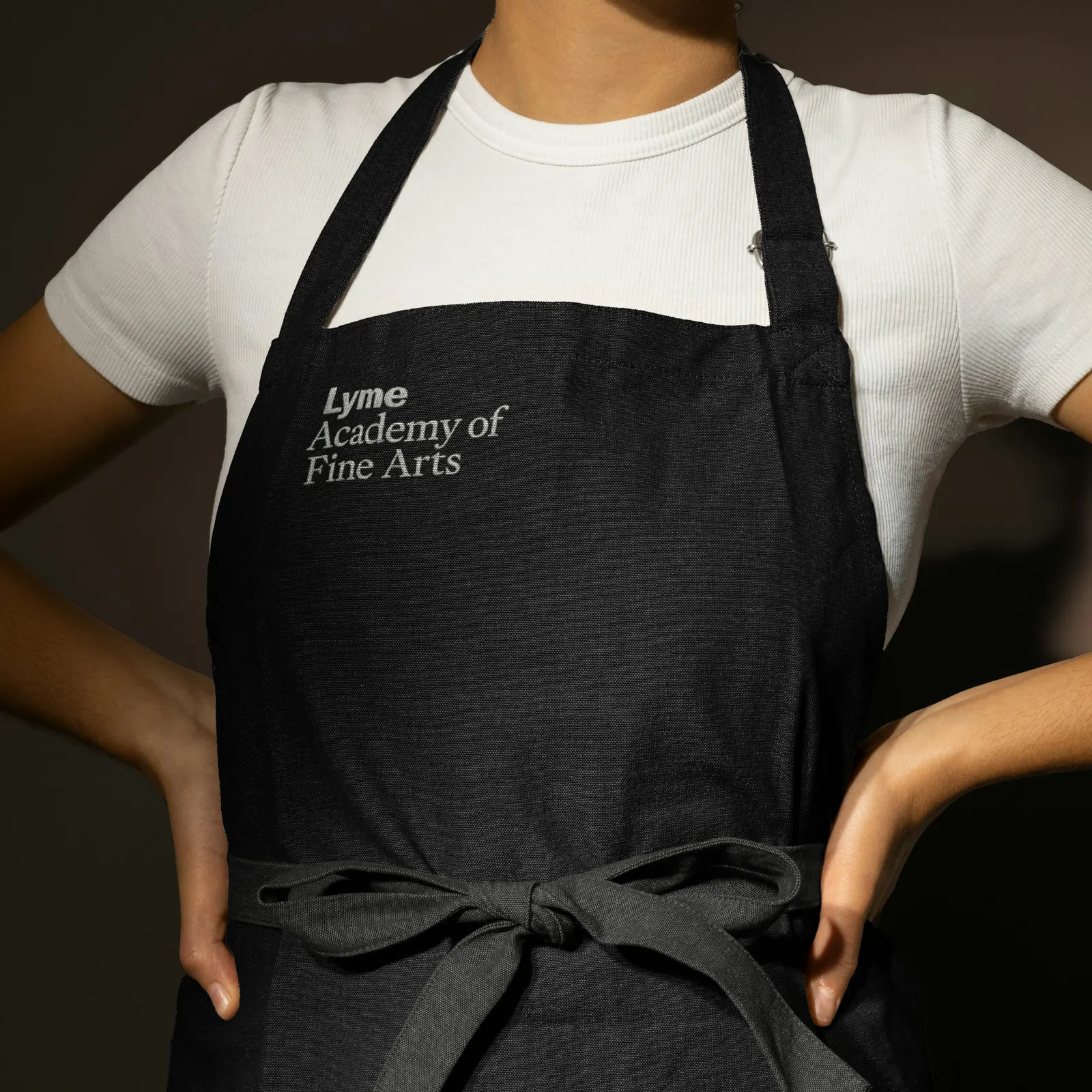
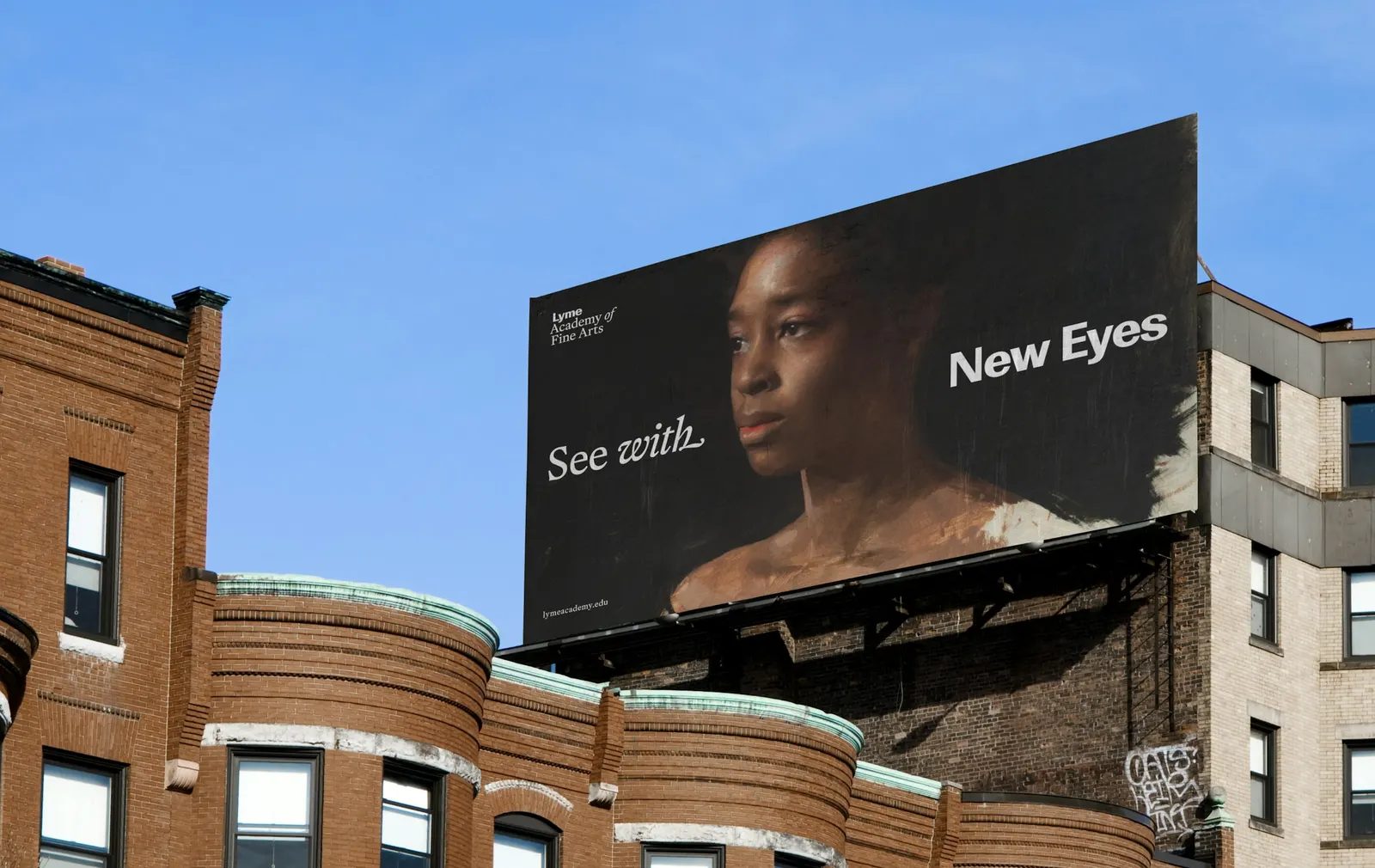
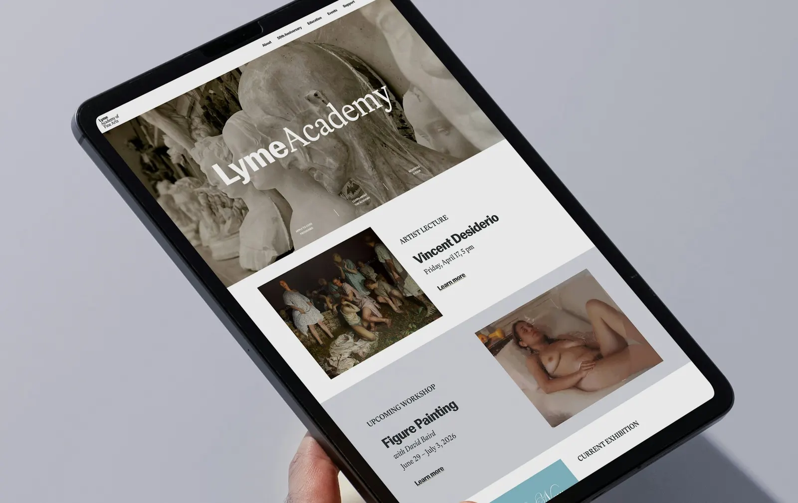
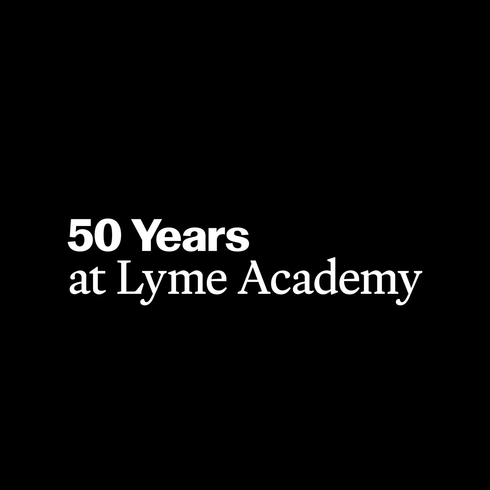
Working with designer Emily Klaebe and strategist Jesse Reed, Order built the system on two typefaces. Optimo's Basel Classic, a high-contrast grotesque, speaks for the present. Mass Driver's MD Lórien, an old-style serif with 18th-century roots, speaks for the past. Headlines set short phrases in both. The palette is strictly black and white, and photography, 2D and 3D work, environmental art, and portraits share equal weight. For the 50th anniversary, the studio added a tagline, an event announcement, and brand recognition materials.
Why it works
Art school identities often lean on a gestural mark or a landmark, and both compete with the work they promote. Here, type carries the whole job, so the mark never fights a painting for attention. Pairing a grotesque with an old-style serif lets a single headline show the school's position instead of explaining it. Black and white keeps posters and publications neutral beside any student's palette, and equal treatment of every kind of imagery suits a school that teaches several disciplines side by side.
Logo
Applications
Typography

Images and video from order.design, by Order.