The Brand Monograph
Franki brand identity by Koto
↗Koto's Franki rebrand makes a recommendation app feel like part of a night out rather than a chore of reading reviews. The studio took a video-first discovery platform and gave it a clear point of view: a good time is personal, and people you trust find it better than ranking algorithms do.
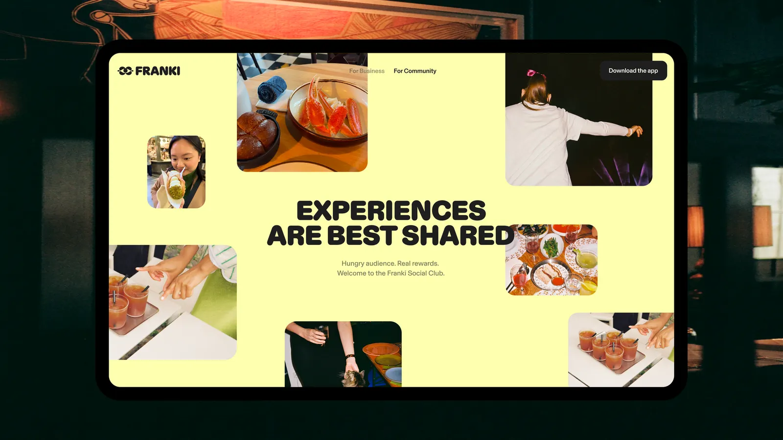
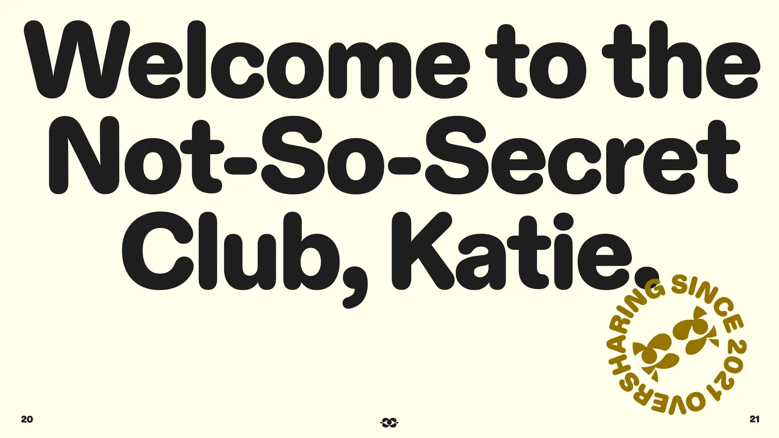
Koto built the identity around a character symbol that stands in for someone who always knows where to go next. Motion runs through the typography, interface, and content, so the brand carries momentum wherever it appears. A playful, Jester-inspired voice favors warmth and honesty over authority. The system extends beyond the app through Franki Social Club, which rewards creators and diners for sharing places they love and marks the platform's move toward a community-led model.
Why it works
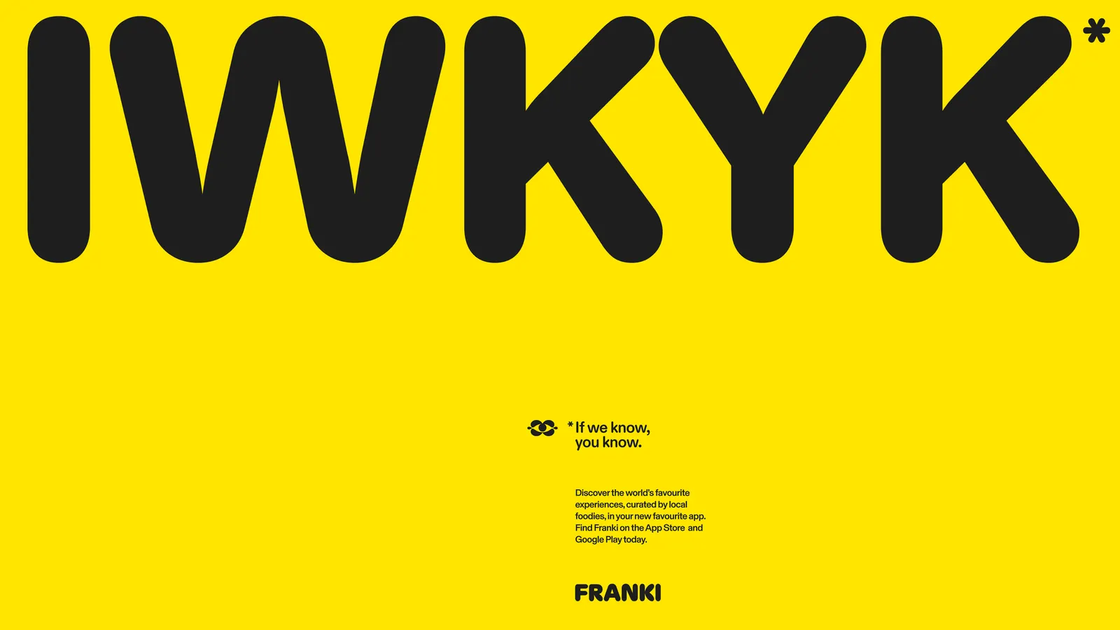
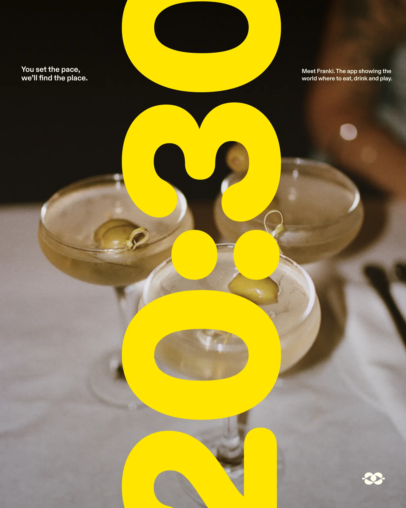
Recommendation platforms tend to look like databases: neutral, tidy, and built to project authority. A character at the center of Franki's identity does the opposite, giving the brand a personality people can warm to before they have read a single review. Motion is the smartest decision here. Nightlife is about timing and energy, and an identity that moves sits naturally beside the video content it frames. The Jester tone finishes the job, making Franki feel like a friend with good taste rather than a ranking.
Applications
Logo
Typography
Images and video from koto.com, by Koto.