The Brand Monograph
Kunsthalle Basel brand identity by Porto Rocha
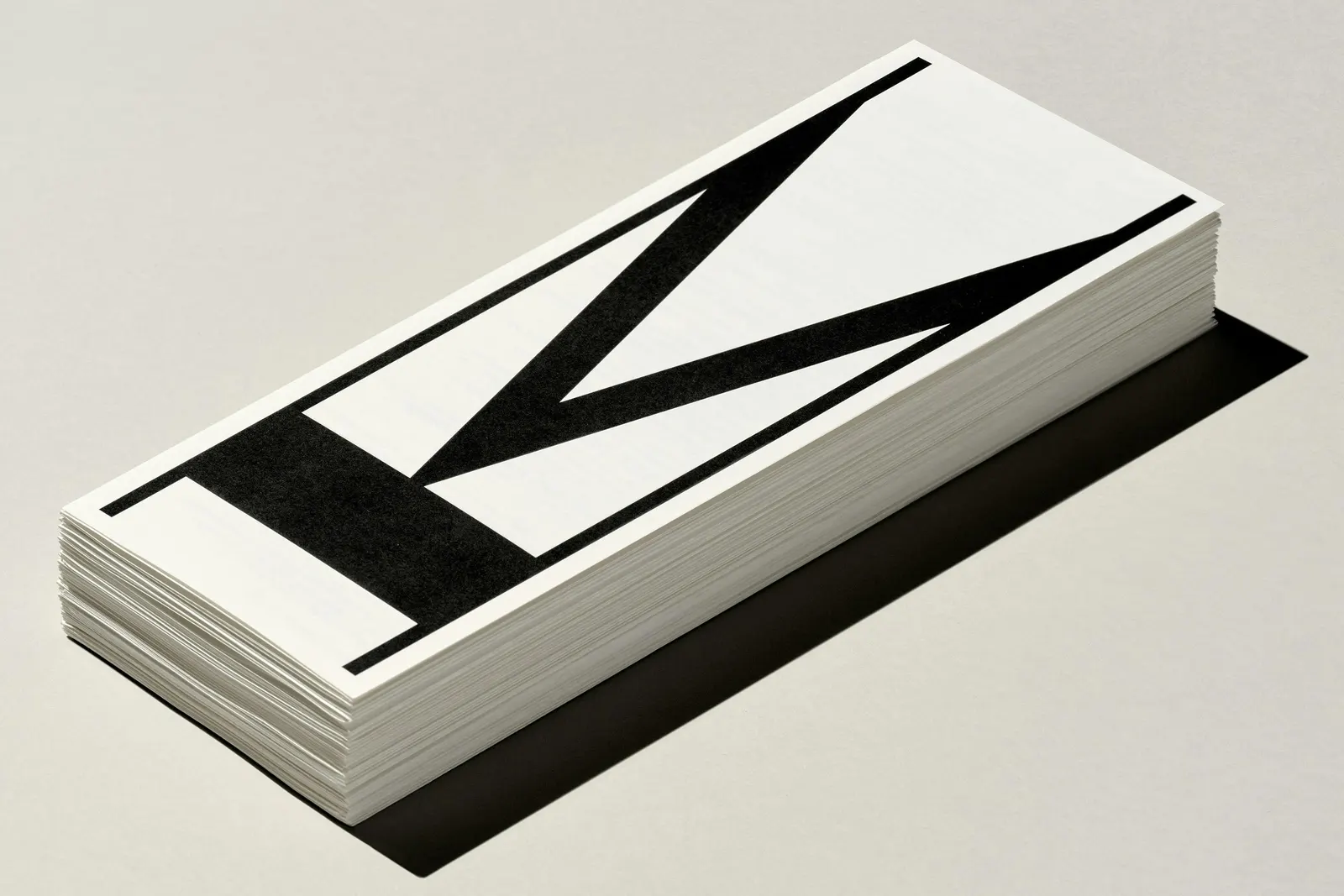
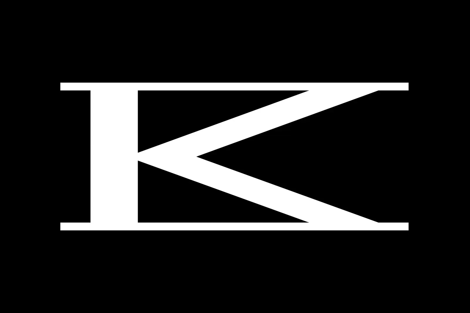
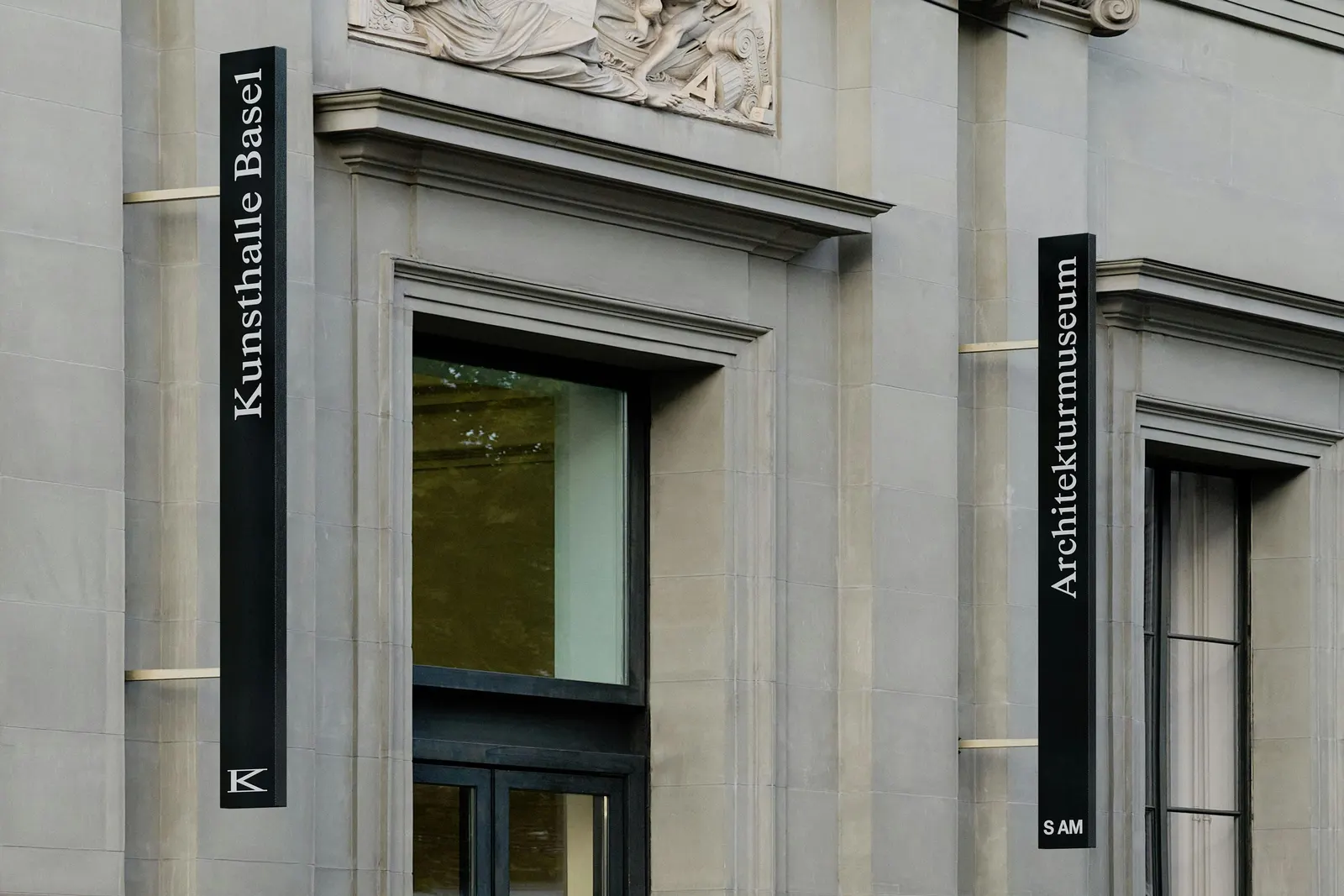
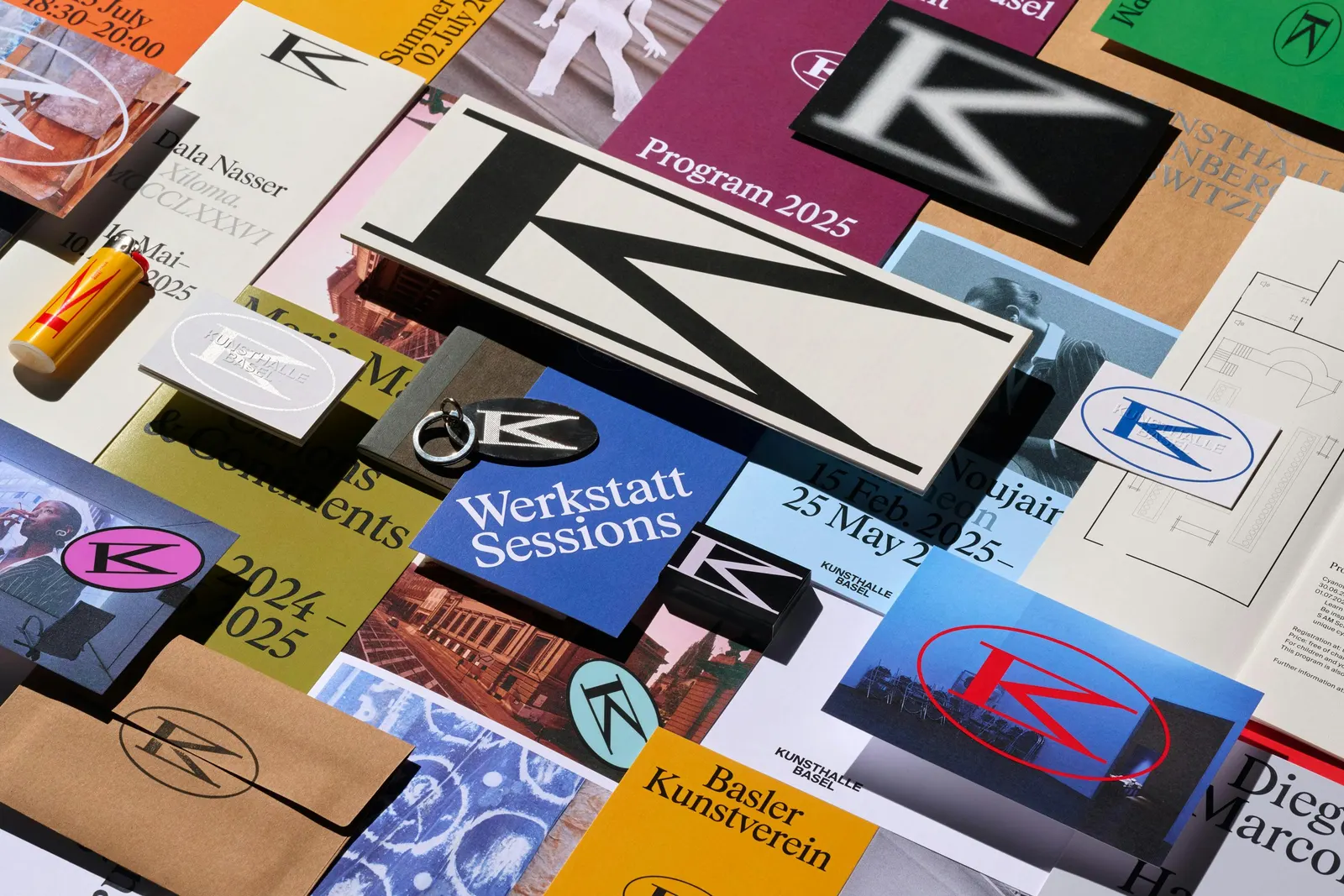
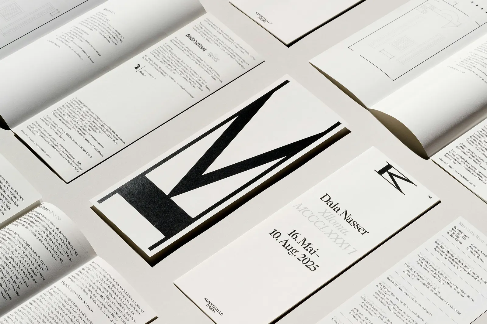
↗A single mark that bends without breaking is what makes PORTO ROCHA's work for Kunsthalle Basel worth studying. The studio fused a K and a B into one monogram that reads as either letter, then let it stretch, compress, and rotate to suit whatever it sits on.
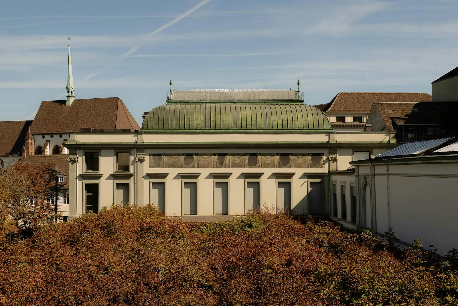
The brief arrived with Mohamed Almusibli's appointment as director in 2024. Switzerland's oldest contemporary art institution had an identity too plain to welcome a wider public. PORTO ROCHA drew the monogram from the building's neoclassical facade and its ever-changing interiors, then carried that elasticity into motion and a redesigned website built with noncitizen, complete with elastic carousel transitions and a movable menu. The headline face, KB Rhymes, was developed with Maxitype from Times New Roman and paired with Suisse International. Color runs neutral beside artwork and vibrant in type-led layouts, and posters stay open for artists to remix.
Why it works
Most contemporary art institutions retreat into austere sans serifs and polite white space. Here, a serif with a familiar, almost bookish ancestry gives the institution authority without coldness, and Suisse International keeps the exhibition text clear. The monogram works less like a logo than a frame that changes shape with each show, which suits a program that never stands still. Because color steps back around artwork and speaks up only in type, the identity supports the art rather than competing with it.
Applications
Logo
Images and video from portorocha.com, by Porto Rocha.