The Brand Monograph
Mayda brand identity by Studio Kiln
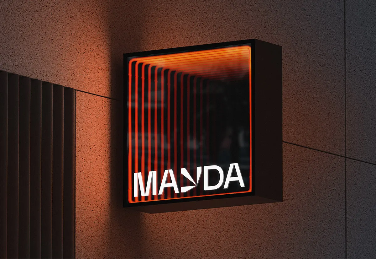
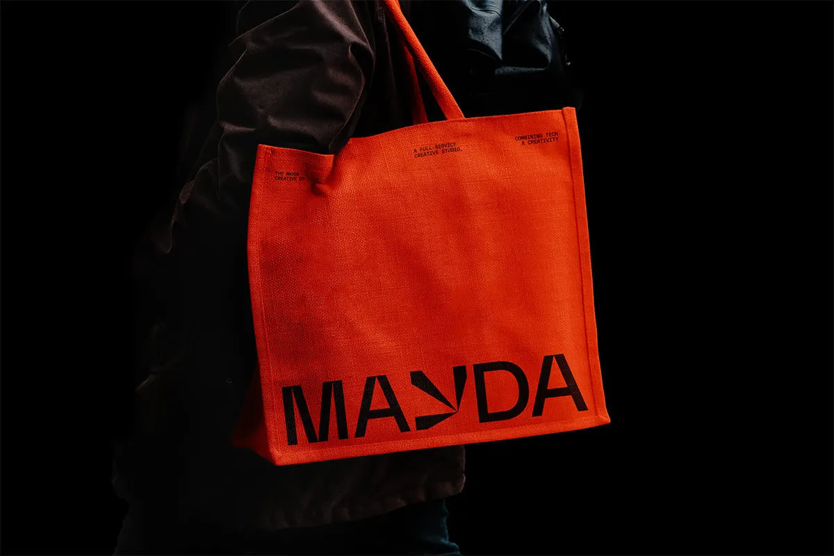
↗Studio Kiln's identity for Mayda turns a single letter into a doorway. The creative collective was founded by well-known, multidisciplinary talents, so the brief was to give very different practitioners one shared face without flattening what each of them does. The studio found its answer in the story behind the name: an island that kept turning up on historical maps and was seldom, if ever, found. The horizon, the point you're always heading toward but never reach, became the organizing idea.
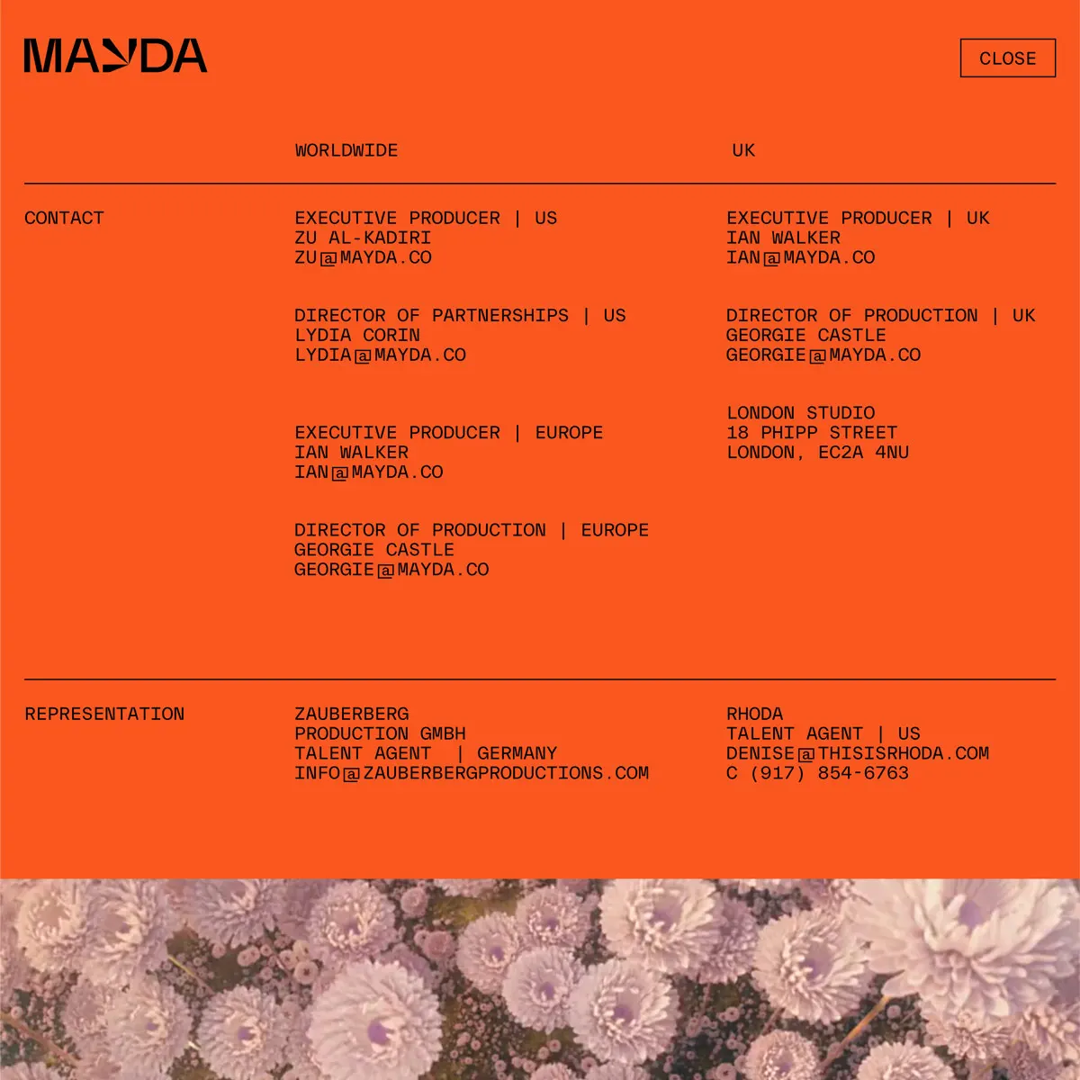
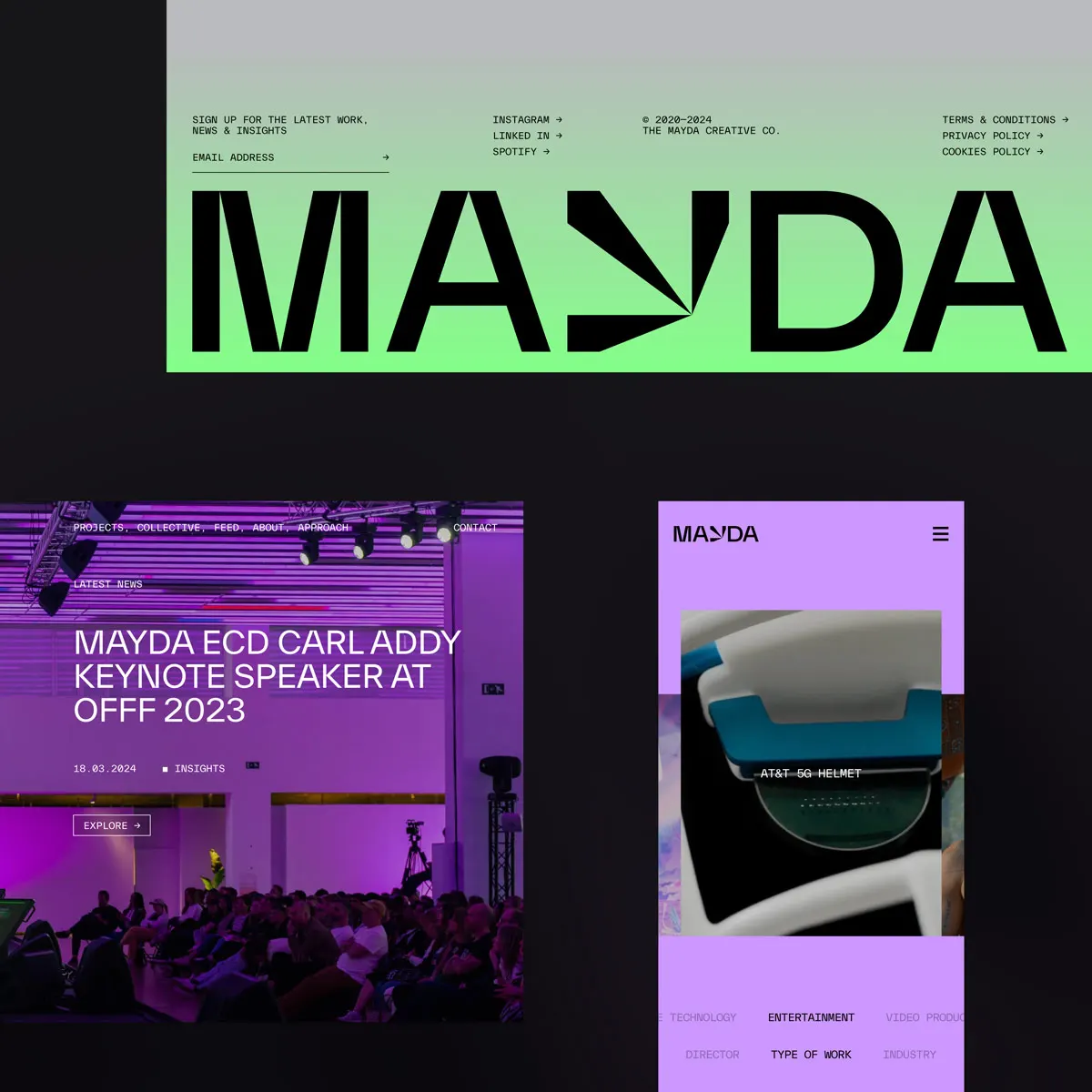
The Y in the logo opens into a portal, and that portal is the working part of the system. It reconfigures for each campaign and product, so the brand changes shape while the idea holds. Blanca San Román Rollán, Charlie Hocking, Edoardo Albertini, and Nathan Smith led design, with Albertini and Sebastian Muñoz on motion. Cliff Studio built the website, where stacked horizontal bands and layered depth make scrolling feel like moving toward a vanishing point.
Why it works
A mark designed to change can easily lose its anchor. Here the Y stays legible as a letter while the opening does the shifting, so the constant is always clear. For an audience of clients and collaborators who are creative themselves, a logo that behaves differently each time signals range and curiosity better than a fixed badge. The horizon idea also sets Mayda apart from collectives that lead with a roster of names or a signature style: it sells a way of working, not a look. Carrying it into the site's structure means visitors experience the metaphor instead of just reading it.
Applications
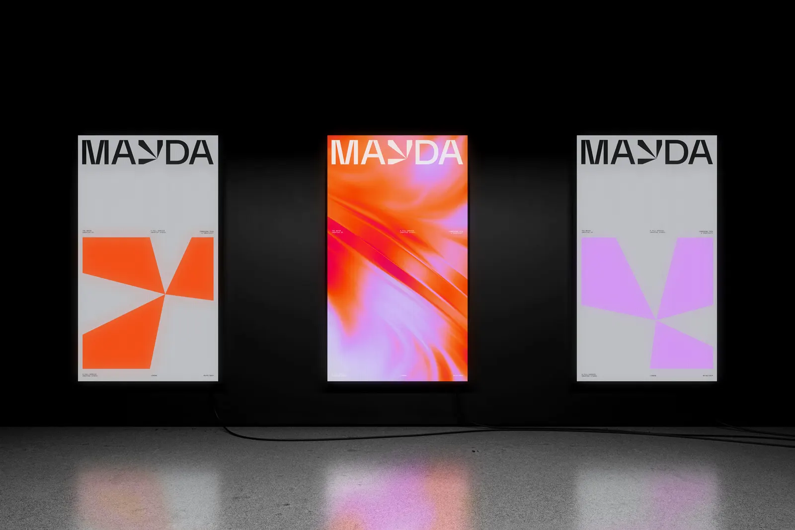

Images and video from studio-kiln.com, by Studio Kiln.