The Brand Monograph
Arcane brand identity by COLLINS
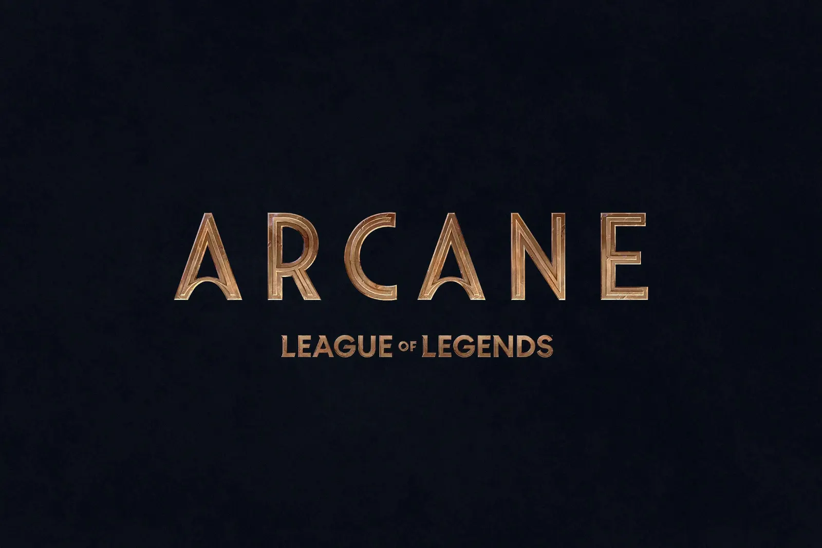
↗Few brand systems have to win over two audiences at once the way Arcane's does. Riot Games was taking League of Legends to television for the first time, and COLLINS needed an identity that would satisfy players who know the lore by heart while reading as serious drama to people who had never opened the game.
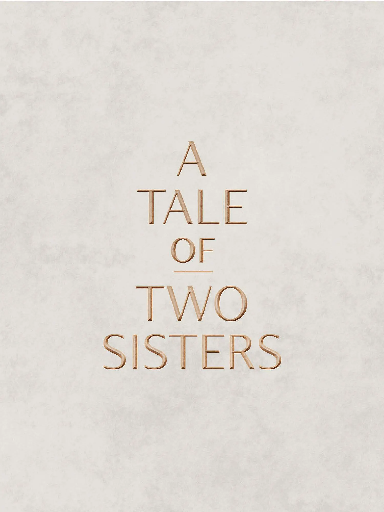
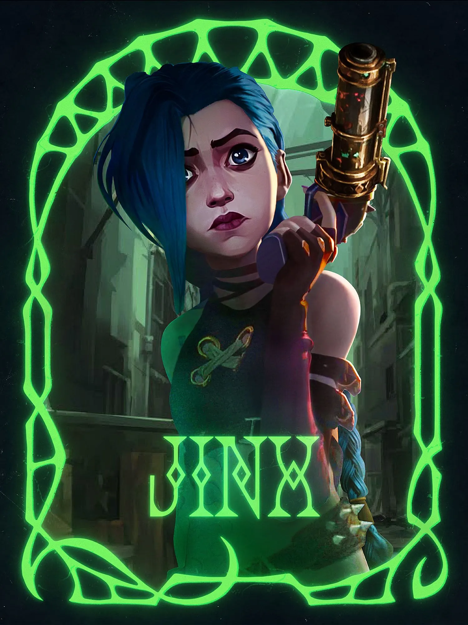
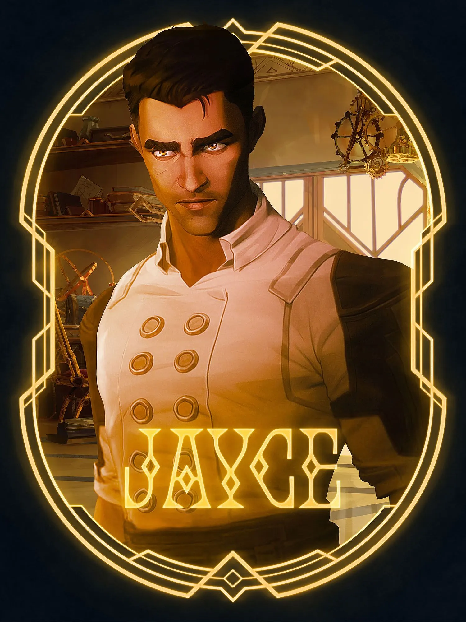
The studio built that identity from the story's own setting. It drew a custom typeface, Iron & Glass, that borrows from both Art Deco and Art Nouveau, then used each style to define a faction: machine-age Deco and Streamline Moderne for Piltover, and sinuous Nouveau curves with a sharp, iridescent edge for Zaun. The type stretches from event-scale titling to detailed social graphics, and Fortiche Production, the animation studio behind the series, worked with COLLINS on a motion signature. The show premiered in November 2021 and reached number one on Netflix in 85 countries.
Why it works
Period styles are an unexpected choice for a game adaptation, and that is the smart part. Art Deco and Art Nouveau carry associations of craft, ambition, and cultural weight, so the brand signals prestige before a single frame plays and avoids the neon-and-grit look many game properties lean on. Giving each city its own style lets the identity express the story's central tension visually, while the shared typeface keeps the two from drifting apart. Custom lettering also gives fans something ownable: a title that feels like an object from the world, not a logo applied to it.
Logo
Typography
Applications
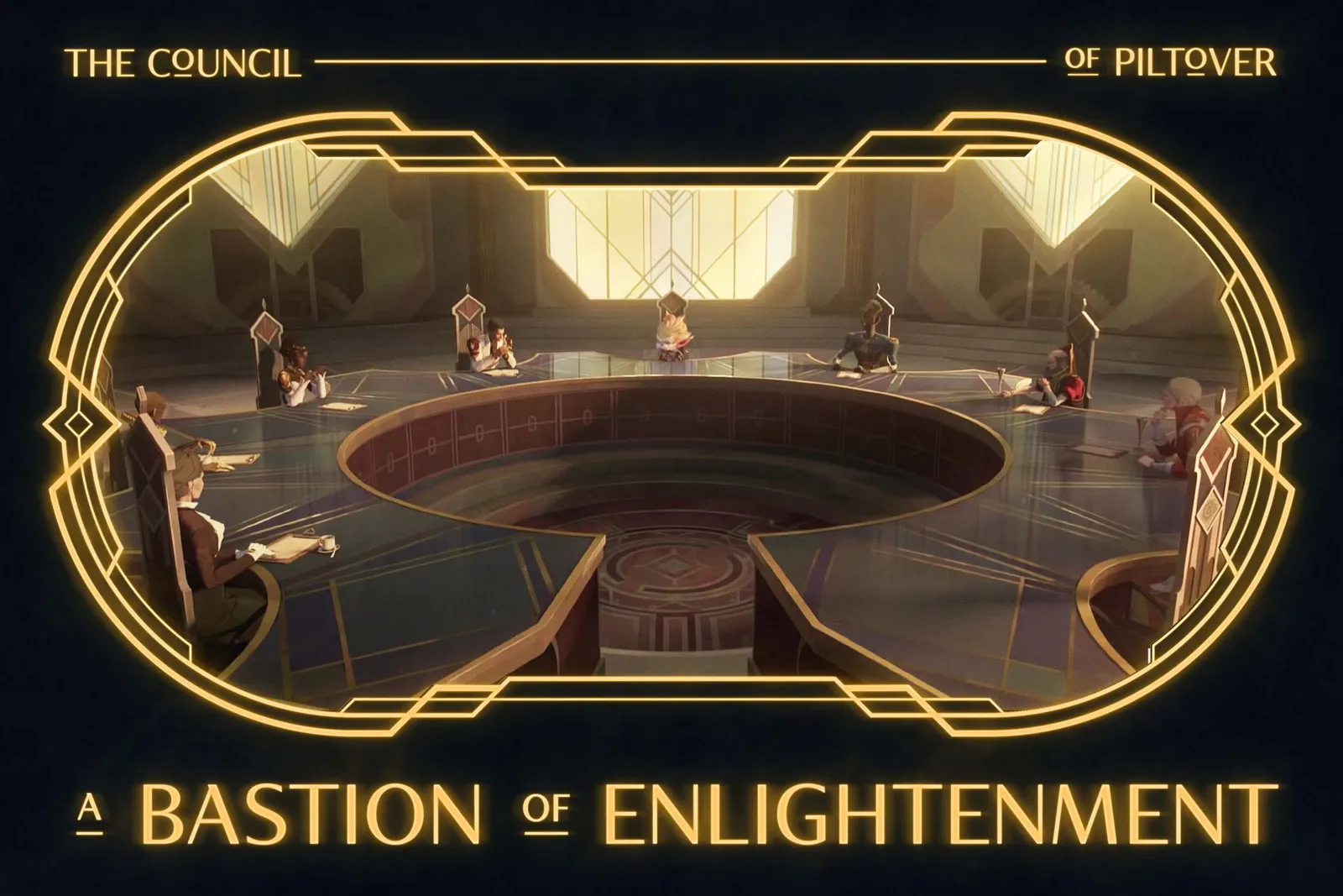
Images and video from wearecollins.com, by COLLINS.