The Brand Monograph
Cadia brand identity by COLLINS
↗Most rebrands begin with a logo. COLLINS' work for Cadia began with a question about what the business should be. The client is an $85B healthcare REIT with more than 1,600 properties across the US, UK, and Canada. It was eyeing a wellness real estate market projected to reach $913B by 2028, and owning buildings wasn't the way in. Running them was.
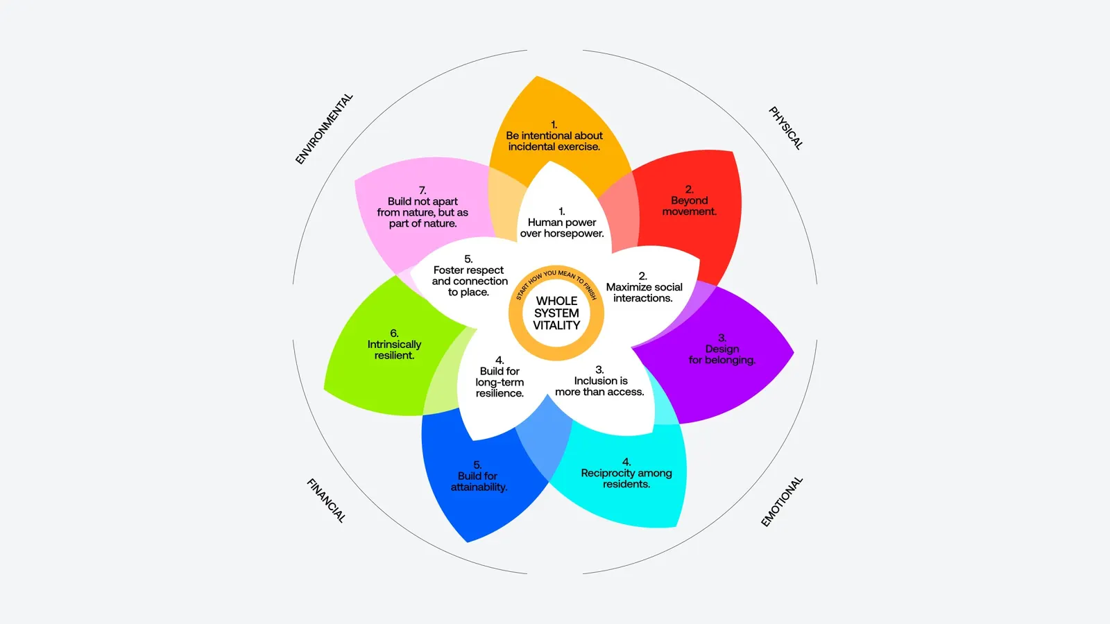
Over two years, the studio started with product, shaping a model that ties architecture, shared spaces, and nature to physical, mental, and social health. From there it moved to company culture, pointing teams toward resident experience over transactions, then refreshed the corporate identity and created Cadia, a consumer brand for the wellness portfolio. It launched with a $2.8B property pipeline behind it.
Why it works
The smartest move is structural. COLLINS gave the wellness portfolio its own name and identity instead of stretching a corporate brand built for investors. Residents and their families need a different kind of signal. "Cadia" is short, easy to say, and free of the clinical and real estate vocabulary that tends to define this category, so it can sit closer to hospitality and lifestyle. The refreshed parent identity lets the two brands coexist without competing. And because the brand rests on a product with measurable results, the promise feels earned rather than decorative.
Logo
Color
Typography
Applications




Images and video from wearecollins.com, by COLLINS.