The Brand Monograph
Rollr brand identity by Mother Design
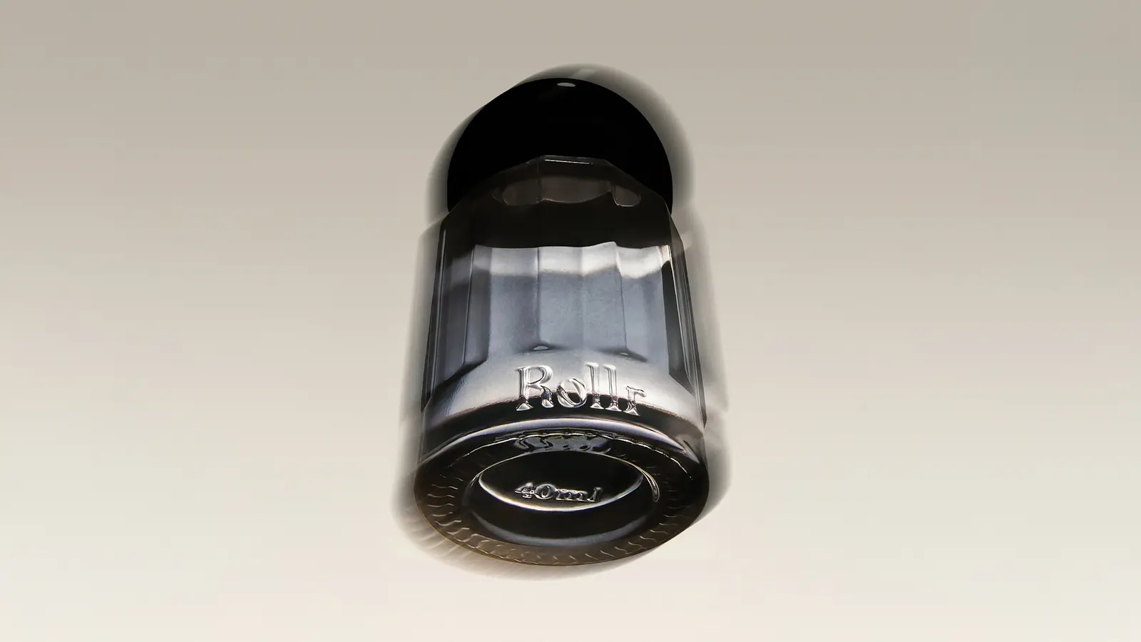
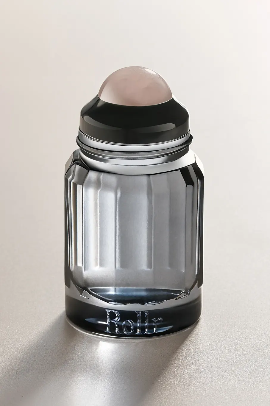
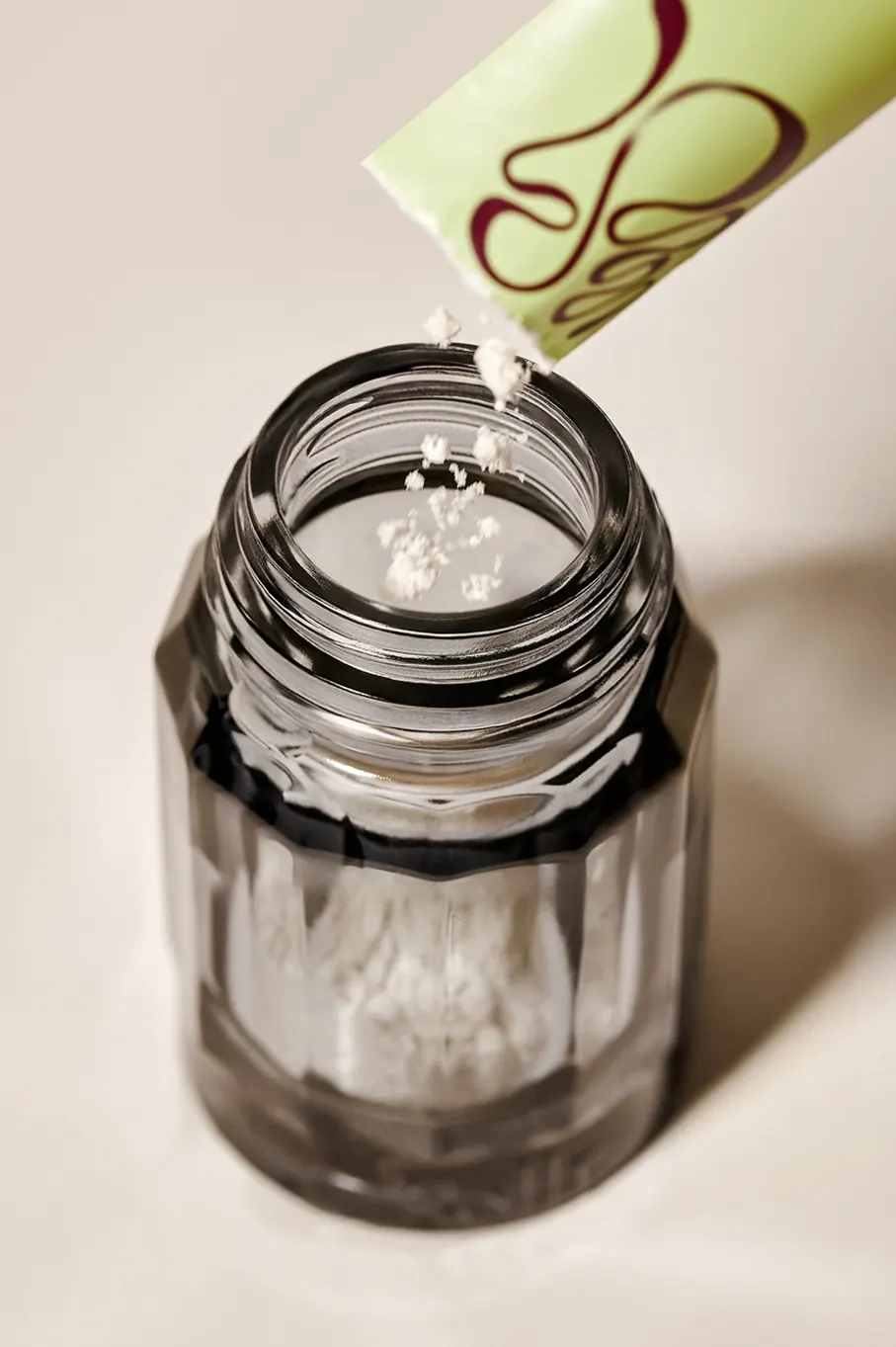
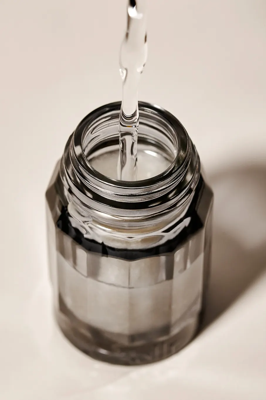
↗Rollr is a deodorant that wouldn't look out of place next to a fragrance on a dresser, and that's the point. Mother Design took on a category built around throwaway packaging, where the numbers are bleak: 26 million disposable packages reach landfill every day. The studio's answer was a paneled glass bottle with a patented screw-top, refilled from sachets that cut packaging and shipping materials by 90%.
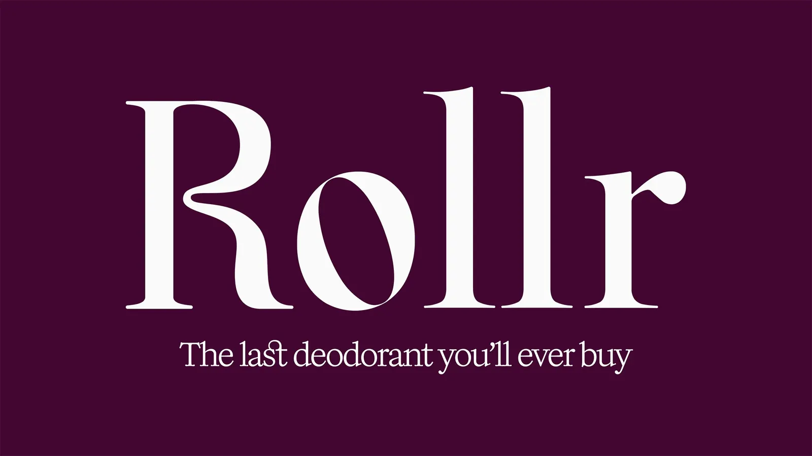
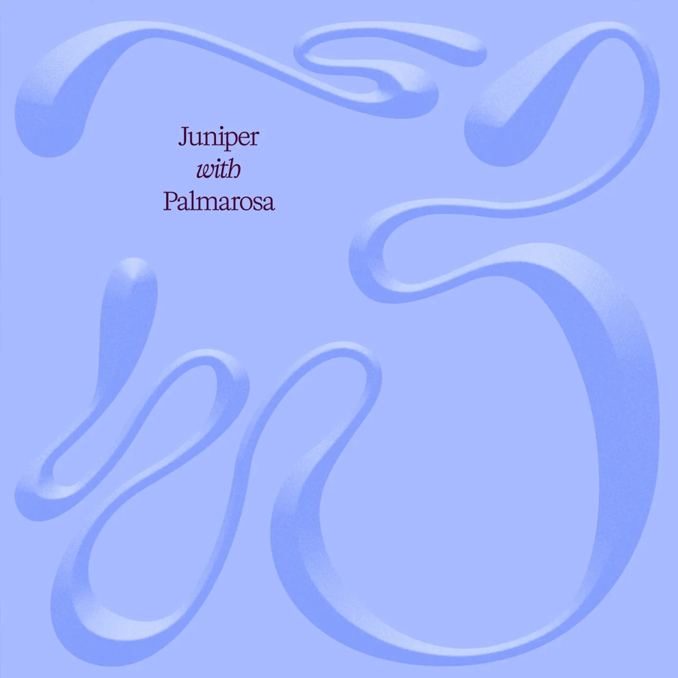
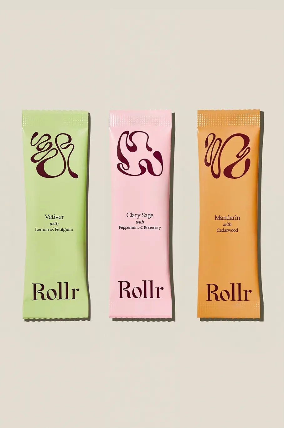
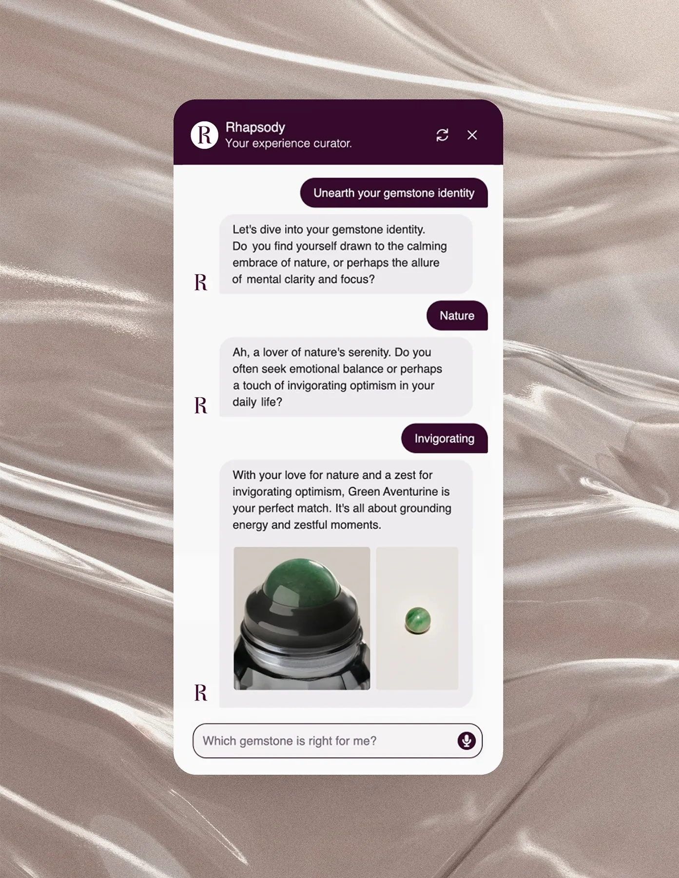
The identity borrows its codes from the fragrance world. The custom wordmark has an R that curves like liquid and an o with a rotated counter, set in deep burgundy with pastels drawn from vetiver, juniper, and mandarin scents. The clean Kalice typeface steadies the more expressive pieces, while scent-initial symbols, rippling motion, and vertical grid lines echo the glass. Veega Studio's photography catches the bottle from blurred, moving angles, and the brand's voice reaches as far as the site's AI assistant.
Why it works
The strongest decision is where Mother Design looked for cues. Most deodorant shelves lean on sporty blues and loud claims, so a burgundy mark and a refined wordmark set Rollr apart before anyone reads a word. The pastels keep that depth from feeling stuffy and give each scent its own personality. The movement in the logo is suggested rather than literal, which fits a product meant to sit on display. Sales up 80% month-on-month suggest the premium positioning landed.
Applications
Logo
Typography
Images and video from motherdesign.com, by Mother Design.