The Brand Monograph
Bezi brand identity by Red Antler
↗Few food brands start by selling something shoppers don't know to look for. Red Antler's identity for Bezi turns that problem into the pitch. Labneh, a strained yogurt spread that is a staple across the Mediterranean, has little presence in American fridges. The brief was to build a snacking category around it, with hummus as the benchmark to beat.
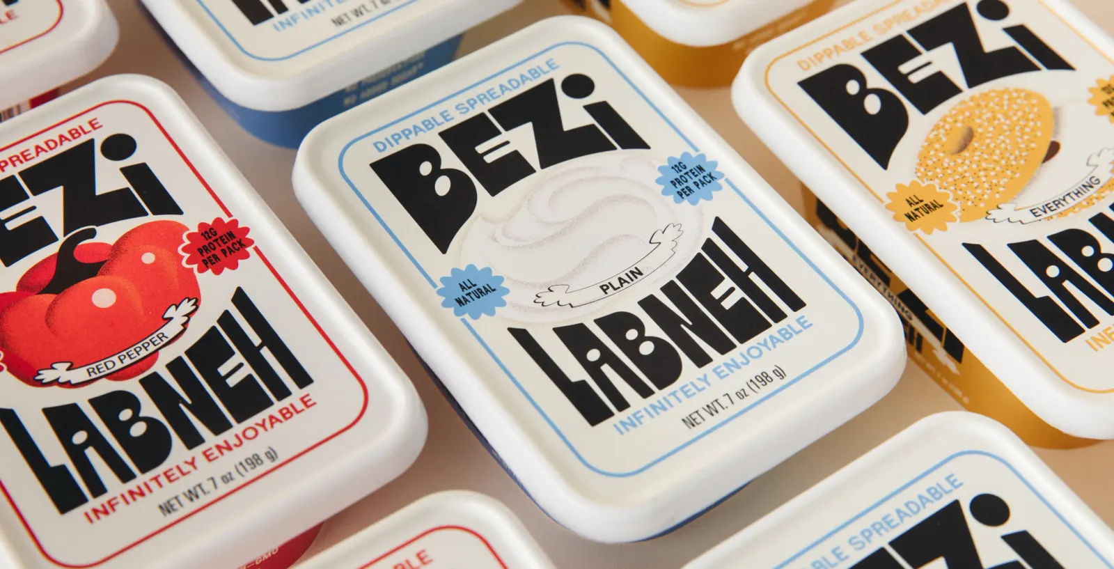
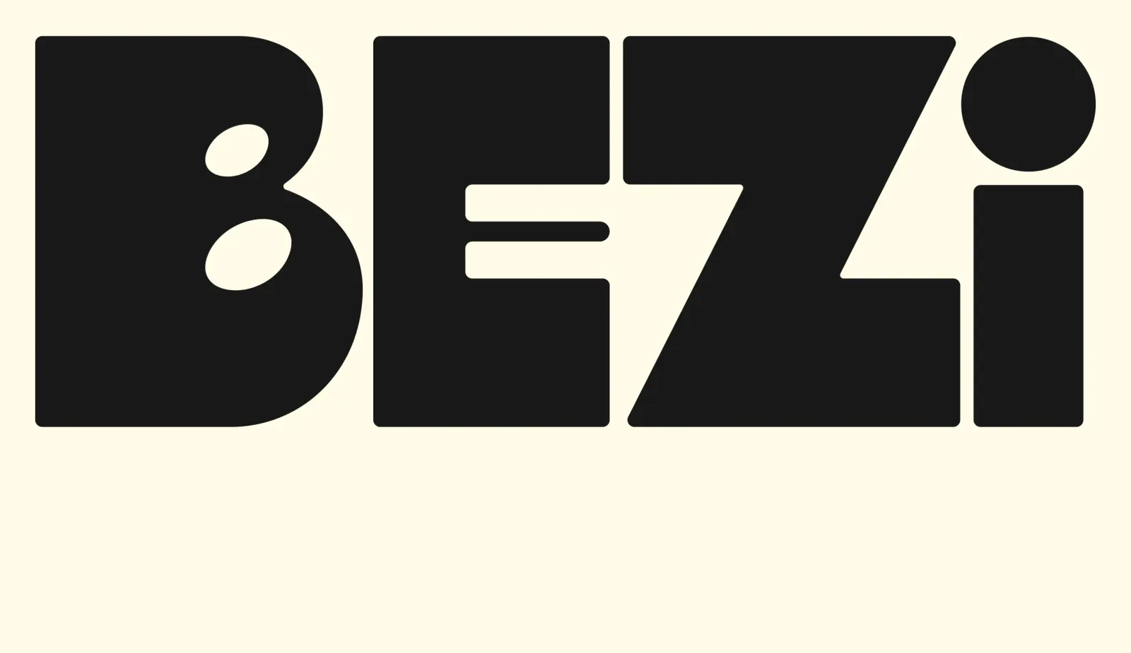
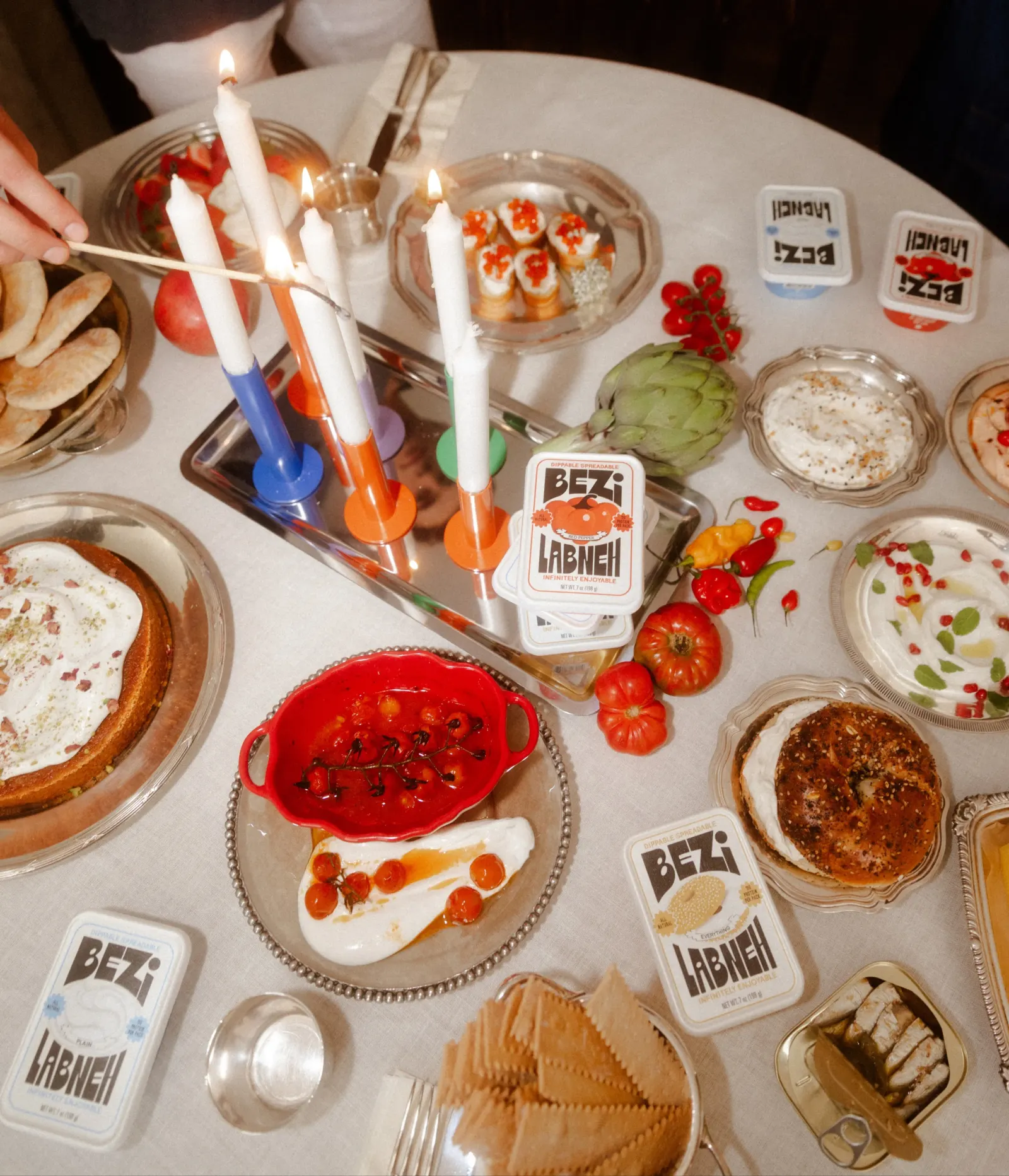
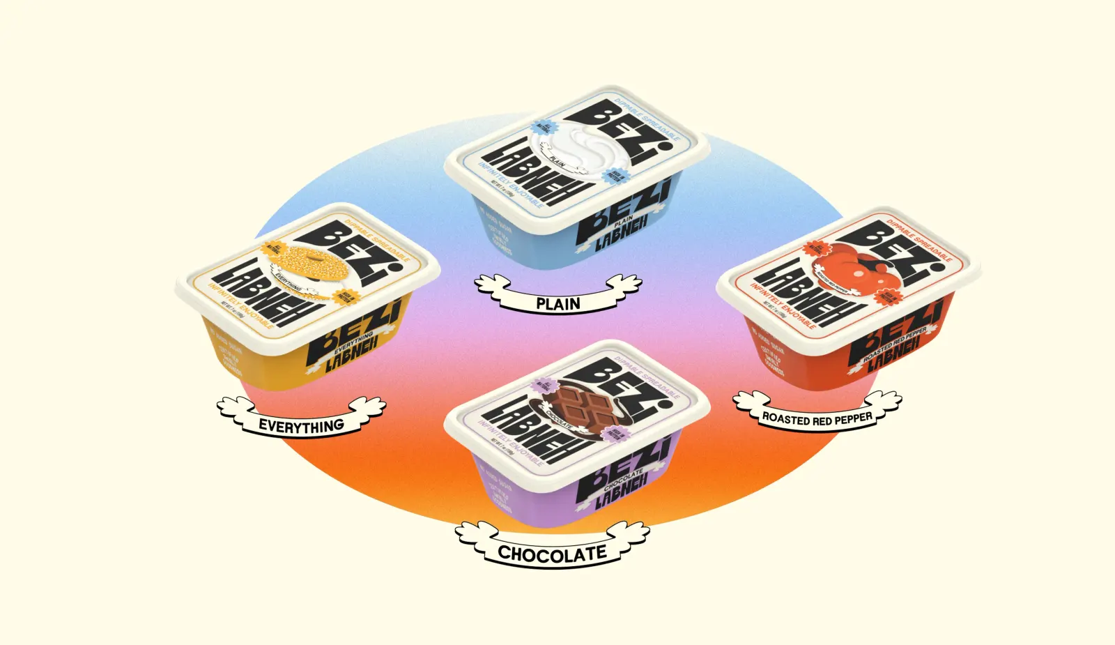
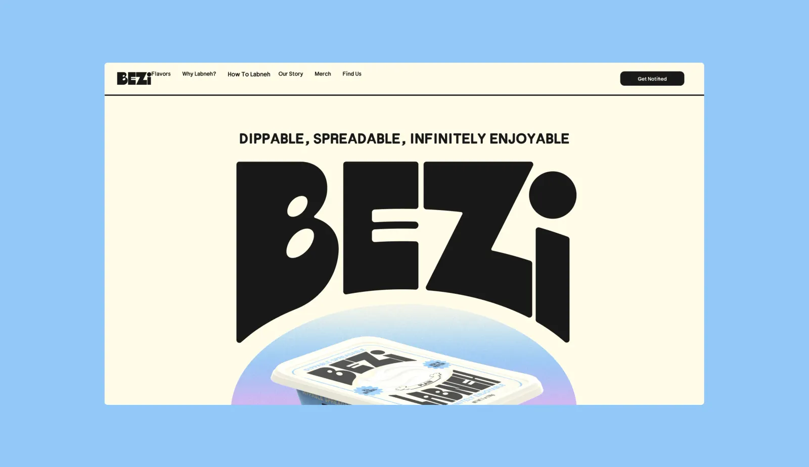
Red Antler built the identity around approachability. A geometric logo anchors the brand, a palette takes its cues from flavors, and a mascot drawn from the swirl of the product itself gives the line a face. Speech bubbles on the packaging let the brand talk to shoppers directly, and the system is set up to absorb new products without losing its character. Bezi is now stocked at top grocers in New York City.
Why it works
The smartest move is the mascot. Instead of borrowing generic Mediterranean cues, Red Antler took the most recognizable thing about labneh, its texture, and made it a character the brand can own. The geometric mark keeps that personality disciplined, so the packs read as confident rather than cute. The speech bubbles do the educating, answering the "what is this?" question with humor instead of a lecture. Together, they make an unfamiliar food feel like an easy, low-risk impulse buy.
Applications
Logo


Images and video from redantler.com, by Red Antler.