The Brand Monograph
Simmer brand identity by Play Studio
↗Play Studio gave Simmer, a head-to-head sports game, an identity rooted in an unlikely source: ancient lion hunt imagery. On the platform, fans draft fictional teams and then watch the games play out to see whose basketball knowledge holds up.
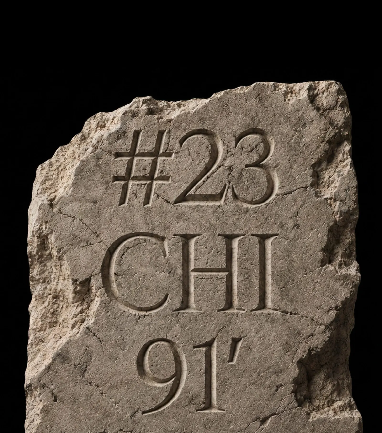
The studio's logo mark shows a human figure facing a lion, rendered in sharp, angular geometry that nods to relief carving while still feeling current. It sits at the top of the app as a constant reminder of the stakes. The same thinking shapes typography, layouts, motion, and UI components, with bold diagonals and tight structure on one side and a sense of continual movement on the other. Decades of player and team stats feed the data visualization, and cyan marks what deserves attention against a warm, earthy palette.
Why it works
Sports products tend to default to scoreboard clichés, so a myth gives Simmer a point of view of its own. It also flatters the player: you're the hunter, not a spectator. The angular mark is bold and simple enough to anchor a busy interface, and the diagonals give screens a sense of tension without adding clutter. Cyan is the smartest move. Used sparingly against warm tones, it works as a functional signal, which suits an audience that wants dense stats without the noise.
Applications
Logo
Typography



Images and video from play.studio, by Play Studio.