The Brand Monograph
Melius brand identity by View Source
↗Few rebrands survive a client changing its answer halfway through. View Source's work for Melius did, because Carly Wright's strategy rested on a point of view rather than a product. Melius started as an operating system for performance marketing and became a creative platform for agents, and a line from a working deck ended up as its headline.
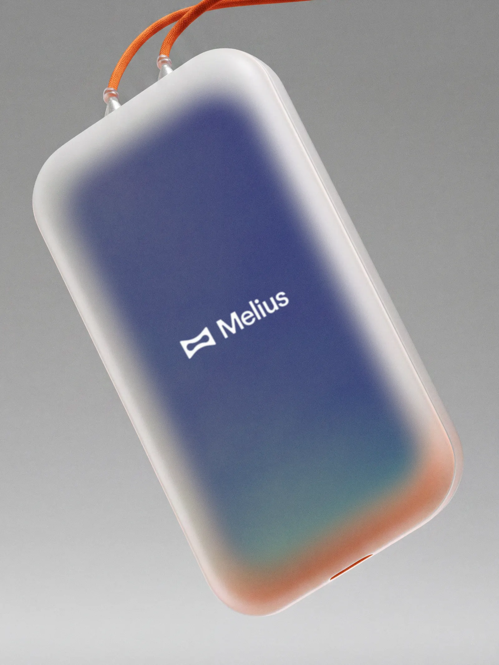
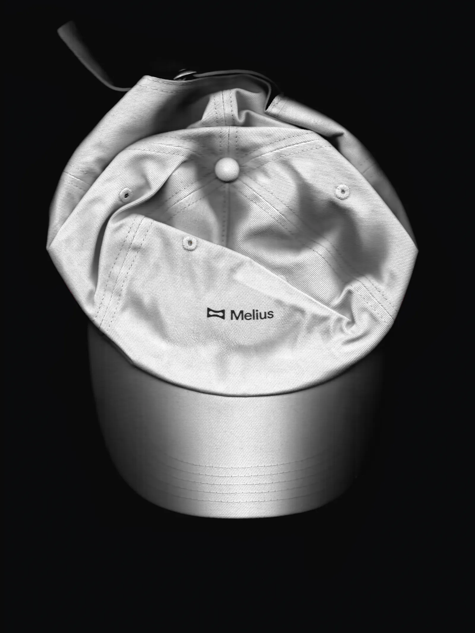
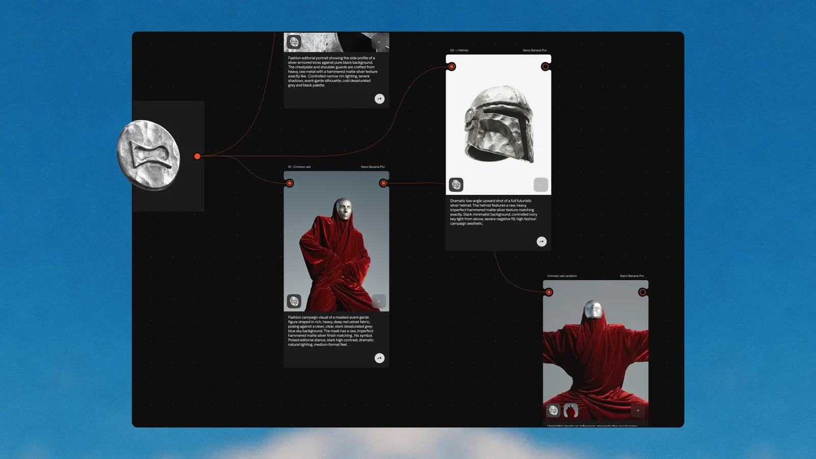
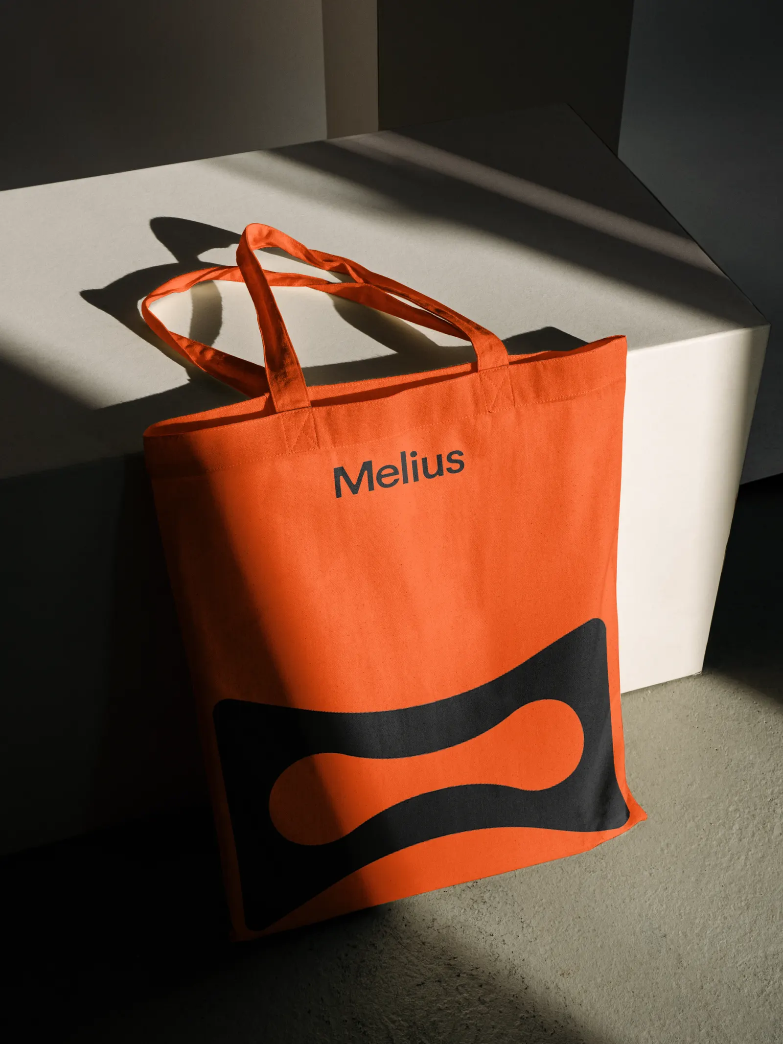
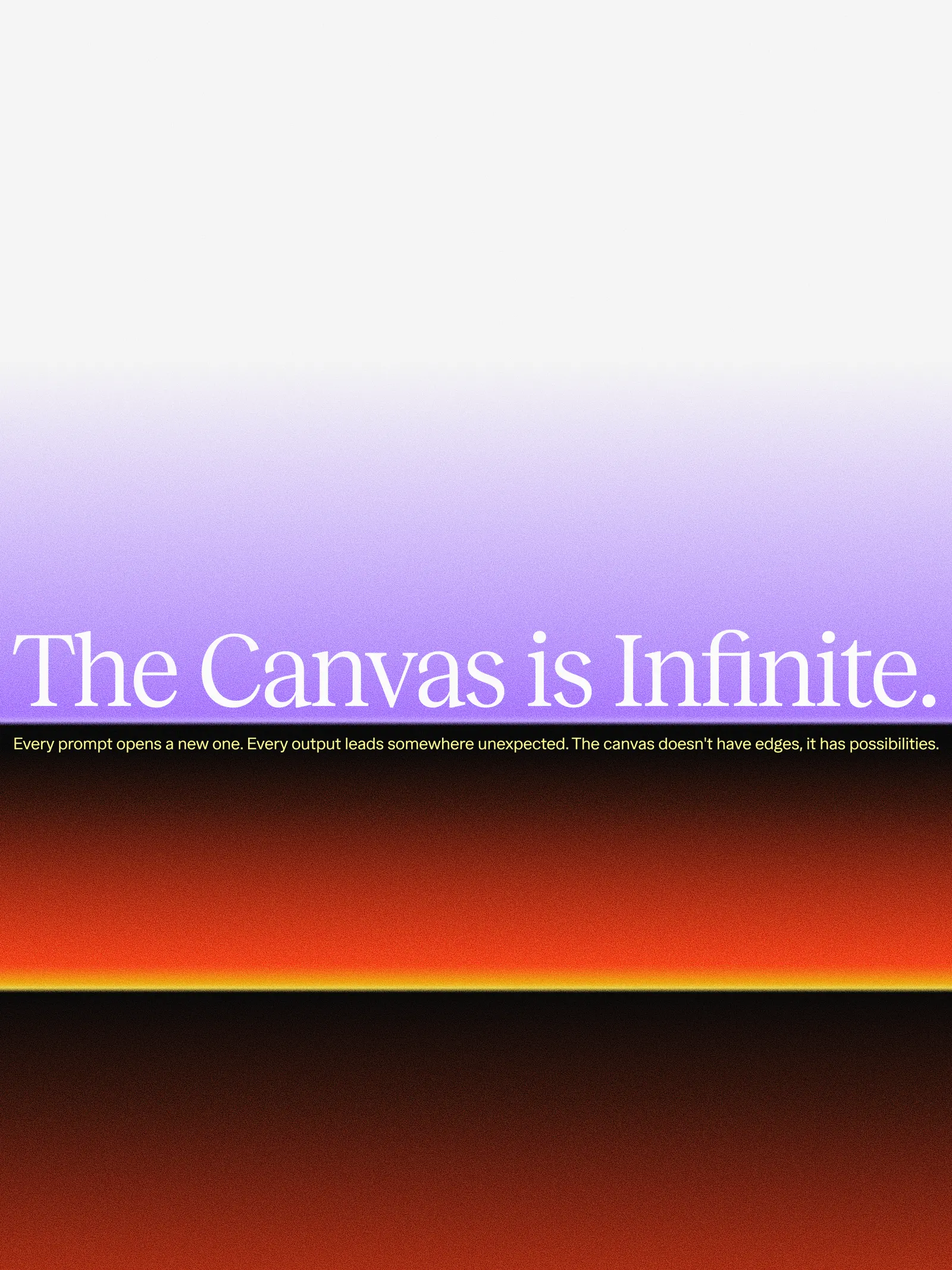
The identity was drawn by hand: an M that frames imagery, a physical token later reused as the unit on the pricing page, a custom typing cursor, and a serif that adds a human note. The five-person design team, with motion designers Anaël Zafra and Minh Nguyen and four developers, grew the site out of WebGL experiments. It opens on an interactive canvas, then shows real workflows being built step by step, each output credited to the model behind it.
Why it works
Melius is selling AI-made work to people who are wary of sameness, so the identity answers with visible evidence of human decisions. The serif and the custom cursor feel authored, which separates the brand from the generic sans-serif look many software companies default to. The token is the smartest move: a tactile object that doubles as a pricing unit gives an abstract product something countable. Crediting each output to its model is the same kind of candor, and it gives creative buyers a reason to trust the claims.
Applications
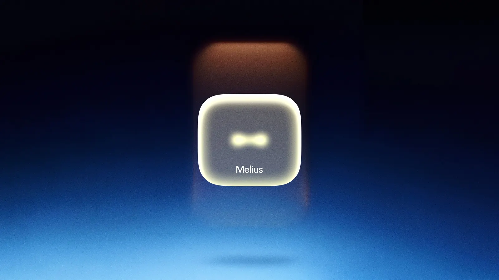
Logo
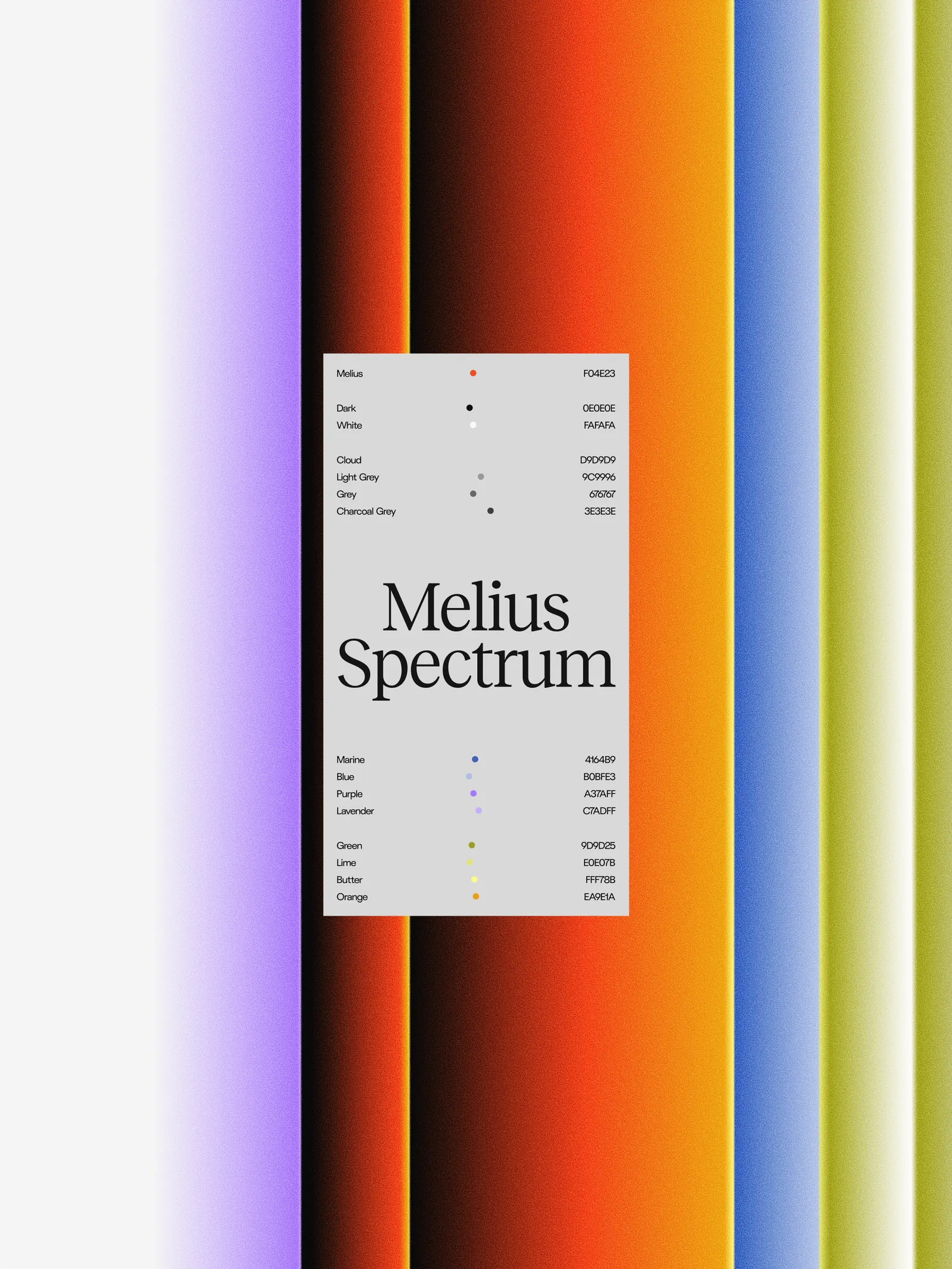

Typography
Images and video from view-source.com, by View Source.