The Brand Monograph
Driver brand identity by Play
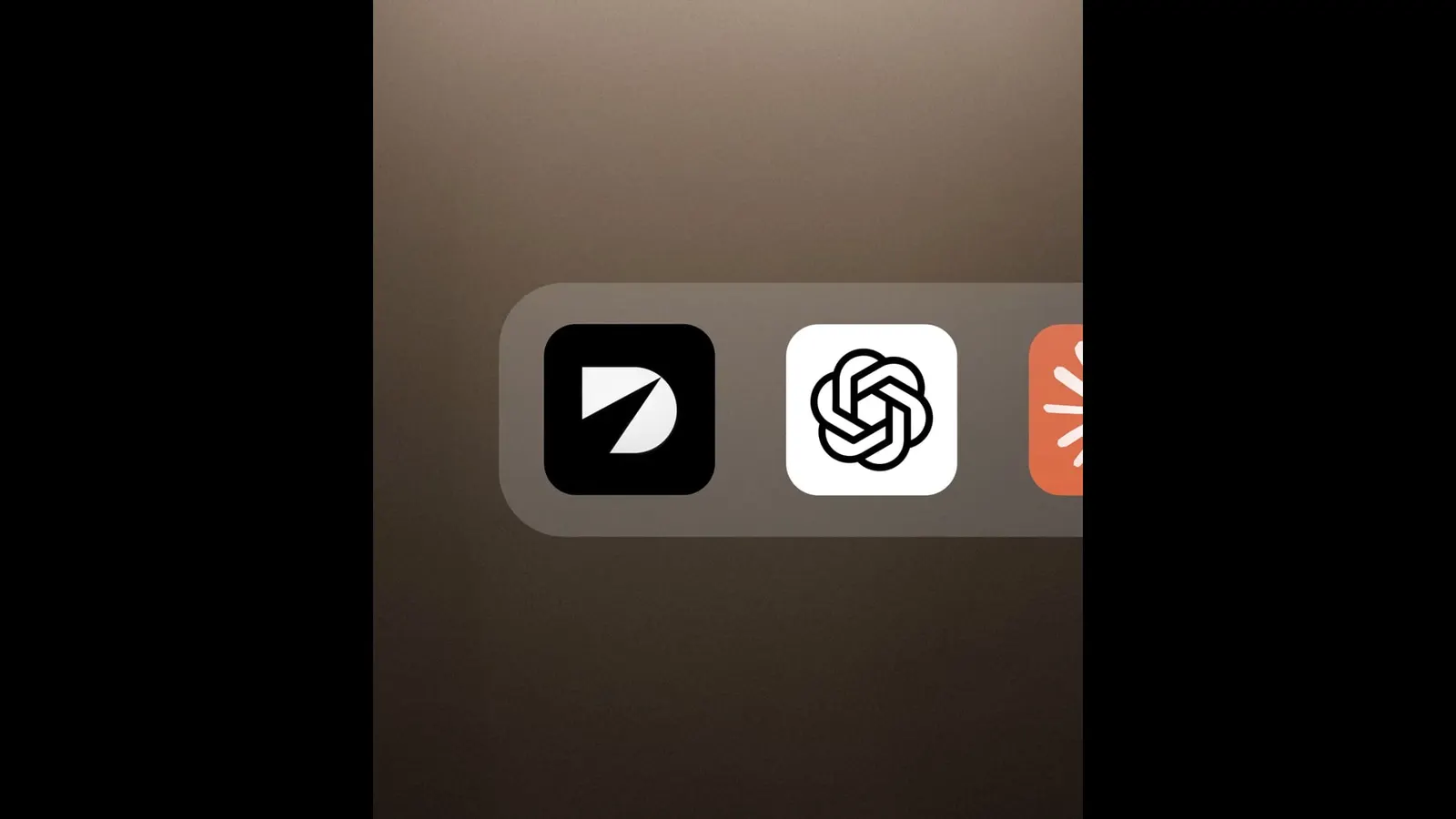
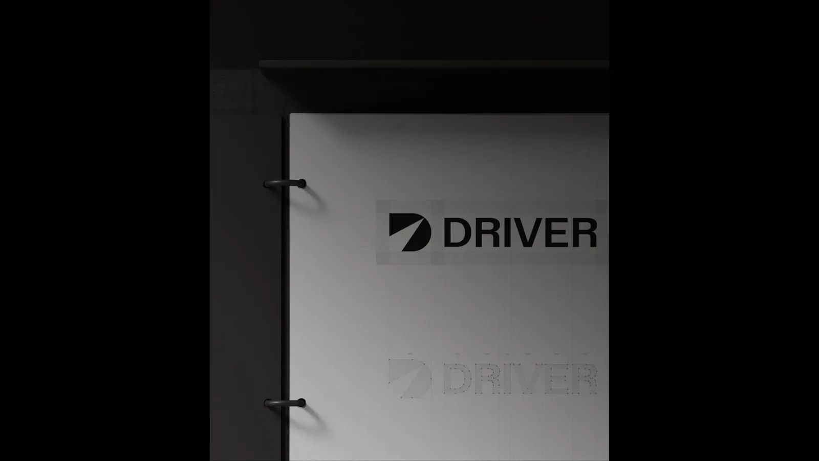
↗Play gives Driver an identity that explains the product before anyone reads a word. The mark is a solid black D split by a narrow slash of light, and that one gesture sets the logic for everything that follows.
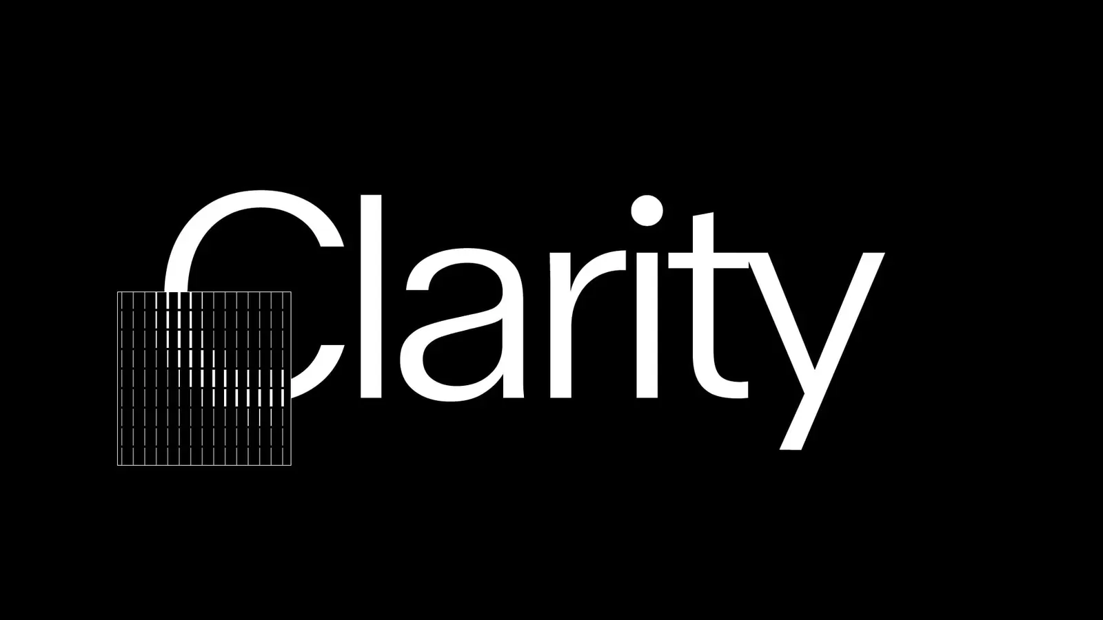
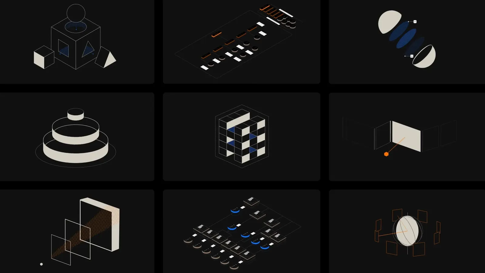
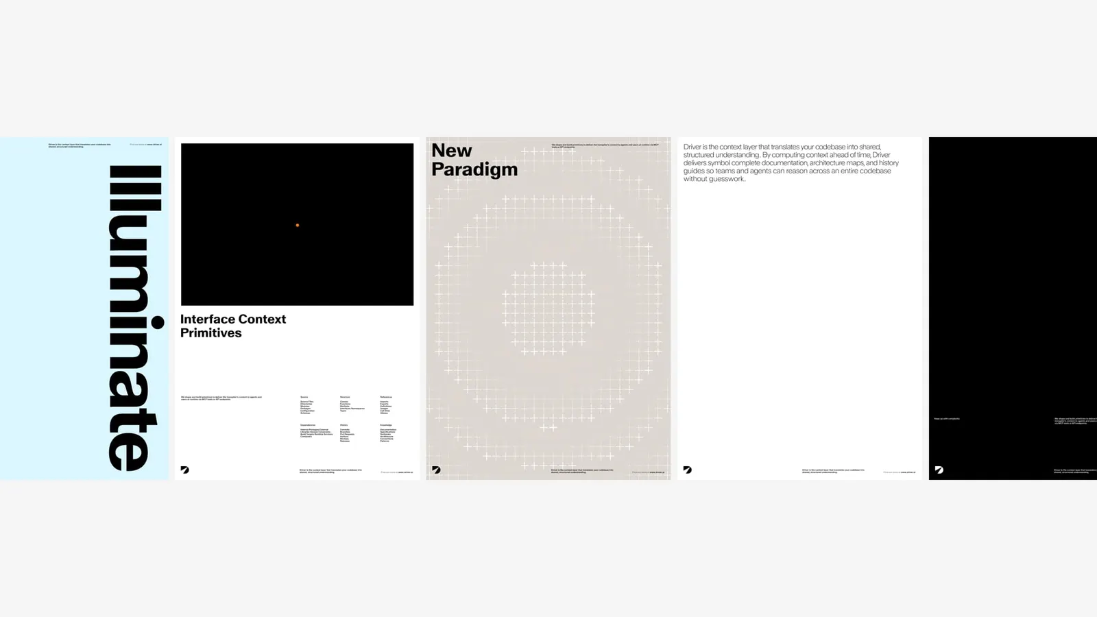
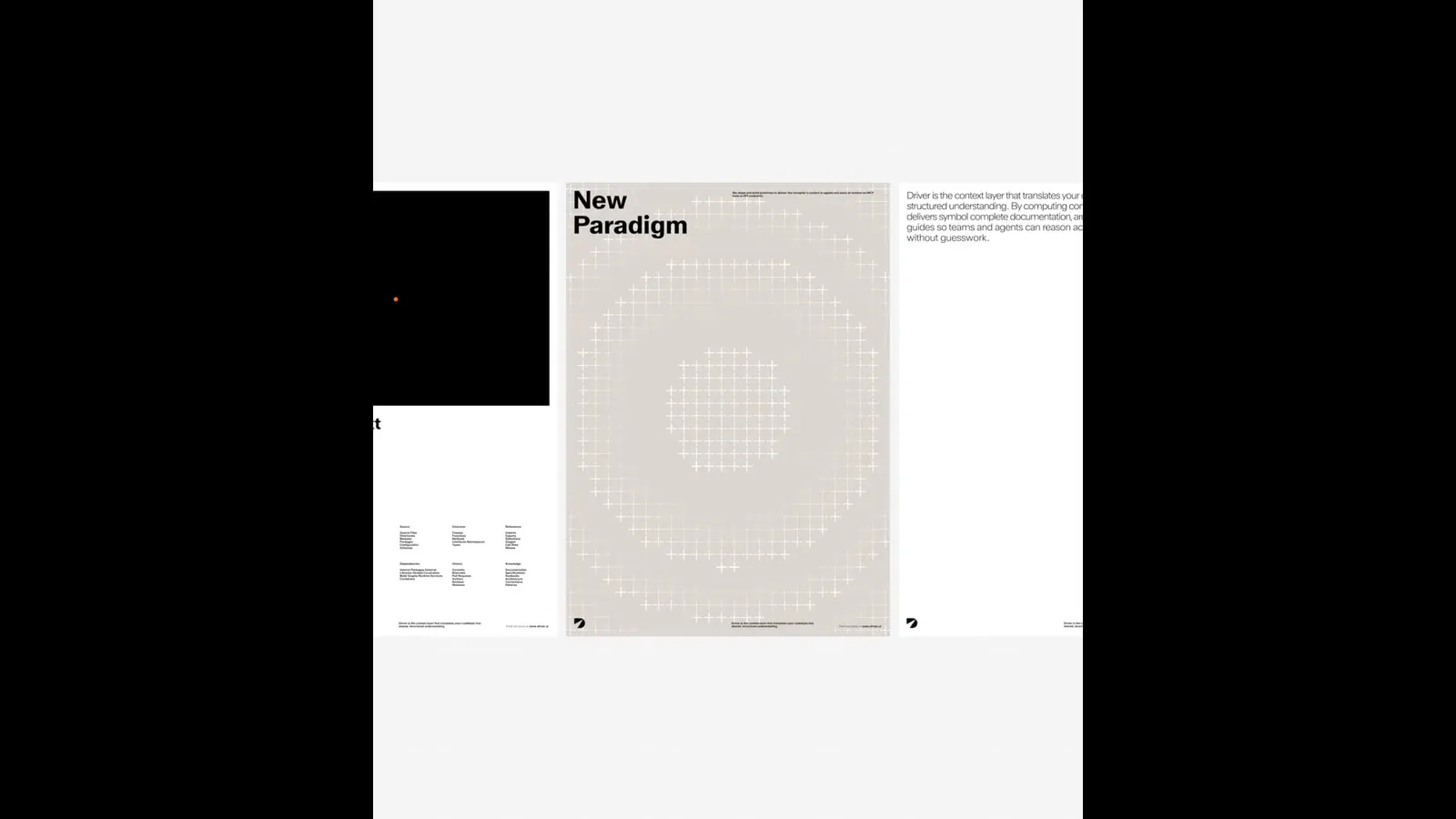
Driver maps a company's entire codebase so engineers can see what a change will touch before it causes costly breakage. Play made visibility the organizing idea. The studio set the brand in Walter Neue Variable and uses its weight range to let words move from hairline to heavy. Charts, patterns, and icons are built from abstracted code characters (dashes, pluses, pipes, and circles) and follow the same progression, while an X-ray mode peels back the surface to show the structure underneath. Black and white carry the system, with blue, orange, and magenta used sparingly as accents.
Why it works
Developer tools often default to neon gradients, terminal green, and generic node graphs. Driver avoids all of that. The D is blunt and simple enough to hold up at small sizes, and it reads as a diagram of the product's promise. Building graphics from characters engineers type every day speaks to them in their own language without resorting to literal brackets and cursors. Because the palette is so restrained, a flash of blue or magenta reads as a signal, much as it would on a good dashboard.
Typography
Applications
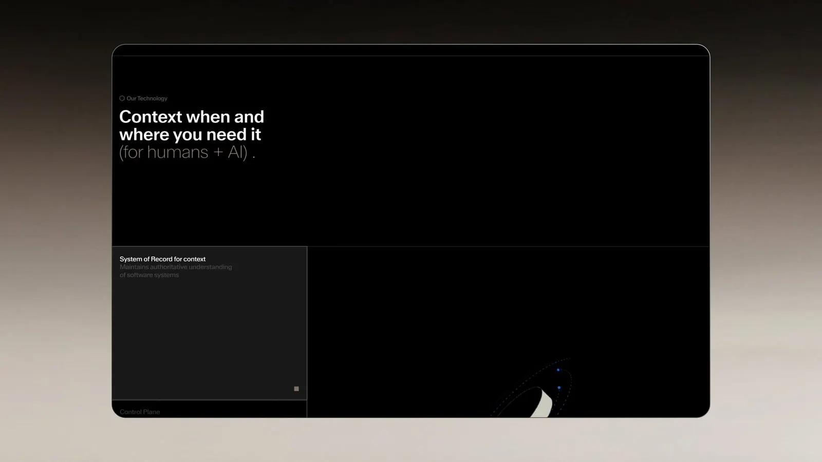
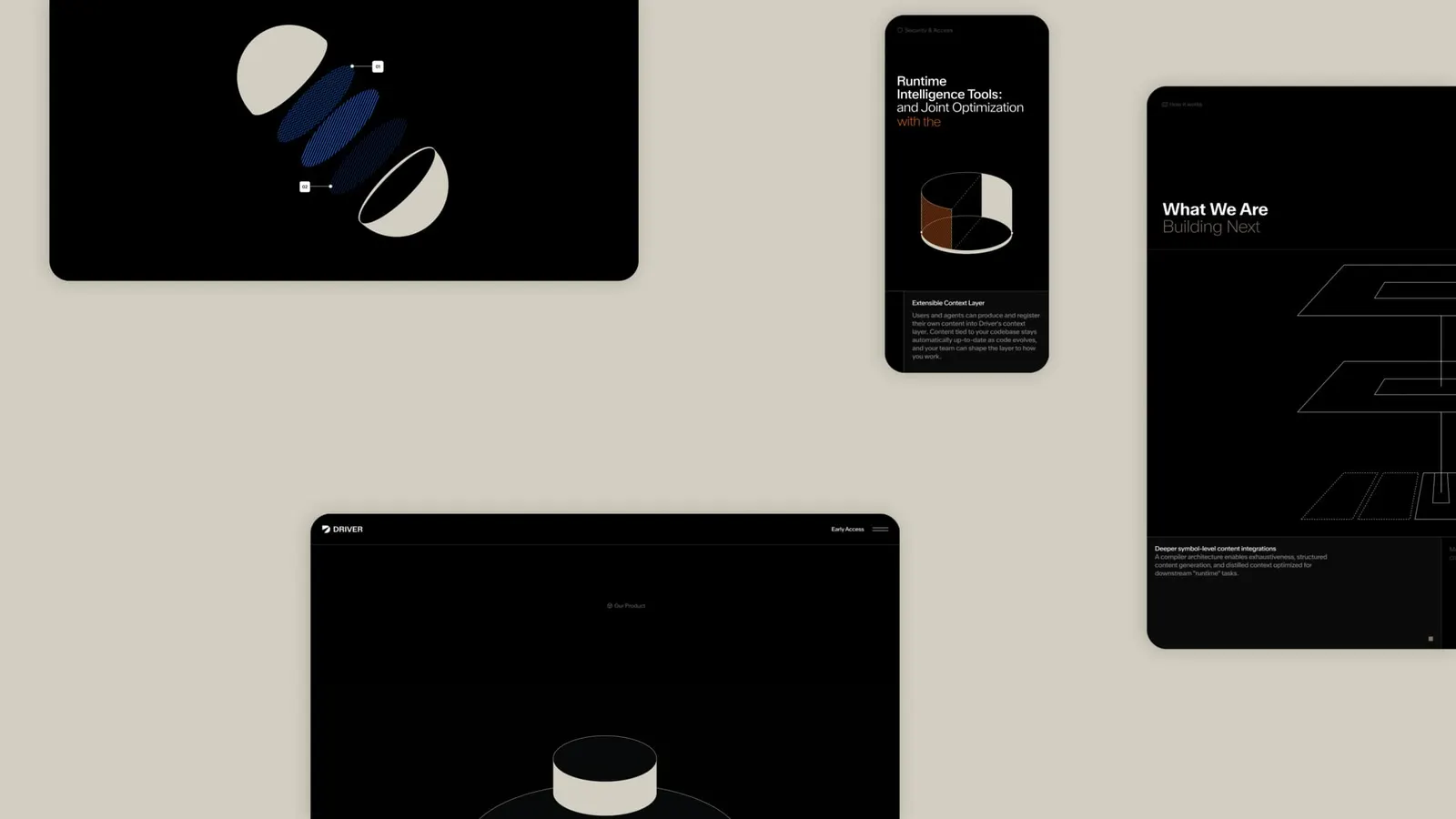
Images and video from play.studio, by Play.