The Brand Monograph
Omega brand identity by Love and Money
↗Beer branding usually shouts about hops, malt, and the latest novelty, so it's refreshing to see Love and Money put the spotlight on the ingredient doing the real work. Omega Yeast is a technology company that uses brewing science to show brewers what yeast can do. The studio's task was to make that story clear and give it a look of its own.
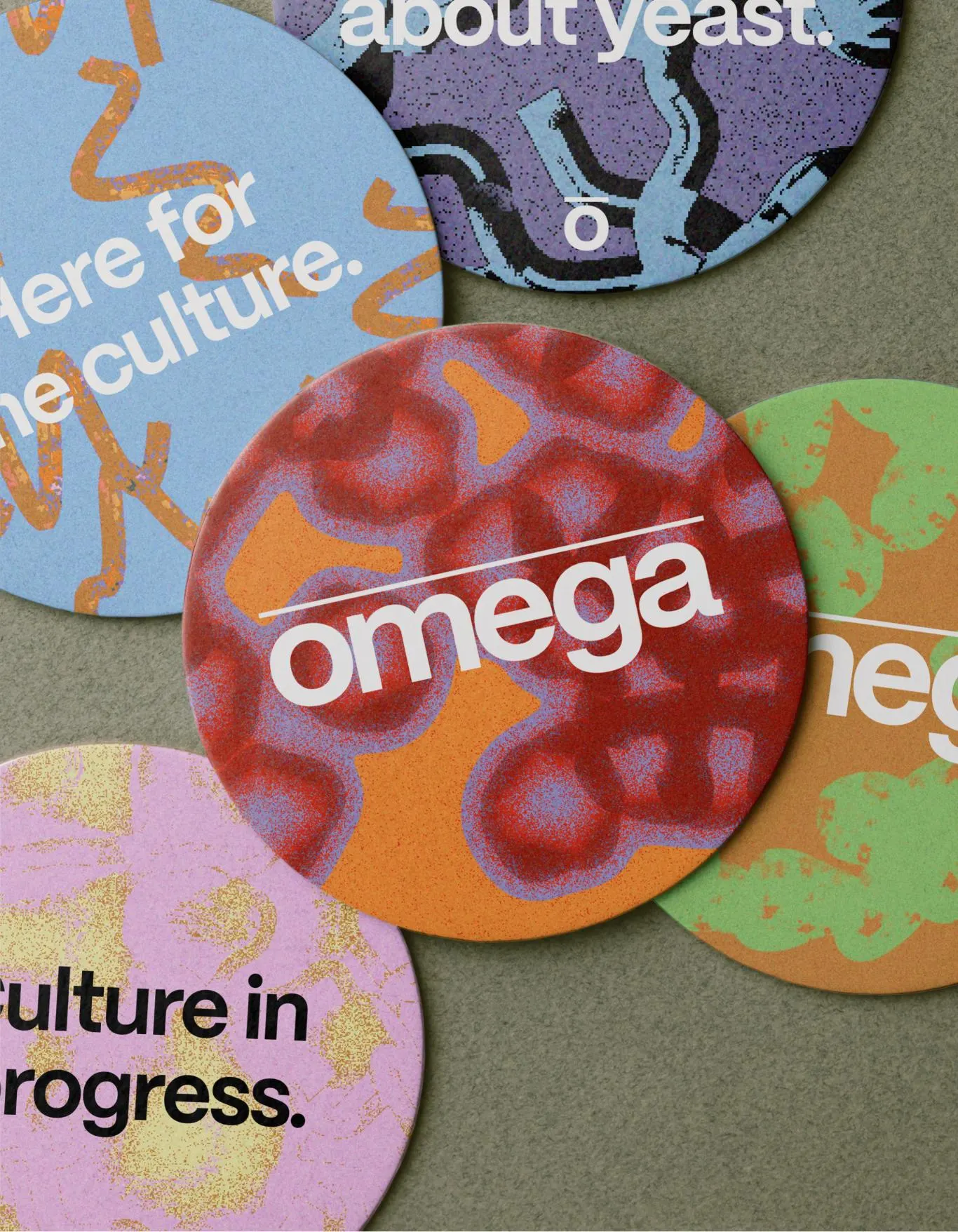
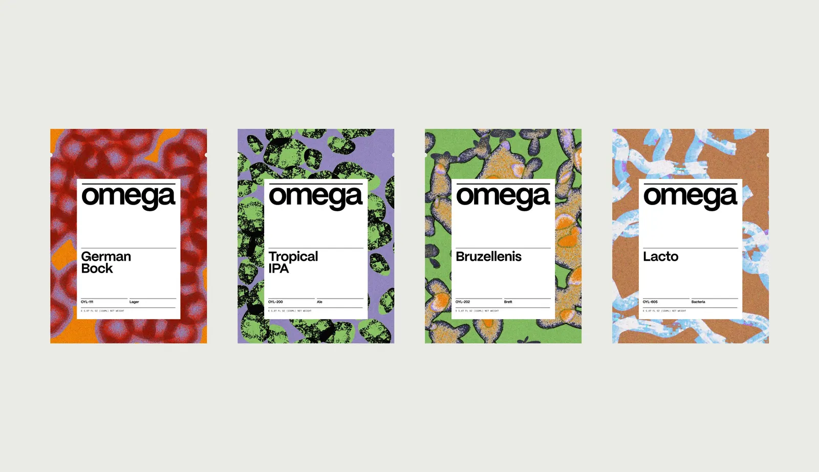
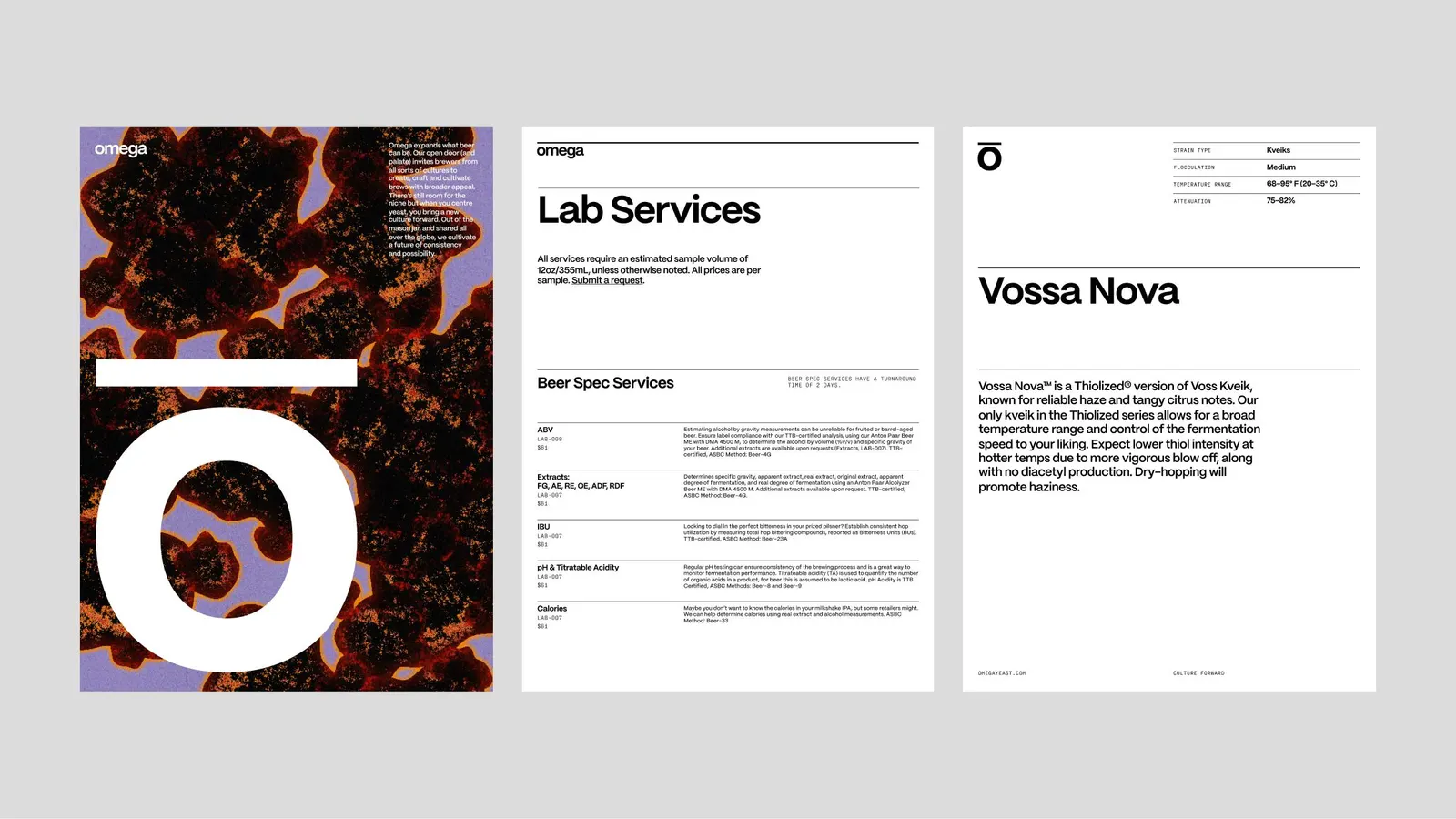
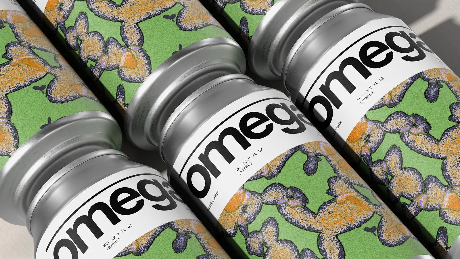
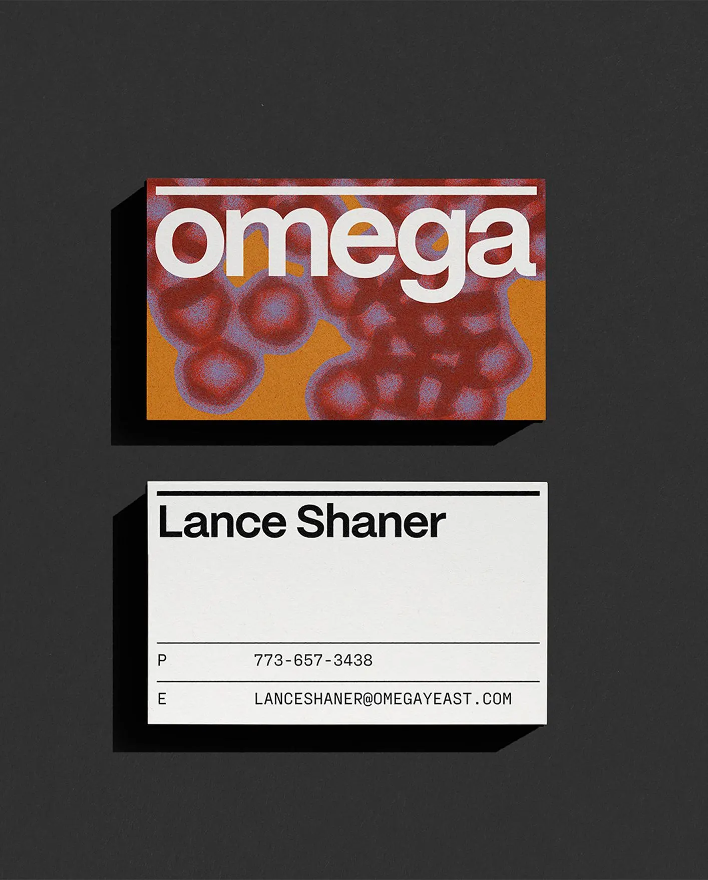
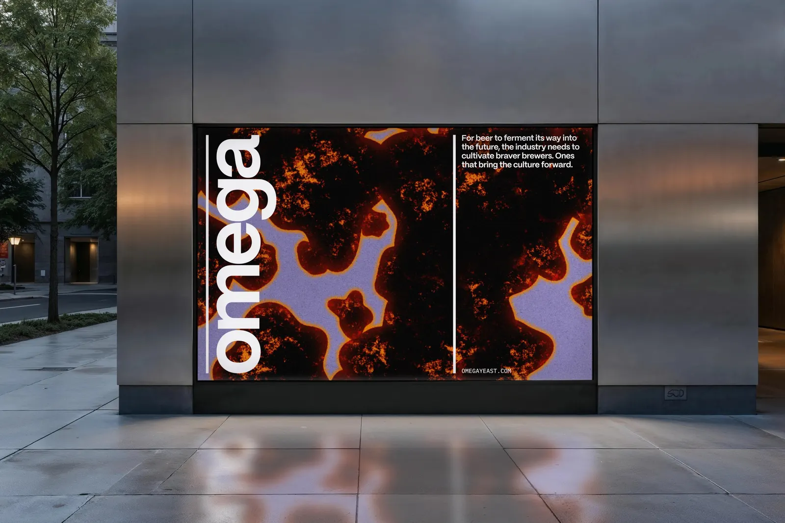
The brief went well beyond a logo. Love and Money restructured the product catalogue and brand architecture, then set a new proposition for the company, so the identity had a clear organizing logic before the design began. The visual language draws on the science of fermentation and has to cover hundreds of products across packaging, an online store, and wholesale sales materials. What stands out is the discipline: one expressive system that holds together in every one of those places.
Why it works
Fermentation gives Omega something its category rarely has: a visual idea rooted in what the product actually does. Beer imagery often leans on hops and novelty, while a science-led identity reads as credible to brewers who buy yeast for results, and it sets Omega apart at a glance on a crowded shelf or a long product list. Because the idea is a process rather than a single motif, it can flex across hundreds of products without becoming repetitive. And because the catalogue was reorganized first, the system helps people find and choose, not just admire.
Applications
Logo


Images and video from loveandmoney.com, by Love and Money.