The Brand Monograph
Fluff brand identity by Love and Money
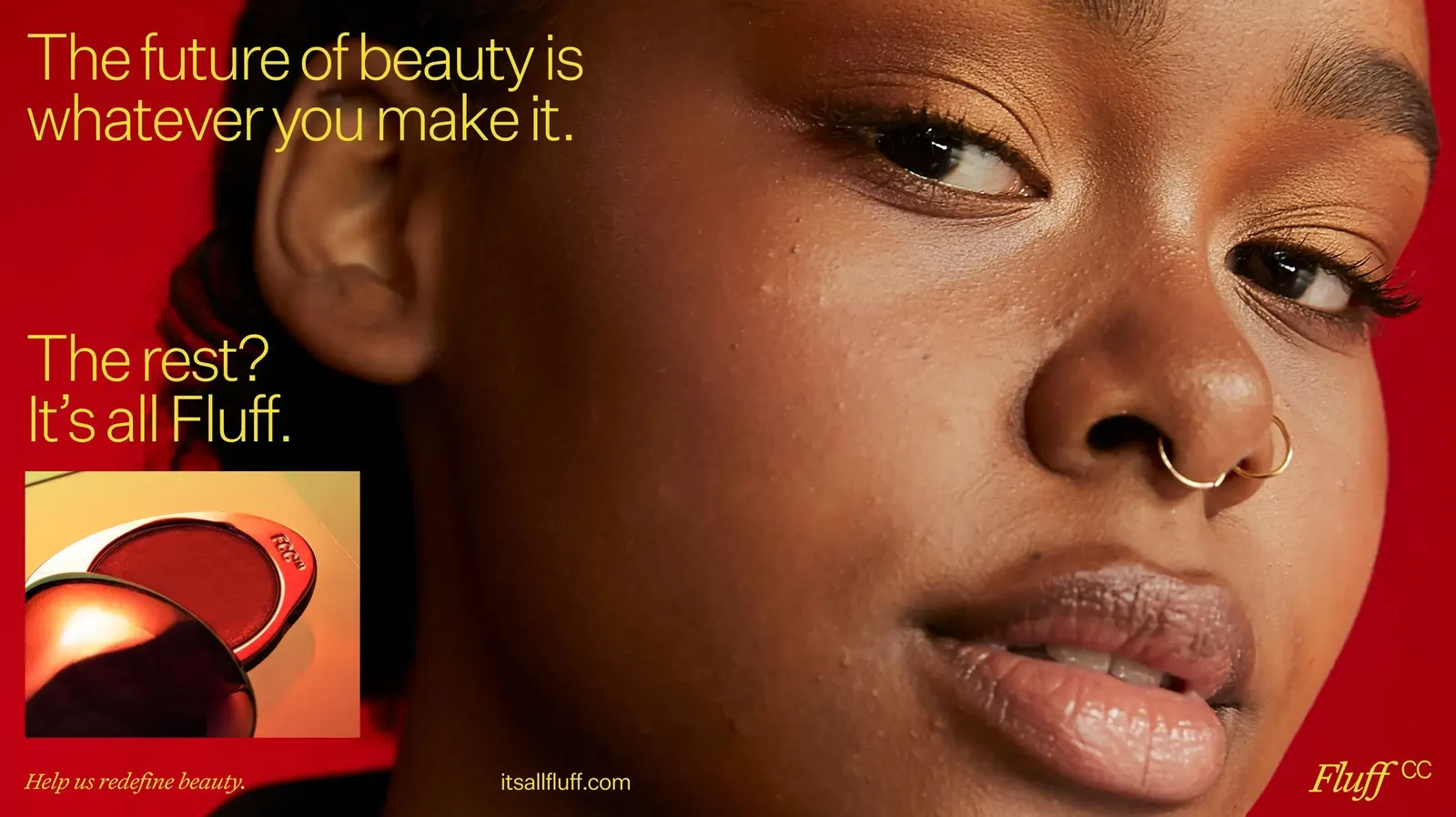
↗Most beauty brands sell customers a better version of themselves. Fluff, an independent Casual Cosmetics™ company, does the opposite, and Love and Money has made that stance something people can hold, read, and wear. The studio built the brand and digital experience, then kept going into product development, community events, and even the global supply chain behind the range.
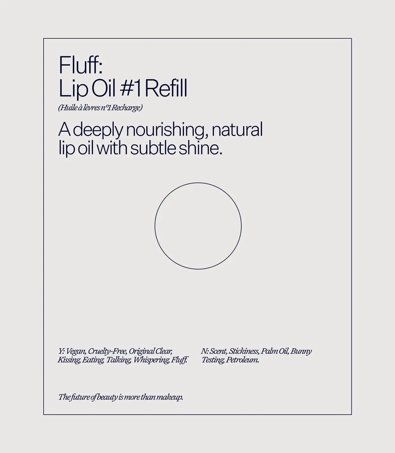
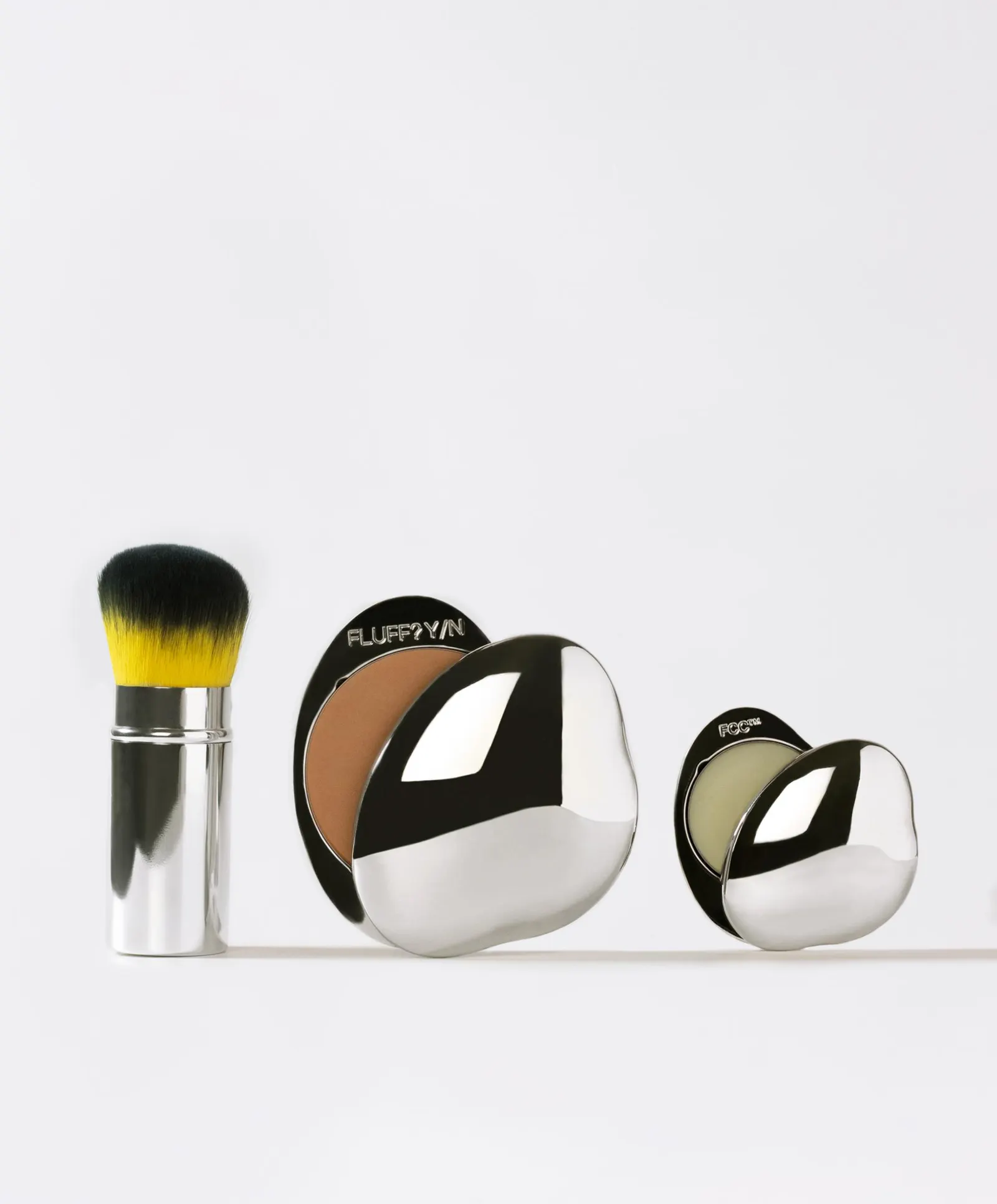
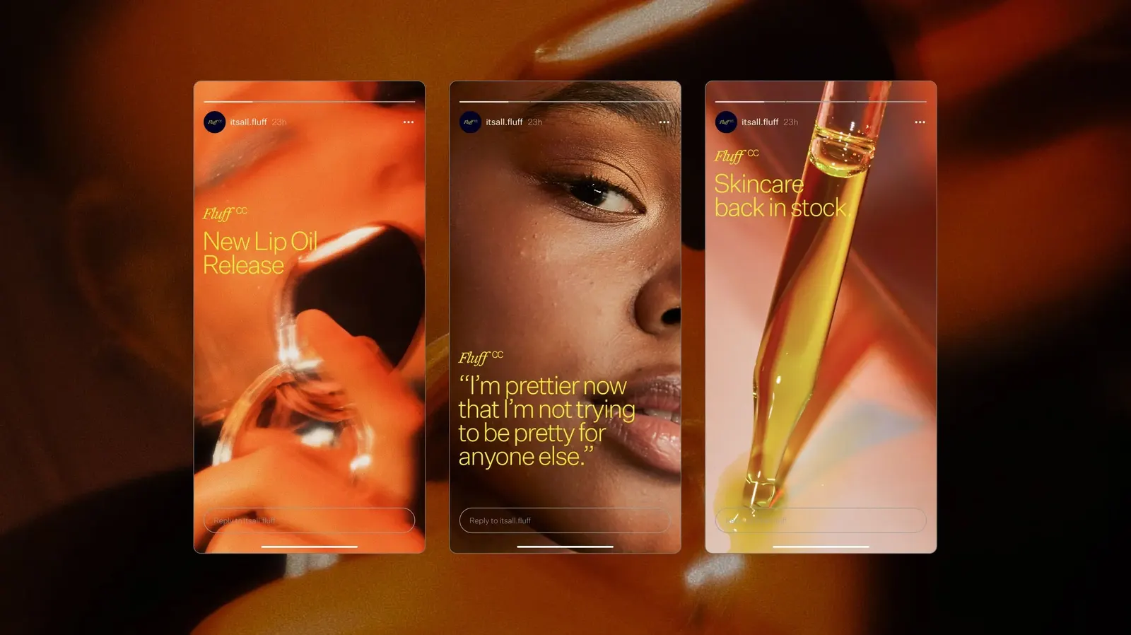
The brief was to speak for a new generation of beauty consumers without talking down to them. The studio started by asking people how they feel and how they want to deal with a beauty brand, and that led to Issues, a digital and print series written in customers' own voices. Klim Type Foundry supplied the typography. The Cloud Compacts anchor the product line, and limited-edition artist designs and refills keep them changing.
Why it works
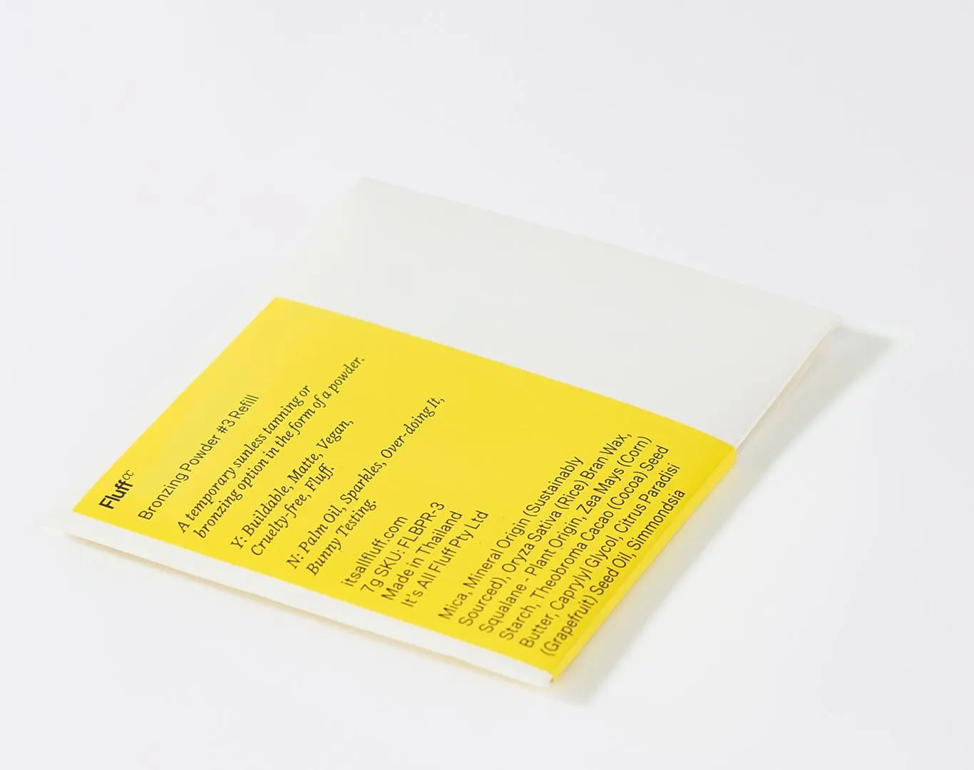
The identity reaches well beyond a logo into things people touch and contribute to. Issues gives customers part of the brand's voice, which is hard for competitors built on aspirational imagery to copy. Treating the compact as a collectible art object gives people something to keep rather than replace, and guest artists keep it fresh. Klim's typography signals craft behind a relaxed tone, so the brand feels casual without feeling disposable. The proof is in the fans who carry the compacts everywhere and have the brand inked on their skin.
Applications
Logo

Typography



Images and video from loveandmoney.com, by Love and Money.