The Brand Monograph
Robinhood Market brand identity by PORTO ROCHA
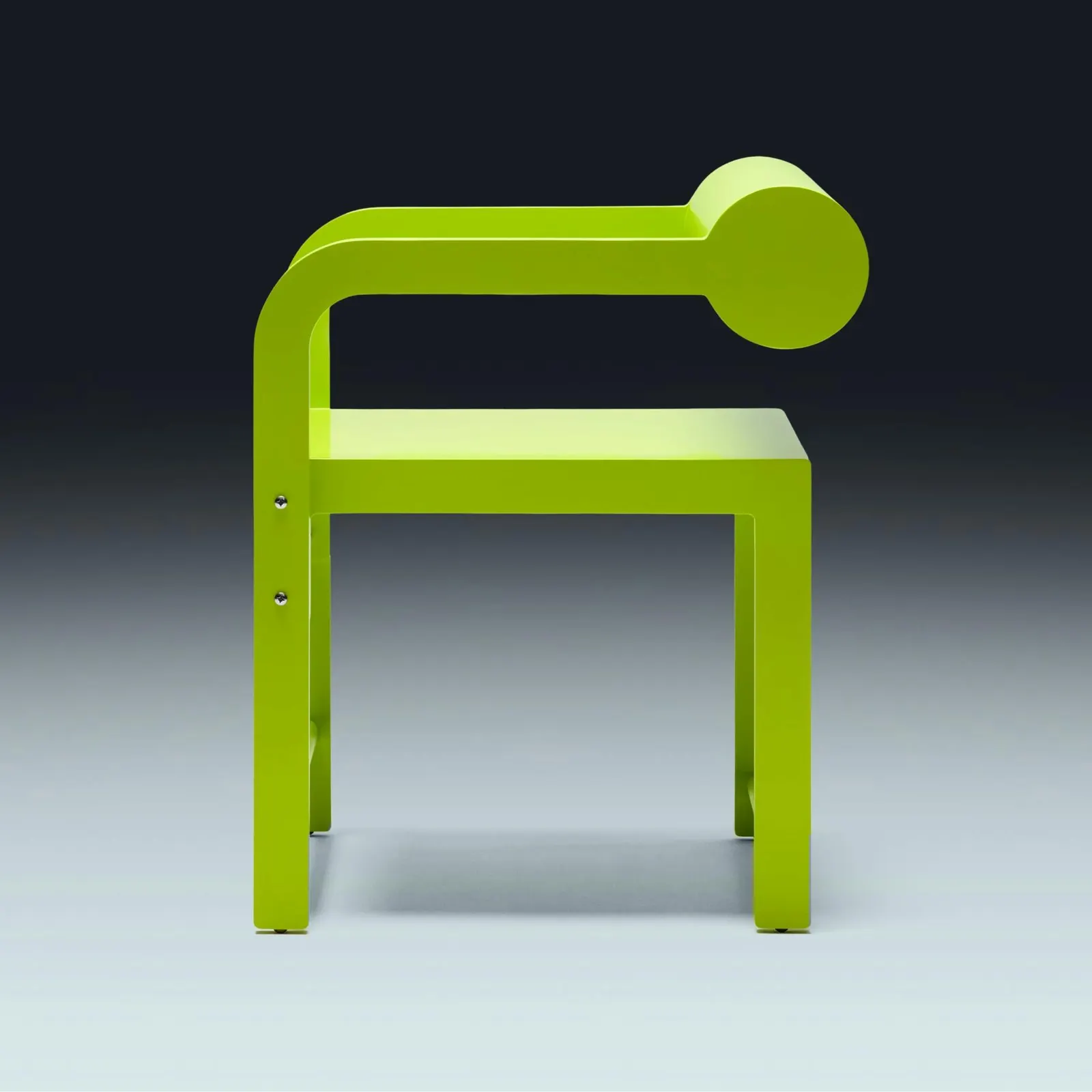
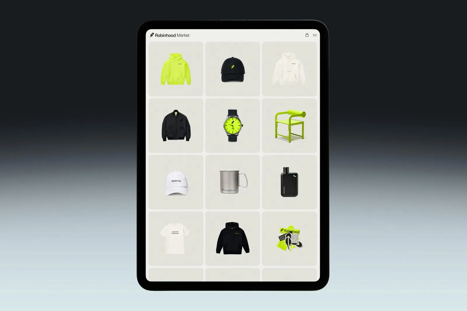
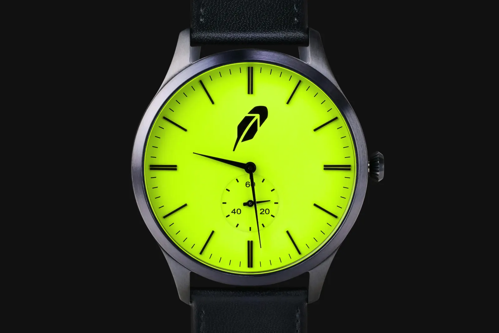
↗Most finance brands treat merch as a giveaway. PORTO ROCHA built Robinhood a store instead. Robinhood Market is a curated shop of collectible objects for users who started trading years ago and now want things that feel grown up. Working with the Office of Applied Strategy and strategist Tony Wang, the studio organized the range into a permanent core line, collaborations with Waka Waka and Golden Bear, and drops tied to marketing moments.
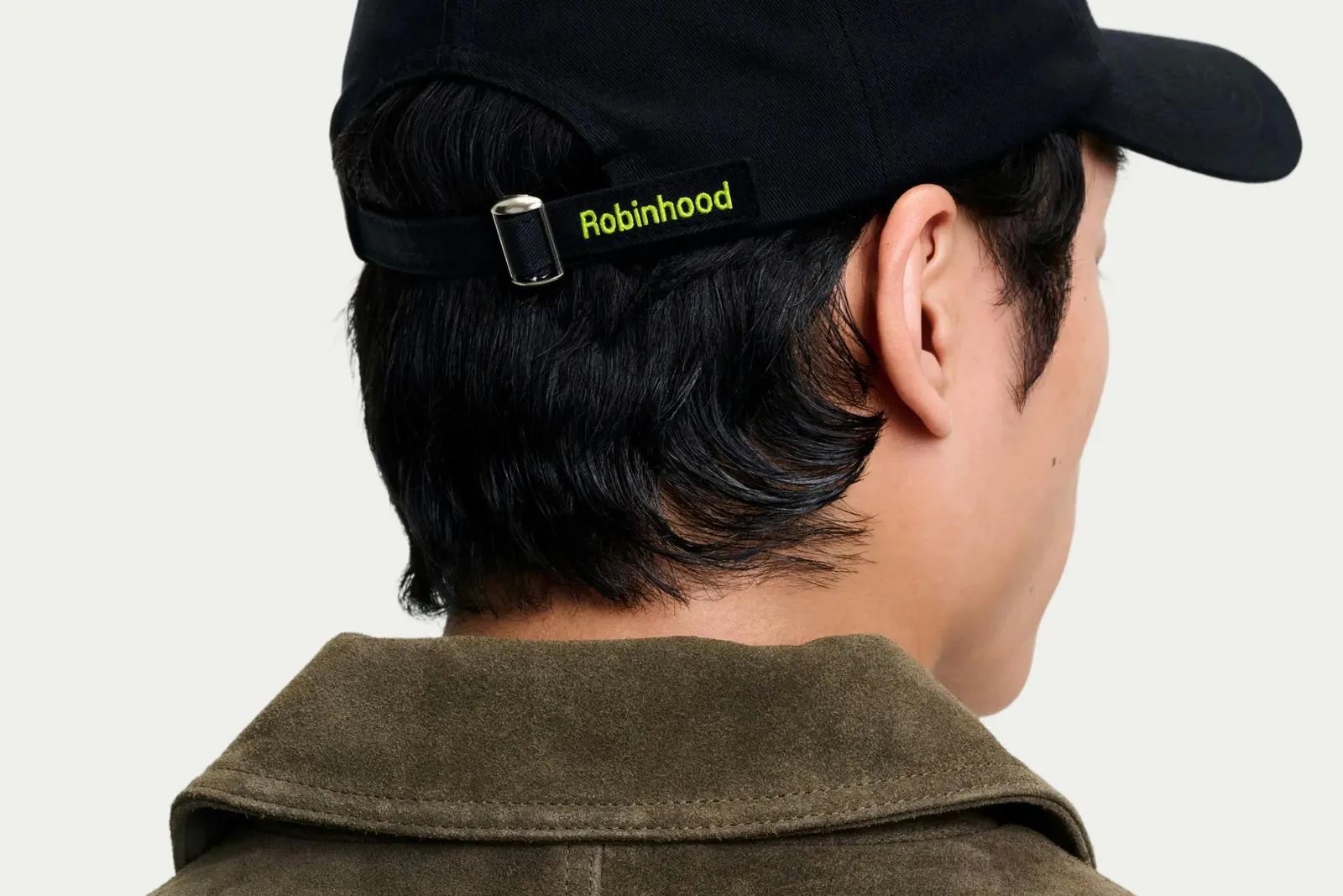
The design carries the sharp, modular logic of Robinhood's 2024 rebrand into physical form, with close attention to fabric choices, tag placement, and embroidery. The feather symbol and neon yellow-green show up in small doses. Photography uses warm, dramatic light to show off texture and construction, and the webstore adds a neon green hover state when zooming in on products.
Why it works
The restraint is what makes it credible. Neon yellow-green is Robinhood's most recognizable signal, and using it as an accent rather than a wash lets it read as a signature instead of a logo slap, so the pieces can be worn well outside the app's world. That suits an audience moving from speculation toward steadier habits. The photography and the hover detail extend the same logic online, presenting a sweatshirt as a considered object. In a category known for charts and compliance language, tangible quality gives the brand warmth without losing its precision.
Logo
Typography
Applications


Images and video from portorocha.com, by PORTO ROCHA.