The Brand Monograph
Brand Identity & Web Design Partner for Early-Stage Brands brand identity by Rayse Creative
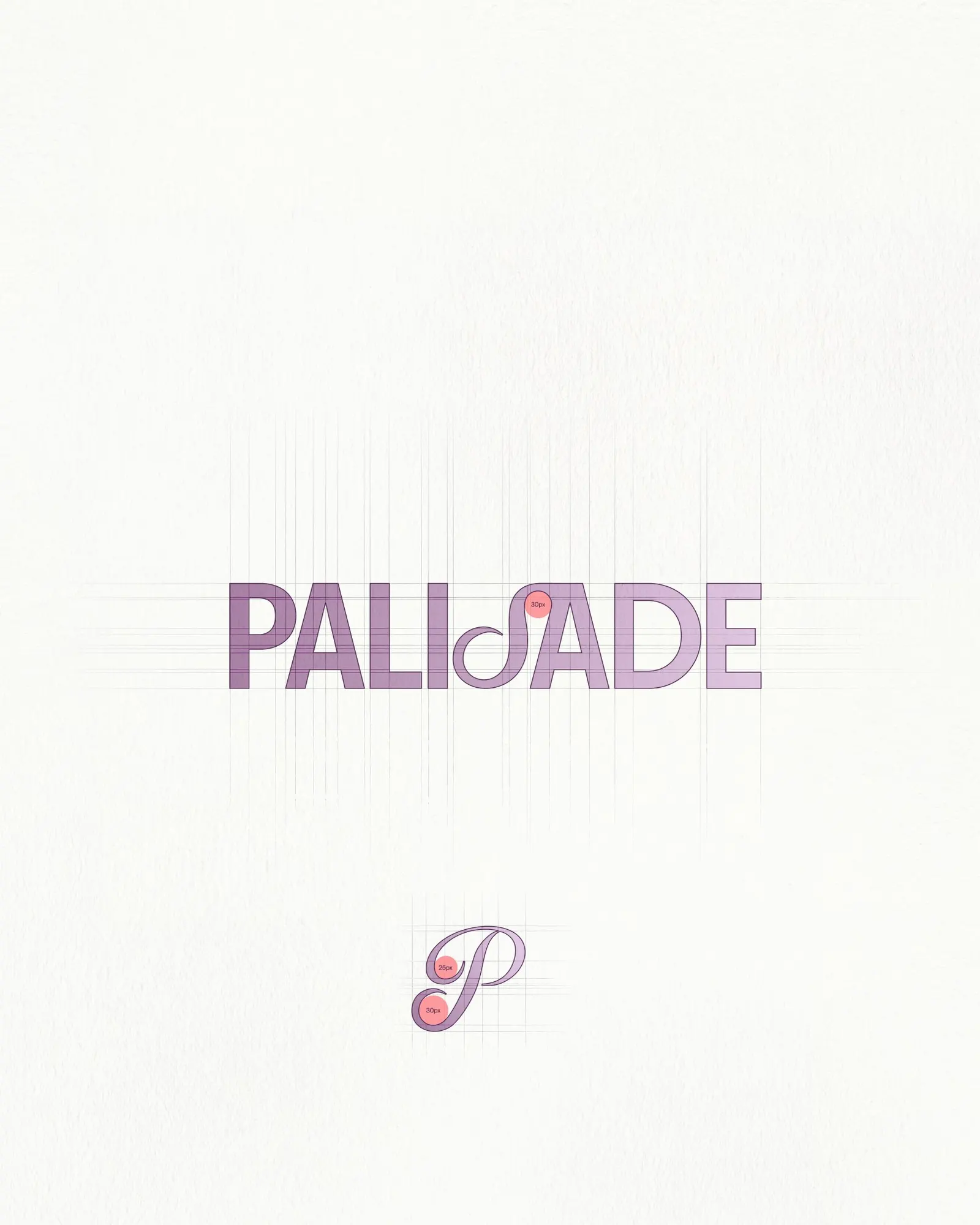
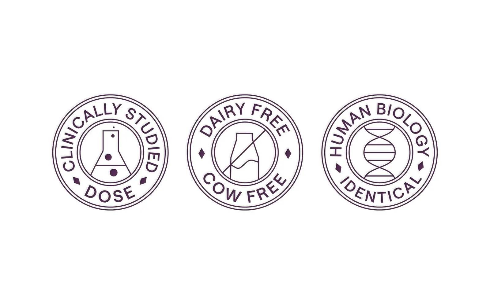
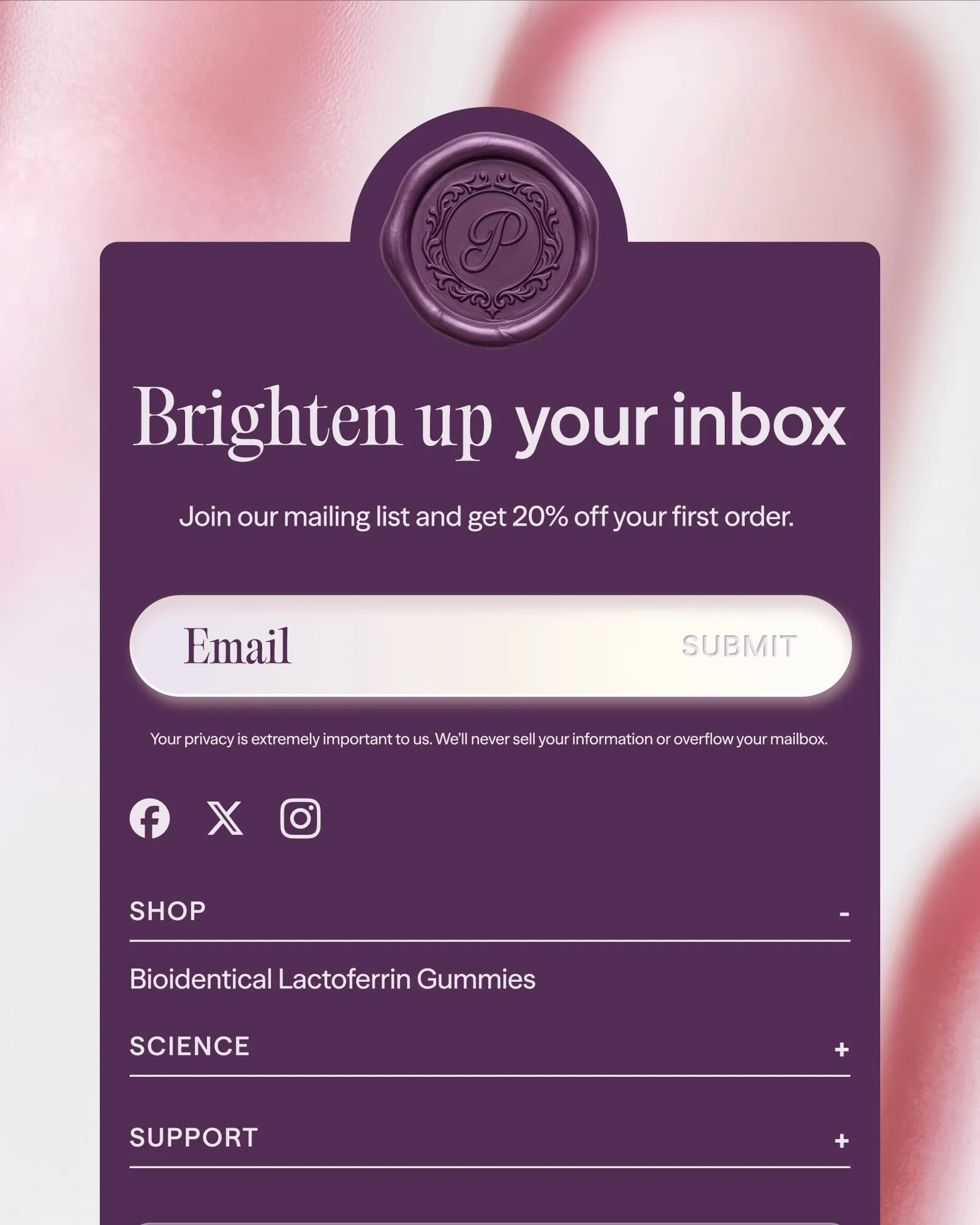
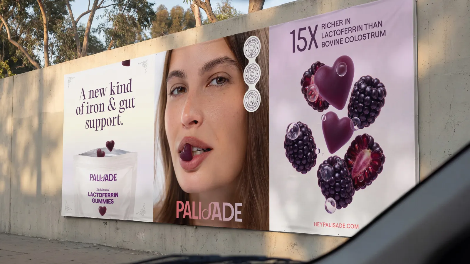
↗Rayse Creative treats a gummy supplement like something you'd keep on a dresser rather than in a medicine cabinet. For Palisade, a lactoferrin product for iron and gut support designed around women's biology, the studio built a full brand that leans on touch: a P monogram seal made to be embossed, debossed, or waxed, a soft-touch pouch with plenty of empty space, and matte, oil-coated gummies. Katie Nulty shaped the strategy behind it.
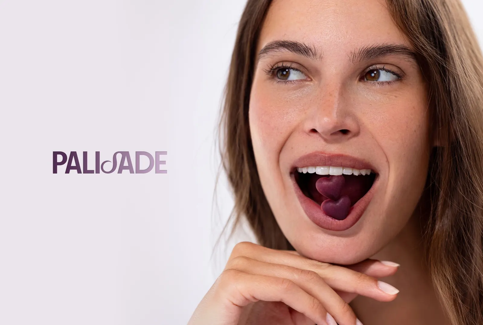
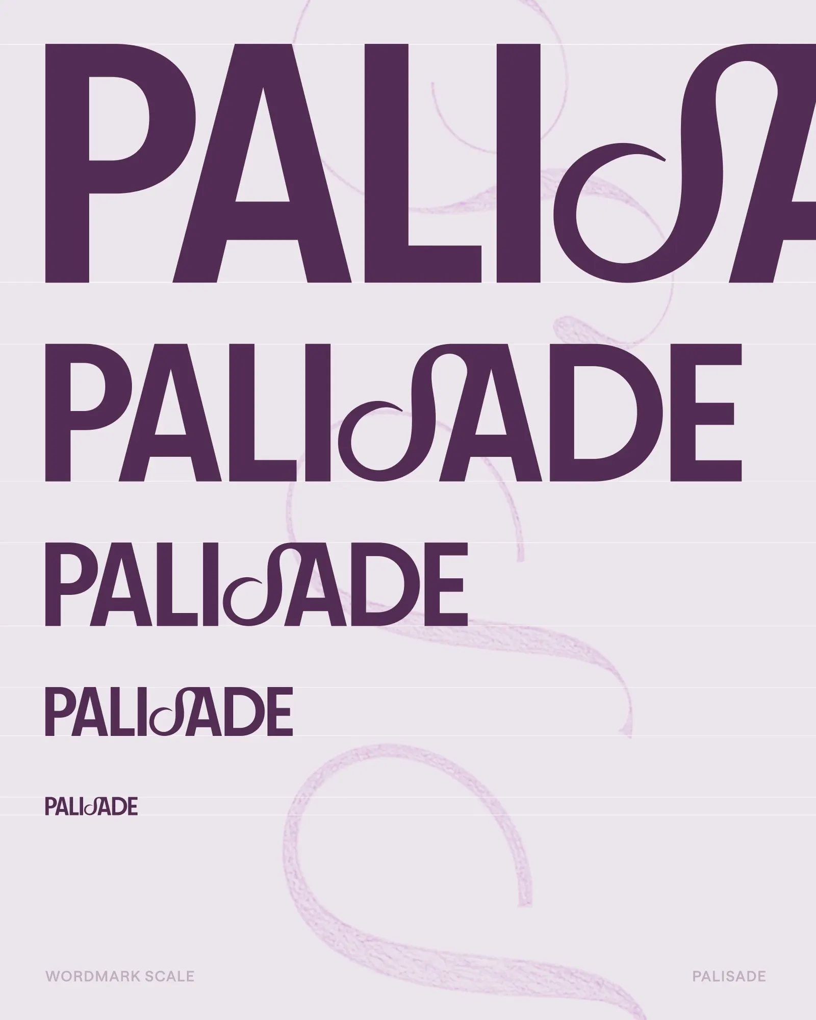
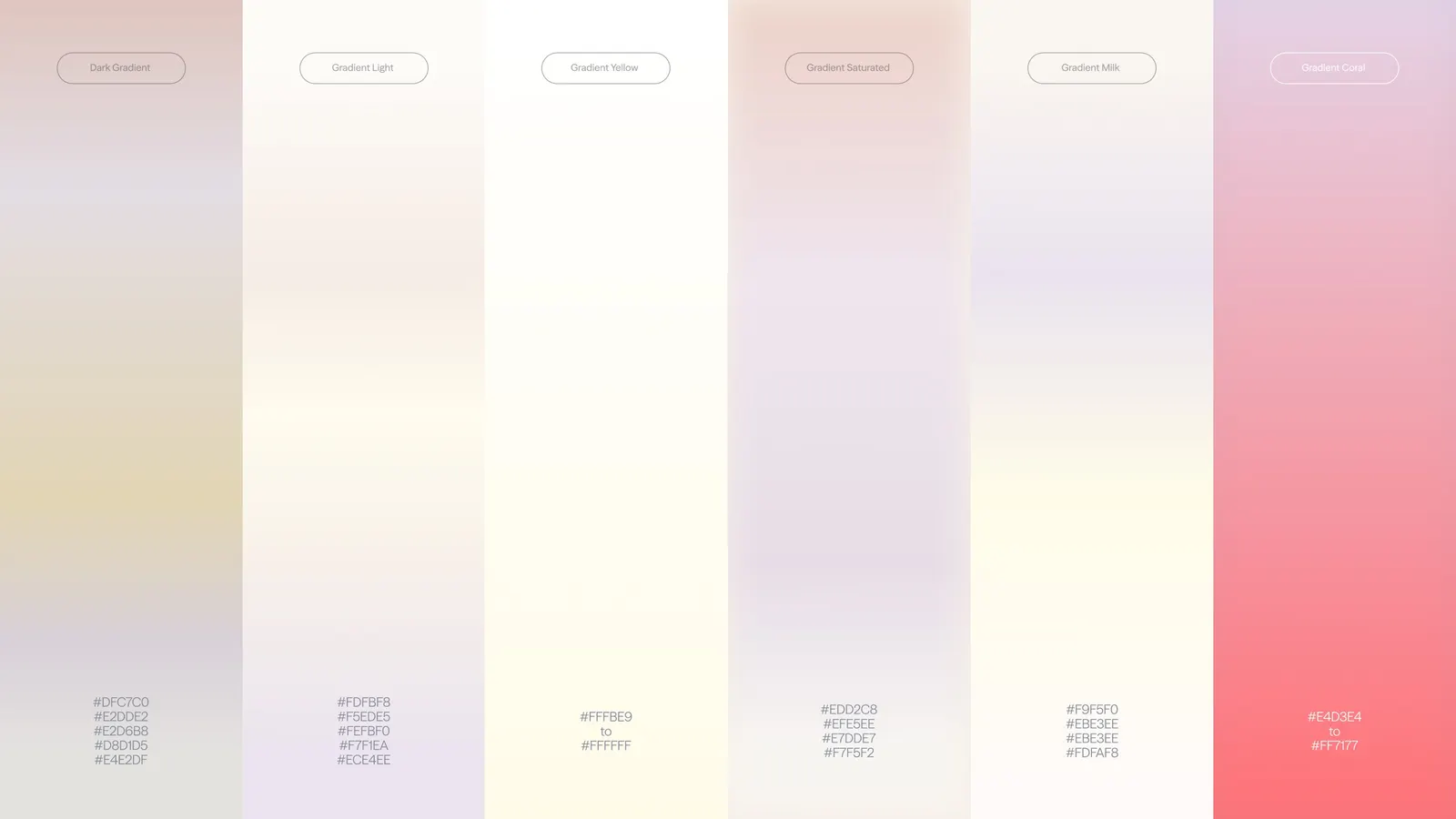
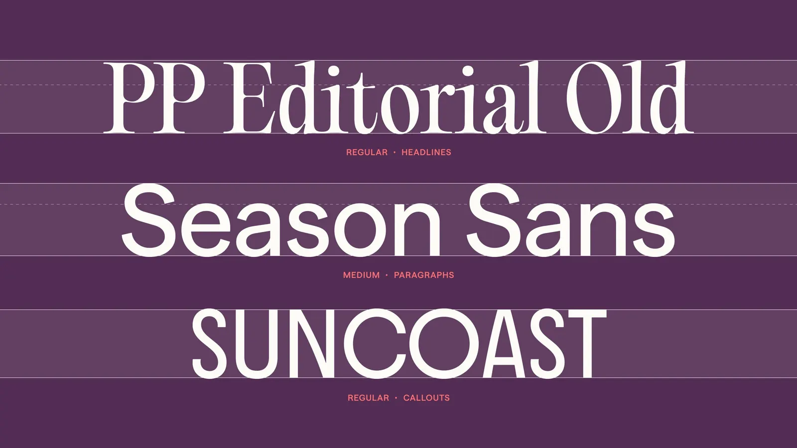
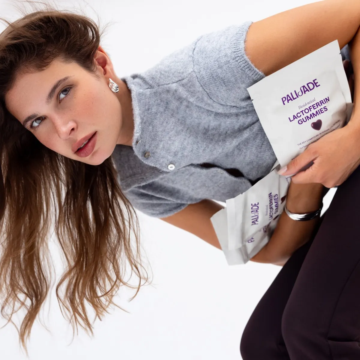
The wordmark is an all-caps sans with a single ornate serif S, set alongside PP Editorial Old, Seasons Sans, and Suncoast. Gradients of blush, violet, cream, and yellow surround a plum signature color, with coral reserved for e-commerce cues. Imagery combines a launch shoot by Valerie Marie Voithofer with AI-generated ingredient macros, and Viney Bishnoi developed the site, where editorial type and softly animated CTAs carry the system online.
Why it works
The seal does the heavy lifting. A stamped mark suggests provenance and care, which is exactly what a new, science-heavy product needs to earn trust. Keeping the ornament to one letter in the wordmark lets the monogram stay the star. Plum and coral also pull the brand away from the pink-and-pastel default of women's wellness, so it reads as discerning rather than cute. Restraint in the packaging makes the claims feel confident, not loud.
Applications
Logo
Color
Typography
Images and video from raysecreative.com, by Rayse Creative.