The Brand Monograph
OpenCoreOS brand identity by Further
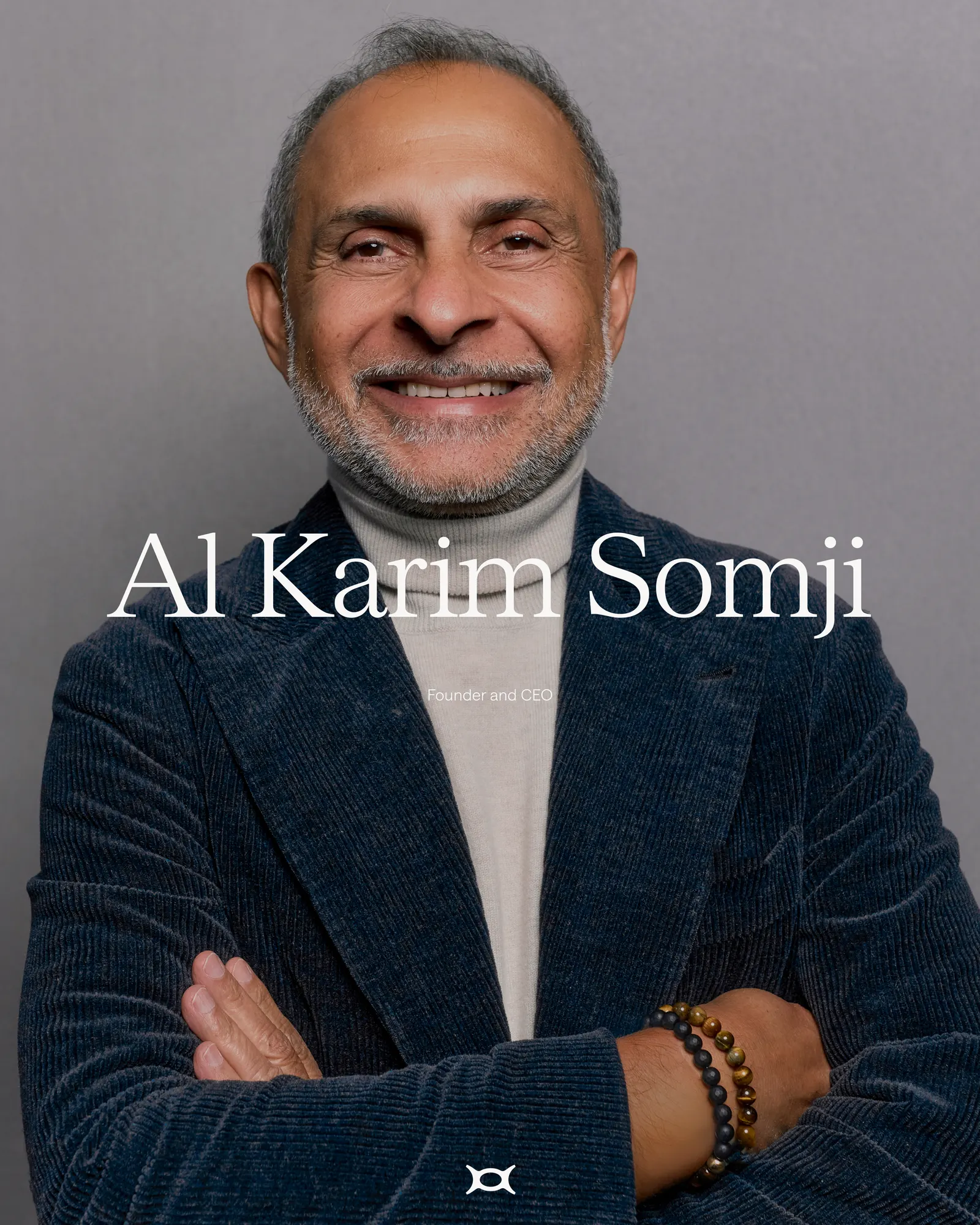
↗OpenCoreOS builds an AI-first core banking platform, and its identity looks nothing like the interchangeable fintech around it. Further was tasked with introducing the company to the people who decide whether a global bank's foundations get replaced: CIOs at tier 1 institutions. The studio's strategy pairs a promise of boldness with one of dependability, and treats a bank's legacy as something still to be made rather than something to escape. The tone is assured and fluent in the sector's language, which suits a company founded by veterans of HSBC, McKinsey, and BIAN's board.
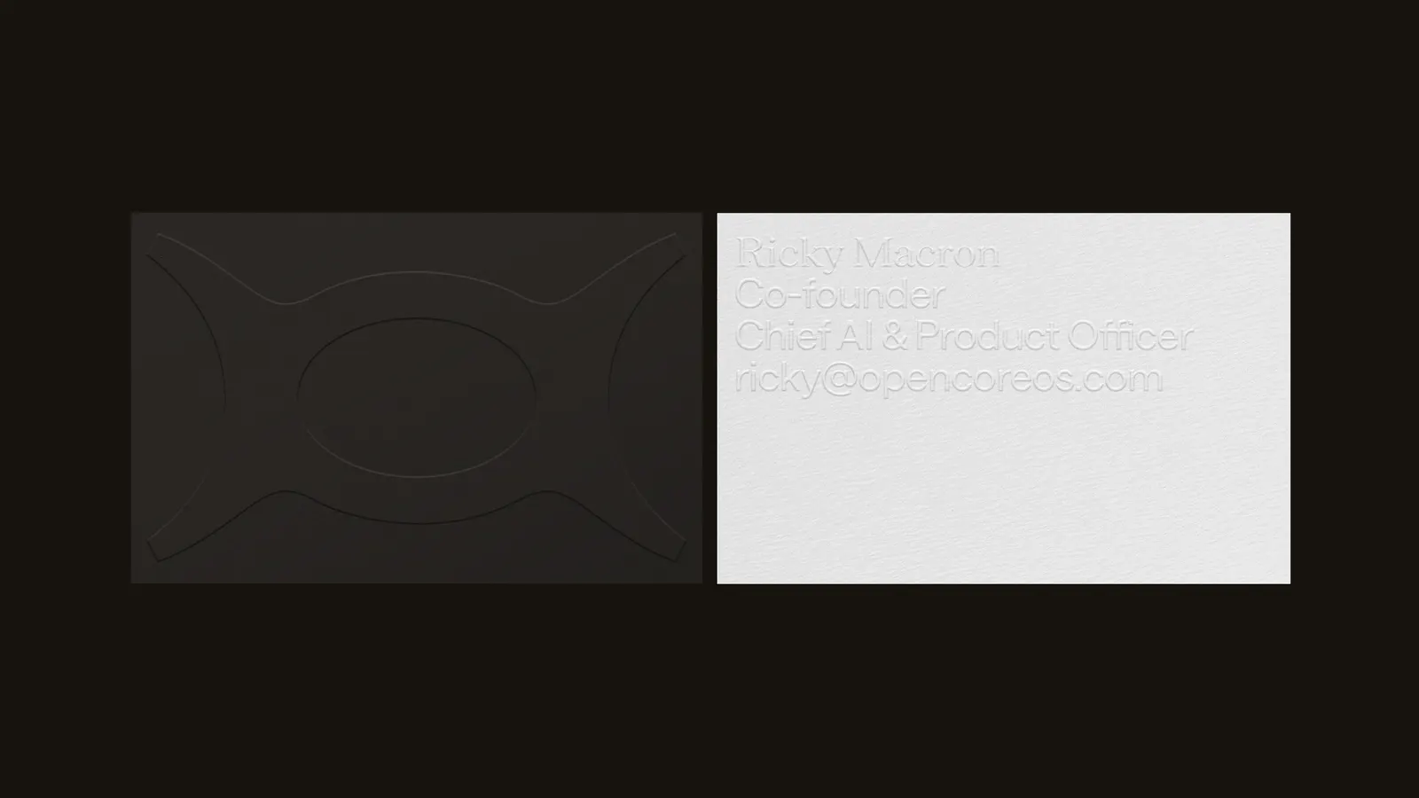
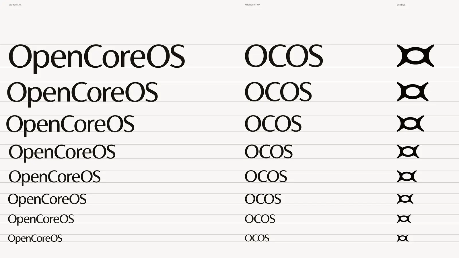
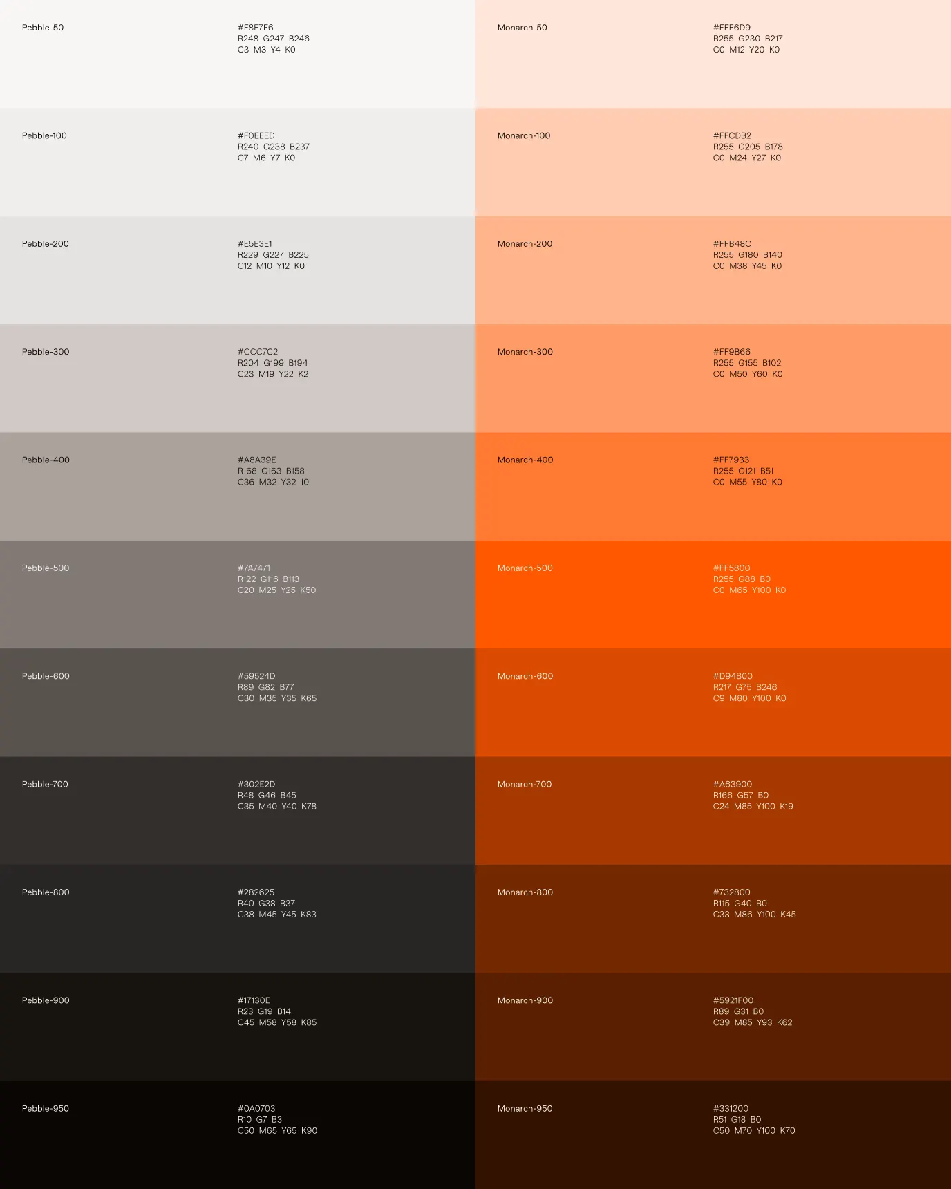
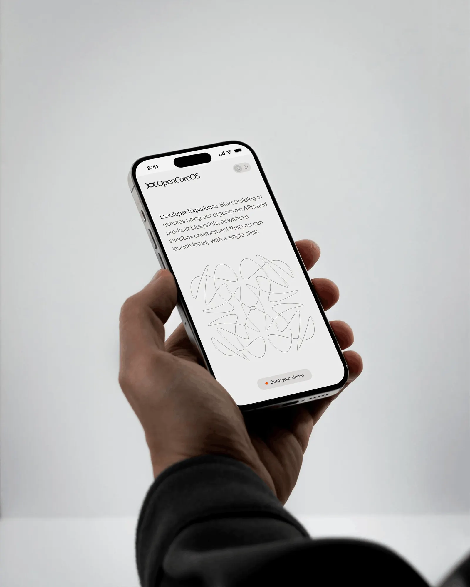
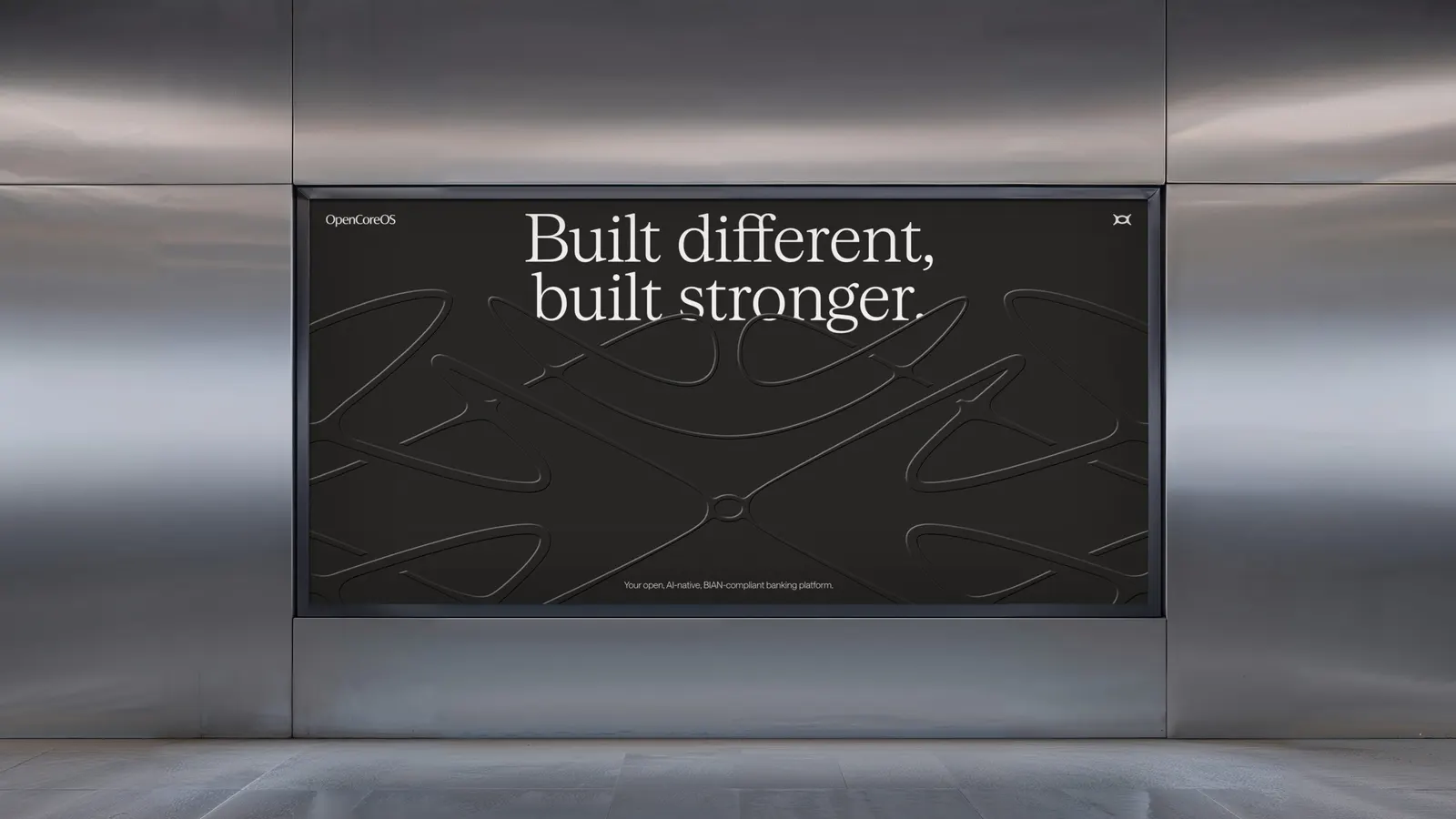
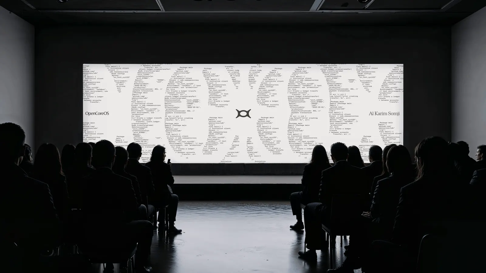
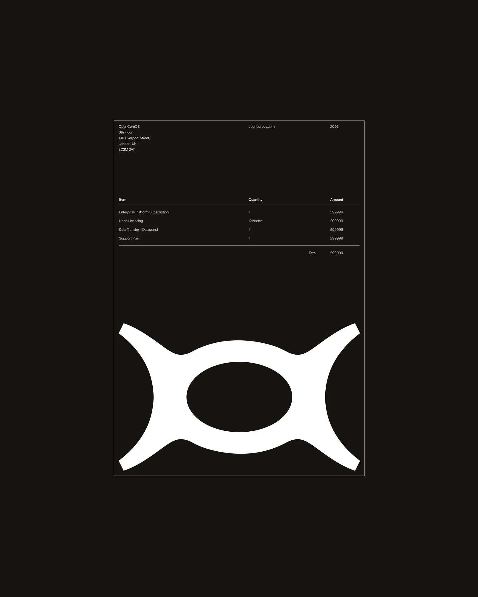
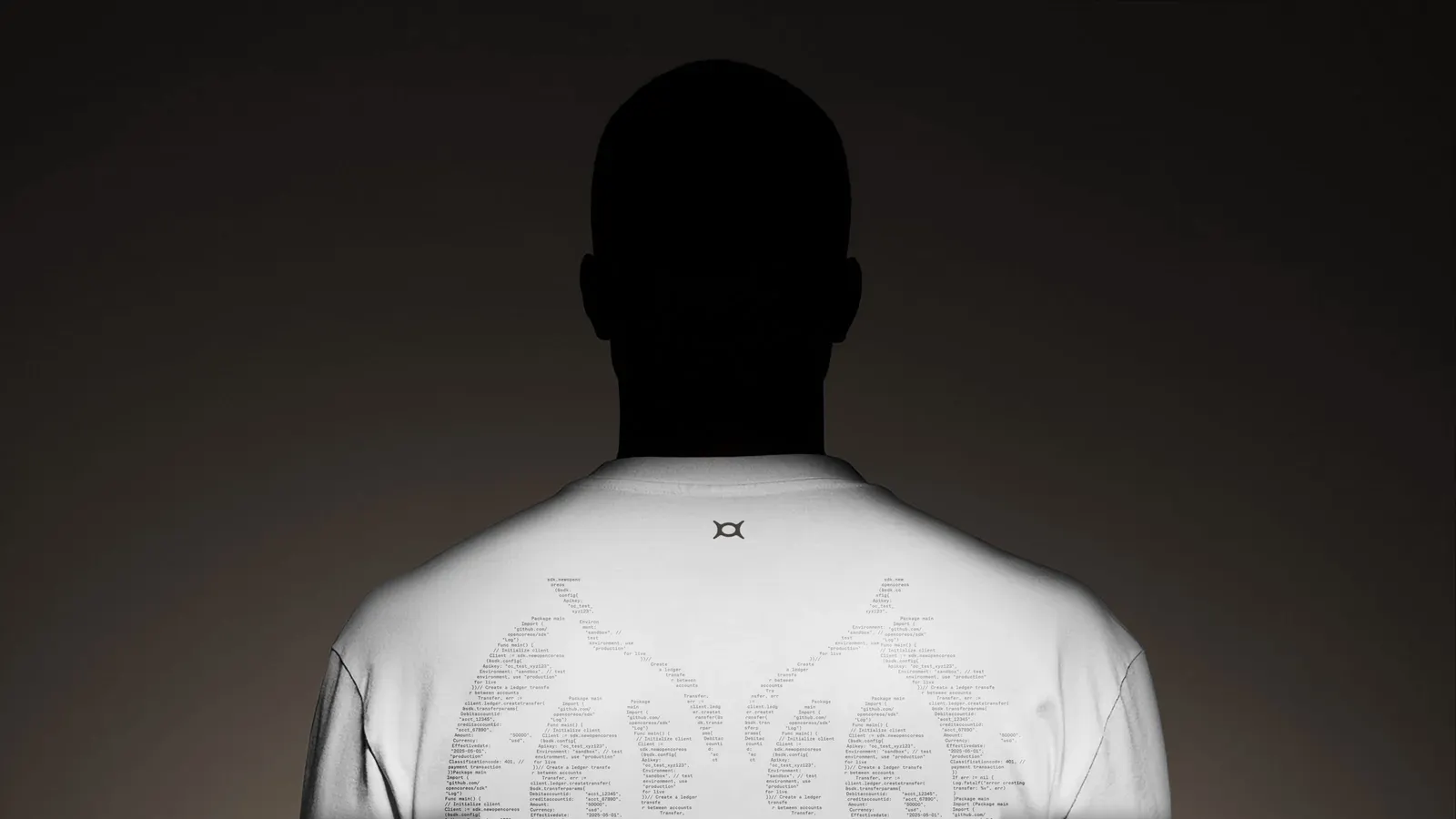
The visual language swaps the category's familiar look for soft, organic forms and patterns that suggest movement and growth. At its center is a mark that merges the O and C of the name into a single shape. Layouts are spare, the palette is restrained, and bright orange appears only where a user should act. Typography echoes the fluid forms, and a new landing page uses light, shade, and open space to carry it all.
Why it works
Banks buy on trust, so the easy route would have been heavy, familiar visuals. Further lets restraint carry the authority instead. A single fused mark is simple to remember and scale, and the sparse layouts feel confident rather than showy. Reserving orange for moments of action turns color into quiet navigation, and it separates the brand from a sea of cool-toned competitors. The organic shapes soften a famously cold subject, suggesting adaptability without costing any seriousness.
Applications
Logo

Color
Images and video from further.group, by Further.