The Brand Monograph
EA Sports brand identity by Further
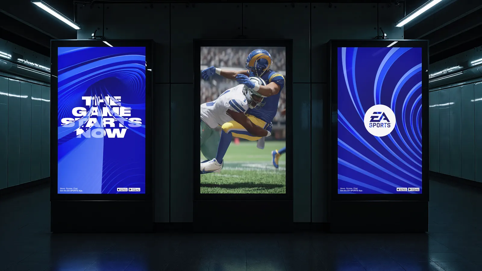
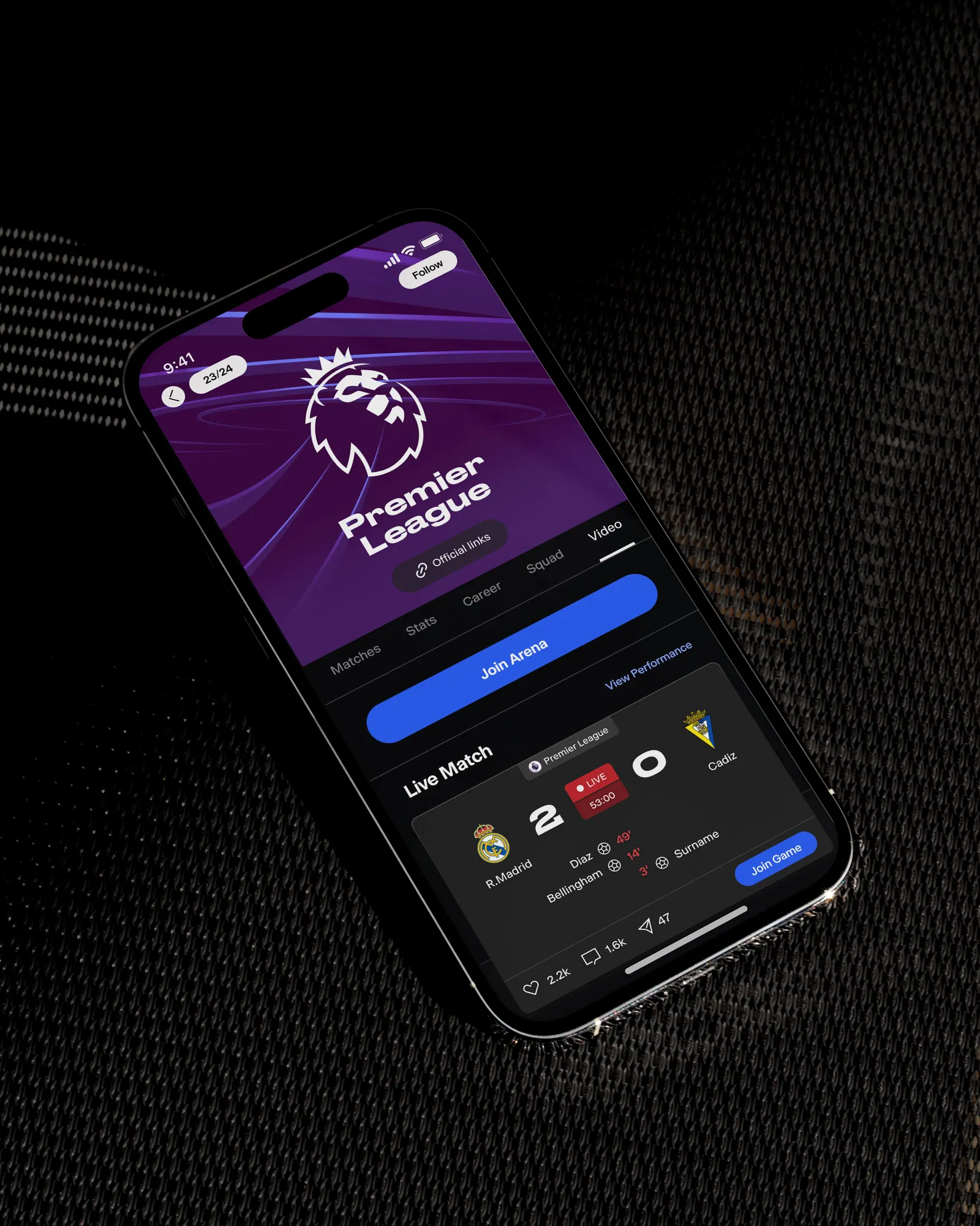
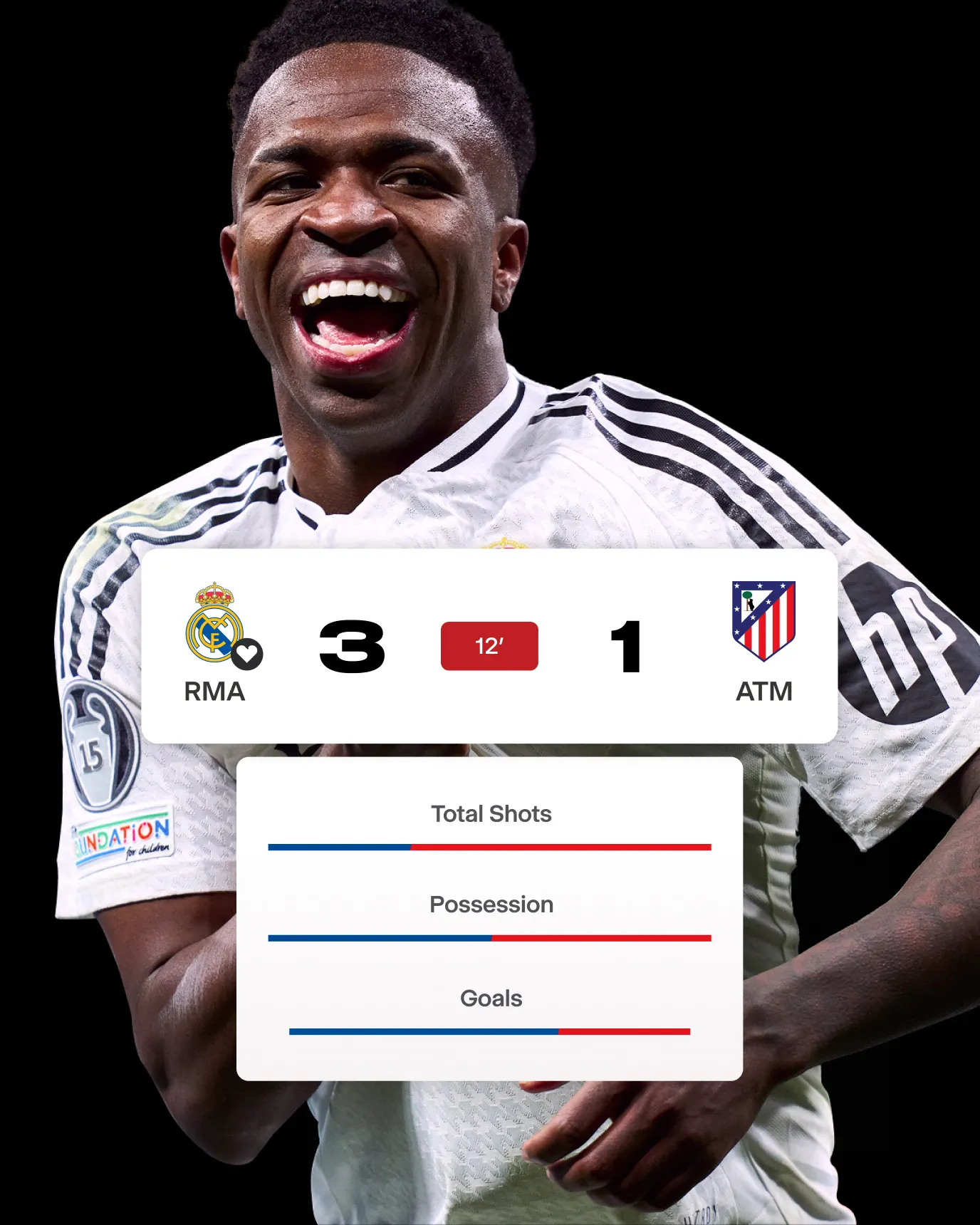
↗Few sports brands have had to change what they are as much as EA Sports. Further took a publisher known for annual releases like FIFA, Madden, and NHL and gave it an identity for a new job: fronting an app that pulls those franchises into one social space for fans. Scores, stats, music, and polls sit alongside sponsored content, and the identity has to hold all of it together.
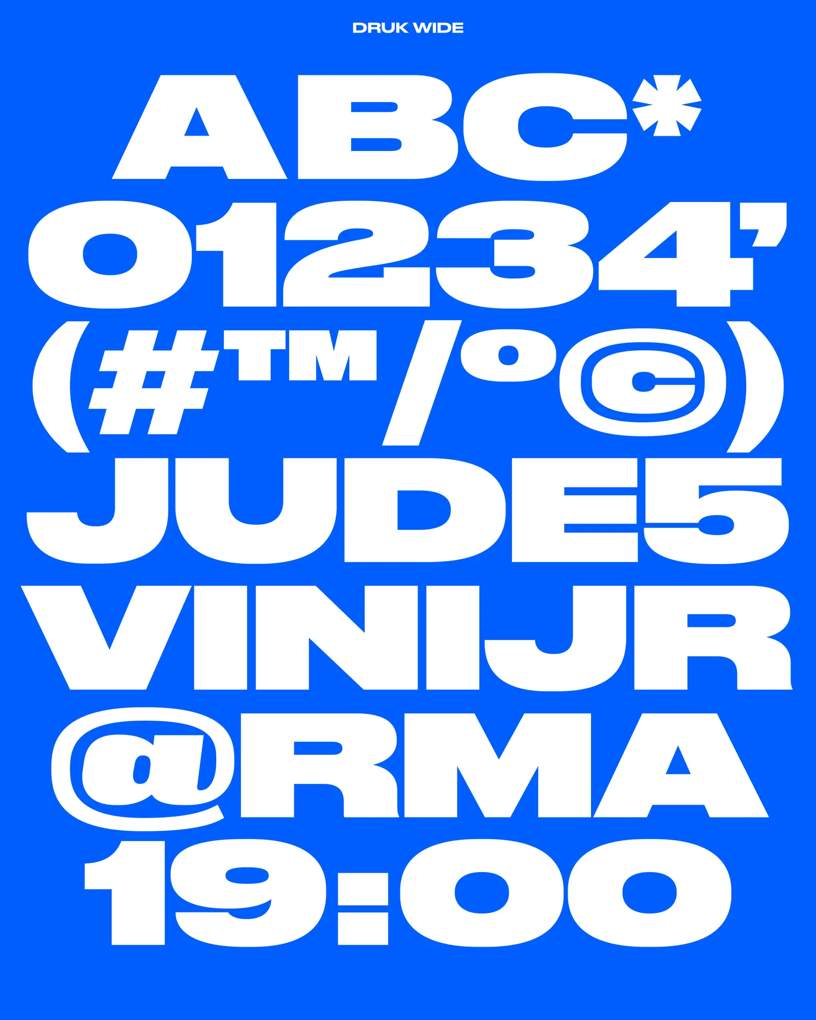
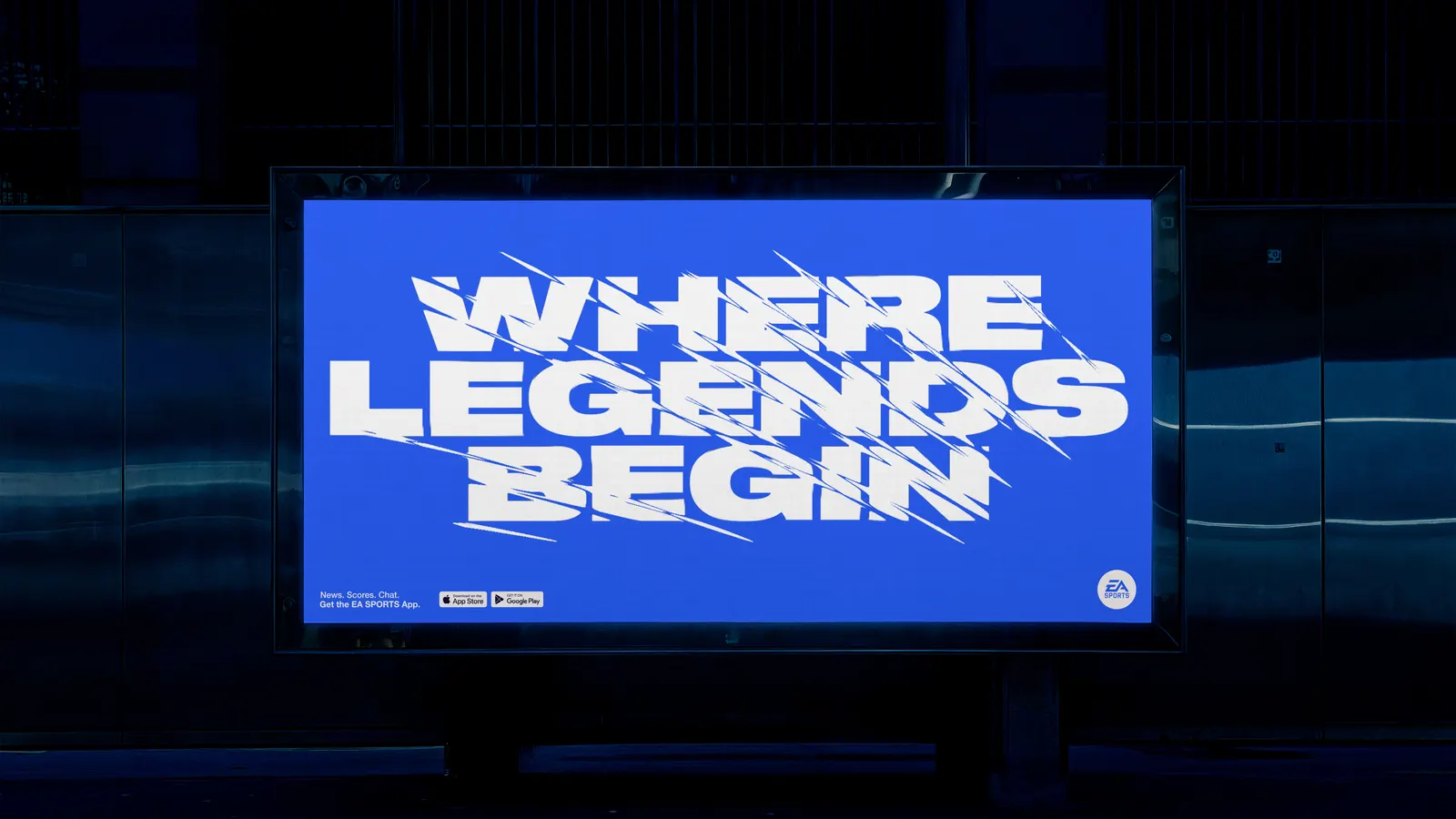
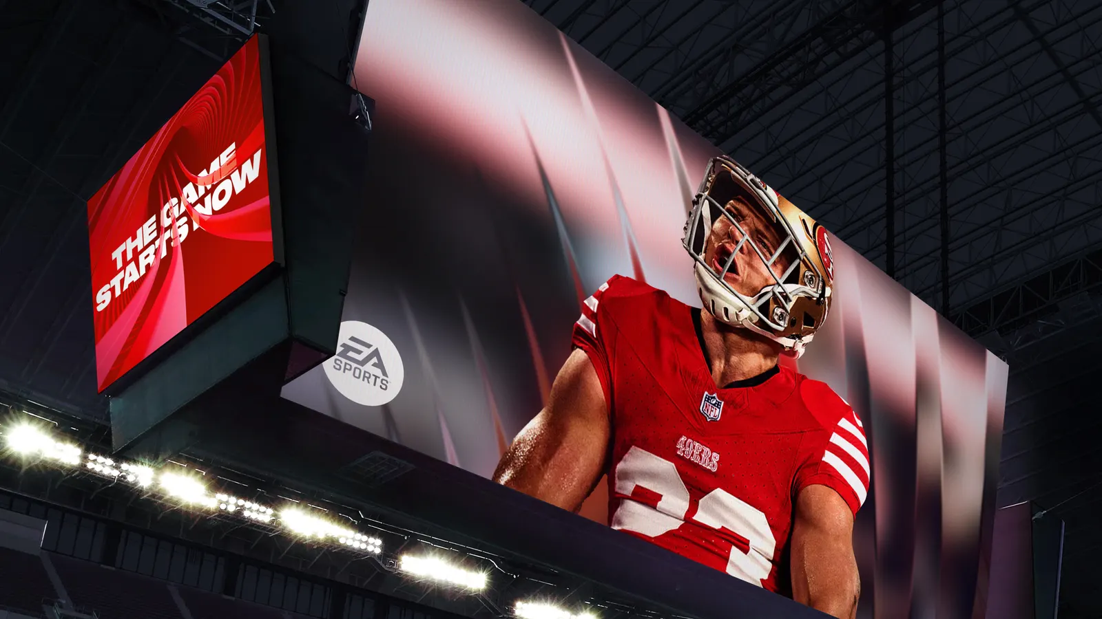
The studio kept the red, white, and blue palette and the brand's long-standing tagline, then built a tunnel system from that idea as the main asset. The existing typeface runs through the tunnel to produce endless variations, and a digital-first toolkit covers UI, motion, and sound. Niceshit Studio handled motion, while father shaped the sonic layer, including audio cues. Early prototypes helped bring leadership along.
Why it works
The tunnel is the smart move. Instead of a mark trying to represent every sport, Further made a space that any sport, team, or game can walk into, which suits a brand that now has to hold many things at once. Keeping the red, white, and blue and a familiar typeface means that flexibility never costs recognition. And because type, motion, and sound all pass through the same device, the identity feels made for screens and feeds rather than box art, which is where younger fans will meet it.
Applications
Typography
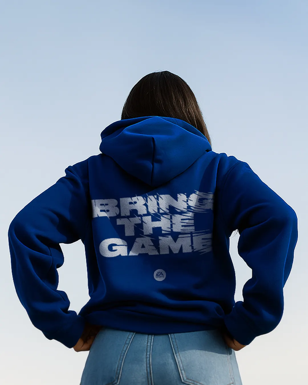
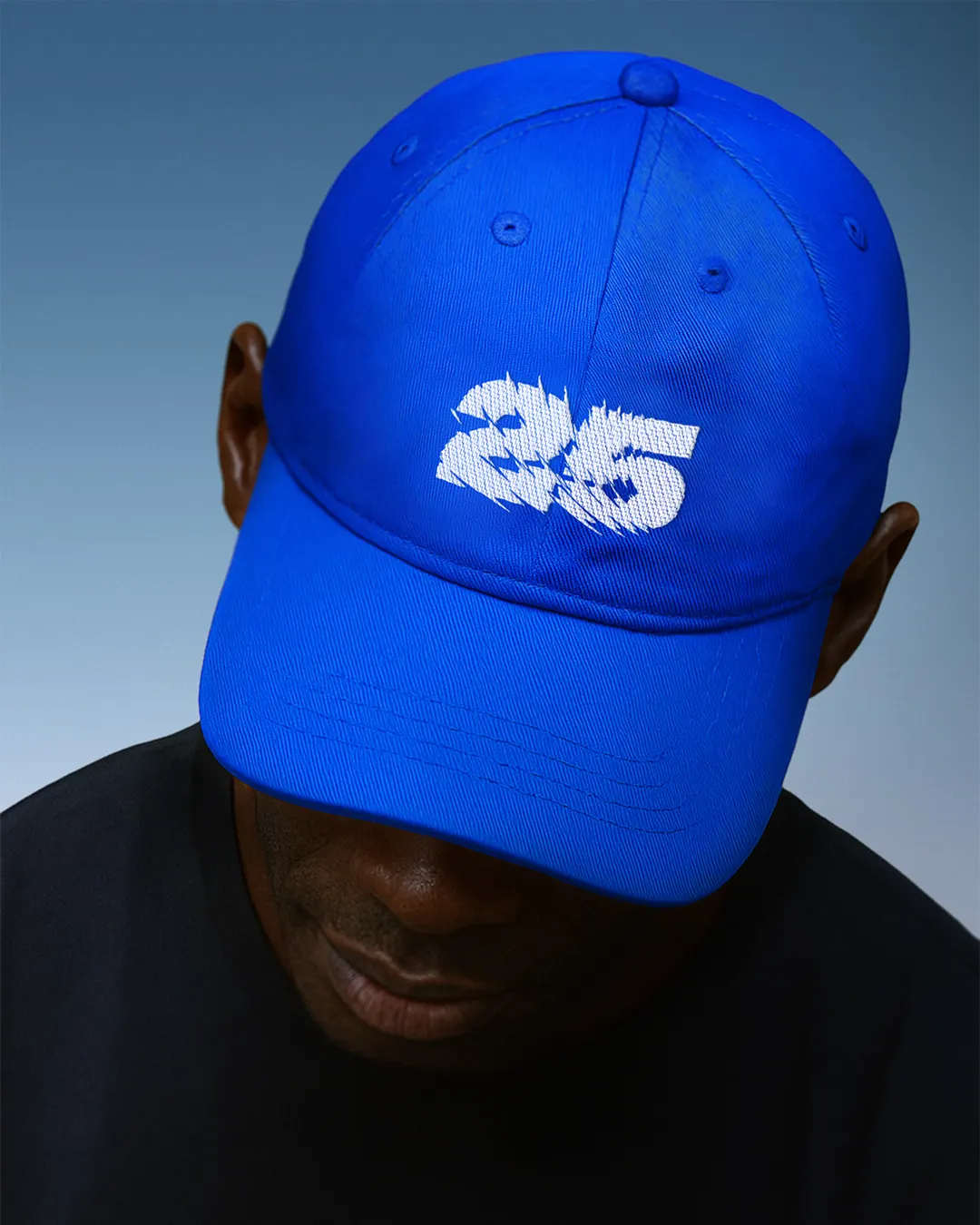
Images and video from further.group, by Further.