The Brand Monograph
DeafCity Hub brand identity by Templo
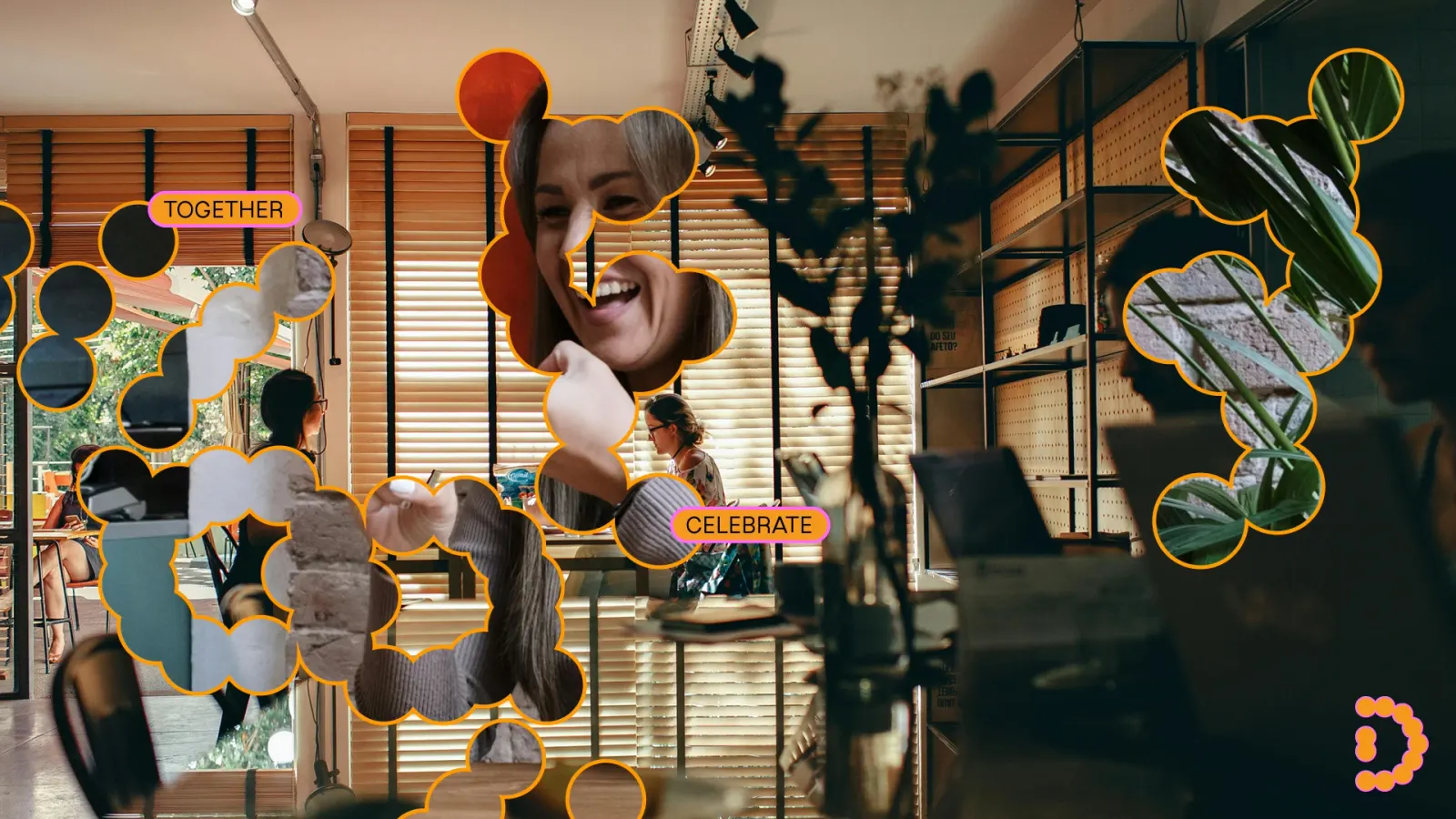
↗Most identities are drawn once and then repeated. Templo's work for DeafCity Hub is closer to a performance. Gestures from British Sign Language form the base of the system, and motion-responsive software reads the position and movement of hands, so the brand changes shape as people sign.
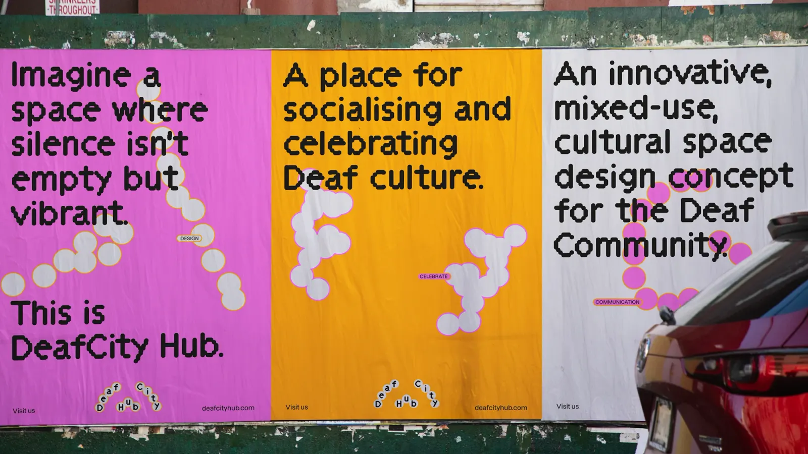
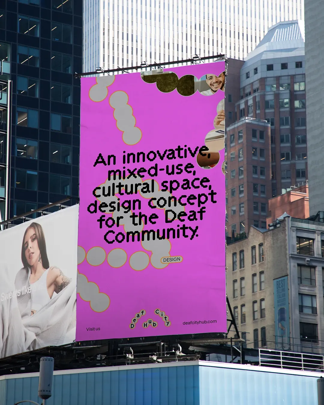
The brief was to give a Deaf-owned, fully accessible cultural space a public face as it launches a year-long pilot campaign. Templo worked with the Deaf community to explore how communication happens beyond speech, then used creative coding to turn that exploration into a visual language. The result behaves more like a live system than a fixed logo. Pink and orange carry it, a pairing picked to separate DeafCity Hub from other Deaf-led identities in the same space.
Why it works
The strongest decision is where the identity gets its movement. Because the visuals respond to real hands, the audience becomes an input to the brand rather than just its subject, and a hearing visitor sees Deaf culture in action instead of a symbol standing in for it. A responsive system also avoids freezing a living language into one static icon. The pink and orange pairing does strategic work too: it is warm, energetic, and distinct enough to be recognized quickly in a small, crowded category.
Applications
Logo
Typography
Images and video from templo.co.uk, by Templo.