The Brand Monograph
Node brand identity by Brand Brothers
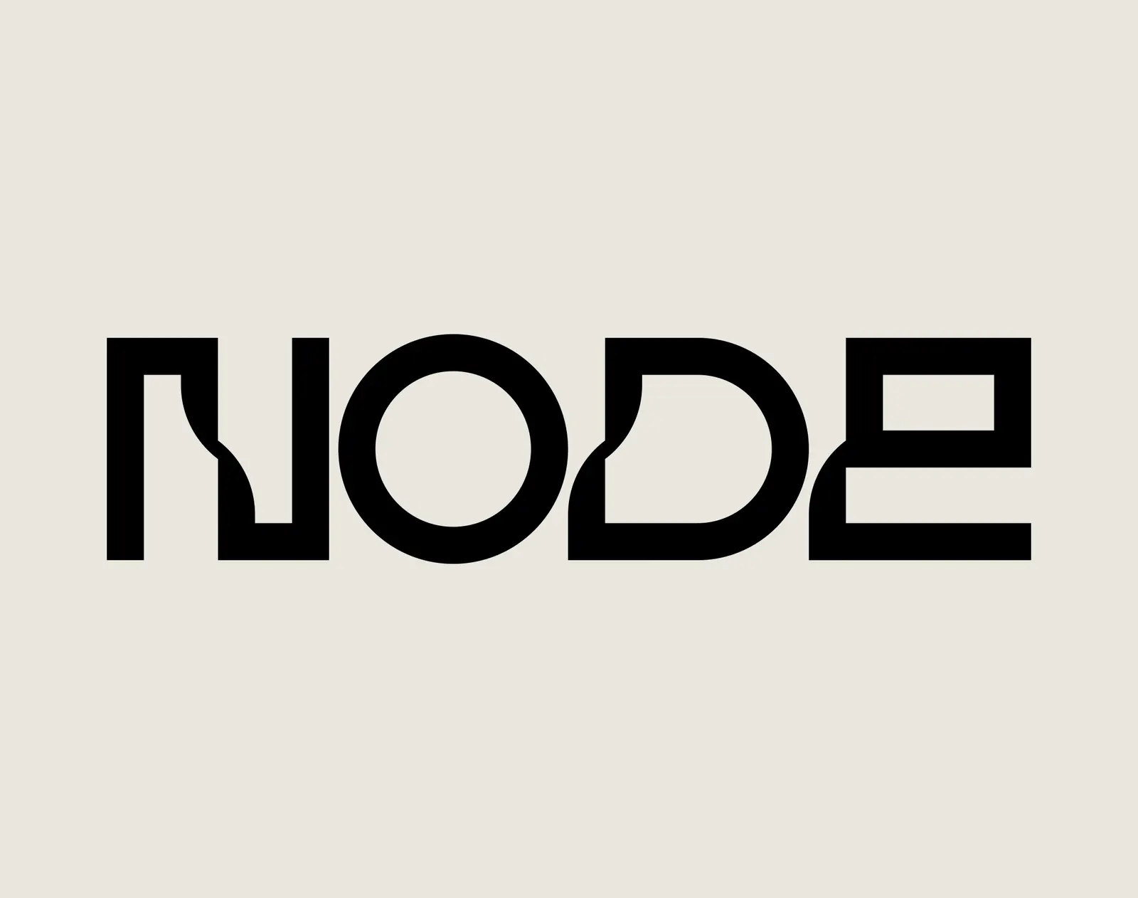
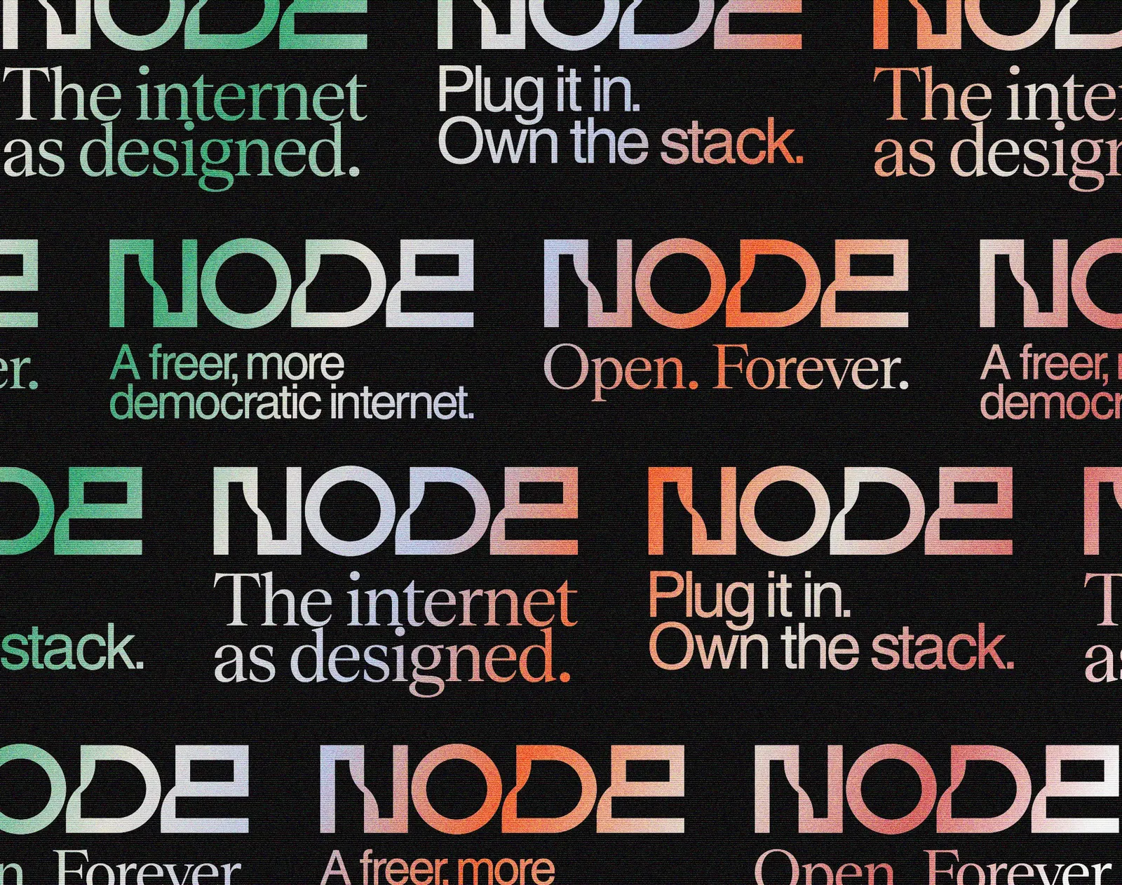
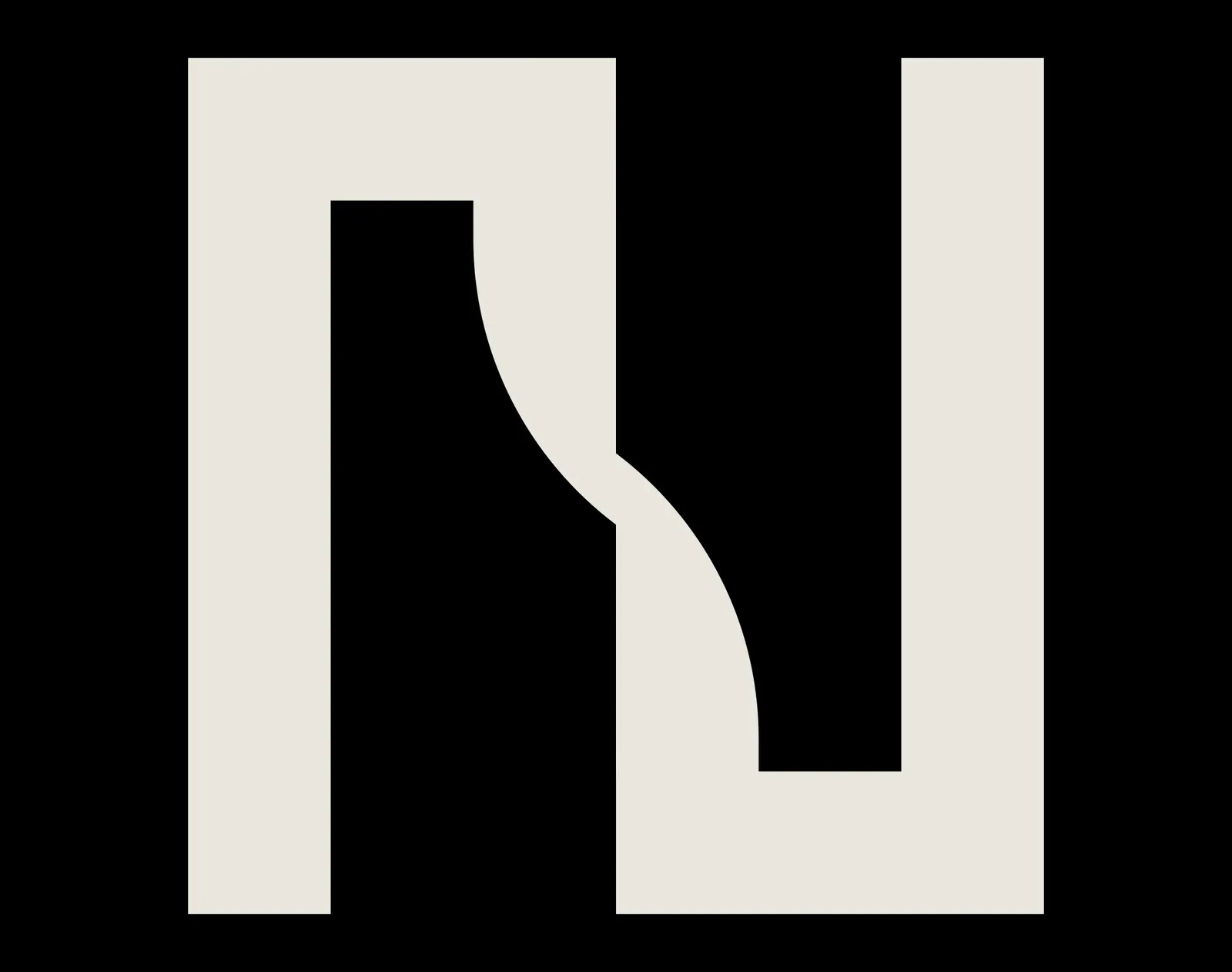
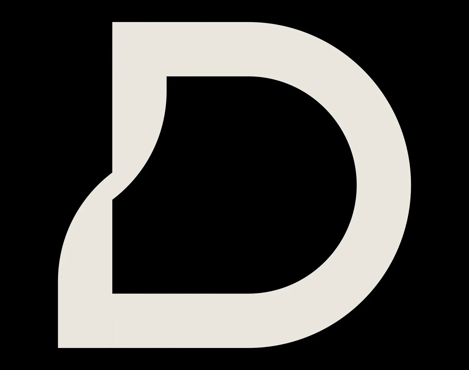
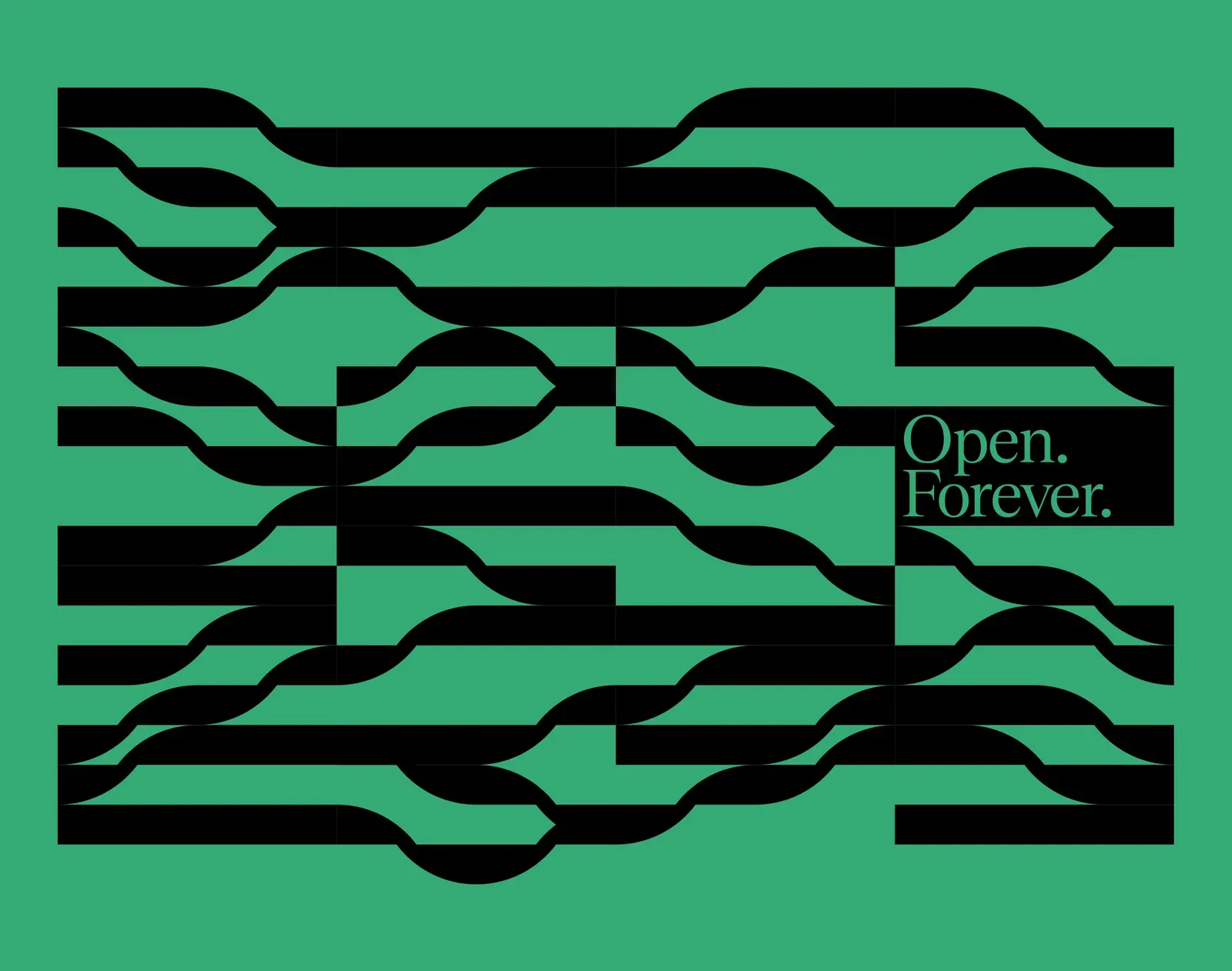
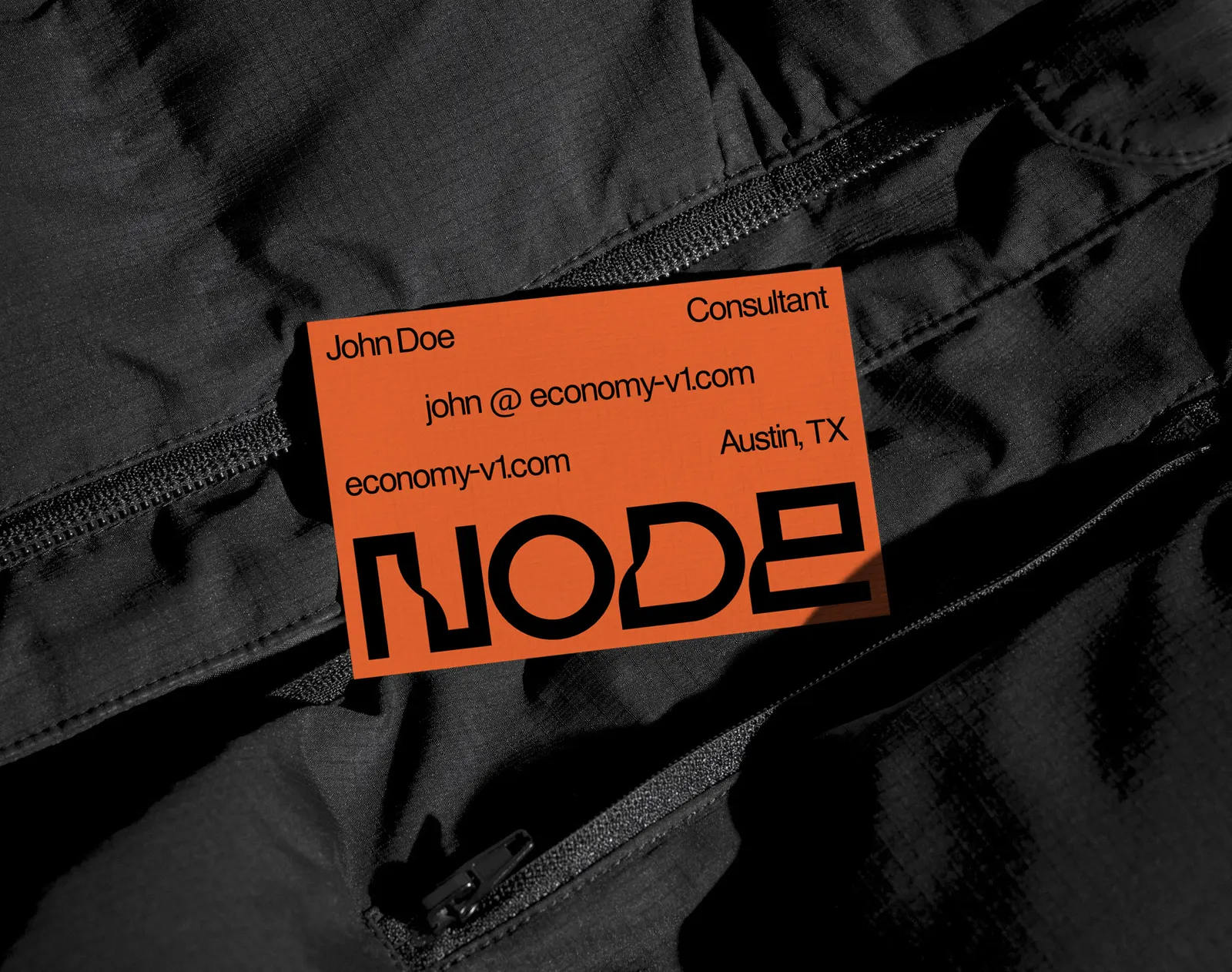
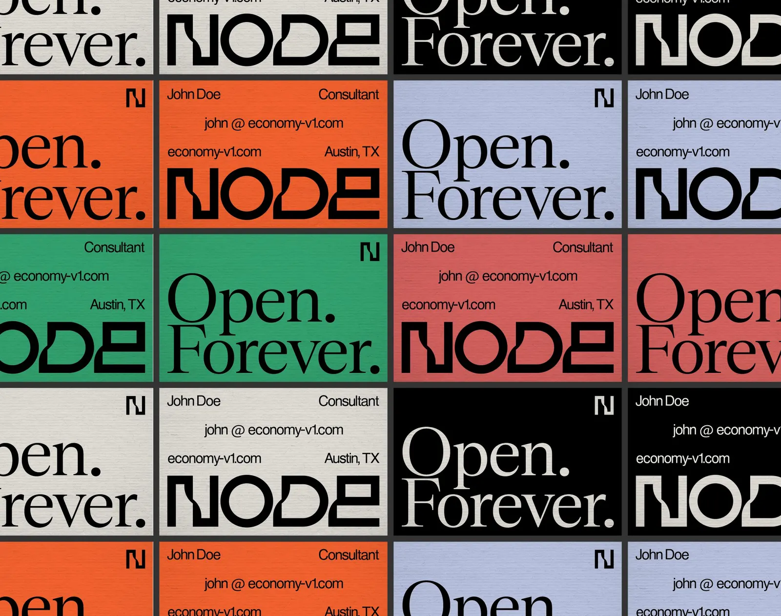
↗Identities in the Bitcoin and self-hosting space often lean on circuit-board clichés or loud manifestos. For Node, the first product from Economy v1, Brand Brothers took a quieter route, building the whole brand from a typographic logo that grows into a modular system.
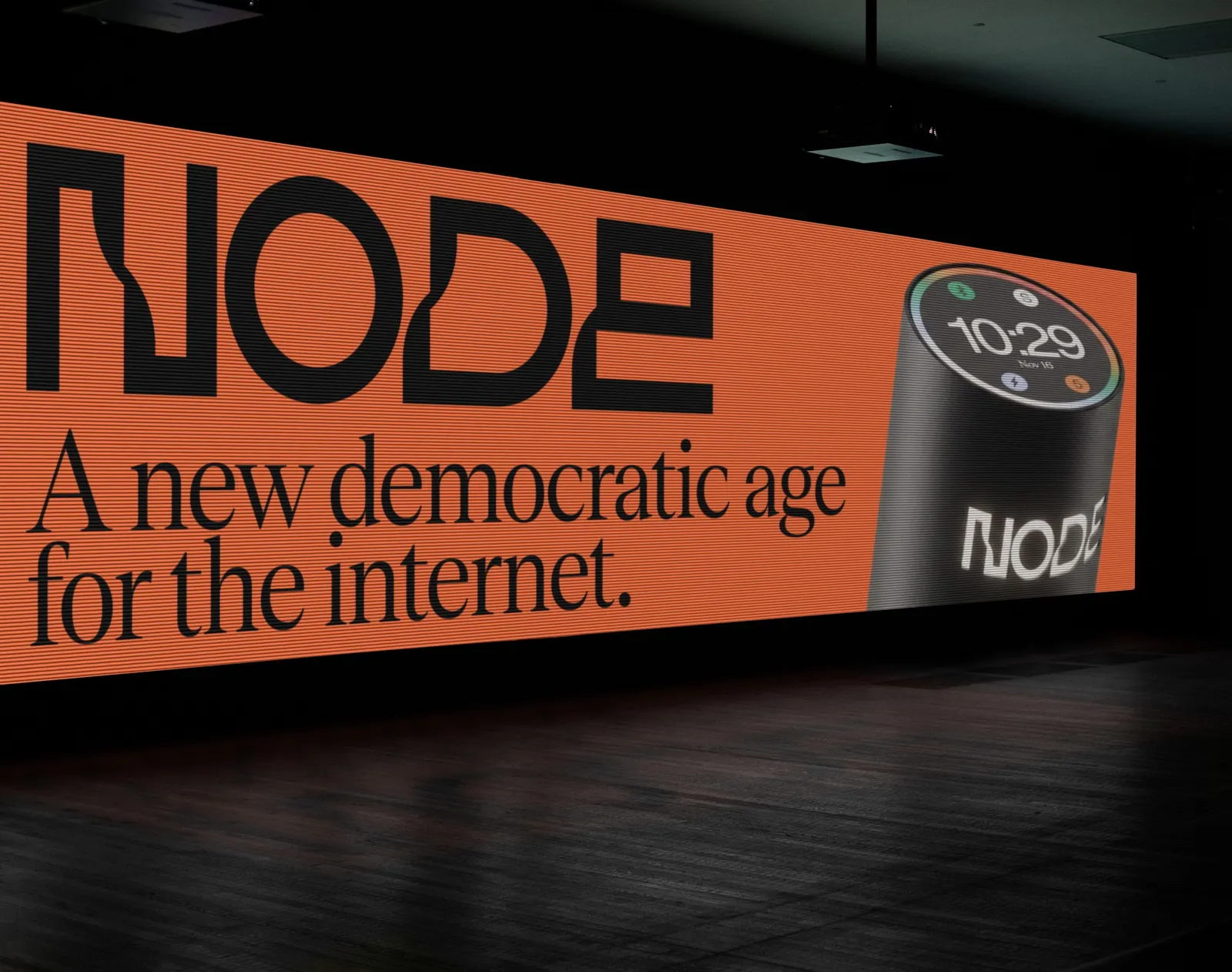
Economy v1 is an American public benefit corporation, and Node is its compact, affordable personal server: a Lightning/Bitcoin node, peer-to-peer apps, and private AI agents in one device, due in 2027. The studio was brought in to set the graphic identity and overall visual direction. Its answer is an abstract language built from the name itself, flexible enough to carry the company's political message about owning your data, identity, and money. It also lays the groundwork for the product's final development phases.
Why it works
A personal server is hard to explain to anyone outside the hobbyist crowd, and a typographic system gives it something concrete without turning it into a gadget. Starting from letters rather than an emblem keeps the identity ownable and easy to extend as the product line grows. The modular approach lets the brand be assertive when the message is political and step back when the hardware needs attention. That restraint also separates Node from a category that tends toward swagger.
Applications
Logo
Typography
Color
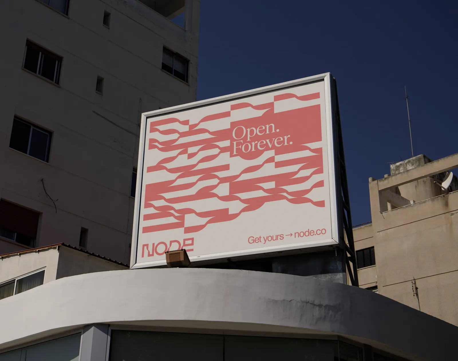
Images and video from brandbrothers.studio, by Brand Brothers.