The Brand Monograph
Archery World Cup brand identity by Arecibo Studio
↗Arecibo Studio built the Archery World Cup's 20th anniversary identity on an unlikely starting point: the moment an arrow goes wide. The series visits five host cities a year, yet it had a logo with no system behind it, so every venue handled it differently. The studio's answer was "Can't Miss," a line that speaks to the archer and the spectator at once.
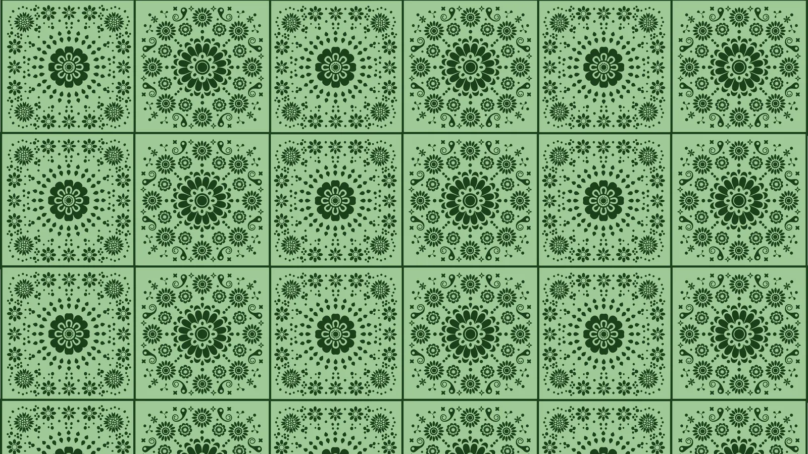
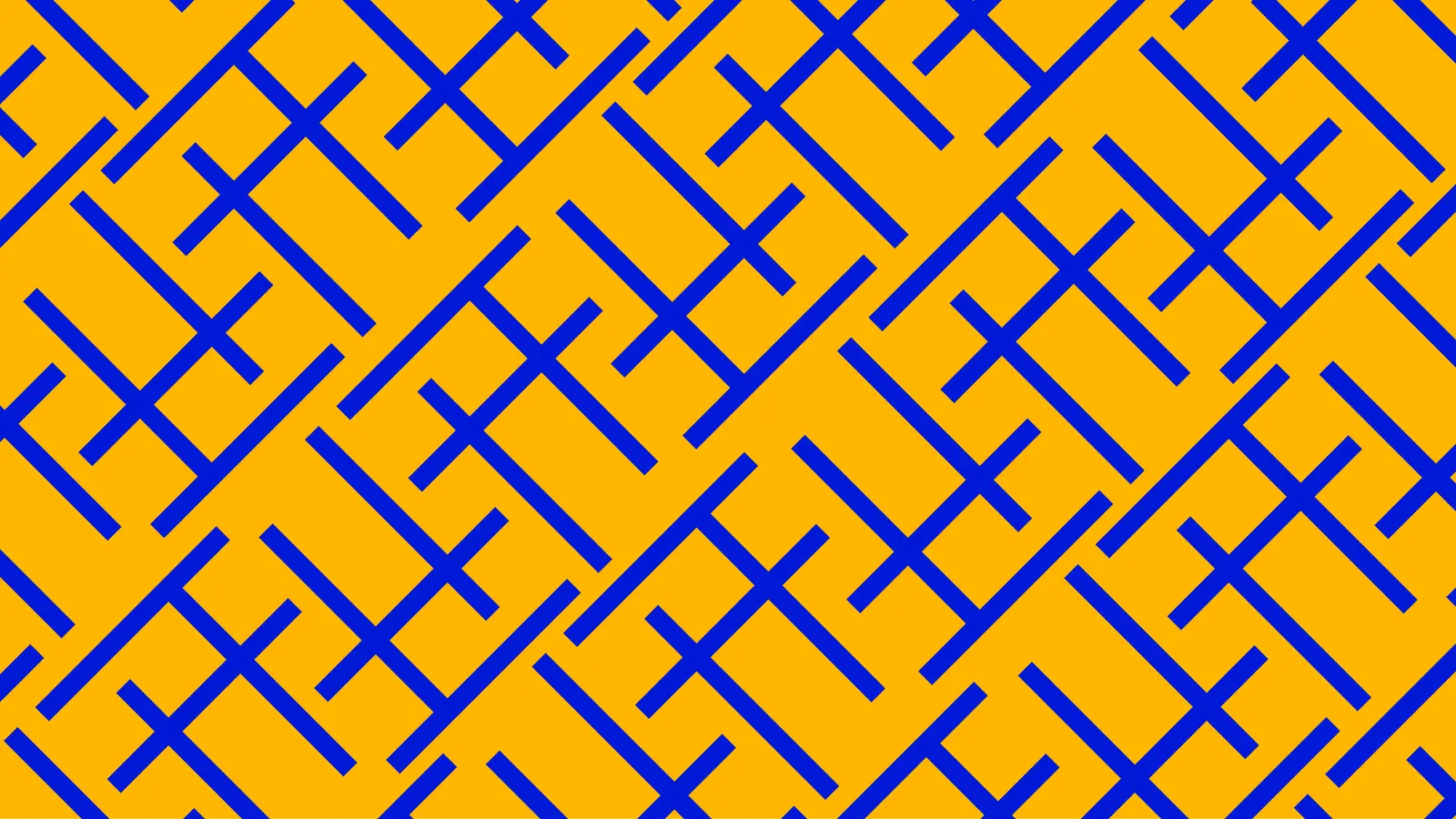
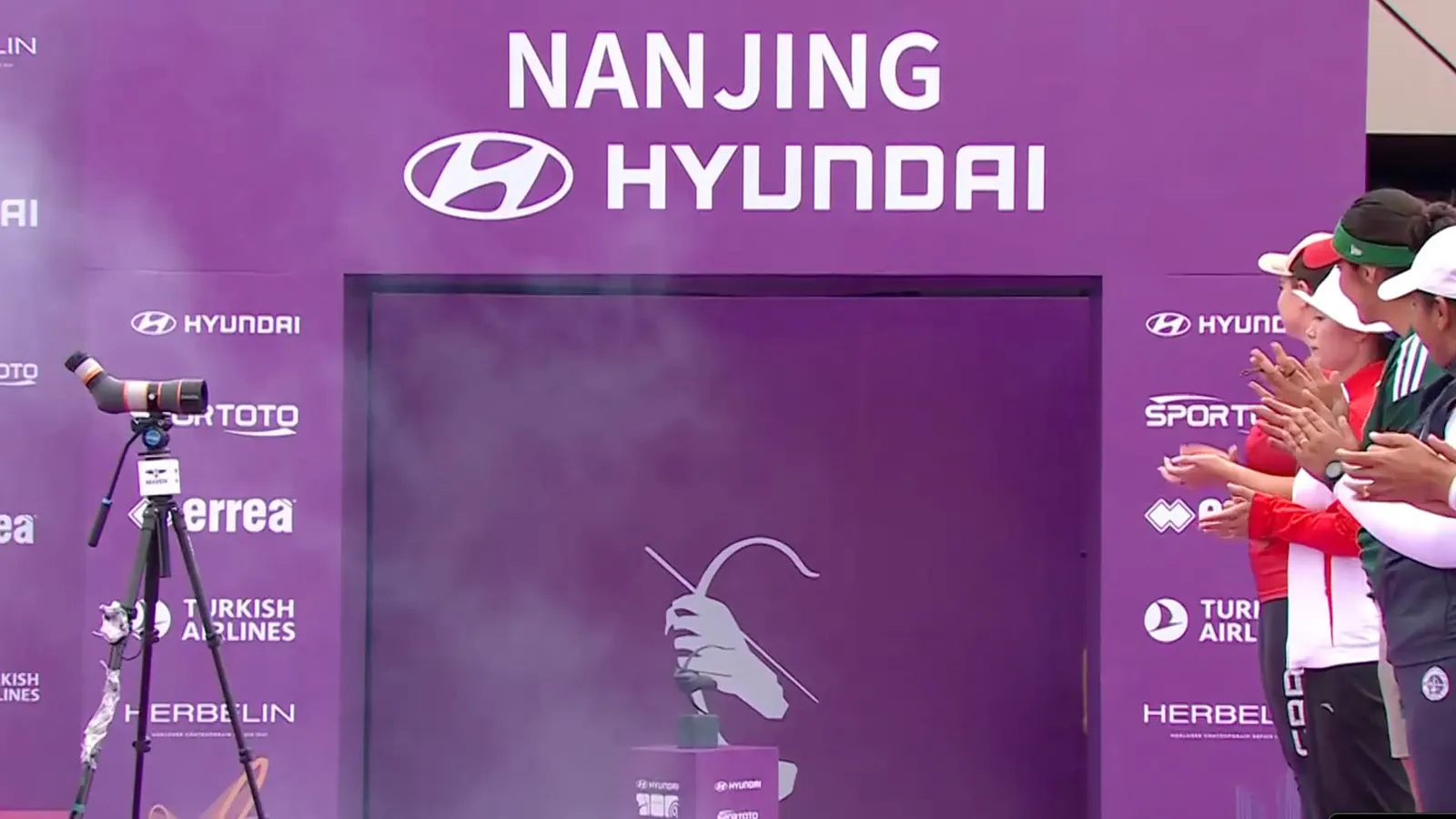
The icon is anchored by the trophy and built on a 45 degree angle taken from the bow. It can detach from the wordmark or be cropped into a graphic device. Newglyph worked with the studio on AWC Baikal, a variable typeface running from condensed light to extended bold. For host cities, the studio replaced one-off logos with a frame grid where each event picks two colors and a local pattern, while broadcast motion arrives as an After Effects template.
Why it works
The angle is the smartest decision here. One geometric gesture, borrowed from the bow, gives the logo, the type, and the motion a shared accent, so the brand stays recognizable even when only a fragment is on screen. Limiting hosts to recoloring means local patterns add variety without being able to break the core, which is where many multi-city events fall apart. The blues keep the series calm and premium beside louder sports properties, and a typeface with a wide width range lets scoreboards and headlines feel related despite very different jobs.
Applications
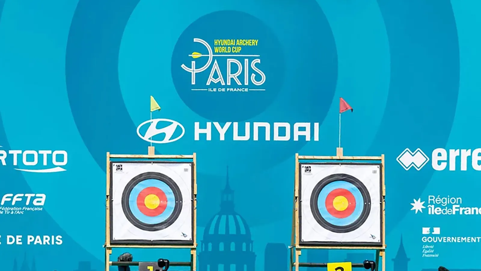
Logo
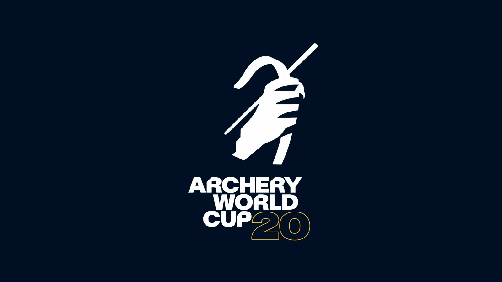
Color
Images and video from arecibo.studio, by Arecibo Studio.