The Brand Monograph
Nayla Arida brand identity by Creative Nights
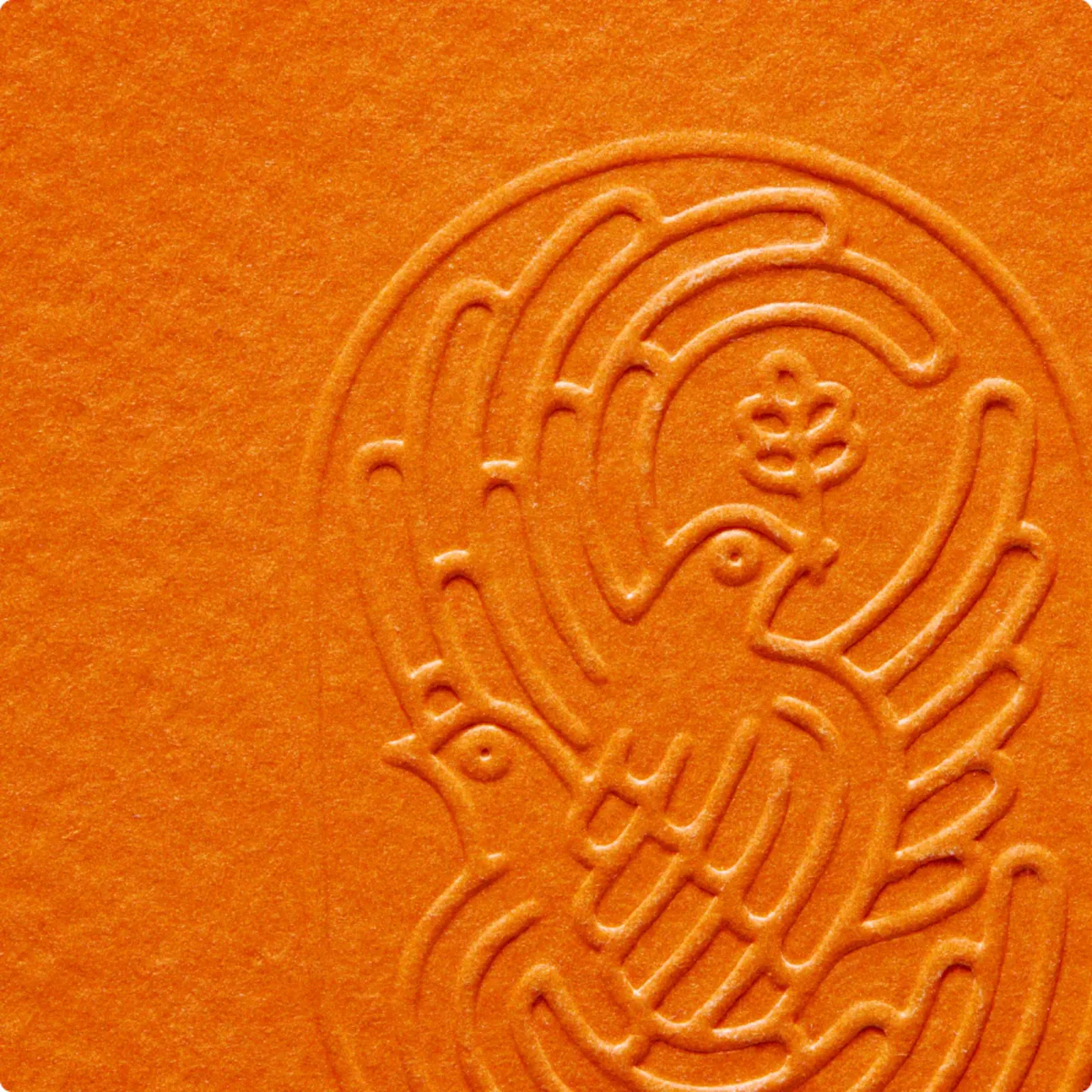
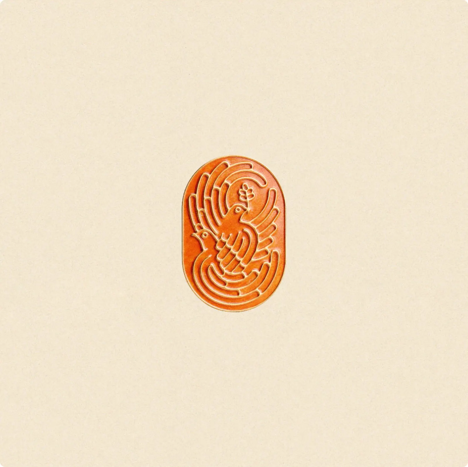
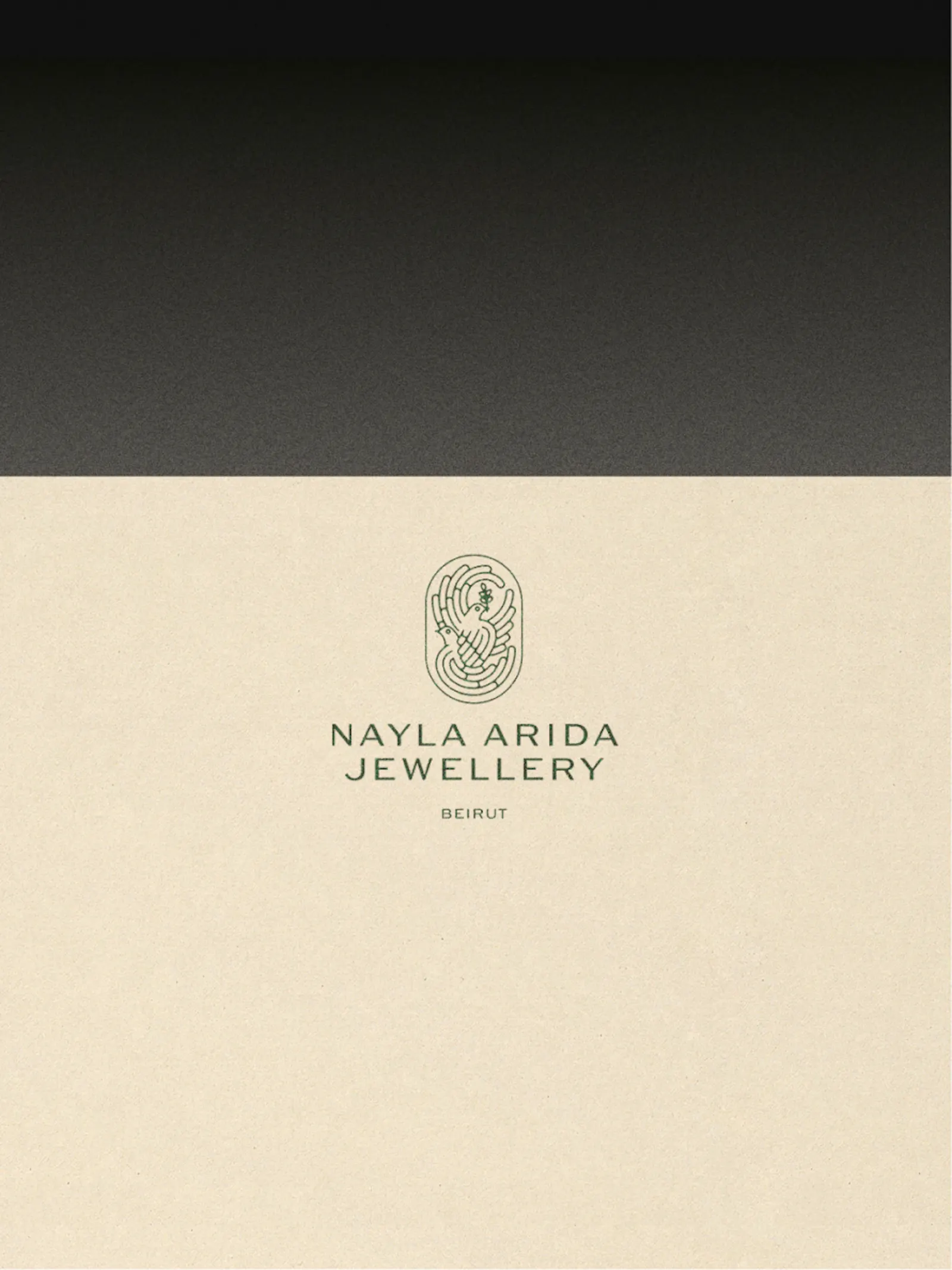
↗Creative Nights approached Nayla Arida's jewelry label as a story about coming home. Arida left Beirut for exile in France, spent twenty-five years away, then returned to Lebanon and its workshops. The jewelry already carried that weight, yet the brand sat inside a stock store theme. The studio, with strategists Marek Suchánek and Šimon Podehradský, built the identity around two turtle doves carrying a branch, refined through dozens of hand sketches until the mark was light enough to share space with the pieces.
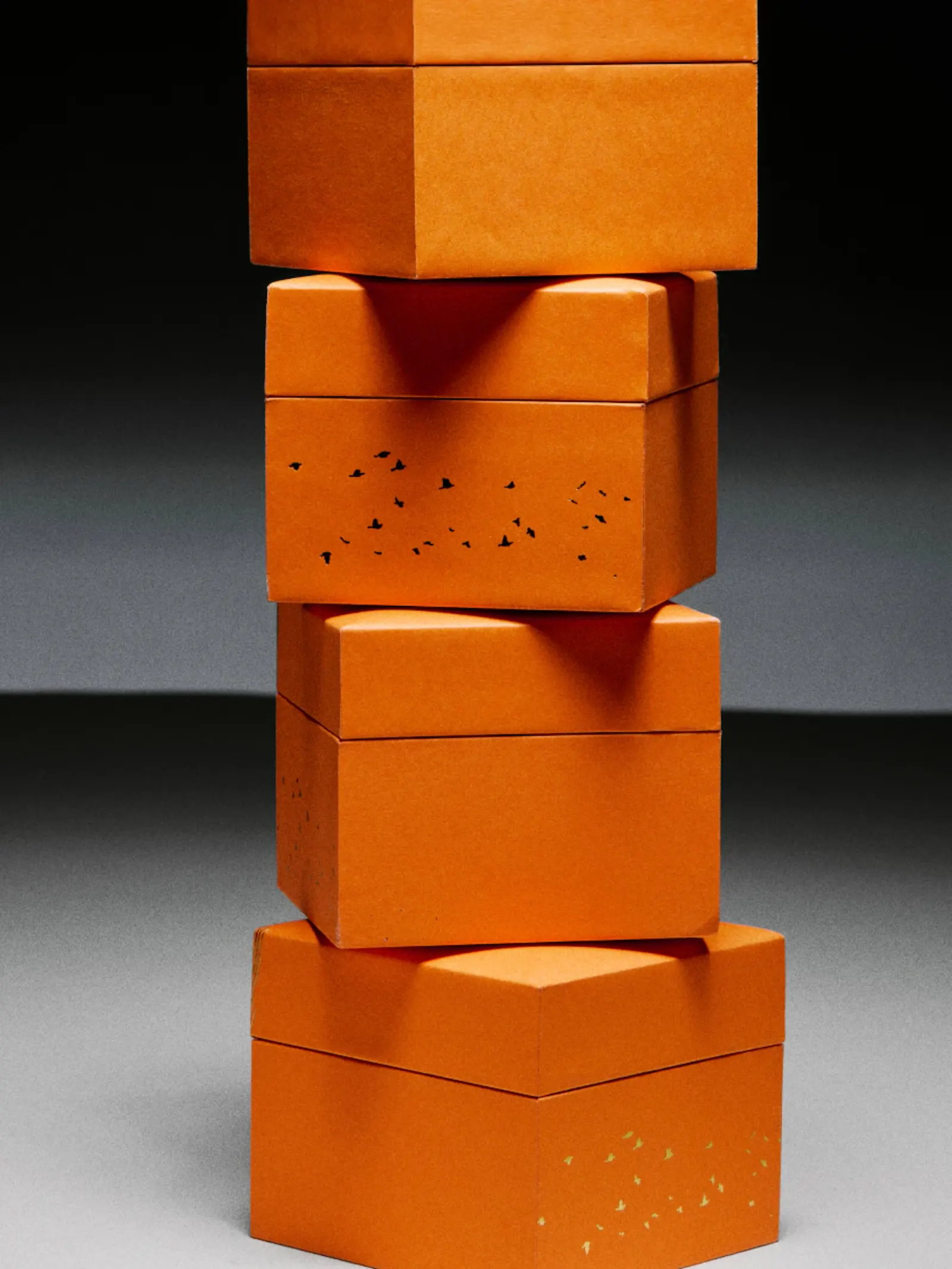
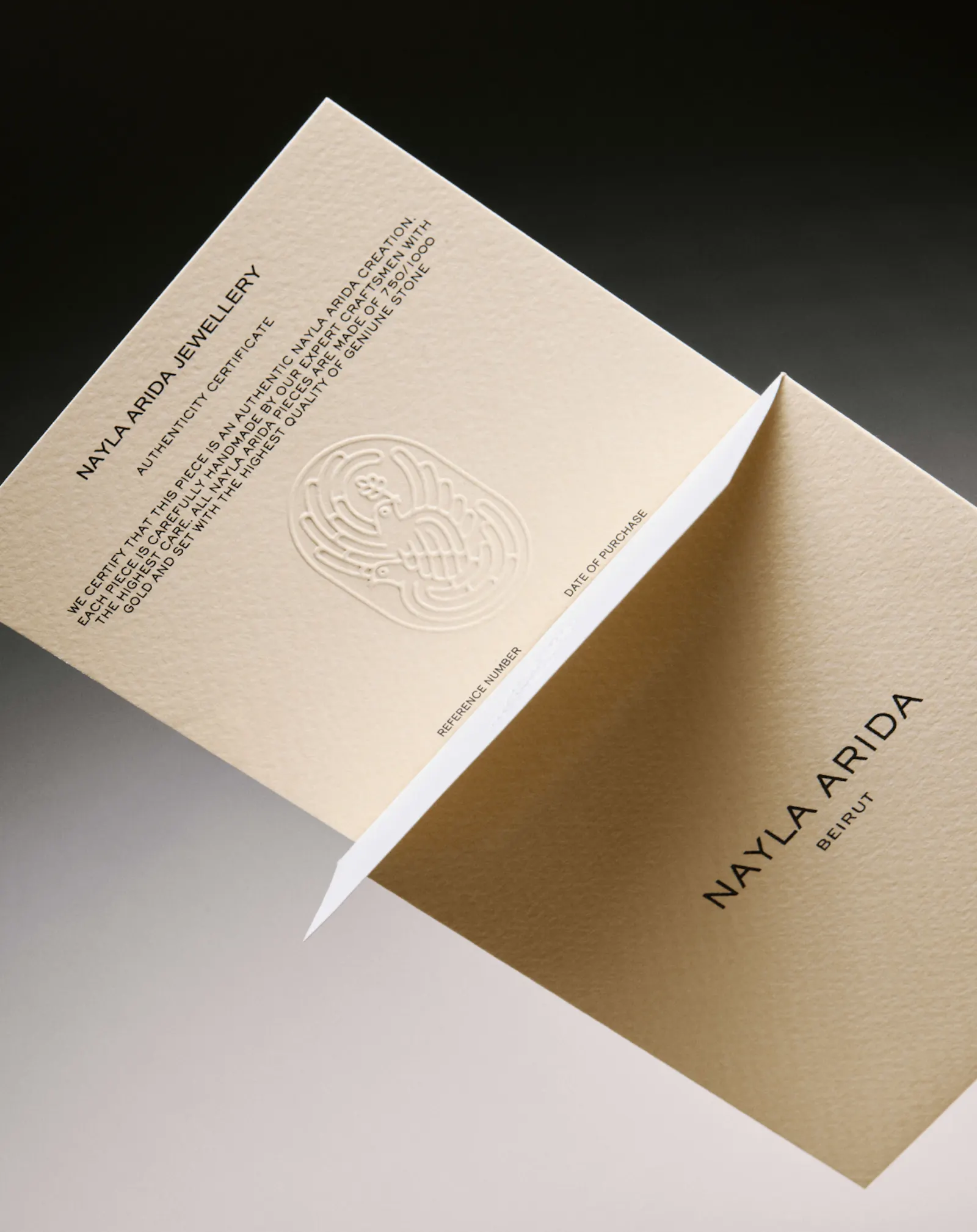
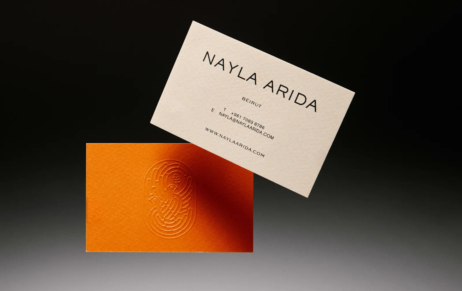
The design team of Elena Smirnova, Jesus Lopéz, and Markéta Mášová paired a palette of sand, navy, blue, and orange with three typefaces, Sackers Gothic, ABC Arizona, and Akzidenz Grotesk, and finished the packaging in gold embossing. Filip Beránek's photography and a motion team of Domagoj Štrok, Kryštof Ježek, and Tomáš Honěk gave each collection its own world, built from pomegranates, dried flowers, sea shells, and translucent materials. The online shop follows the same logic.
Why it works
The restraint is the smart part. Jewelry is small, personal, and often bought on instinct, so a fine, symbolic mark suits it better than a loud monogram. The doves also give Arida an emblem rooted in her own story, which template-driven competitors can't borrow. A palette drawn from place, sand and sea, feels specific to Lebanon rather than the usual gold-and-black shorthand for luxury. Assigning each typeface a clear job keeps the shop easy to use while leaving room for editorial personality. And collection-specific worlds let the range grow without the brand losing its center.
Applications
Logo
Images and video from creative-nights.com, by Creative Nights.