The Brand Monograph
Uniqode brand identity by Koto
↗Koto's work for Uniqode makes one of the most utilitarian technologies around feel considered and crafted. The brief came with a rename: Beaconstac became Uniqode just as the QR code boom filled the market with lookalike platforms and muddled messaging. The identity had to signal that this was the serious, enterprise-ready option.
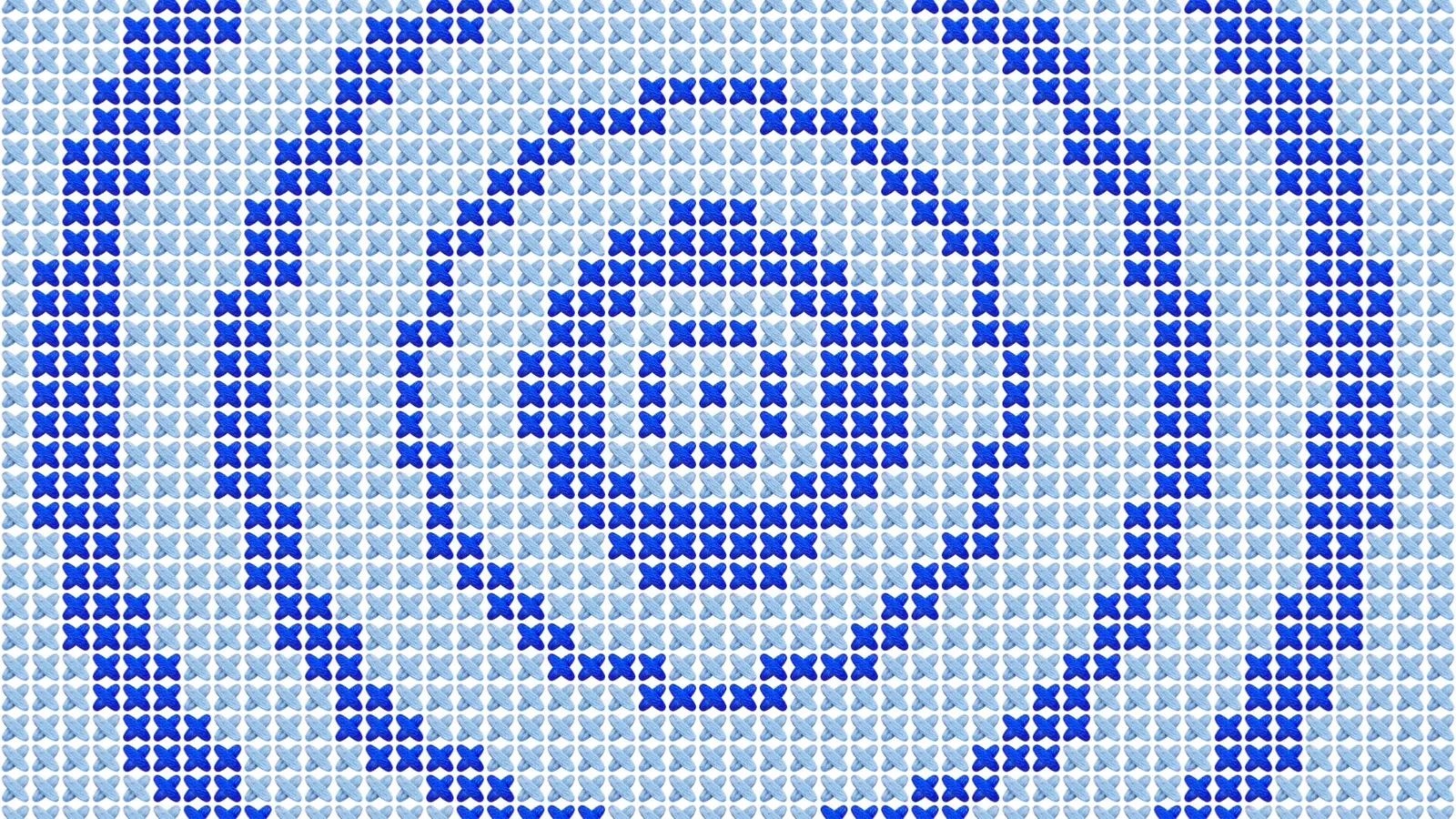
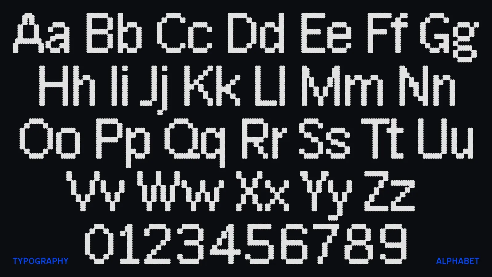
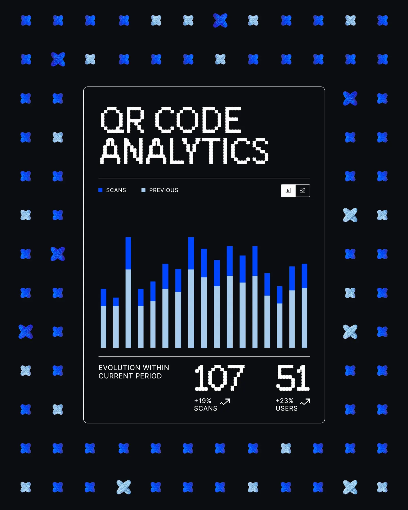
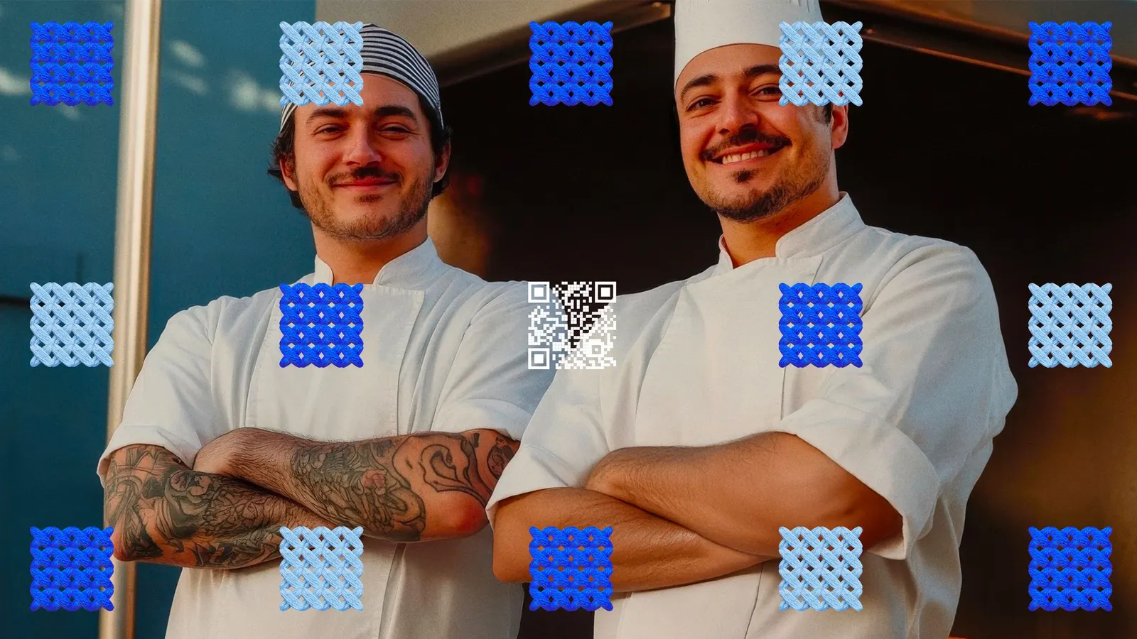
Koto positioned the brand as the link between the printed world and the screen, then gave that idea a visual language. The centerpiece is Uniqode Sans, a custom typeface that draws separate points into a single connected surface. Stitched patterns, motifs, and icons pick up the same logic and carry it through product dashboards, scan experiences, campaigns, and sales decks.
Why it works
QR codes are generic by nature, and so are most brands built around them. A custom typeface gives Uniqode something competitors can't borrow, and the stitching idea explains what the product does without a tagline. It also gives the patterns a clear job instead of leaving them as decoration. For enterprise buyers, a system this consistent across product and marketing signals reliability, while the handmade quality of the pattern work keeps a security-minded brand from feeling cold.
Applications
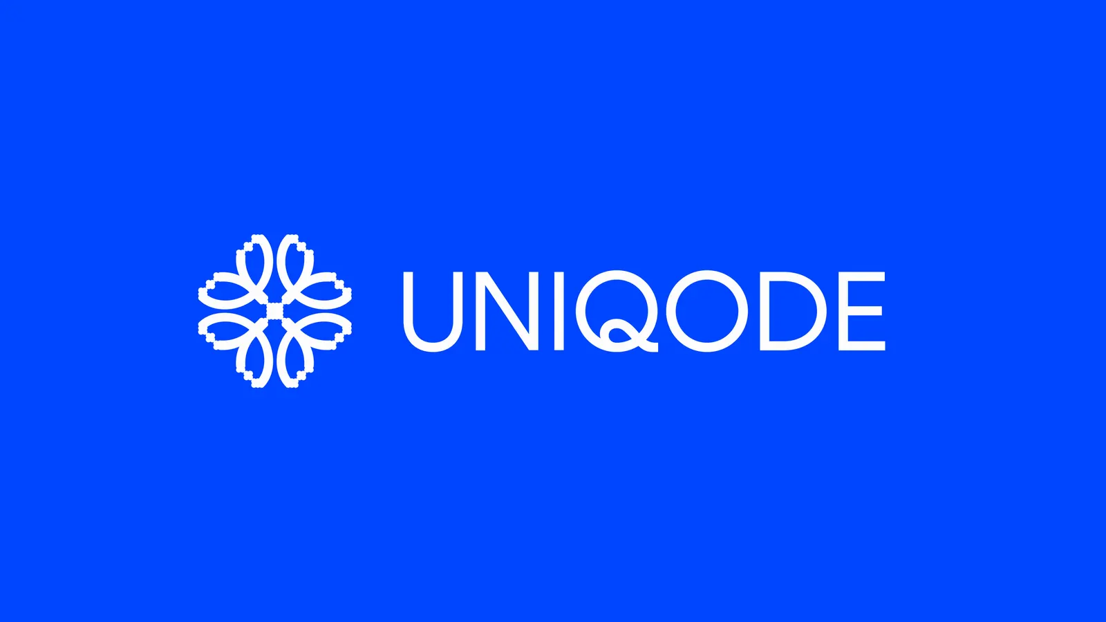
Logo
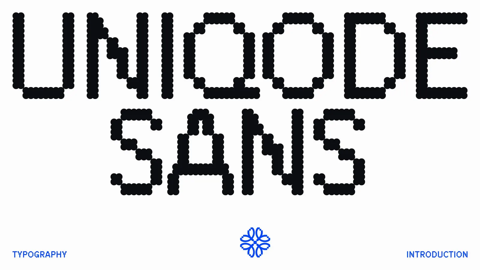
Typography

Images and video from koto.com, by Koto.